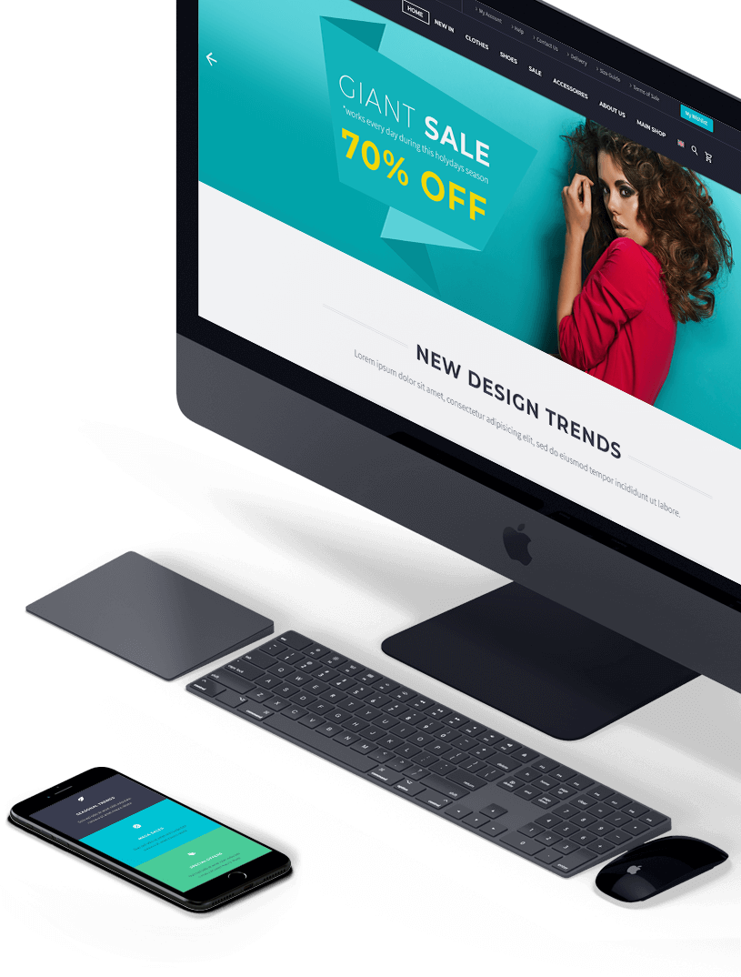
Responsive
& mobile ready
TheGem is fully responsive. It means, it can automatically adapt to different screen sizes, no matter which device your website visitors use. You can check it by resizing your browser window. Every content & layout element of TheGem has been optimised to look great in its responsive variant. Don’t put limitations on your audience – let people discover your website on any screen and device they use.

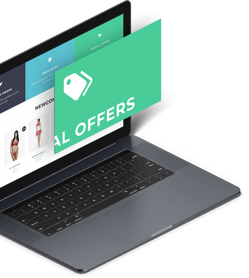
Retina
ready
TheGem was made with the idea to look great everywhere. The common problem of common themes on retina displayts is poor quality of images and icons. In TheGem it will never be your problem. All your images will look really sharp on retina devices. Give your visitors real great visual experienve – with Scalia, opimised for retina!

the gem is mobile
friendly theme!
Lorem ipsum dolor sit amet, consectetur adipisicing elit, sed do eiusmod tempor incididunt ut labore et dolore magna