Theme Options
Introduction
General
Theme Options & Page Options are the main tools and the core of TheGem, which gives you full control over the whole website, its layout, styles and settings.
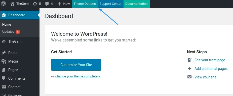
Theme Options control the global site settings and are based on the WordPress page template hierarchy. Theme Options can be accessed by clicking on “Theme Options” button in the top panel in your WordPress admin
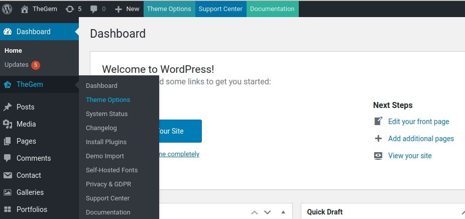
or by selecting this menu item in the left menu
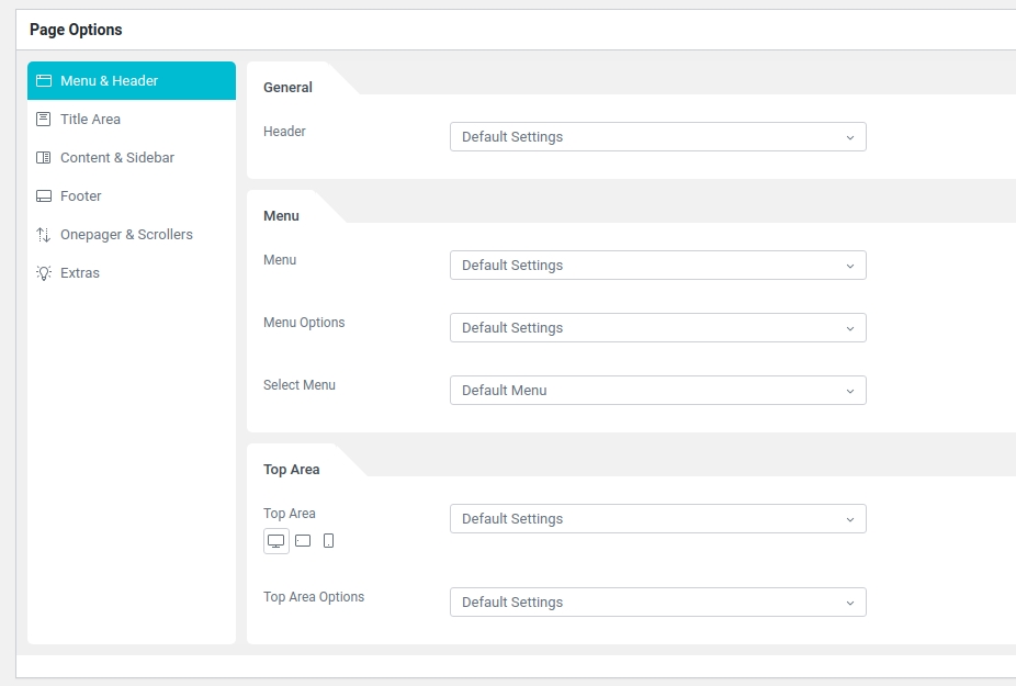
Page Options are located in every page, post, portfolio page, product etc. and can be used to control the layout & style settings of the individual page / post (read more in “Page Options”).
Three-Tiered Approach
In TheGem, Theme Options are built reflecting the flexible three-tier template hierarchy approach. Sounds complicated, but very easy in use:
Tier 1: Theme Options allow you to make global website setup, which will be automatically applied to all single pages & posts and all archive pages (see “Global Website Settings”) .
Tier 2: Additionally, you can make separate settings for chosen types of single and archive pages (posttypes) , which will differ from global settings and will apply only on this selected types. For example, if you wish, that all your blog posts or product categories have different layout & styles than the rest of your website, you can easily make this custom settings in Theme Options (see “Single Pages” and “Archive Pages”).
Tier 3: And finally, using Page Options, you can setup individual pages, posts, products etc. to look differently than set for the whole website (Tier 1) or for the selected posttypes (Tier 2).
UI Overview
Main Elements
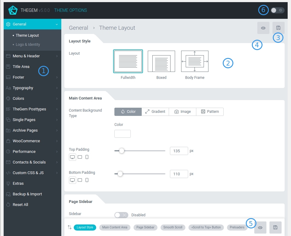
1. Settings menu: settings are grouped in two-level hierarchy
2. Settings section: inside the selected menu, settings are grouped and separated in sections
3. Save button: this button is used for saving Theme Options. It turns active as soon as some changes have been made.
4. Preview button: this button helps to check the preview of your website. It turns active as soon as changes have been saved after clicking on “save” button.
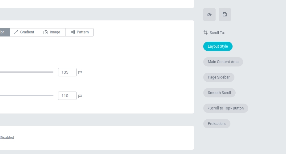
5. Quick navigation: this panel helps to quickly navigate between settings sections inside the selected settings menu. It is located at the bottom on notebook screen resolutions and on the right side on desktop screen resolutions
6. Dark mode: here you can switch between light and dark mode of Theme Options.
Responsive Settings
In TheGem Theme Options you can make separate settings for different screen devices.
If some setting can be differently set for different screen resolutions, it has this control.
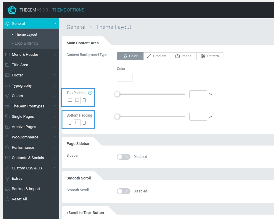
By clicking on “Desktop”, “Tablet” or “Mobile” you can switch between different values for different devices.
Typography Preview
FONTS LIST
Controls for selecting fonts have a preview option right inside the fonts list. Just scroll through the fonts list, stop for a little and the font names will be displayed in the corresponding fonts
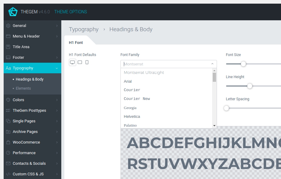
SELECTED FONT PREVIEW
Using the control “Preview” you can enable / disable preview of selected typography (font, size and its styling). By default this option is disabled.
Help Tooltips
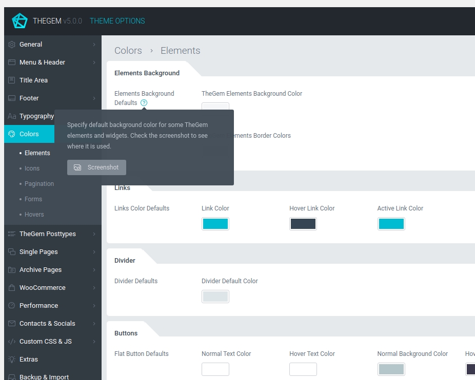
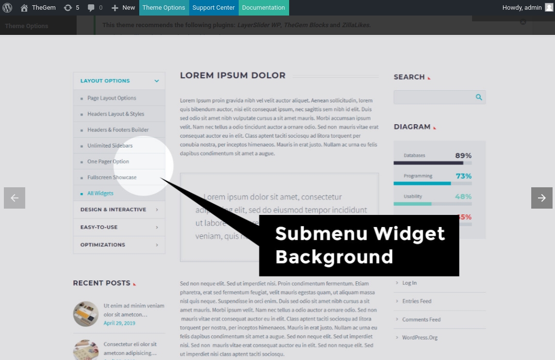
By mouse over on different separate settings a question symbol appears. By clicking on this symbol you will get a tooltip with help text, describing the meaning and purpose of this settings. On many help tooltips you will find “SCREENSHOT” button, which loads gallery to demonstrates the application of this setting.
Background Types
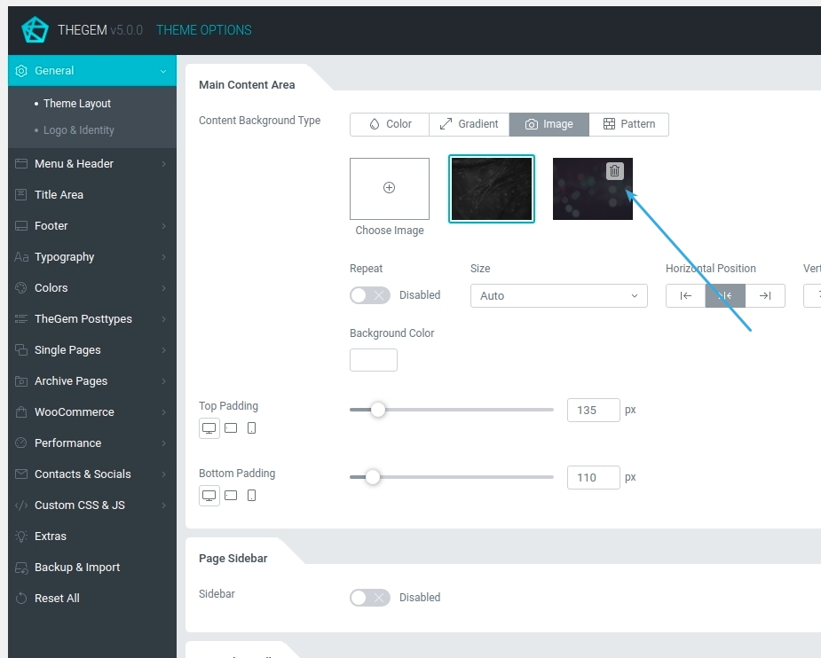
In Theme Options and in Page Options you have background settings for different elements. You can choose between “Color”, “Gradient”, “Image”, “Video” and “Pattern” background types by selecting respective button in “Background Type” control
Please note: “Image” background type adds the chosen images in a kind of favourites gallery. You can remove images from this gallery by clicking on “Trash” icon
Please note: in “Video” background type you can select between youtube, vimeo and self-hosted video. For youtube and vimeo videos please use video ID
Global Website Settings
General
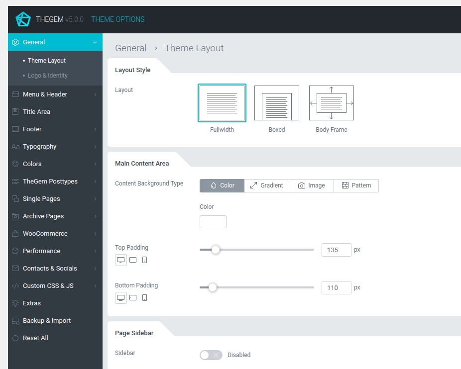
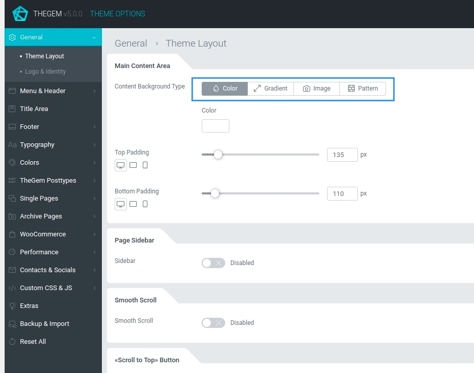
Theme Layout
You can define the general global layout of your website by selecting “General – Theme Layout” in Theme Options.
LAYOUT STYLE
In this section you can select the general website layout for desktop resolutions starting from 1260px and above.
Fullwidth: page body covers the whole browser width.
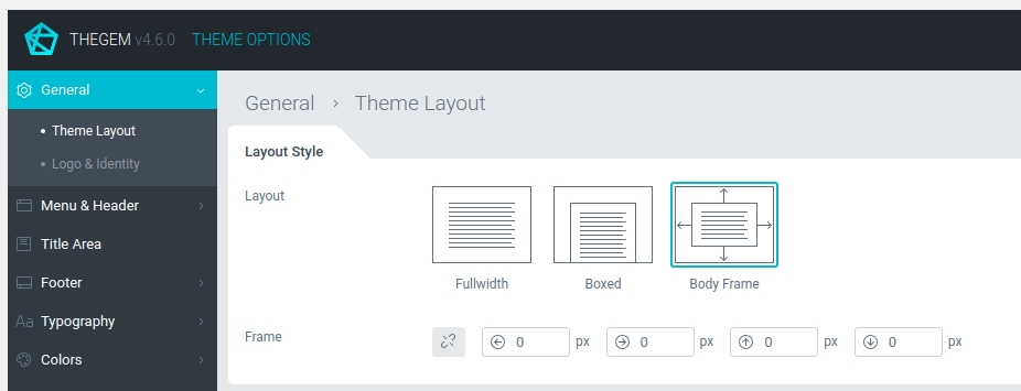
Boxed: page body is in the box of 1260px width and has a fullwidth background.
Body Frame: page body has a frame around it.
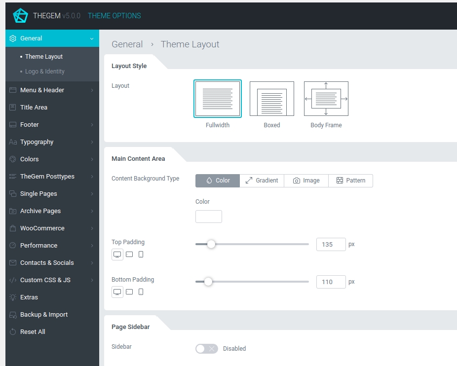
MAIN CONTENT AREA
Define the global style settings for main content area.

PAGE SIDEBAR
Enable or disable sidebar for all pages / posts of your website. You can also switch on/off sidebar for individual posttypes and individual posts/pages separately. Read more about sidebars & widgets
SMOOTH SCROLL
This setting allows you to enable smooth vertical scrolling on your website.
“SCROLL TO TOP” BUTTON
Allows you to enable/ disable “scroll to top” button which appears in the bottom corner of your website
PRELOADERS
In this section you can define if you wish to use page preloader globally on your website and specify its colors. Also you can select the preloader type for ajax content elements (like for example portfolio grids).
Logo & Identity
LOGO
To set up your website’s logo go to “General – Logo & Identity”.
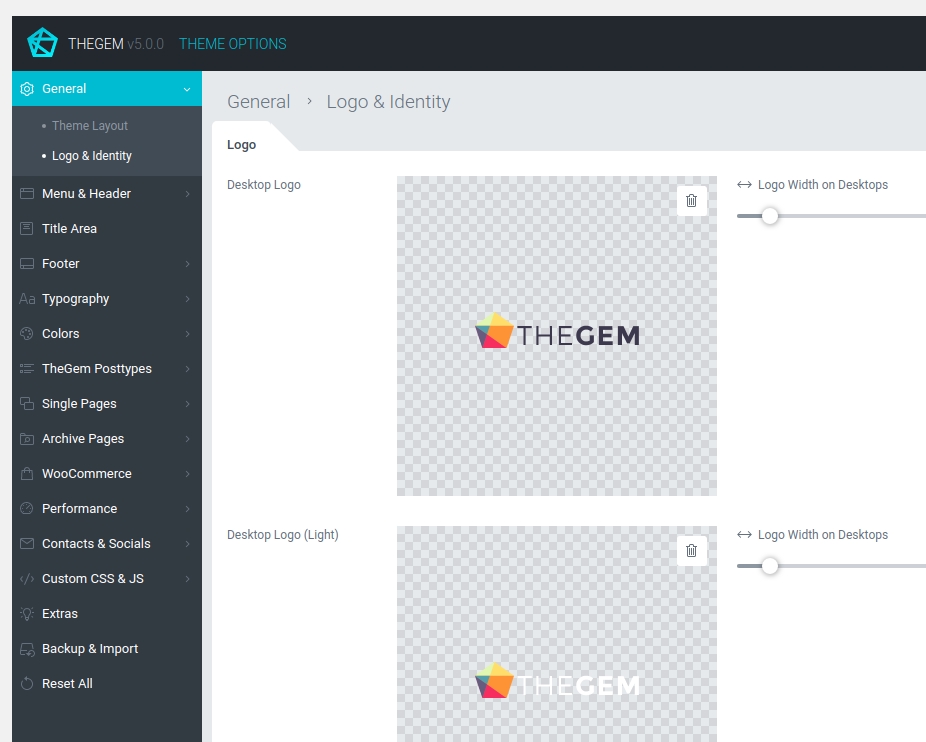
Desktop Logo
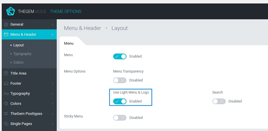
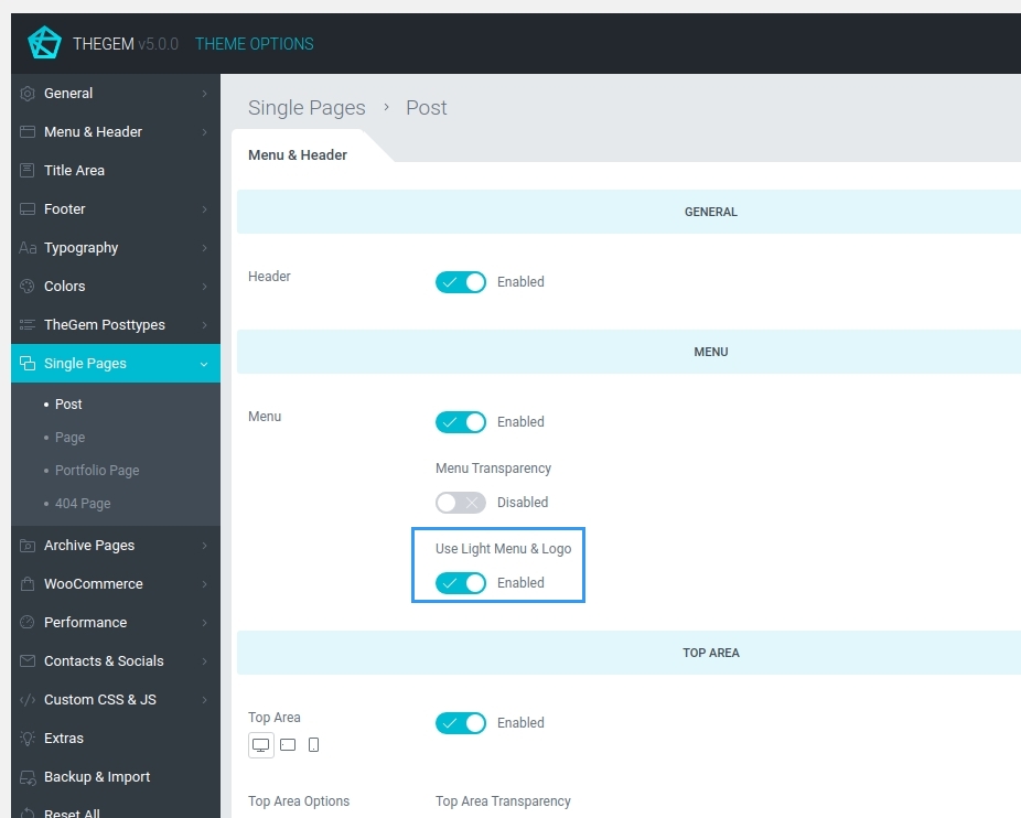
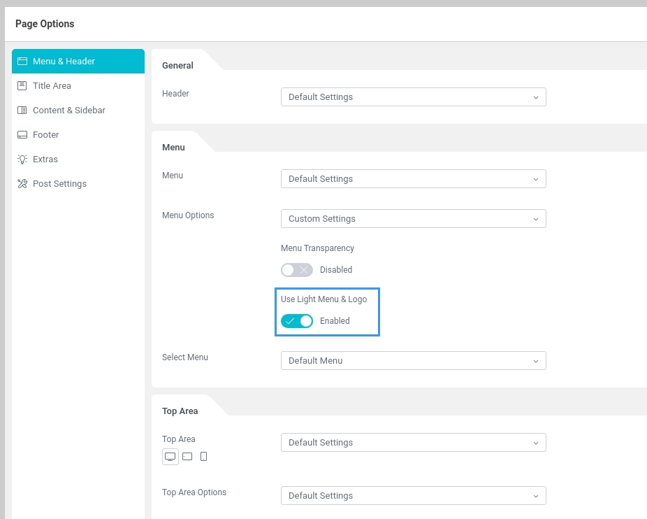
Depending on the background color of your menu & header area, to maintain optimum contrast and visibility, TheGem offers you to upload two color versions of your logo: one version for the light backgrounds and one version for the dark backgrounds. You can then vary between default (light backgorunds) and light (dark backgrounds) logo using the setting “Use light menu & logo” in “Menu” settings on all three levels:
- Global: in “Menu & Header – Layout” settings menu of Theme Options
- Single & Archive Pages: in “Single Pages” or “Archive Pages” settings menu of Theme Options -> “Menu & Header” settings section
- In individual pages or posts in “Menu & Header” settings menu in page options
Mobile & Sticky Menu Logo
This logo is used on mobile devices and in sticky menu (if sticky menu is enabled).
Recommended sizes (retina)
For best retina results please upload image file, which width is 3 times larger than the width specified in slider. Example: on TheGem’s demo website the logo width for desktops is specified with 164 px -> the logo image file uploaded has 164 px x 3 = 492 pix width.
FAVICON
To set up your website’s favicon, navigate to “Favicon” settings section in “General – Logo & Identity”. Here you can upload your favicon file.
Menu & Header
In this settings menu you can define the layout and styles of your website’s menu & header.
Menu & Header Layout
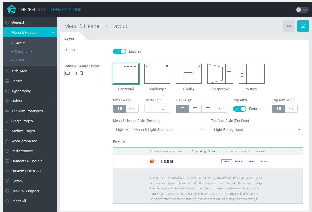
LAYOUT
This section contains a set of settings to define the menu & header layout.
You can choose between different layout types, define width, logo alignments, hamburger size, enable/disable top area and select between various style presets for menu and top area. In the preview area you can see how the selected combination of layout and style are displayed. This preview is not a live preview of your website, it is a dummy preview which helps you to understand the appearance of different layouts and menu styles.
Please note: switching between different style presets of menu and top area changes the default colors and fonts as well.
MENU
This section controls additional settings for website’s menu on a global level. Here you can enable menu transparency and set its opacity, switch on light menu & logo in case your website has a dark background in header. Also you can enable/disable search button in header. Additionally, here you can enable/disable sticky menu (so the menu bar sticks to the top while vertical scrolling).
TOP AREA
Top area is an additional top bar which is displayed above the main menu if enabled.

Like in the “Menu” section, in this settings section you can define various settings for Top Area of your website.
Menu & Header Typography
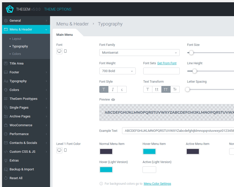
MAIN MENU
Here you can define the typography of your website’s main menu and specify font menu colors for main menu items.
SUBMENU
Here you can define the typography of your website’s submenus and specify font menu colors for submenu items.
OVERLAY MENU
Typography settings for “Overlay” menu layout.
TOP AREA
Font colors for top area.
Menu & Header Colors
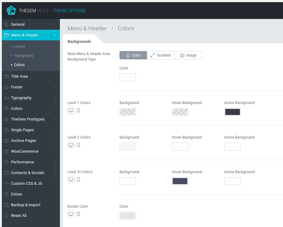
BACKGROUNDS
This section controls the background colors for menu & header. The “Background Type” control allows you to switch between different background types for the header area. Level 1, Level 2, Level 3+ colors give you an option to specify background colors for menu items.
HAMBURGER
Color settings for hamburger icon for “Hamburger”, “Perspective” and “Overlay” menu layouts.
OVERLAY MENU
Color settings for overlay background in case “Overlay” menu layout has been selected.
MEGA MENU
Color settings for mega menus.
TOP AREA
Background type and additional color settings for top area.
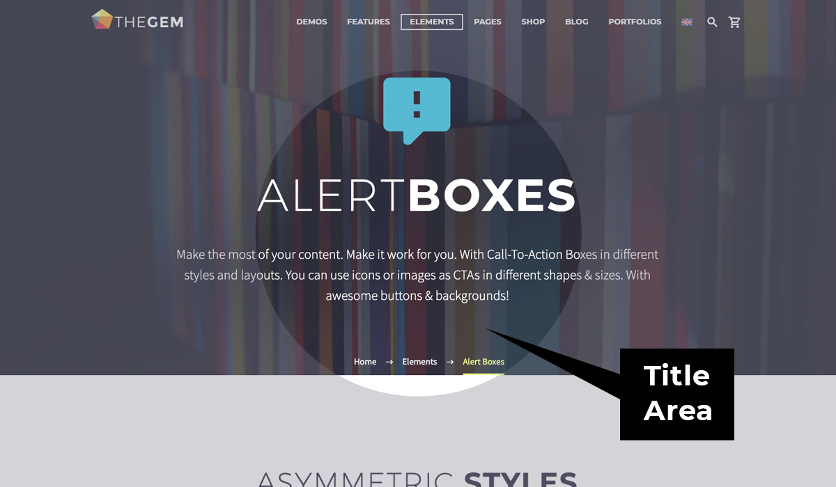
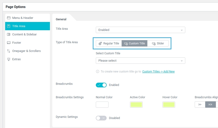
Title Area
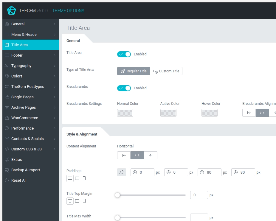
Title area includes post/page title, excerpt and breadcrumbs.
GENERAL
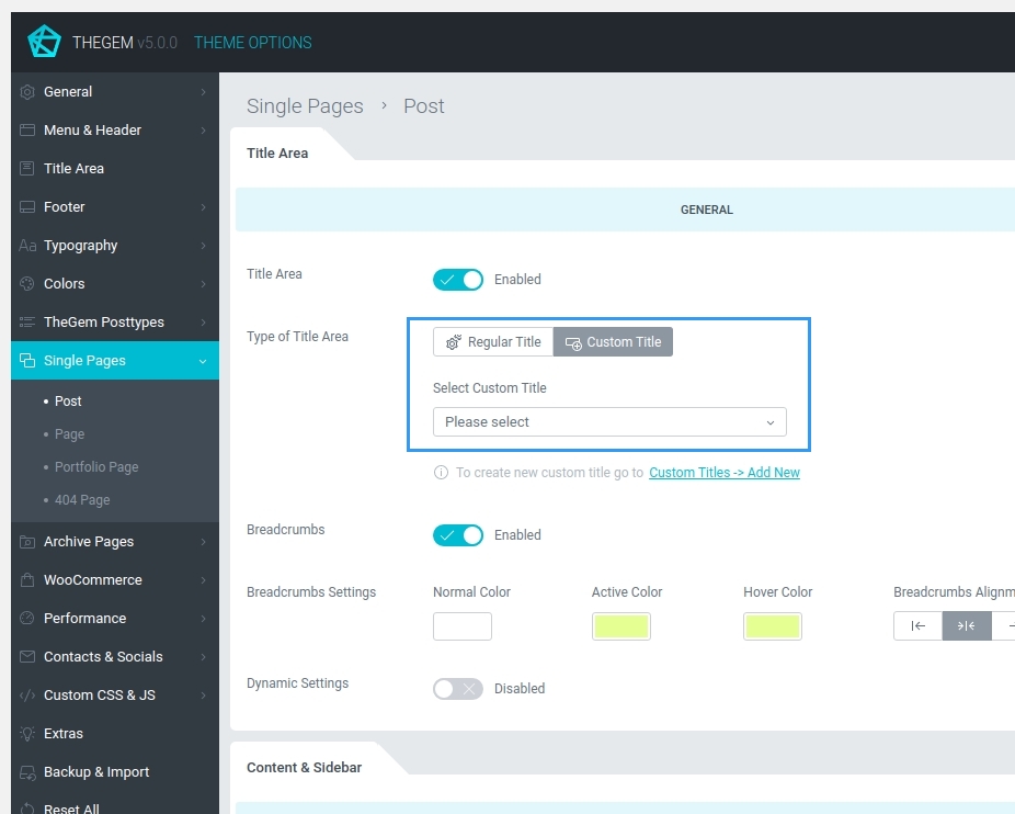
- Regular Title: the layout & style of title area is controlled via theme options below
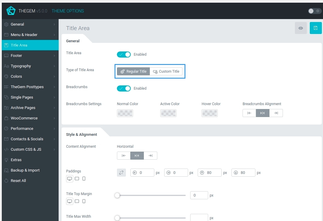
- Custom Title: in TheGem you can create any layouts/templates for your title area using page builder. You can create this templates in “Custom Titles” menu option in your WordPress admin and then select it in the “Select Cutom Title” control here in theme options
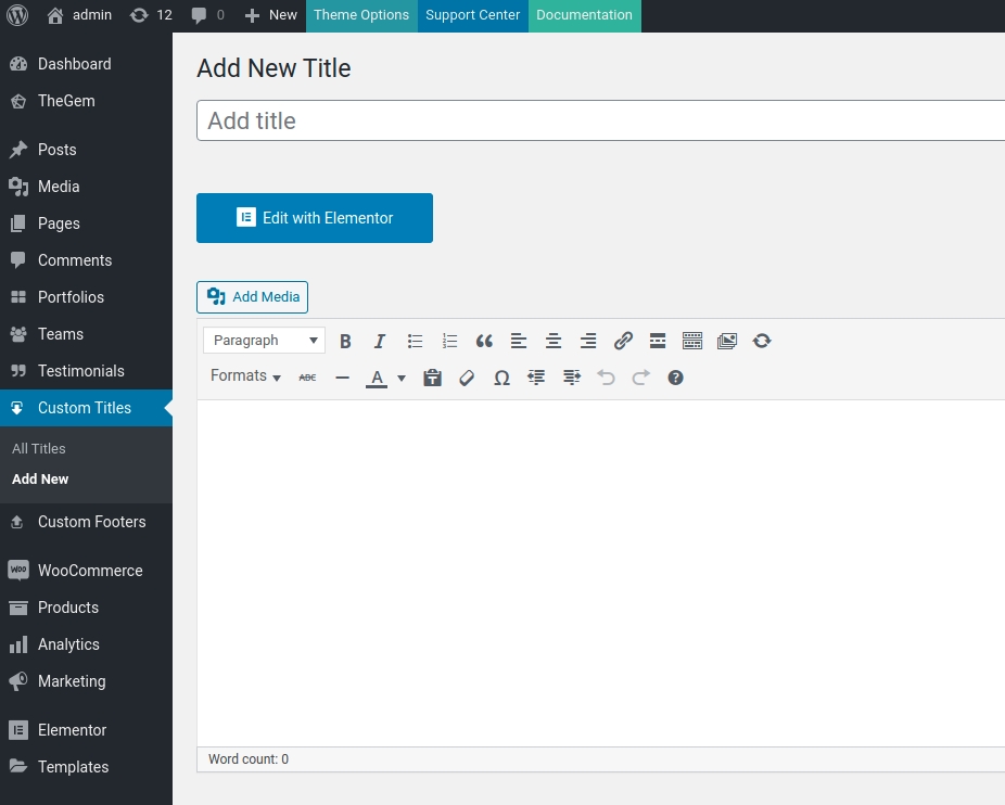
Learn more about “Custom Titles” here
In case of selecting “Custom Title” for your Title Area you have then an option to embed additional styling options in the selected custom title dynamically. By activating “Dynamic Settings” option you get additional settings for title & excerpt colors as well as for title area background, which will be applied to the selected custom title automatically.
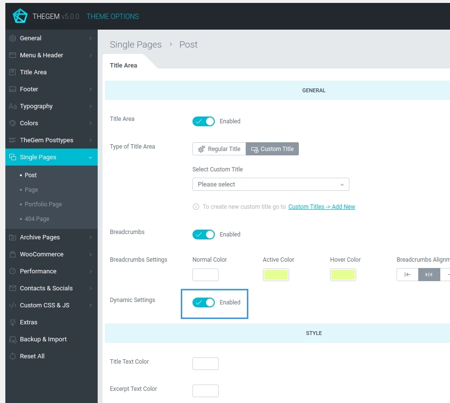
Additionally, in “General” section of “Title Area” settings you can set up breadcrumbs.
STYLE & ALIGNMENT
In this settings section you can control different layout & style settings of the regular title.
BACKGROUND
Here you can specify the background type for title area.
Footer
Footer Layout
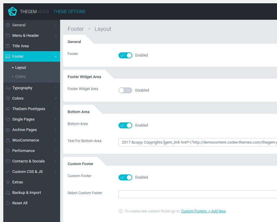
Set of settings to define the layout of your website’s footer.
GENERAL
Here you can enable or disable website’s footer globally.
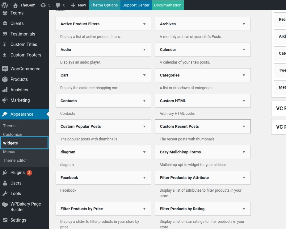
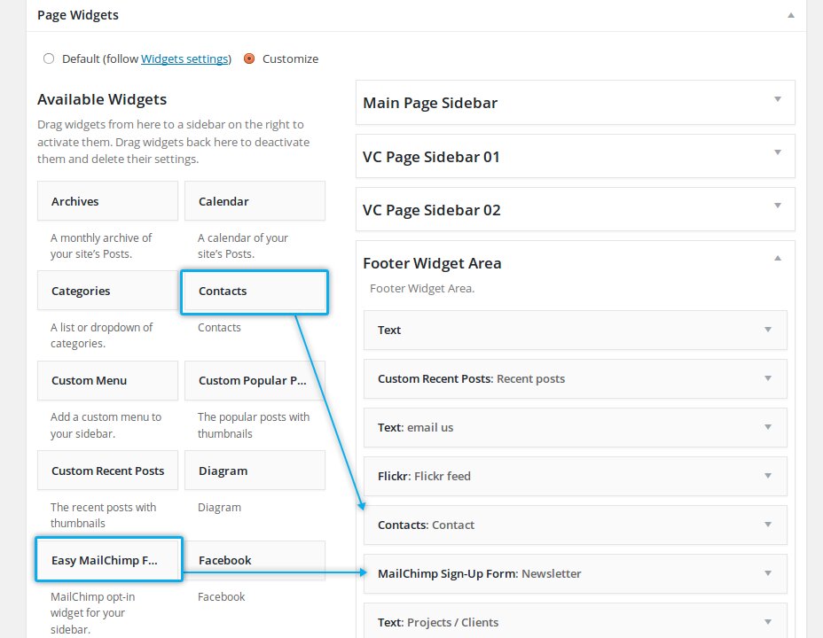
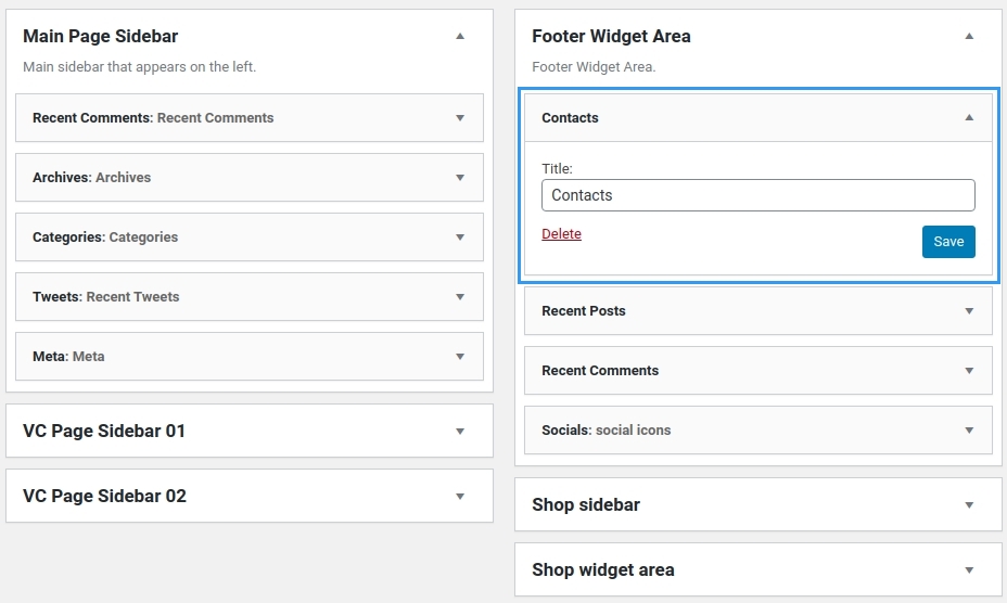
FOOTER WIDGET AREA
Footer widget area is a widgetized area which can be enabled to display in website’s footer. Footer widget area is an area below the main body where you can use different sidebar widgets.
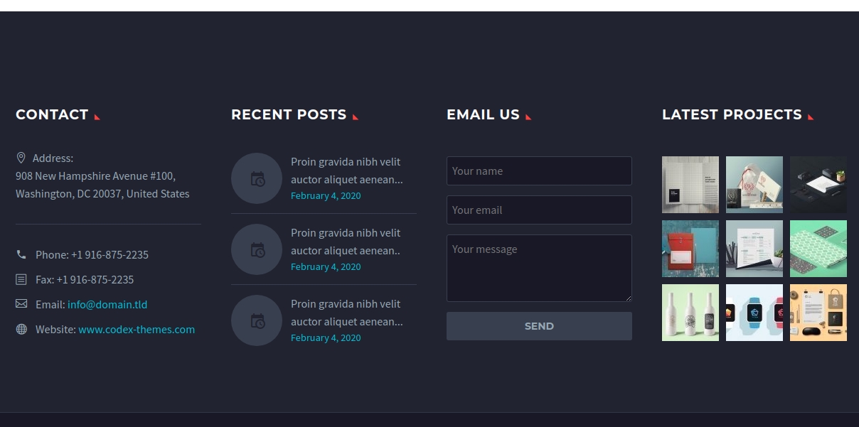
You can populate the footer widget area with different widgets in “Appearance – Widgets” menu of your WordPress admin.
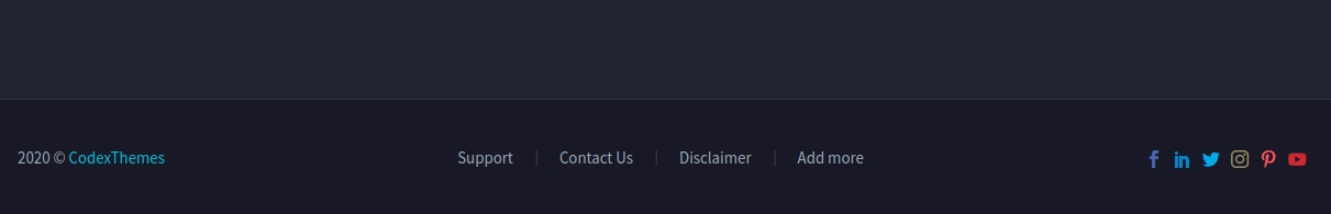
BOTTOM AREA
Bottom area is also referenced as a copyright area of the website. Here you can enable or disable this area for the whole website globally.
CUSTOM FOOTER
In TheGem you can create any layouts/templates for your footer using page builder. You can create this templates in “Custom Footer” menu option in your WordPress admin and then select it in the “Select Cutom Footer” control here in theme options, so it will be displayed in addition (or instead of) footer widget area and bottom area.
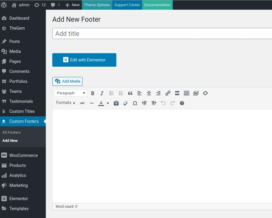
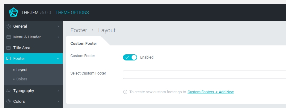
Learn more about “Custom Footers” here
Footer Colors
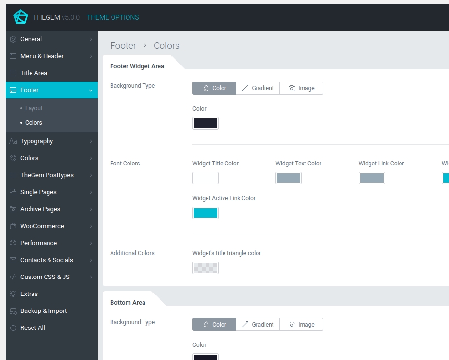
FOOTER WIDGET AREA
Here you can specify background type and font colors to be used in footer widget area.
BOTTOM AREA
Here you can specify background type and font colors to be used in bottom area.
CUSTOM FOOTER
Here you can specify background type to be used as default background color for custom footers.
Typography
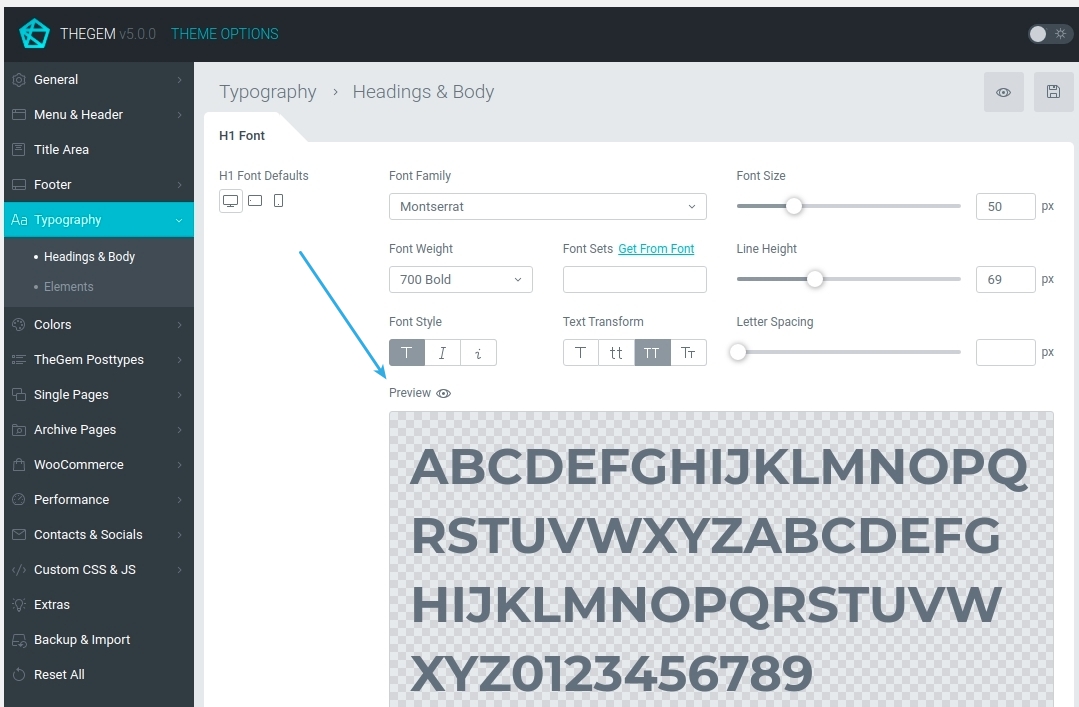
Headings & Body
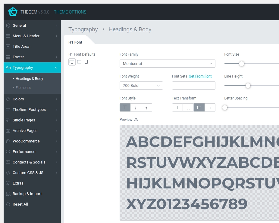
H1 – H6 FONT DEFAULTS
Specify default fonts and font colors for H1 – H6 headings.
BODY FONT
Specify default font and font color for website’s body.
EXCERPT FONT
Specify default font for excerpt. Excerpts can be used in title area.
STYLED SUBTITLE FONT
Specify default font for styled subtitles.
XLARGE TITLE FONT
Specify default font for XLarge title.
LIGHT TITLE FONT
Light (or thin) title is an additional style option to display titles in other font. In this way you can create stylish “bold – thin” title combinations. Here you can specify default font for thin titles.
Elements

BUTTONS
Here you can specify default typography settings for buttons. TheGem includes two default typography styles for buttons: regular and thin. This can be further customized in page builder.
TABS & ACCORDIONS
Here you can specify default typography settings for tabs & accordions. TheGem includes two default typography styles for tabs & accordions: regular and thin. This can be further customized in page builder.
COUNTERS
Here you can specify default typography settings for counter numbers. This can be further customized in page builder.
SIDEBAR WIDGETS
Typography settings for sidebar widgets.
Colors
Elements
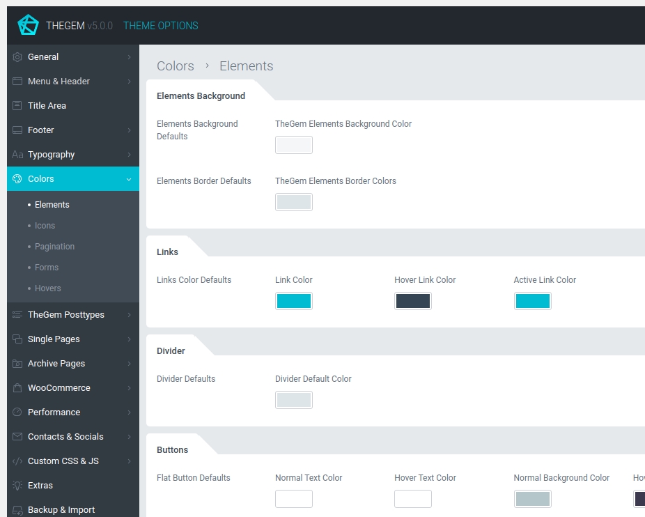
BUTTONS
Here you can specify default typography settings for buttons. TheGem includes two default typography styles for buttons: regular and thin. This can be further customized in page builder.
TABS & ACCORDIONS
Here you can specify default typography settings for tabs & accordions. TheGem includes two default typography styles for tabs & accordions: regular and thin. This can be further customized in page builder.
COUNTERS
Here you can specify default typography settings for counter numbers. This can be further customized in page builder.
SIDEBAR WIDGETS
Typography settings for sidebar widgets.
Icons
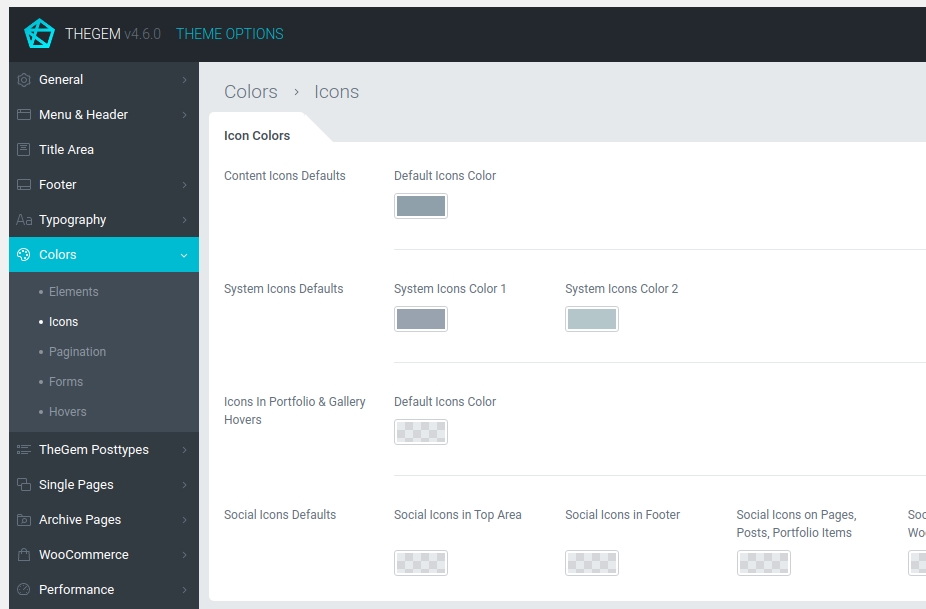
ICON COLORS
In this section you can define default color settings for icons used in TheGem:
- Content Icons: icons, used in content elements of TheGem. Check the screenshots in help tooltips to see where it is used.
- System Icons: icons used for example in blog posts, portfolio items, product grids and sidebar widgets. Check the screenshots in help tooltips to see where it is used.
- Icons in Portfolio & Gallery hovers: icons used in hovers, check the screenshots in help tooltips to see where it is used.
- Social Icons: default colors for social icons
Pagination
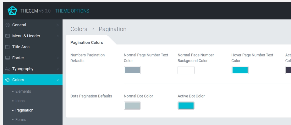
PAGINATION COLORS
Here you can specify default colors for pagination elements: classic “numbers” pagination and dots pagination
Forms

CONTACT FORMS
TheGem comes with two color presets for contact forms: light style (for contact forms, used on light backgrounds) and dark style (for contact forms, used on dark backgrounds). Here you can specify color defaults for contact forms.
NEWSLETTER FORMS
TheGem uses EasyForms for Mailchimp for adding newsletter forms in your content. In this section you can specify default color settings for newsletter forms in main content, in sidebars and in footer.
COMMENTS & CONTENT FORMS
Default color settings for comments forms.
Hovers
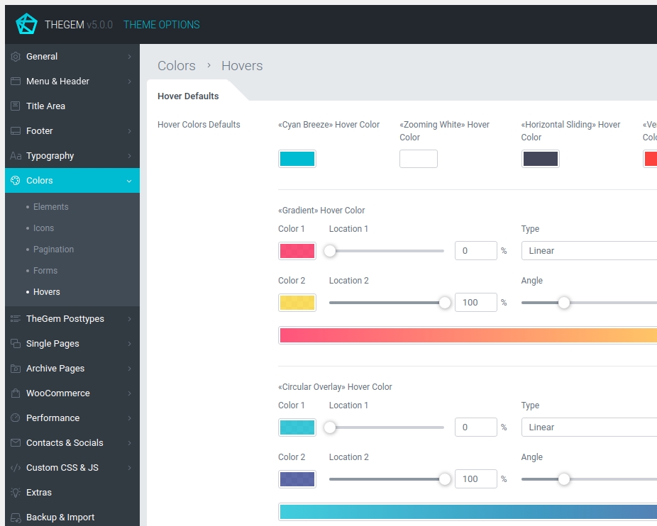
HOVER DEFAULTS
Settings to specify default colors for different hover types used in TheGem.
TheGem Posttypes
Quickfinders
Default typography settings for quickfinder posttype. Check the screenshots in help tooltips to see where it is used.
Galleries
Default typography & color settings for galleries posttype. Check the screenshots in help tooltips to see where it is used.
Portfolio Grids
Default typography & color settings for portfolio grids (portfolio posttype). Check the screenshots in help tooltips to see where it is used.
Testimonials
Default typography & color settings for testimonial posttype. Check the screenshots in help tooltips to see where it is used.
Single & Archive Pages
In TheGem you can flexibly control the appearance of different parts of your website’s single and archive pages by adjusting their settings under “Single Pages” and “Archive Pages” in Theme Options. For example, if you wish, that all your blog categories have different header, title area and footer (different from all other pages and posts of your website), you can just go to “Archive Pages → Blog”, enable and adjust the settings for header, title area and footer. Moreover, you can apply this new settings to all previously created blog categories by just one simple click.
Post

GLOBAL SETTINGS
Here you can enable separate settings for all blog posts, which will override global website settings (tier 1) and will apply only on blog posts (tier 2). All options listed here will be reflected in all your blog posts unless you specify different settings in single page options (tier 3).
By default, this separate blog post settings will be applied on all new posts. However, using “Apply on all existing posts” button you can apply this settings on all existing blog posts, which have been created earlier. Please note: by applying on existing posts all current settings of this posts will be overwritten.
APPEARANCE
Settings to control appearance of different elements on your blog post. Check the screenshots in help tooltips to see where it is used.
MENU & HEADER
Settings to control menu & header of blog posts.
TITLE AREA
Settings to control title area of blog posts.
CONTENT & SIDEBAR
Settings to control main content area & sidebars of blog posts.
FOOTER
Settings to control footer of blog posts.
Page

GLOBAL SETTINGS
Here you can enable separate settings for all pages, which will override global website settings (tier 1) and will apply only on pages (tier 2). All options listed here will be reflected in all your pages unless you specify different settings in single page options (tier 3).
By default, this separate page settings will be applied on all new pages. However, using “Apply on all existing posts” button you can apply this settings on all existing pages, which have been created earlier. Please note: by applying on existing pages all current settings of this pages will be overwritten.
MENU & HEADER
Settings to control menu & header of pages.
TITLE AREA
Settings to control title area of pages.
CONTENT & SIDEBAR
Settings to control main content area & sidebars of pages.
FOOTER
Settings to control footer of pages.
Portfolio Page

GLOBAL SETTINGS
Here you can enable separate settings for all portfolio pages, which will override global website settings (tier 1) and will apply only on portfolio pages (tier 2). All options listed here will be reflected in all your portfolio pages unless you specify different settings in single page options (tier 3).
By default, this separate portfolio page settings will be applied on all new portfolio pages. However, using “Apply on all existing portfolio pages” button you can apply this settings on all existing pages, which have been created earlier. Please note: by applying on existing pages all current settings of this pages will be overwritten.
APPEARANCE
Settings to control appearance of different elements on your portfolio pages. Check the screenshots in help tooltips to see where it is used.
MENU & HEADER
Settings to control menu & header of portfolio pages.
TITLE AREA
Settings to control title area of portfolio pages.
CONTENT & SIDEBAR
Settings to control main content area & sidebars of portfolio pages.
FOOTER
Settings to control footer of portfolio pages.
404 Page
Here you can enable and select custom 404 page to be used on your website.
Blog

Layout
In this section you can select between different layout styles of displaying blog posts in blog archive pages – Blog List or Blog Extended Grid. By selecting “Blog Extended Grid” additional grid options will appear, which you can adjust to meet your project requirements.
GLOBAL SETTINGS
Here you can enable separate settings for all blog archive pages (blog categories, blog tags), which will override global website settings (tier 1) and will apply only on blog archive pages (tier 2). All options listed here will be reflected in all your blog archive pages unless you specify different settings in single page options (tier 3).
By default, this separate blog archive page settings will be applied on all new blog archive pages. However, using “Apply on all existing blog categories” button you can apply this settings on all existing blog archive pages, which have been created earlier. Please note: by applying on existing pages all current settings of this pages will be overwritten.
MENU & HEADER
Settings to control menu & header of blog archive pages.
TITLE AREA
Settings to control title area of blog archive pages.
CONTENT & SIDEBAR
Settings to control main content area & sidebars of blog archive pages.
FOOTER
Settings to control footer of blog archive pages.
Search

Layout
In this section you can choose, which post types should be displayed on the search page and select between different layout styles of displaying search results – Default Masonry or Extended Grid. By selecting ” Extended Grid” additional grid options will appear, which you can adjust to meet your project requirements.
In case “products” and other post types are enabled for displaying on the search results page simultaneously, the search results page will automatically show a “mixed” grid: product grid as set in “WooCommerce – Shop Grid” (above) and search results grid with other post types (below).
CUSTOM SETTINGS
Here you can enable separate settings for search page, which will override global website settings (tier 1) and will apply only on search page (tier 2).
MENU & HEADER
Settings to control menu & header of search pages.
TITLE AREA
Settings to control title area of search pages.
CONTENT & SIDEBAR
Settings to control main content area & sidebars of search pages.
FOOTER
Settings to control footer of search pages.
WooCommerce
This section appears in Theme Options in case WooCommerce plugin has been installed and activated. In this section you can control all settings concerning your WooCommerce shop.
Product

Settings to control the appearance of product on product pages.
Global Settings
All settings you are making for a product here in Theme Options are automatically applied on all new products or products which inherit its settings from Theme Options. By using “Apply on all existing products” you can apply this settings also on all existing products with individual settings made via Page Options.
Layout & Style
Here you can adjust layout & style settings for product appearance on product page.
Please note: general layout settings like header, title area and footer can be controlled globally via “General”, “Menu & Header”, “Title Area” and “Footer” section in Theme Options.
Alternatively this settings can be adjusted only for single product pages via “Single Pages -> Product Page” section in Theme Options or only for one certain product via Page Options of this product.
Product Gallery
Various settings for product gallery on product page.
Description & Reviews
Settings for appearance of description & reviews section on product page.
Additional Tabs
By default WooCommerce includes three standard content tabs for the product page: Description, Additional Information, Reviews.
Here you can add additional custom tabs to the products and populate them with different content sources. Learn more in chapter “Additional Tabs”
Buttons
Settings for “Add to cart “ and “Add to wishlist” buttons on product page
Elements
Here you can control the appearance of all other elements on product page
Shop Grid
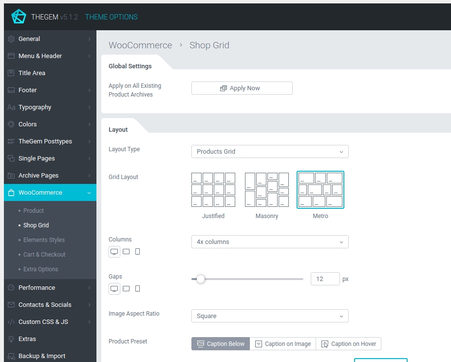
Settings to control the appearance of products grids on main shop page and shop archive pages (categories, archives etc.)
GLOBAL SETTINGS
All settings you are making for a shop grid here in Theme Options are automatically applied on all new product archive pages or product archives which inherit its settings from Theme Options. By using “Apply on all existing products” you can apply this settings also on all existing product archive pages with individual settings made via Page Options.
Layout
Here you can adjust layout & style settings for shop grid appearance on product archive pages.
Please note: general layout settings like header, title area and footer can be controlled globally via “General”, “Menu & Header”, “Title Area” and “Footer” section in Theme Options.
Alternatively this settings can be adjusted separately only for all product archive pages via “Archive Pages -> Product Categories” section in Theme Options or only for one certain product archive page via Page Options of this page.
Product Caption
Various settings for displaying product caption (like title, price, buttons etc.) on product item in shop grid.
Pagination
Settings to control pagination options for shop grid.
Labels
Settings to control appearance of labels (sale, new, out of stock) on product items in shop grid.
Sidebar
Here you can enable a sidebar for product archive pages.
Filters
Settings for specifying product filters in shop grid.
Please note: in case sidebar is enabled, you can choose between:
- filtering by WooCommerce Sidebar Widgets (standard WooCommerce widgets like “Filter by…”) which you can add to your sidebar via “Appearance -> Widgets” in your WordPress admin
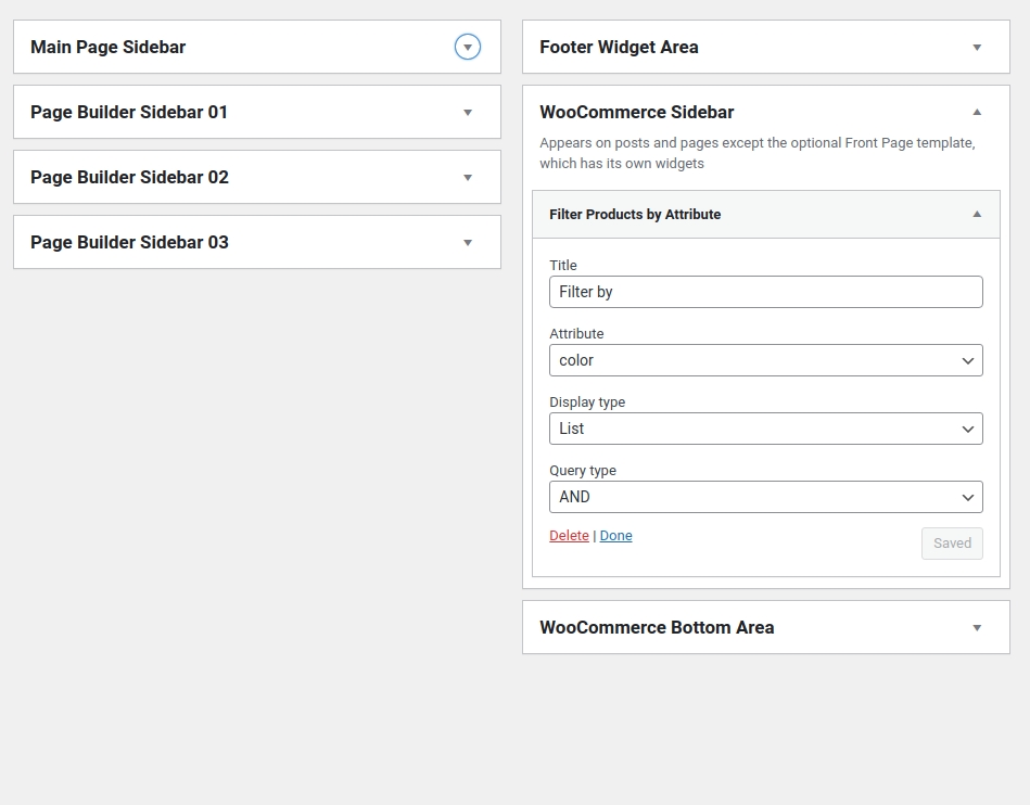
- filtering by in-built TheGem filters, which you can specify here in Theme Options
Additional Options
Various additional options for shop grid.
Style
In this subsection you can customize different default TheGem styles for product item presets in shop grid.
Elements Styles
Settings to control style (typography, colors) of different shop elements like product title, product price, labels etc.
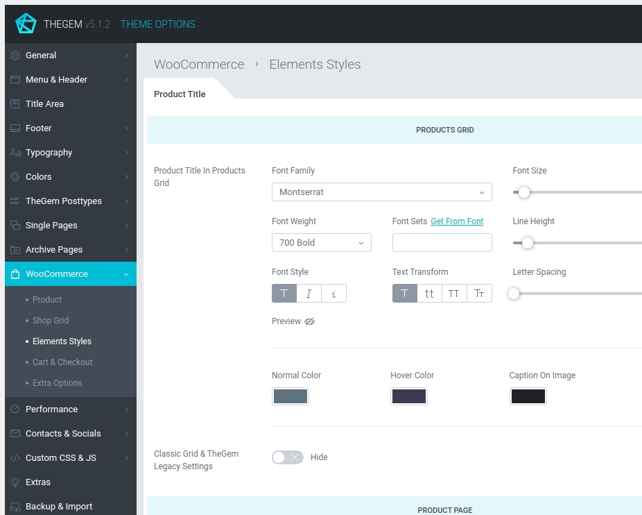
Product Title
Here you can specify styles for appearance of product title in shop & products grid, product page, sidebar widgets and cart & checkout.
Product Categories
Here you can specify styles for appearance of product categories title and product counts in shop & products grid and categories grid.
Product Price
Here you can specify styles for appearance of product price in shop & products grid, product page, sidebar widgets and cart & checkout.
Buttons
Style settings for buttons in woocommerce store: buttons in products & shop grid and product page.
Icons
Style settings for icons in woocommerce store: icons in products & shop grid.
Labels
Settings for product labels like “new, “sale”, “out of stock” in products grid and on product page. Here you can also select between different label presets.
Cart & Checkout
Settings for cart & checkout layouts.
Extra Options
Additional options for WooCommerce store.
Extra Options
Here you can enable/disable catalog mode for your store. Catalog mode means that all cart & checkout specific features will be disabled, like price, add to cart, cart & checkout.
AJAX Notifications
Specify settings for AJAX notifications in your store. This notifications appear after certain actions like adding product to cart and adding product to wishlist.
PageSpeed
PageSpeed
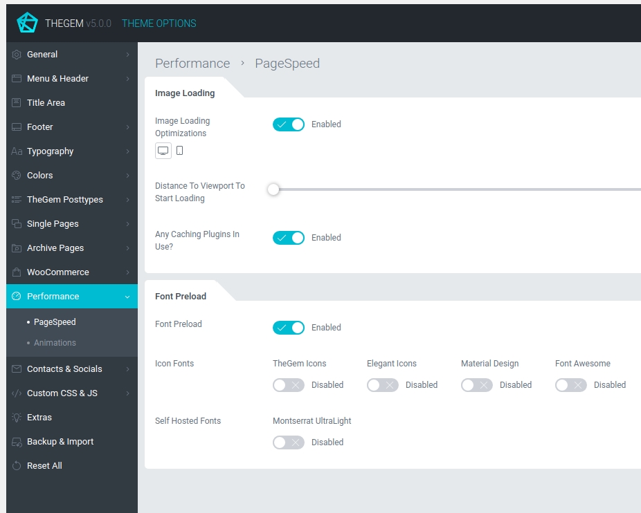
IMAGE LOADING
If enabled, all images on a webpage will start loading only by nearing the desktop device viewport. In this way, by loading your webpage, all images below the fold (which are not immediately displayed for user) are physically not loaded. And only by scrolling down the page, as soon as this images appear in above the fold area they are being loaded and displayed.
You can also specify distance to viewport to start loading (i.e. buffer zone). In order to avoid any unpleasant loading interruptions, there is a special “buffer” zone below the fold, which enables the image loading some pixels before this images appear in above the fold area.
In case you use any caching plugins you would need to activate “Any Сaching Plugins In Use? “ setting.
FONT PRELOAD
In some cases Google Pagespeed recommends to use `<link rel=preload>` to prioritize fetching self-hosted fonts that are currently requested later in page load. Preloading such requests can make your pages load faster. If the pagespeed testing of your pages shows such recommendation (check screenshot), enable “Font Preload” option and then the preload of the fonts recommended in pagespeed results. Learn more
Contacts & Socials
Socials

SOCIAL NETWORKS
Here you can select social networks where you are presented and specify links to your social profiles. This can be optionally shown in top area, footer, sidebars and content elements.
COLORS
Specify colors of social icons across different positions on your website: in top area, in footer, in content and in woocommerce store.
ADD NEW SOCIAL
Here you can add new social network in case this network is not available in the list above
Contacts

CONTACTS IN TOP AREA
Specify your contact details. This contacts can be displayed in top area of your website (if enabled).

CONTACTS WIDGET
Specify your contact details for “Contacts” widget. This widget can be added to page content, footer widget area and sidebars.
Custom CSS & JS
Custom CSS
CUSTOM CSS EDITOR
If you need to insert some customizations, you can take advantage of the inbuilt css editor and insert custom CSS code. Once saved, custom CSS is automatically applied for your website.
Custom JS
CUSTOM JS EDITOR
If you need to insert some custom js code, you can take advantage of the inbuilt js editor and insert custom js code. Once saved, custom js is automatically applied for your website.
Tracking Code
ANALYTICS, REMARKETING etc.
If you need to insert some Google Analytics, Google Tag Manager, Facebook Pixel etc. code snippets, you can paste it in the inbuilt editor.
Extras

EXTRA OPTIONS
Regenerate CSS: Styles set in TheGem Theme Options are saved in CSS file. Here you can recreate this CSS file according to the most recent settings set in Theme Options.
TheGem’s Open Graph Tags: TheGem provides open graph tags in posts/pages automatically, which include title, description, image. In case you wish to use open graph tags from third-party SEO plugins, it is recommended to disable TheGem’s open graph tags.
Thumbnails Cache: In case you will delete any image thumbnails (portfolio grids, products, galleries etc.) from your hosting or if you will specify custom image size for product images in your store, you need to click this button to clear the thumbnails cache in the database in order to be able to regenerate new thumbnails.
VERSION CONTROL
Experiencing some issues with the current TheGem version? Here you can rollback to a previous theme version.
PAGE OPTIONS FOR CUSTOM POST TYPES
Here you can enable TheGem page options for public custom post types. Public means this post types can be visible on front end. So in case you are using your own individual public custom posttypes, they will be listed in this section automatically and you can then enable TheGem page options for this custom public posttypes.
Backup & Import
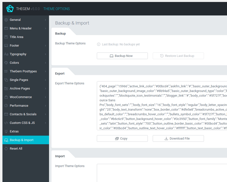
BACKUP
If you would like to experiment with the settings of your theme and don’t want to loose your previous settings, use the “Backup Settings” – button to backup your current theme options. You can restore these options later using the button “Restore Settings”.
EXPORT
In order to apply the theme options settings of this TheGem installation on a different website running TheGem just copy the settings in the text box. Alternatively you can download a file with the settings, which then can be uploaded on the different differnet website running TheGem.
IMPORT
In order to apply the settings of another TheGem installation used on a different website just copy and paste the settings in the text box and click on “Apply”. Alternatively you can import this settings from file you have downloaded on a different TheGem installation.
Reset All
Here you can reset all theme options settings to the default state (reset factory settings). Note: all your current settings will be overwritten.