Custom CSS & Useful Stuff
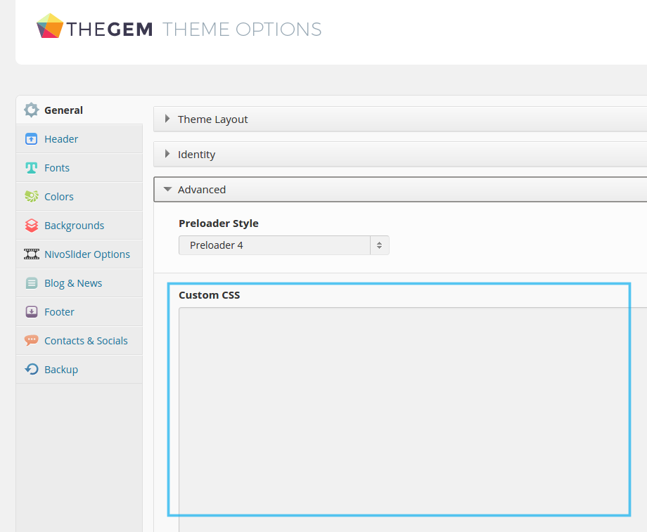
CUSTOM CSS
CSS is used to define styles for your web pages, including the design, layout and variations in display for different devices and screen sizes.
In order to avoid possible risks, that your custom css will be removed after theme updates (in case you are not using our child theme) we STRONGLY recommend to use child theme, which comes budled with the main TheGem theme.
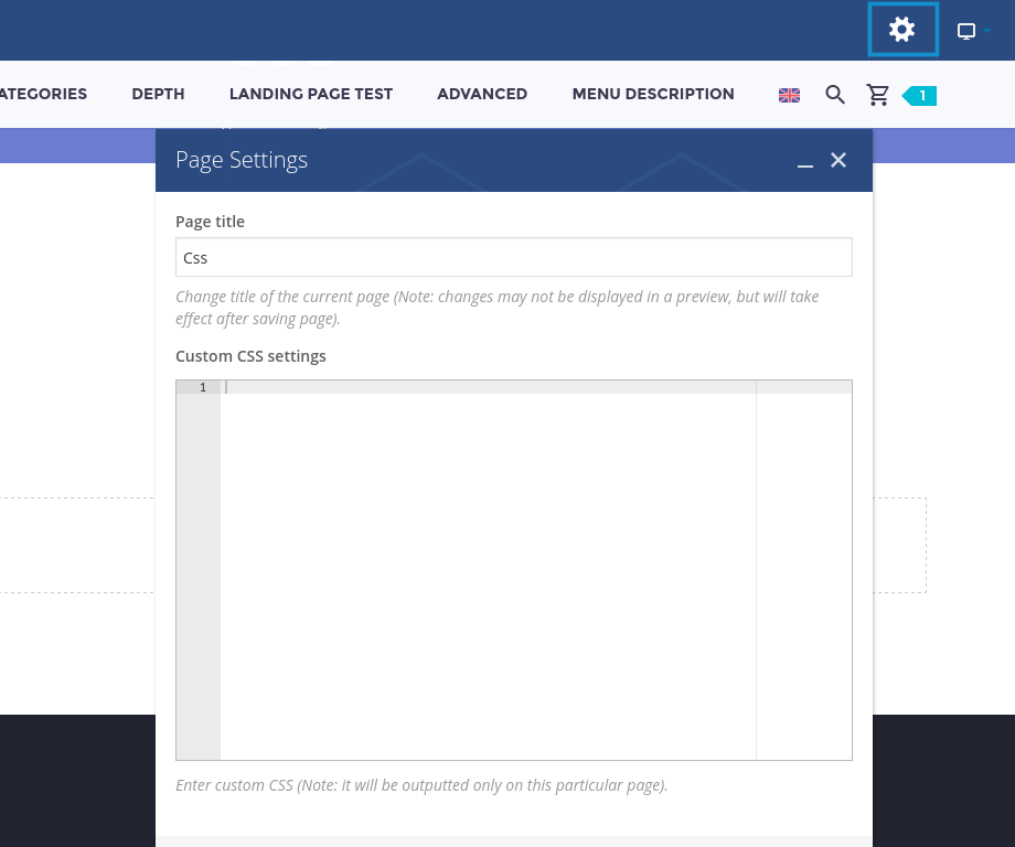
If you need to apply some custom css for a single page only, you can use custom css field of this page
You can apply your custom css for a single content element as well. To do this, just use the field “Extra class name”
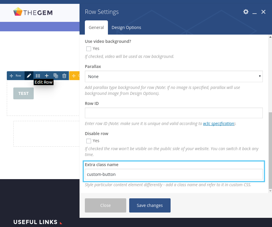
In this case, the css selector will look like this:
.custom-button .gem-button {
    background-color: #000;
}
Input color, background-color and border-color:
input[type="text"],
input[type="password"],
input[type="color"],
input[type="date"],
input[type="datetime"],
input[type="datetime-local"],
input[type="email"],
input[type="number"],
input[type="range"],
input[type="search"],
input[type="tel"],
input[type="time"],
input[type="url"],
input[type="month"],
input[type="week"],
textarea {
    border: 1px solid #dfe5e8 !important;
    background-color: #f5f7f6 !important;
    color: #3c3950 !important;
}
Button submit color and background-color:
.wpcf7 input[type='submit'] {
        background-color: #3c3950;
        color: #ffffff;
}
Button submit hover colors:
.wpcf7 input[type='submit']:hover {
        background-color: #3c3950;
        color: #ffffff;
}
Title:
.vc_tta-tabs-container .vc_toggle_title > h4 {
    color: #000000 !important;
    font-size: 22px !important;
    line-height: 1.3 !important;
    font-weight: 300 !important;
}
Hover Title Color:
.vc_tta-tabs-container .vc_toggle_title:hover > h4 {
    color: #cccccc !important;
}
Section title color, background-color, font-size:
.vc_tta.vc_general .vc_tta-panel .vc_tta-panel-title {
    background-color: #ffffff !important;
    color: #5f727f !important;
    font-size: 18px !important;
    font-weight: 300 !important;
}
Active section title color, background-color, font-size:
.vc_tta.vc_general .vc_tta-panel.vc_active .vc_tta-panel-title > a{
    background-color: #123 !important;
    color: #eeeeee !important;
    font-size: 16px !important;
    font-weight: 300 !important;
}
Section title color, background-color, border-color, font-size:
.vc_tta-tabs-position-left.vc_tta .vc_tta-tab > a {
    border-color: #fff !important;
    background-color: #000 !important;
    color: #eee !important;
    font-size: 16px !important;
    font-weight: 300 !important;
}
Active section title color, background-color, border-color, font-size:
.vc_tta-tabs-position-left.vc_tta .vc_tta-tab.vc_active > a {
    border-color: #fff !important;
    background-color: #000 !important;
    color: #eee !important;
    font-size: 16px !important;
    font-weight: 300 !important;
}
Section title color, background-color, font-size:
.vc_tta-tabs-position-top.vc_tta .vc_tta-tab > a {
    border-color: #fff !important;
    background-color: #000 !important;
    color: #eee !important;
    font-size: 16px !important;
    font-weight: 300 !important;
}
Active section title color, background-color, font-size:
.vc_tta-tabs-position-top.vc_tta .vc_tta-tab.vc_active > a {
    border-color: #fff !important;
    background-color: #000 !important;
    color: #eee !important;
    font-size: 16px !important;
    font-weight: 300 !important;
}
Font-size, paddings, heigth:
.gem-button {
    font-size: 16px !Important;
    padding-left: 20px !Important;
    padding-right: 20px !Important;
    height: 50px !Important;
    line-height: 3 !Important;
}
Deleting grayscale filter:
.gem-clients .gem-client-item a img {
    filter: none; /* works for firefox */
    -webkit-filter: none; /*for chrome/ safari */
    -webkit-transition: none;
    opacity: 1;
}
Fonts, colors:
.gem-counter .odometer.odometer-auto-theme {
    font-size: 33px;
    font-weight: 100;
    color: #eeeeee;
}
.gem-counter  span.gem-counter-suffix {
    font-size: 22px;
    font-weight: 100;
    display: block;
    color: #eeeeee;

}
.gem-counter-text.styled-subtitle {
    font-size: 14px;
    font-weight: 100;
    color: #eeeeee;
}
Legend colors and font-size:
.diagram-circle .diagram-legend .legend-element .title {
    font-size: 14px !important;
    font-weight: 300;
    color: #ccc;
    line-height: 2;
}
Legend colors and font-size:
.digram-line-box .skill-title {
    font-size: 15px;
    font-weight: 100;
    color: #ccc;
}
Style-1 background color:
.digram-line-box {
    background-color: #eee;
}
Skill – line background color:
.diagram-wrapper .digram-line-box .skill-line {
    background-color: #ccc !important;
}
Dropcap size and font-size:
.gem-dropcap .gem-dropcap-letter {
    width: 60px !important;
    height: 60px !important;
    line-height: 60px !important;
    font-size: 50px;
    font-weight: 400 !important;
}
Project info title font-size and color:
.project-info-shortcode .project-info-shortcode-item .title {
    font-size: 26px;
    font-weight: 300;
    color: #123;
    line-height: 1.3;
}
Project info description font-size and color:
.project-info-shortcode .project-info-shortcode-item .decription {
    font-size: 26px;
    font-weight: 300;
    color: #123;
    line-height: 1.3;
}
Quickfinder title font-size:
.quickfinder-item-info-wrapper .quickfinder-item-title {
    font-size: 14px !important;
    font-weight: 100 !important;
    line-height: 1 !important;
}
Quickfinder description font-size:
.quickfinder-item-info-wrapper .quickfinder-item-text {
    font-size: 14px !important;
    font-weight: 100 !important;
    line-height: 1 !important;
}
.quickfinder-item-box {
    padding: 10px !important;
}
Blockquote font-size:
.gem-quote blockquote {
    font-size: 27px !important;
    font-weight: 300;
    line-height: 1;
    color: #123;
}
Setting paddings in block:
.gem-quote blockquote {
    padding: 20px !important;
}
Quote style default border colors:
.gem-quote.gem-quote-style-default {
    border: 1px solid #ddd;
}
.gem-quote.gem-quote-style-default blockquote {
    border: 1px solid #ddd;
}
Blockquote background color:
.gem-quote {
    background-color: #000000 !important;
}
Blockquote icon color:
.gem-quote:after {
    color: #000000 !important;
}
Search font-size, background, border-radius:
.gem-search-form input {
    background-color: #cccccc !important;
    color: #000000 !important;
    border-radius: 5px !important;
}
Search form icon color:
.gem-search-form .search-submit:after {
    color: #000 !important;
}
Styled List font-size:
.gem-list li {
    font-size: 24px !important;
}
Styled List icon font-size and color:
.gem-list > ul > li:before {
    font-size: 30px;
    color: #000000 !important;
}
Table style 1 background and border color:
.gem-table thead th {
    background-color: #ccc;
}
.gem-table-style-1 tr:nth-child(even) td {
    background-color: #ccc;
}
.gem-table-style-1 td {
    border: 1px solid #eee !important;
}
Table style 2 background and border color:
.gem-table thead th {
    background-color: #ddd !important;
}
.gem-table-style-2 td, .gem-table-style-2 thead {
    border: 2px solid #dfe5e8 !important;
}
Table style 3 background colors:
.gem-table-style-3 thead tr th:nth-child(odd) {
    background-color: #111111;
}
.gem-table-style-3 thead tr th:nth-child(even) {
	background-color: #222222;
}
.gem-table-style-3 tr:nth-child(even) td {
	background-color: #333333;
}
.gem-table-style-3 tr:nth-child(even) td:nth-child(even) {
	background-color: #444444;
}
.gem-table-style-3 tr:nth-child(odd) td{
	background-color: #555555;
}
.gem-table-style-3 tr:nth-child(odd) td:nth-child(odd) {
    background-color: #666666;
}
Teams title, position, phone, mail, icons:
.team-person .team-person-name.title-h4 {
    font-size: 22px;
    font-weight: 300;
    color: #ccc;
    line-height: 1;
}
.team-person .team-person-position  {
    font-size: 18px;
    font-weight: 300;
    color: #ccc;
    line-height: 1;
}
.team-person .team-person-phone {
        font-size: 18px;
    font-weight: 300;
    color: #ccc;
    line-height: 1;
}
.team-person .team-person-email a {
    font-size: 18px;
    font-weight: 300;
    color: #ccc !important;
    line-height: 1;
}

.team-person .team-person-socials .socials-item-icon:before {
    color: #222;
}
Testimonials name, positions, text, icons:
.gem-testimonial-item .gem-testimonial-name {
    color: #000;
    font-size: 22px;
    line-height: 1;
    font-weight: 300;
}
.gem-testimonial-item .gem-testimonial-company {
    color: #000;
    font-size: 16px;
    line-height: 1;
    font-weight: 300;
}
.gem-testimonial-item .gem-testimonial-position {
    color: #000;
    font-size: 16px;
    line-height: 1;
    font-weight: 300;
}
.gem-testimonial-item .gem-testimonial-text p{
    color: #000;
    font-size: 16px;
    line-height: 1;
    font-weight: 300;
}
.gem-testimonials.style1 .gem-testimonial-wrapper:after,
.gem-testimonials.style2 .gem-testimonial-wrapper p:after {
    color: #000;
}
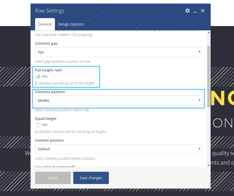
Adding mouse scroll to the bottom of full-height row:
1. Create row with any background and set:
Full height row? YES
Columns position > Middle
2. Add Text Block shortcode after this row and in the text mode add next code:
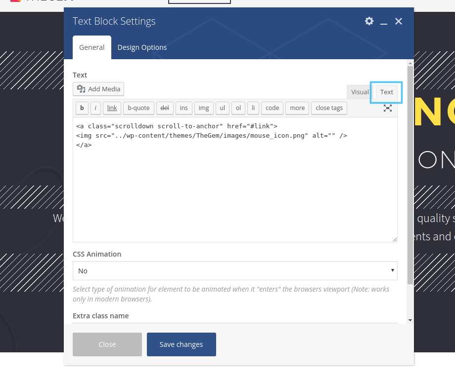
<a href="#link"class="scrolldown scroll-to-anchor">
<img src="../wp-content/themes/TheGem/images/mouse_icon.png" alt="">
</a>
If you wish mouse like on this page: http://codex-themes.com/the-gem/agency-light/
<a class="mouse-scroll scroll-to-anchor" href="#details">mouse</a>
Or like on this page: http://codex-themes.com/the-gem/elements/typography/
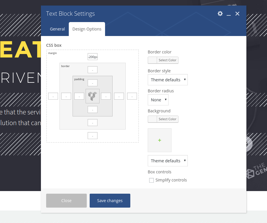
3. Set negative margin for example “-200px” in the Design Options of Text Block Shortcode:
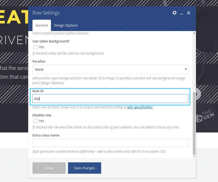
4. Set id “link” in the row settings which you wish to scroll by clicking on the mouse:
If you use the first style you can add your own mouse image.
Just set your path of the image:
<img src="../wp-content/themes/TheGem/images/mouse_icon.png" alt="">
You can change colors of the second style with next css:
.mouse-scroll:after {
    background-color: #ffffff;
}
.mouse-scroll {
    color: #ffffff;
    border-color: #ffffff;
}