
THEME DOCUMENTATION
In case of any questions please do not hesitate to contact us via our support forum at https://codexthemes.ticksy.com/
Please don’t forget to rate Magna and leave a nice review, it means a lot for us and our theme.
Simply log in into your Themeforest, go to Downloads section and click 5 stars next to the Magna WordPress theme.
INSTALLATION
INSTALLING WORDPRESS
To install this theme you must have a working version of WordPress already installed. If you need help installing WordPress, follow the instructions here: http://codex.wordpress.org/Installing_WordPress
To use Magna, you must be running WordPress 3.9 or higher. We have tested it with Mac, Windows and Linux. It has been tested on Chrome, Firefox, Safari, Opera, Internet Explorer 10+
downloading Magna
Download the Magna.zip file from themeforest.net and unzip it. In this zip file you have everything you need:
Magna_theme.zip
the main theme zip file you need to upload to your WordPress in order to install Magna (see below). In this zip you will find the theme itself. NOTE: Do not unzip this file. Do not upload the entire Magna.zip file you get from ThemeForest, upload ONLY Magna_theme.zip
Child_Theme
here you will find Magna’s child theme
Demo_Sliders
All demo sliders we have used on our demo website.
Demo_Default_Widgets
Default widgets used for widgetised footer area and default page sidebars on our demo website.
XML Files with demo content, which you can use for manual content import in WordPress.
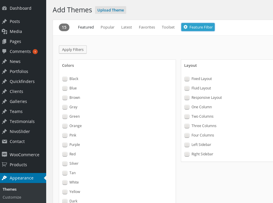
INSTALLING Magna IN WORDPRESS ADMIN
- Open Appearance → Themes
- Click “Add New Theme” and hit upload link
- Find the the file “Magna_theme.zip” on your hdd and hit install now button
- After the theme is installed click on “Activate”
THEME ACTIVATION
After theme installation you need to activate it using your purchase code. By clicking on “Activate” here
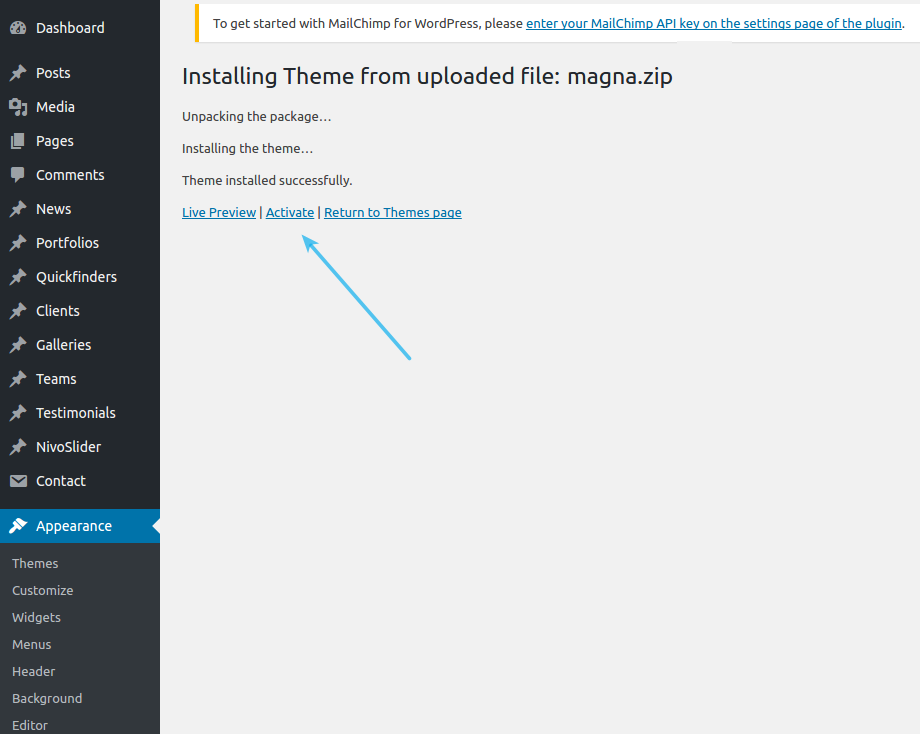
you will be automatically redirected to the welcome page of Magna.
Here you need to activate your copy of Magna. To do this, please proceed as follows:
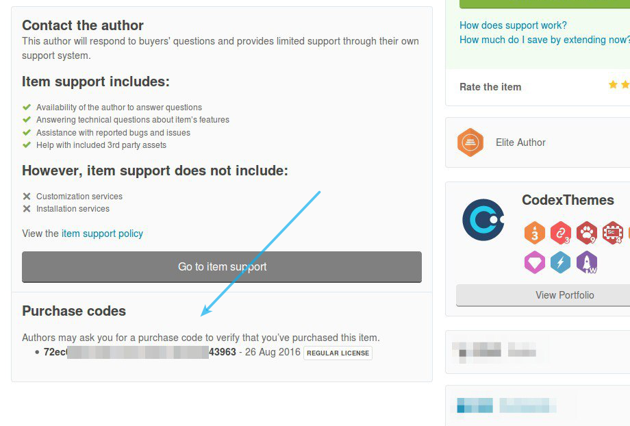
- Go to Magna support page on Themeforest (https://themeforest.net/item/thegem-creative-multipurpose-wordpress-theme/16061685/support [^])
- Below you will see section “Purchase codes”. Select and copy the purchase code you see here:
3 Paste the copied purchase code in the activation field of Magna and click on “Activate” button. Below you will see section
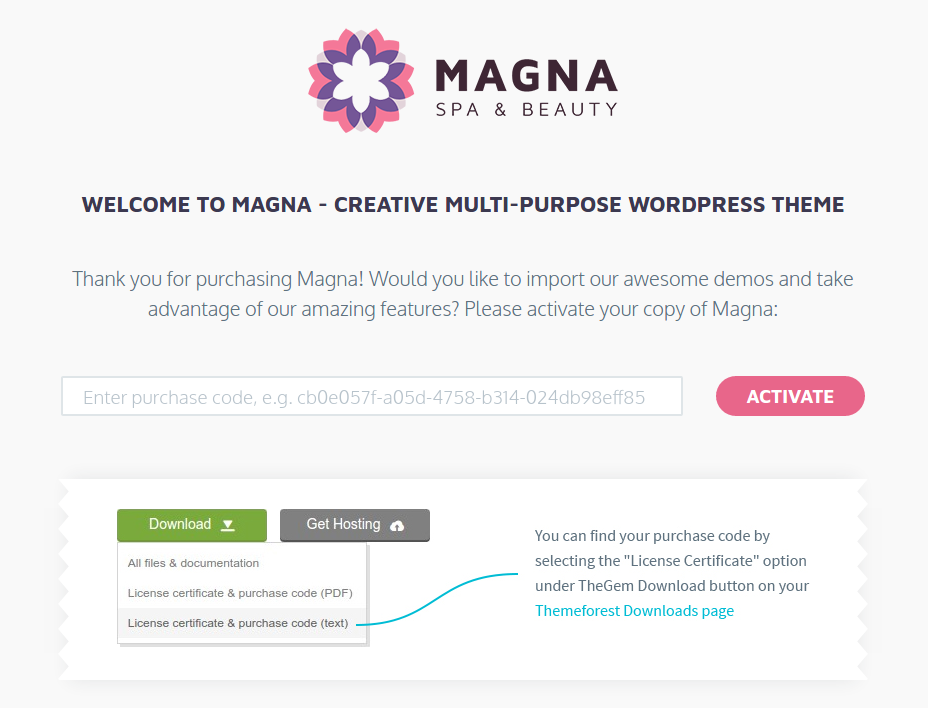
Alternatively you can download your purchase code via your “Downloads” page on Themeforest (https://themeforest.net/downloads [^]). Here click on “Download” button for Magna and select “License certificate & purchase code”,
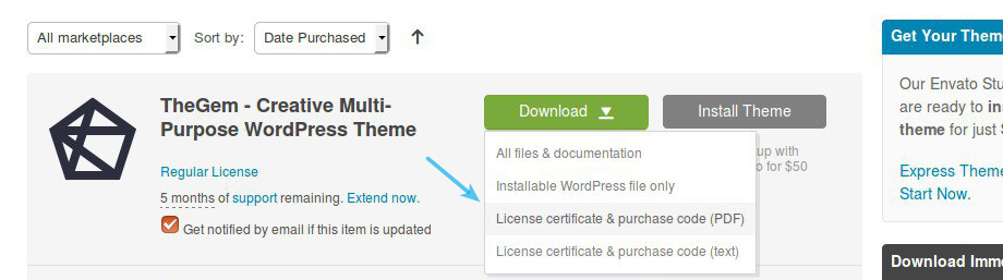
After that open the downloaded document, select and copy the purchase code , paste it in the theme’s activation field and click on “Activate” button.
INSTALLING PLUGINS
In order to get Magna properly work you need to install some useful plugins. All this plugins are included in Magna, you don’t need to purchase them extra!
After the theme is installed successfully you will get following message about installation of required and recommended plugins:
- Click on “Begin installing plugins”
- Check all plugins, select “Install” and click on “Apply”
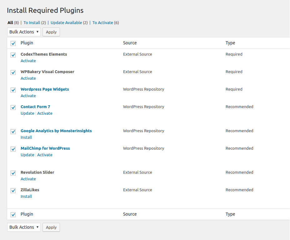
In order to use Magna in its full, please note, that following plugins SHOULD BE installed during the theme installation (see installation instructions above):
- CODEX THEMES ELEMENTS – native essential set of all Magna’s features, functions, shortcodes & custom post types
- VISUAL COMPOSER – leading visual drg’n’drop page builder for WordPress
- PAGE WIDGETS – flexible & powerful pluging for creating sidebar content
- Black Studio TinyMCE Widget – dds a new “Visual Editor” widget type based on the native WordPress TinyMCE editor
In addition, you can take an advantage of enriching your Magna’s experience with following recommended plugins:
- CODEX THEMES IMPORT – one-click import of demo content of main multipurpose demo website
- LAYERSLIDER – awesome multi-layer slideshow plugin
- REVOLUTION SLIDER – leading slider plugin for WordPress
- MAILCHIMP SIGNUP – mailchimp newsletter signup form
- CONTACT FORM 7 – one of the most popular plugins for managing contact & feedback forms
- Easy Forms for MailChimp – allows you to generate and display mailing list
opt-in forms anywhere on your site with ease (in addition to Mailchimp Native
Plugin) - ZillaLikes – Add “like” functionality to your posts and pages
That’s all! Now you are ready to go on with Magna, installed on your WP.
ALTERNATIVE: UPLOAD Magna VIA FTP
In case you wish install the theme via FTP, proceed as follows:
- Unzip Magna_theme.zip
- Login to your hosting space via an FTP Client
- Upload the whole contents of the unzipped Magna_theme.zip into wp-content/themes/ folder under your wordpress installation.
- Once you’ve uploaded the theme you can open Appearance → Themes page and activate the theme from list. After that you need to install and activate the plugins as described above.
INSTALLING CHILD THEME
If you plan to modify the source code of the main parent theme (php, js, style.css) we strongly recommend to install this child theme and make such modifications inside this child theme in order to avoid any possible problems & issues by installing updates of Magna’s main parent theme in future. You can find this child theme in folder „Child_Theme“ – pls check for Magna_child.zip
The installation of the child theme works in the same way as the installation of the main parent theme (see description above).
IMPORTING DEMO CONTENT
RECOMMENDED PHP SETTINGS
In order to avoid any possible import issues because of your server and php setings, we would recommend setting following PHP values in your server’s php.ini:
- Memory Size: memory_limit = 256M
- Script execution time: max_execution_time = 400
- Number of input variables: max_input_vars = 4000
If you don’t have an access to the php configurtation on your server, you can try to set this values in .htaccess file:
php_value max_input_vars 4000
php_value max_execution_time 400
php_value memory_limit 256M
Pls be careful, because some of hosting companies don’t allow to change php settings directly using .htaccess. In case you have some problems after modifying your .htaccess file, log in to your FTP account and remove these modifiactions from .htaccess
one-click import of demo content
Magna comes with plugin “Magna import”, allowing you to import the whole demo content from the main multipurpose demo site (http://codex-themes.com/themes/magna/). Use this option if you wish to import all demo data, including all posts, pages, portfolios etc. and all media files like images, video etc. with one click.
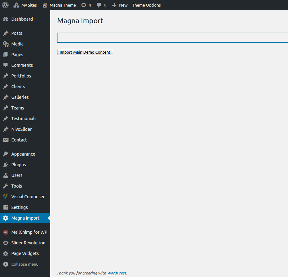
1. In WordPress Admin go to “Magna Import”
2. After that click on the button “Import Main Demo Content”
3. Import process will start. Do not close the active browser tab while importing. The import process of full demo content could take from 15-20 min.
4. Wait until 100% of import is accomplished. After that you can just close this tab.
Pls note: full import & generating of image thumbnails depending on your server/hosting configuration.
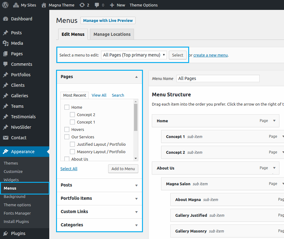
SETTING UP MENUS
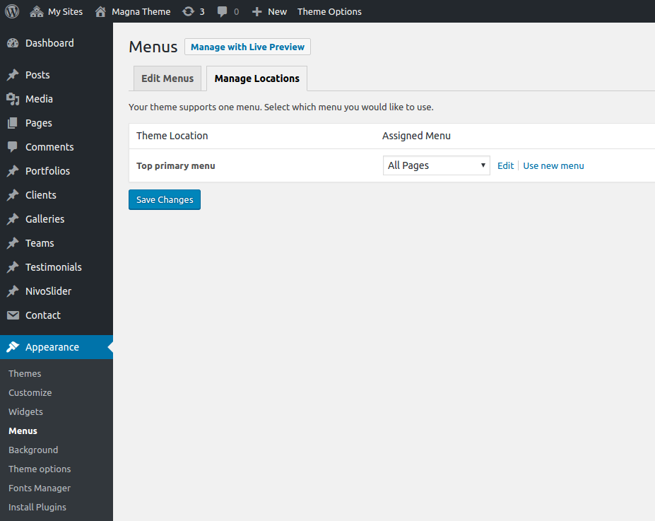
After the demo content is imported, the next step would be to set menu locations for the demo menus:
Go to “Appearance -> Menus” page and select “Manage Locations” tab. Here select following
- For Top Primary Menu -> All Pages
and finally click on “Save Changes”.
setting up footer
In order to import default demo widgets for default page sidebars
and default widgetised footer area
Pls. proceed as follows:
1. Go to “Plugins -> Add new” and search for “Widget Importer & Exporter” plugin here
2. Install & activate this plugin
3. Go to Tools > Widget Importer & Exporter
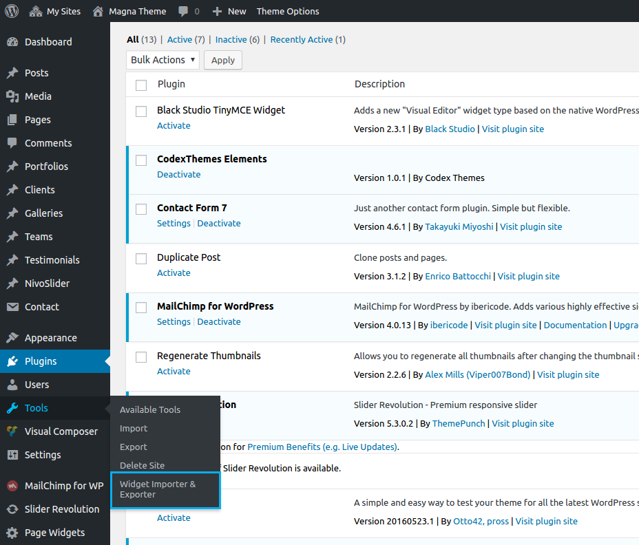
4. Select a demo_widgets.wie file from “Demo_Widgets” folder
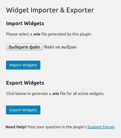
5. Click on “Import Widgets”
That’s all.
Or, if you wish to set your footer widgetised area manually, please read “Widgetised Footer Area” chapter
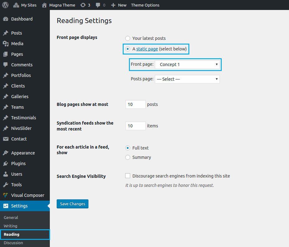
selecting homepage
The next step would be to select the homepage of your choice for your website. Go to “Settings -> Reading”, select a static page option to be displayed as your front page and choose for example “Concept 1” page from the select box “Front page”. Save your changes.
importing demo sliders
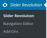
1. Go to „Revolution Slider“ section in your wp admin
2. On the dashboard screen click on „Import Slider“ option
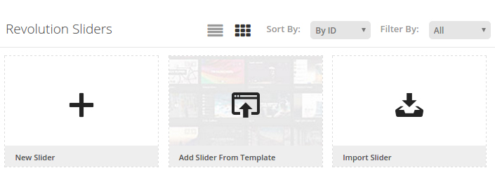
3. Choose the slider you wish to import from your hdd. Browse to the unzipped Magna folder, you will find here „Demo_Sliders“ subfolder. Here you can see all sliders used in our demo pages. The sliders have the same names as the corresponding demo pages. I.e.
if you wish to import the slider used on „Business 02“ page, select „Business_02.zip“.
4. Click on „Import Slider“ and wait for while until the slider will be imported.
first steps
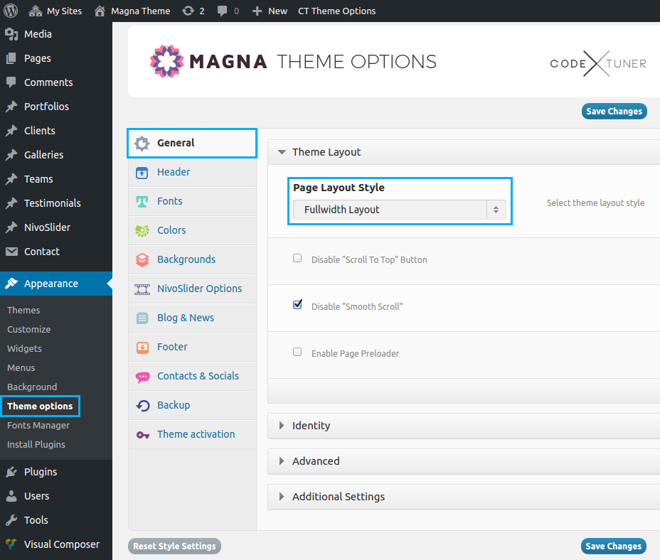
First thing after installing Magna would be to make some main general settings of your website, if you wish to change the default presets of the imported demo content. Go to Appearance – Theme Options to get the admin panel of Magna. Let’s start with the first set of settings – General.
theme options
Magna has an advanced admin panel for Theme Options, which gives you plenty of options and settings to customize your website.
Go to Appearance -> Theme Options and you will get Magna admin panel. All settings are organized in logical sections and have brief descriptions of what they do. A lot of these settings are self explanatory.
- Always click on “Save changes” in order to make your settings take effect
- By clicking on “Reset options” you can reset all your settings to the skin defaults
- You can always make a backup and/or restore your settings by using “Backup” option in admin panel. So you can freely experiment with all of Magna options without having fear to loose some of them
- Pls note: in order to ensure the correct working of theme options (saving your style changes) all caching plugins you may be using on your website should be better deactivated. After you are done with your changes you can activate this caching plugins again.
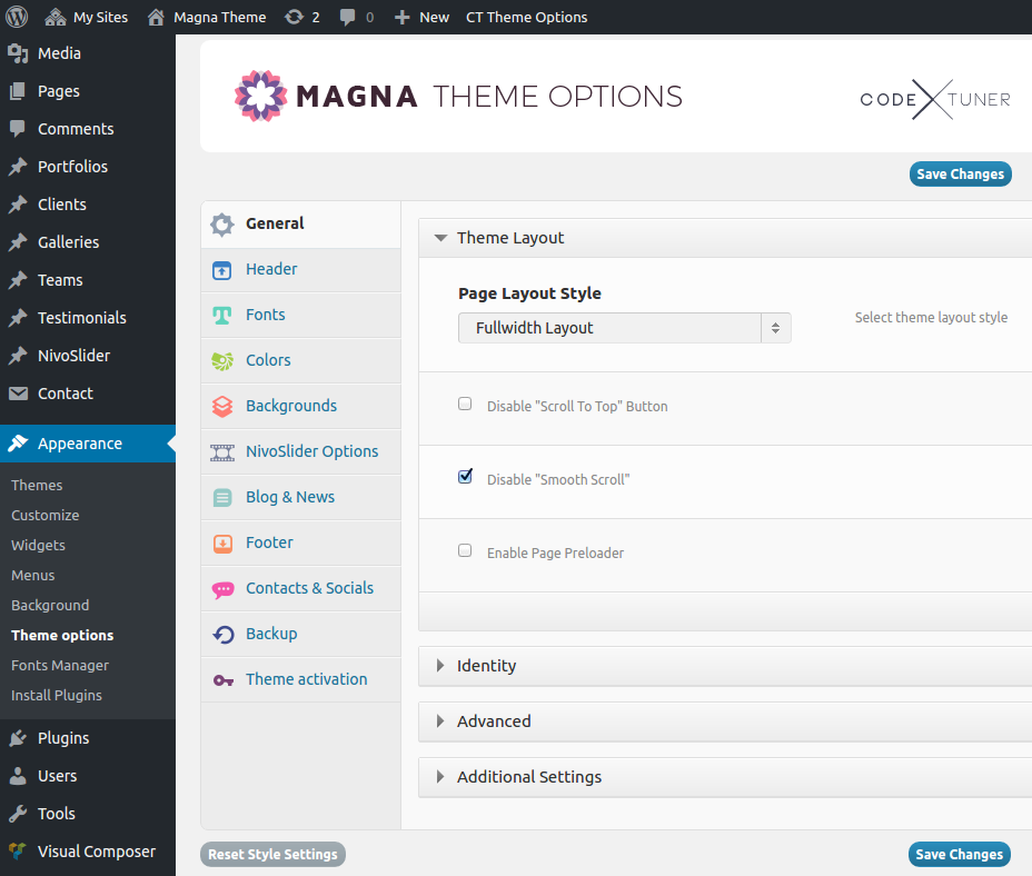
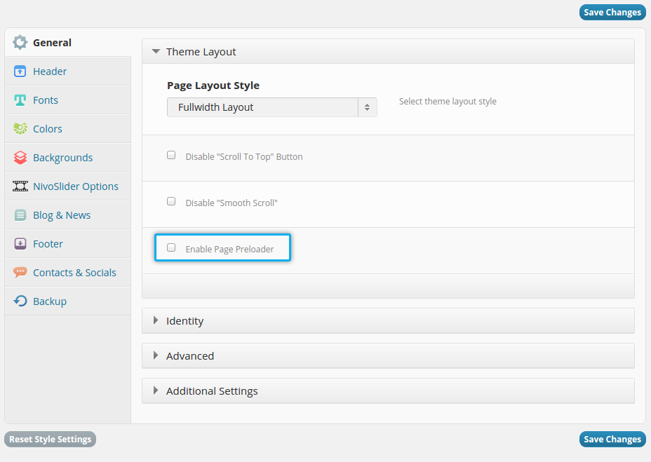
theme layout
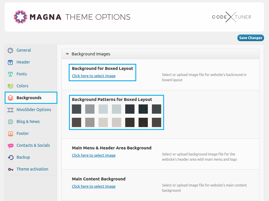
You can choose between fullwidth or boxed layout for your pages. By default Magna use fullwidth layout. If you like to use the boxed version, you can further configure the color or image for the general website background.
To configure background color choose “Colors” leftside in Magna admin panel and here use the “Background Color For Boxed Layout” field in “Background And Main Colors” panel to choose the appropriate boxed background color.

To configure background image choose “Backgrounds” leftside in Magna admin panel and here use the “Background for Boxed Layout” field to upload your background image. Or you can choose one of the included patterns by choosing one in “Background Patterns for Boxed Layout”
logo
types of logo
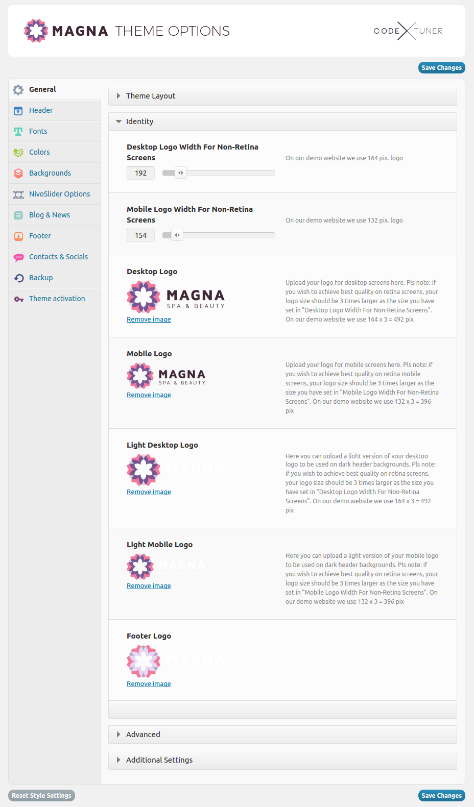
In Magna you can differ between logo, which should be displayed on desktop computers and logo , which should be displayed on mobile devices. It is important, because the size of the logo could differ depending on screen sizes. So in order to preserve the perfect logo look, it is better to use separate logo versions: one for desktops, one for mobiles.
In some cases, if you will need to use transparent website header, where your logo and main menu will be placed above some dark image or background, you will need another colors for your logo as well. In order to prevent the situation, where your logo will not be seen, for instance because it is black on very dark background. For such cases you would prefer am inverted version of your logo, i.e. in white or light gray colors.
logo size
Magna is retina ready. So in order to make your logo look sharp on modern retina displays, we recommend you to prepare your logo image for retina screens. It is quite simple: just take a standard logo size you wish to have on your website (on non-retina screens) and make it three times bigger. For instance: if your „normal“ logo should be 200 x 100 pix, your retina-ready logo should be 600 x 300 pix.
on our demo website we use following sizes:
- 192 px width for desktops (=576 px for retina)
- 154 px width for mobiles (=462 px for retina)
uploading your logo
In order to set up your logo, go to „General → Identity“ in Theme Options. As described above, here you can set:
- Logo width for desktop and mobile devices. Pls note: actually you can upload any logo image of any size and adjust its width here using this settings. However we recommend to initially prepare your logo in the right size in order to avoid some unwanted artefacts.
- Upload your logo images for different cases (see description above)
- Upload your favicon
logo position
In Magna you have multiple options for positioning your logo on your website. You can set it to be displayed left or right to menu, above the menu or be centered within the main navigation. Pls check the next section for further details.
setting up navigation
There are three embeded menus in Magna:
Top primary menu : main navigation in website’s header
To edit main menu do the following:
- Go to Appearance → Menus
- Select „Top primary menu“
- Edit your menu as usually
navigation layouts & styles
In order to set your prefered navigation layout, go to „Header → Main Menu & Header Area“ section of Theme Options. Here you have following options:
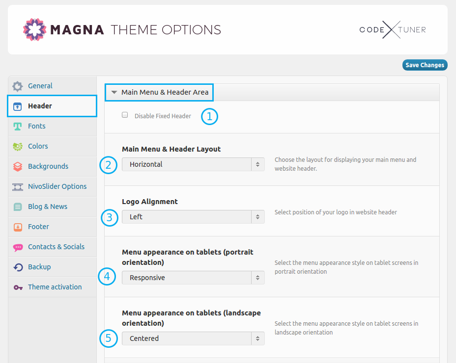
1. Disable Fixed Header
By checking this option you can disable the fixed menu header, which appears by vertical page scrolling
2. Main Menu & Header Layout
In Magna you have 2 main layout options for displaying your navigation:
- Horizontal: classic standard horizontal main menu position
- 100% Width Horizontal: positions menu using the 100% width of the display device
3. Logo Alignment
Choose where to position your logo:
- To the left of main menu
- To the right of main menu
- Centered above the main menu
- Centered in main menu
4-5. Menu appearance on tablets (portrait orientation) & Menu appearance on tablets (landscape orientation)
This two options are useful for defining the main menu appearance on tablets & mobile phones. You can choose between:
- Responsive: hides the menu in hamburger
- Centered: centers the menu position and brings logo to the top above the main navigation
- Default: leaves the default navigation (selected in „Main Menu & Header Layout“)
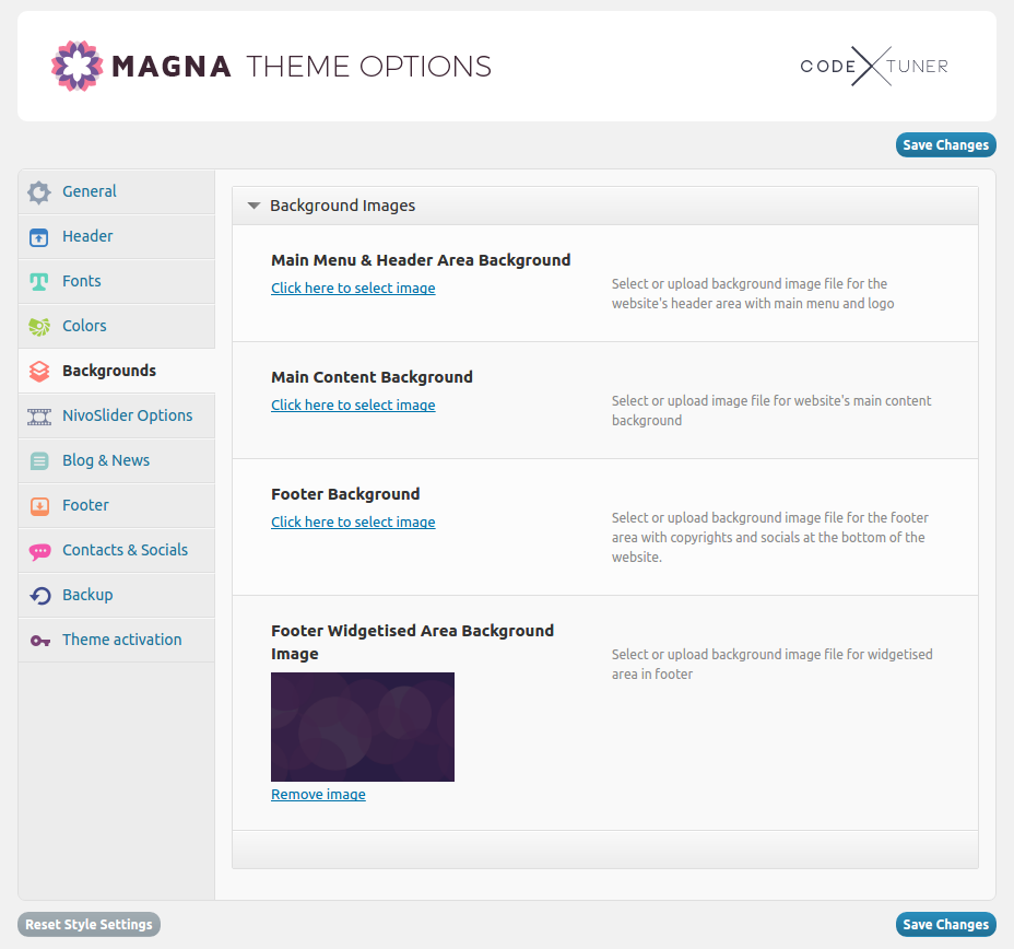
footer
By default the whole footer area is enabled in Magna. But you can easily disable footer area by going to “Footer->Footer Options” and unchecking “Activate footer” option.
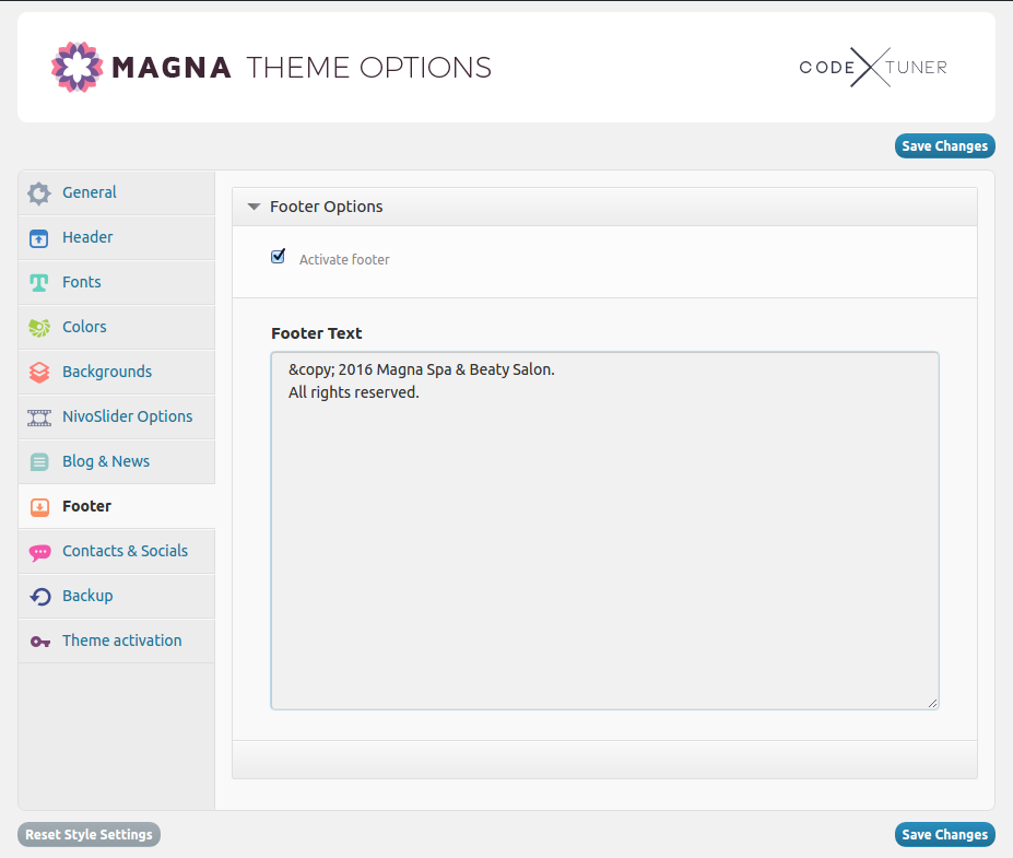
You can set some text content in footer as well. For example your copyrights. Pls note: here you can use shortcodes, delivered with Magna.
You can set a custom background color for footer area by going to “Colors – Footer Background Color” .
Or in case you wish to use some image for your footer background, go to „Backgrounds → Footer Background“ and upload your image
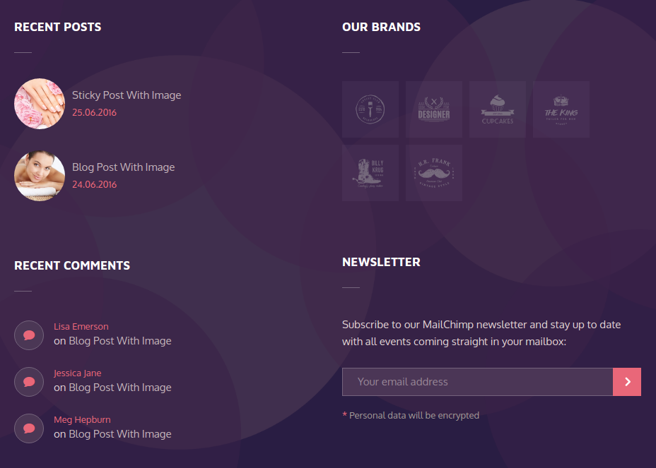
widgetised footer area
You do not need to activate this area for your website. It will appear automatically as soon as you will add some widgets here.
In Magna you can add different widgets to your footer widgetised area.
Go to „Appearance → Widgets“ . Here you will see „Footer Widget Area“ sidebar, where you can add / drag’n’drop your desired widgets from the widget list „Available Widgets“ to the left:
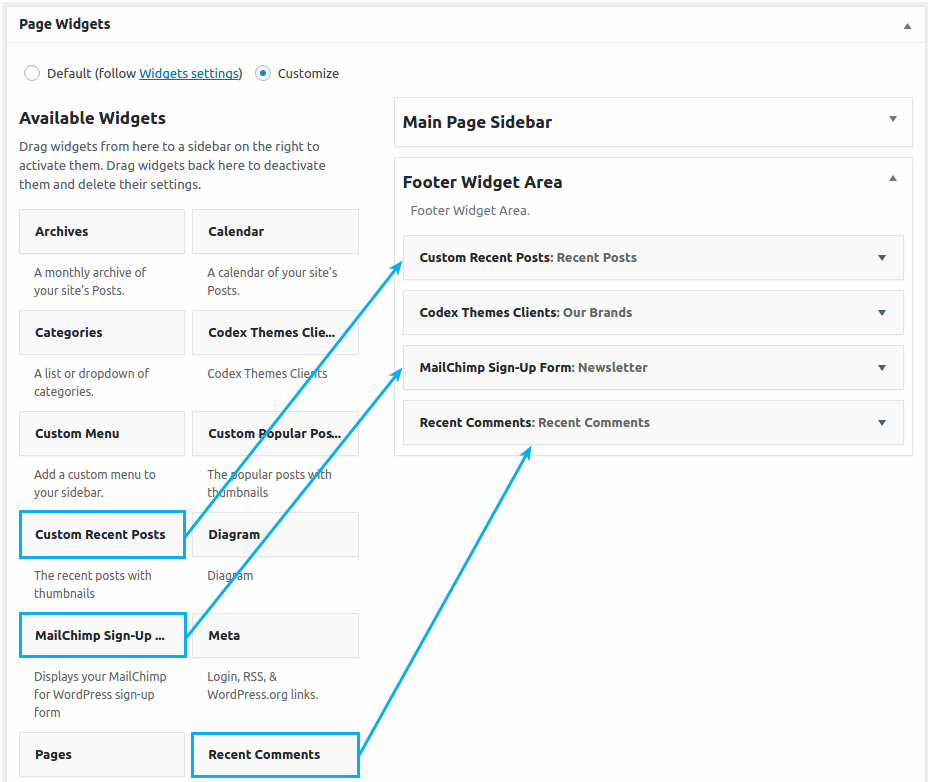
You can set a custom background color for widgetised footer area by going to “Colors – Footer Widgetised Area Background Color” .
Or in case you wish to use some image for your footer background, go to „Backgrounds → Footer Widgetised Area Background Image“ and upload your image
setting up homepage
Next step after making your general website settings would be to set your homepage – starting page of your website.
- Go to “Settings -> Reading”
- Select a static page option to be displayed as your front page
- Choose a page from the select box “Front page” that should be your homepage
- Save your changes
backing up settings
In Magna admin panel you can easily save all your theme configurations as Backup in order to restore it later, if something goes wrong and you’d like to restore your previous state of theme settings. Go to Appearance – Theme Options and choose “Backup” in Magna admin panel. In order to backup your settings, just click on “Backup settings”. If you would like to restore your previous Backup click on “Restore settings”. If you wish to save your current settings somewhere locally on your hdd, copy the content of the textbox below and paste it in your text editor – if you would like to restore these settings later, just copy this “code” from your text editor and paste it here in text box, and after that click on “Import Settings”.
PAGES
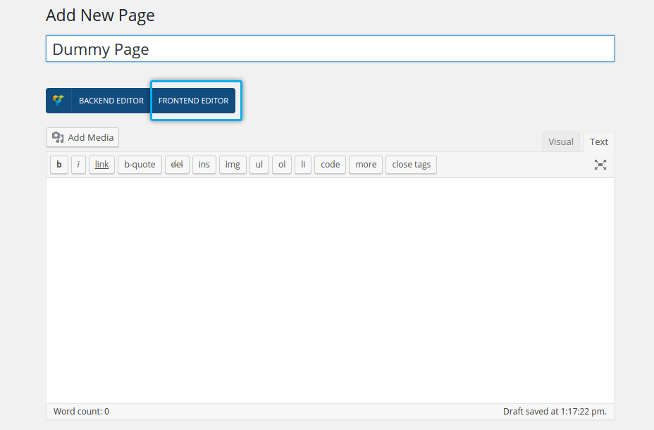
adding new page
You can add new page to your website by clicking on Pages ➜ Add new in the leftside wordpress
panel.
Here you have following content fields:
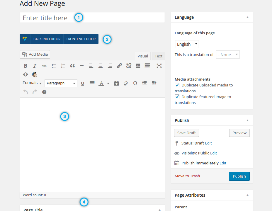
Title of your page = Title of your page’s content
Both Backend & Frontend Editor Controls of Visual Composer.
Here you enter your page’s content.
Further page options you can use to configure your page.
custom / fancy page title
Check the „Page Title“ block of settings directly under the WYSIWYG editor. Here you can make following:
- set style for page title
- enable / disable showing of page title
- add alternative customized page title (optionally using HTML formatting)
- add excerpt / subtitle
- set font colors for page title & page excerpt
- enable / disable breadcrumbs
- add custom background for page title area
- add icon
- set video background for the page title-h4
Let’s take a closer look at these settings.
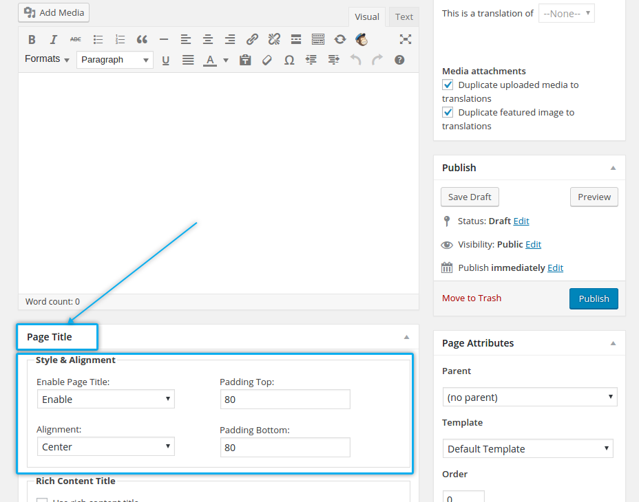
setting style for page title
Check „Style & Alignment“ group of settings inside of „Page Title“ setting
- Enable Page Title: here you can enable or disable displaying of page tite for the page
- Alignment: set the alignment of page title. Pls note: if you add some icon to your page title (see below), its position depends on this setting. For example „Centered“ means your title, subtitle as well as your icon will be centered inside the page title area, etc.
- Padding Top: set the top padding for your page title
- Padding Bottom: set the bottom padding for your page title
alternative page title (with optional html formatting)
If you wish to add some alternative page title for your page (to display it instead of default page title of wordpress you have entered above) and optionall format this page title using some html code, you can use this option:
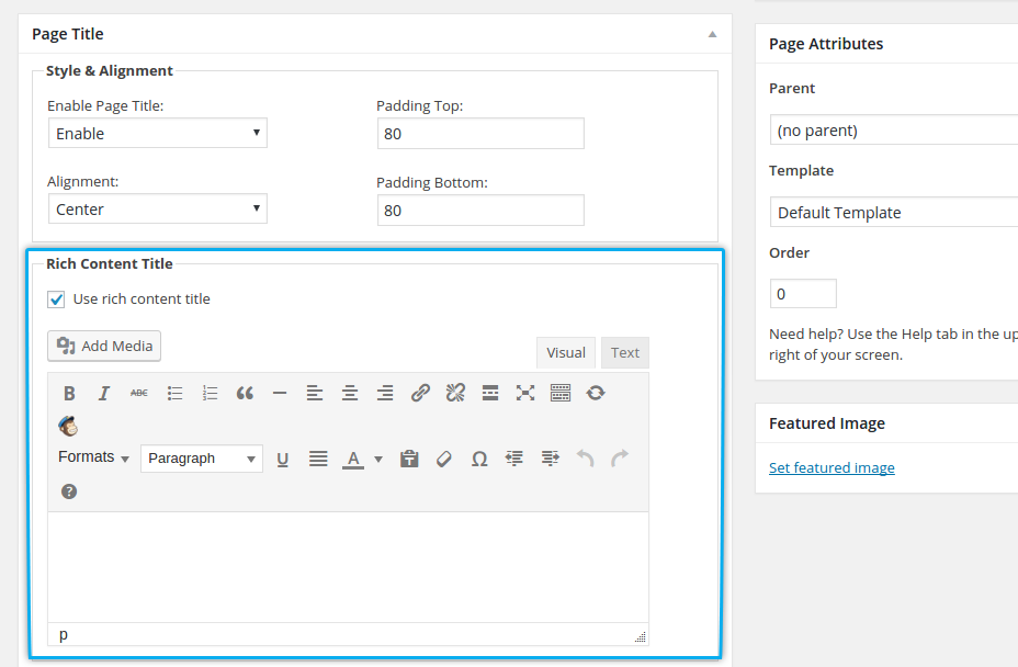
To enable this custom page title, activate „ Use rich content title“ checkox and you will see another wysiwyg editor, where you can enter your page title.
adding page excerpt / subtitle
To display some excerpt / subtitle in your page title area, use this field
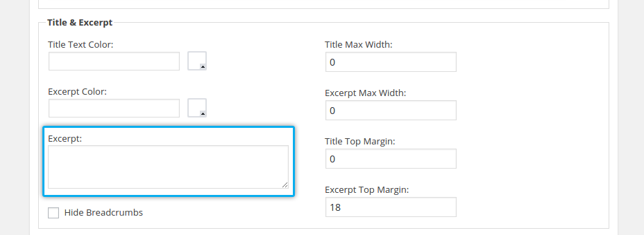
in „Title & Excerpt“ settings
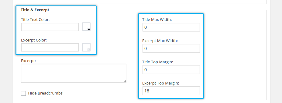
ont colors, width & margins for title & subtitle
To change font colors for your page title & excerpt as well as to set its width and margins, use following settings in „Title & Excerpt“ section:
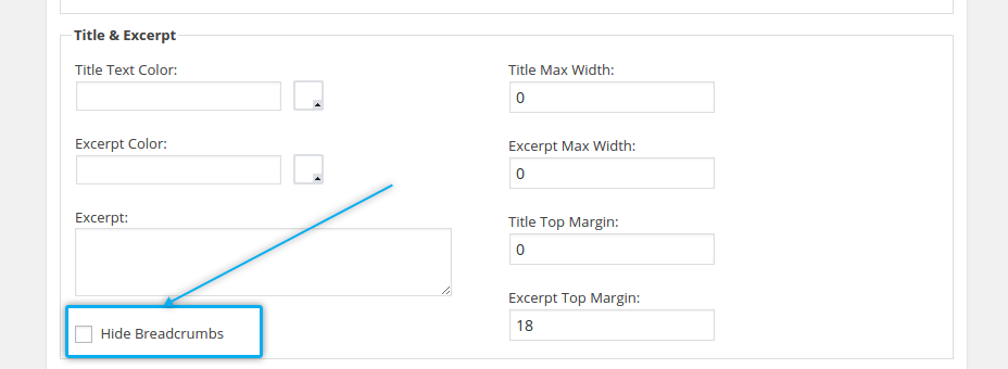
enabling / disabling breadcrumbs
By default breadcrumbs are enabled and are shown in page title area. If you wish to hide / disable breadcrubms, use this option in „Title & Excerpt“ settings:
setting custom background
In Magna you can use background color or background image for your page title area. Check „ Background“ section:
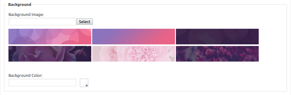
- Background Image: here you can set the background image for page title bar. You can select from the set of pre-defined styles/images by clicking on one of them, or you can upload your own image
- Background Color: if you don’t wish to use an image for header’s background,
here you can choose some color using colorpicker
adding icon for page title
Additionally to page title and subtitle you can insert icon to be displayed in page title area. Check „Icon“ section in „Page Title“ settings:
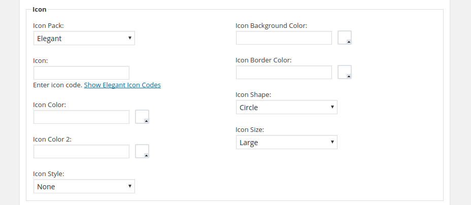
- Icon Pack: select the icon pack you wish to choose an icon from
- Icon: here you can choose an icon from the font icon set you have selected in „Icon Pack“. Just click on “Show icon codes”, select and copy the code of the icon you wish to insert and paste this code here
- Icon Color: Choose the main font color of your title icon here
- Icon Color 2: If you wish to make your icon bicolored, here you can choose the second font color for your icon
- Icon Style: Needed for bicolored icons – here you can define the angle of color splitting on your icon
- Icon Background Color: Choose the background color of your icon
- Icon Border Color: Choose the border color of your icon
- Icon Shape: Here you can choose between different icon shapes
- Icon Size: In which size your icon should appear
setting video background for page title
In „Video Background“ section of „Page Title“ settings you can optionally set some video to be played in the background of your page title:
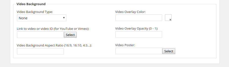
- Video Background Type: select the source of your video – self-hosted html5 video, youtube or vimeo video
- Link to video or video ID : here you can enter the URL to the HTML5 video or use Video ID of corresponding youtube or vimeo video
- Video Background Aspect Ratio: here you can define the aspect ration for this video
- Video Overlay Color: in case you wish some overlay, here you can select the color for that
- Video Overlay Opacity (0 – 1): choose opacity for your video overlay
- Video Poster: select cover image to be displayed instead of video on mobile devices
transparent page header
In case you wish to set a transparent header on some page individually (transparent means: your main menu area will be positioned directly above the page with transparent background), check „Page Header“ settings in page options:
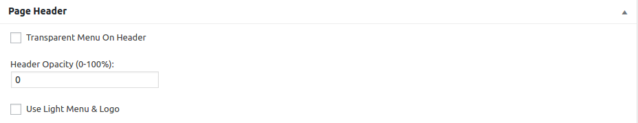
- Transparent Menu On Header: this setting enables the transparent menu on page header
- Header Opacity (0-100%): set the opacity for your transparent header
- Use Light Menu & Logo: in case you use some dark images in your page’s hero section, this option enables you to use different colors for main menu and logo (for example „white“). In order to set up colors for your light version of main menu and logo, go to „Colors → Menu Colors“ in Theme Options (for logo: „General → Identity“ ).
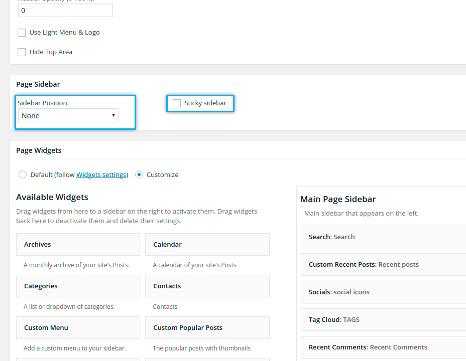
adding page sidebars
Using „Page Sidebar“ page option you can add right or left sidebar to your page
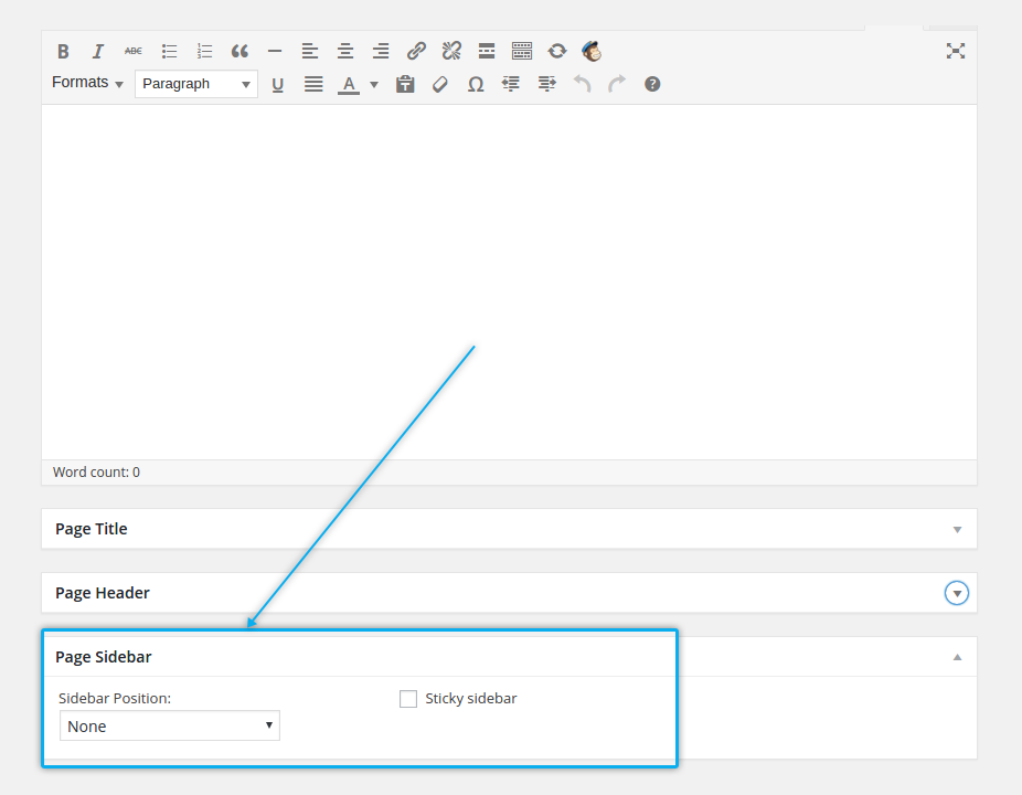
- Sidebar Position: here you can select, where you wish to have your sidebar
- Sticky Sidebar: with this option you can define if you wish your sidebar to be fixed positioned by vertical scrolling
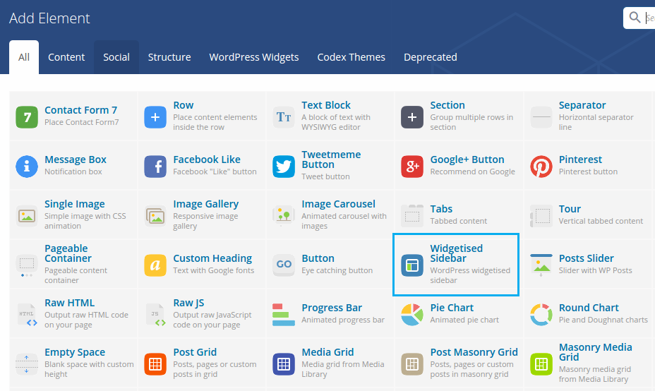
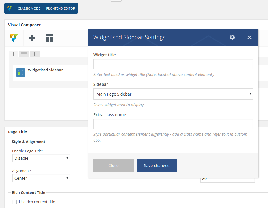
If you wish to add additional sidebars to your page, you need to use Visual Composer. For this cases pls add following VC element to your page:
- Add VC element, choose „Widgetised Sidebar“
- Here select the additional sidebar you wish to add
adding custom sidebar widgets
To add some custom widgets to your page’s sidebar, pls check „Page Widgets“ page options. This option is only relevant if you have enabled a sidebar in “Page Sidebar” section. Here you can choose, whether you want to use a default sidebar (by selecting “default” setting) or customized sidebar on your page. Default sidebar is the set of widgets you have added in „Appearance → Widgets“. In case you would like to customize this widgets on some pages (use other widgets than default set), choose „Customize“ option.
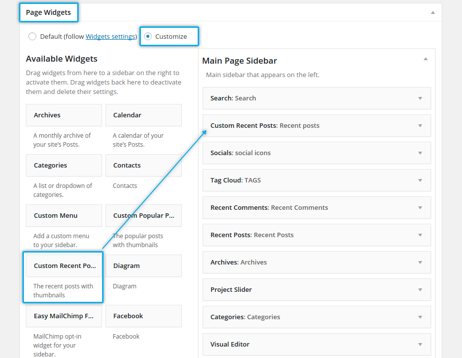
To easily customize your page sidebar you can simply drag-and-drop any widgets of your choice from Available Widgets panel to the Page Sidebar panel. See chapter Sidebars for details.
adding sliders
Magna comes with three awesome sliders onboard: Revolution Slider, Layer Slider and Nivo Slider. To enable one of this sliders on top of your page, use „Page Slideshow“ page option:
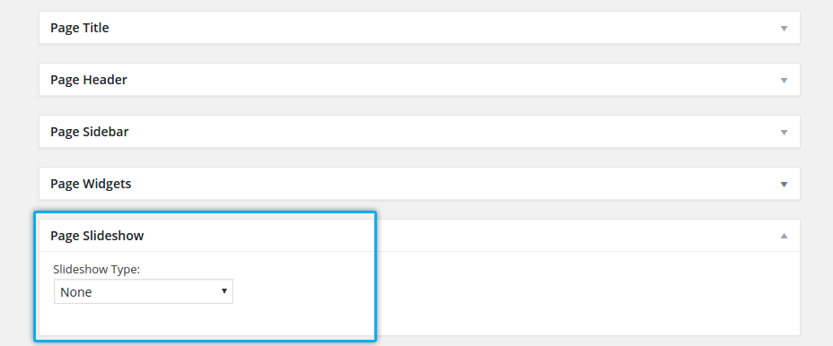
After enabling one of this sliders, you will be prompted to choose the slideshow from the list if created slideshows.
enabling page preloader
If you wish to enable page preloader for your page, pls use „Page Preloader“ page option
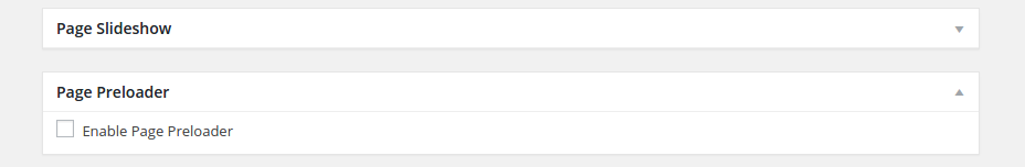
By default page preloader is disabled.
If you wish to enable page preloading for all pages and posts etc. of your website, go to Theme Options → General → Theme Layout , here you have an option „Enable Page Preloader“
lazy loading & bottom margins
In this option you can activate or deactivate lazy loading animations for the content elements of your page. Also here you can “stick” the bottom of the page to the footer without any gaps.
building pages
The easiest way of building your pages in Magna is to use Frontend Editor of Visual Composer. Here you have the full control over layout of your content as well as all of the shortcodes and its options. Visual Composer is a great tool for creating page layouts and content “on-the-fly”, in backend or in frontend mode by simple drag&drop of different content and page elements. Visual Composer is a required plugin and should be installed in the process of Magna’s theme installation (see Chapter “Installing Magna”)
elements/shortcodes
visual composer
Visual Composer is the best drag’n’drop visual editor for building pages, posts etc. in WordPress. If you are not familiar with Visual Composer, we would recommend to take a look at following videos:
https://www.youtube.com/watch?v=XJz_XWiOK78
https://www.youtube.com/watch?v=ngDEopRPHoA
https://www.youtube.com/watch?v=XJz_XWiOK78https://www.youtube.com/watch?v=ngDEopRPHoA
https://www.youtube.com/watch?v=dn5TqabaBMk
https://www.youtube.com/watch?v=dtAAx_r9oLM
https://www.youtube.com/watch?v=waZqhu8tlo4
Under https://vc.wpbakery.com/video-tutorials/ you can find some other useful video tutorials.
Under https://wpbakery.atlassian.net/wiki/display/VC/Visual+Composer+Pagebuilder+for+WordPress you will find the complete documentation.
Please note, that Visual Composer inside Magna is optimised for this theme, so all content elements and shortcodes you have here are Magna-related. All Magna elements you will find in tab „The Gem“ in Visual Composer:
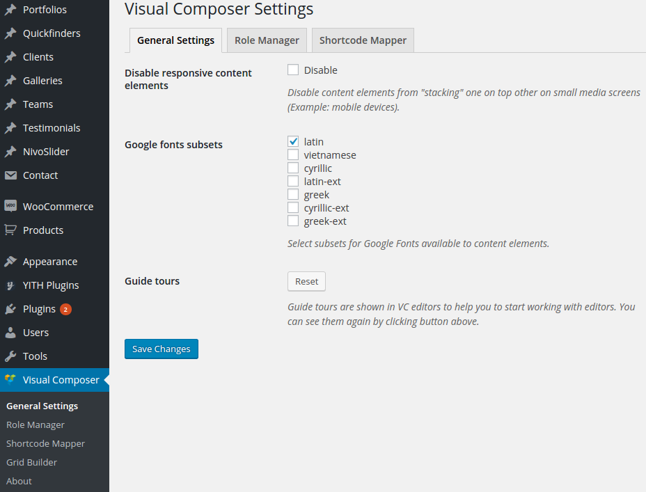
By default, Visual Composer is enabled for Pages, Portfolio, Products, Posts & News; however you can also enable it for other post types, if you need it. To do this go to “Visual Composer” and make your selection.
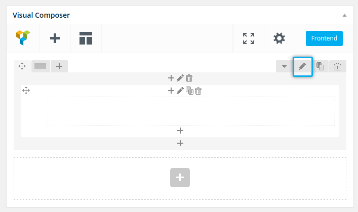
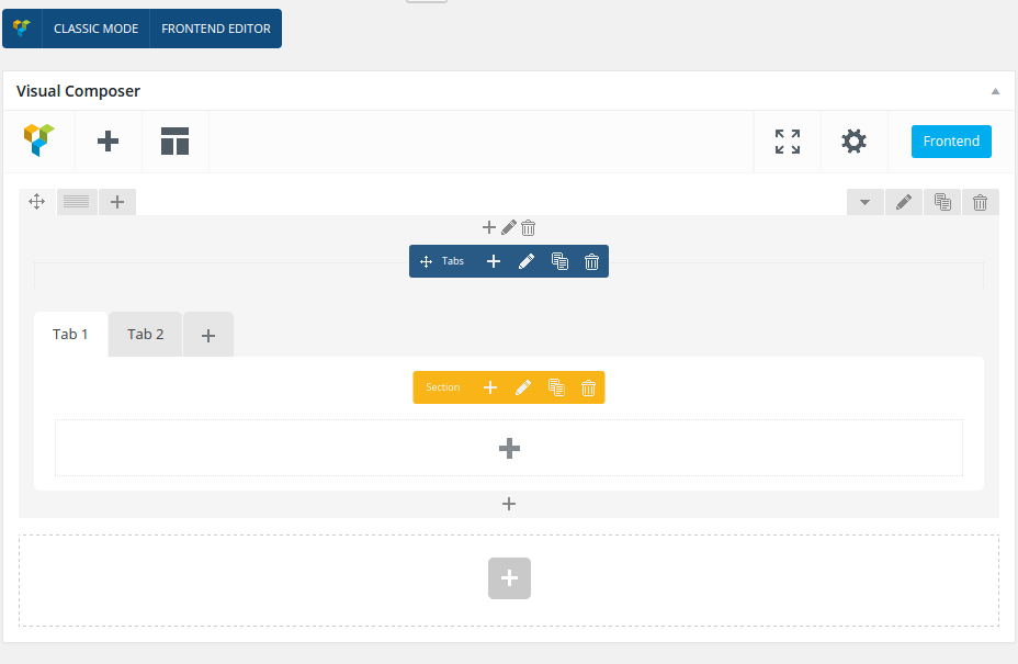
To start creating new page layout you can choose wether to do it in backend or in frontend editor. We recommend to use Frontend Editor, because it is a real “What You See Is What You Get” way to build your pages. Click on “Front End Editor”
and you will be switched to Visual Composer Frontend Editor:
Here you might want to begin with adding a new content element by clicking on “Add element”. After that the overview of all content elements will be displayed.
You can begin with adding a new content row in your page; choose “Row”. You will be switched to your page with added row element. Now you can edit its properties like for example number of columns and layout.
In this way you can add and edit all other elements; you can combine them with each other and drag-n-drop them.
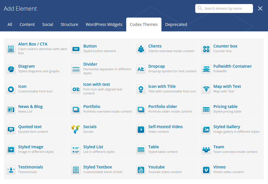
Pls check the detailed overview of all content elements delivered with Magna:.
rows & columns
Each page / post building process begins with adding rows and columns, defining your block layout.Pls refer to this video tutorial: https://www.youtube.com/watch?v=dtAAx_r9oLM
spaces & margins
There are three main ways to control spaces, margins & paddings in Magna.
This is a native Magna shortcode. You can find it here

With this element you can manage your horizontal margins & paddings very precisely. The advantage of using this shortcode is, that it shows you inserted spaces using dashed areas. Another useful feature of this shortcode is to insert nice colorful content dividers.
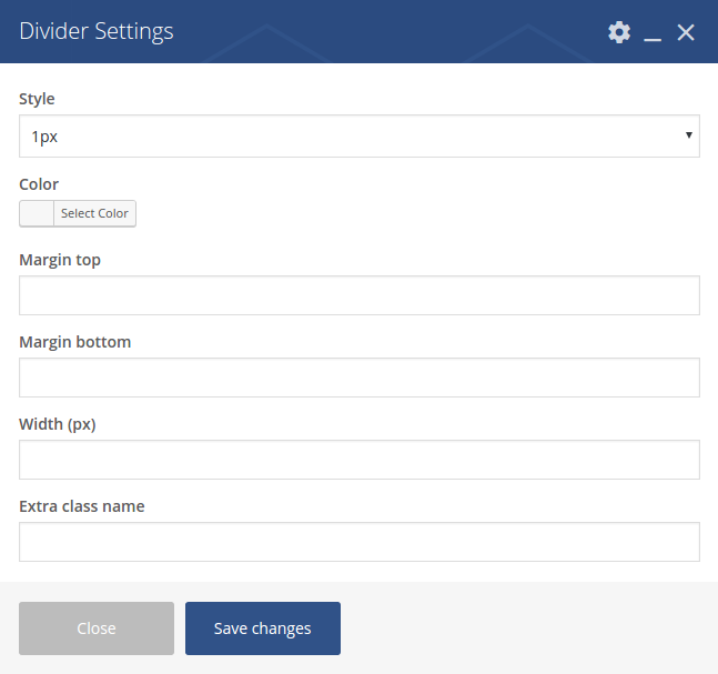
Style: select the style of your separator. If you wish to use divider to set horizontal margins, use preselected “1px” style
Color: select the color of your separator.
Margin top: set the top margin in px.
Margin bottom: set the bottom margin in px. NOTE: you can also use negative values (i.e. -27) to reduce margins!
Width (px): set the width of divider
Extra class name: you can use extra class name
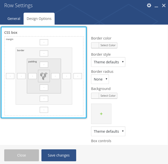
In Visual Composer you can swith to „design options“ tab in Rows or Columns properties and here you can set margins and paddings as well:
text block
To add some text block to your page, use „Text block“ element:

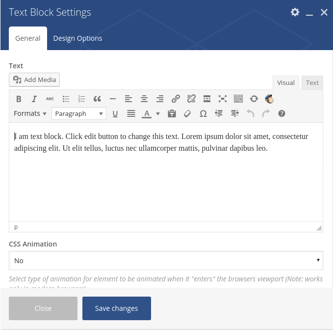
This element adds a WYSIWYG editor for inserting / formatting text blocks in a usual comfortable way.
buttons
To add some button anywhere in your content, use „Button“ element:

Here you have following options:
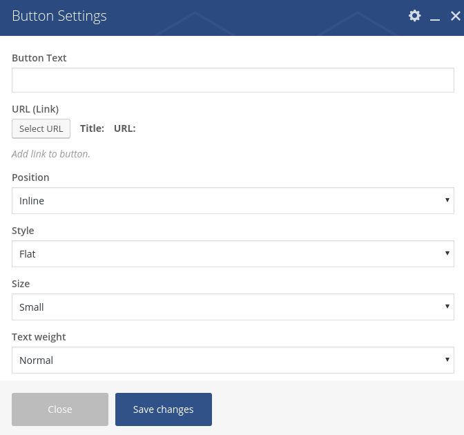
Button Text: type in the text, which should appear on your button
URL (Link): define the link for your button
Position: define position and alignment of this button
Style: Magna buttons incluide two basic styles – flat (solid filling) and outline (ghost like)
Size: select the size for your buttonText weight: font weight for the button text
No uppercase: by checking this checkbox you disable uppercase letter styling for button text
Border radius: define the radius for rounded corners of the button
Text Color: Select the font color of the button’s text
Hover Text Color: Select the hover font color of the button’s text
Background Color: select the background color fill for the button
Hover Background Color: select the background color fill for the button in hover state
Separator Style: this option gives you a possibility to enable line separator to the left and to the right of the button
Icon pack: if you wish to use some icon in your button, here you can define the icon pack, where you wish to choose your icon
Icon: here you can choose an icon from the font icon set you have selected in „Icon Pack“. Just click on “Show icon codes”, select and copy the code of the icon you wish to insert and paste this code here
Icon Position: where to position the chose icon – to the left or to the right of the button’s text Choose the main font color of your title icon here
Lazy Loading enabled: here you can enable a lazy loading animation for your button
icons
Magna delivers three shortcodes for inserting buttons in your content.
icon
This shortcode inserts a standalone icon on any position in your content
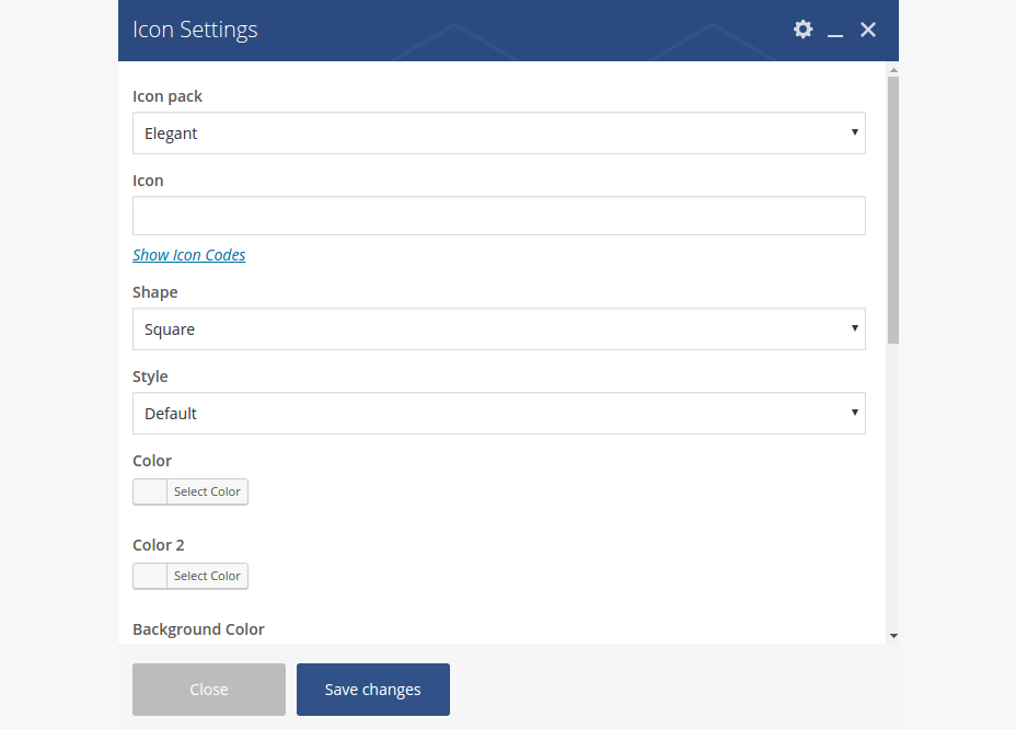
Icon pack: if you wish to use some icon in your button, here you can define the icon pack, whereyou wish to choose your icon
Icon: here you can choose an icon from the font icon set you have selected in „Icon Pack“. Just click on “Show icon codes”, select and copy the code of the icon you wish to insert and paste this code here
Shape: Here you can choose between different icon shapes
Style: Needed for bicolored icons – here you can define the angle of color splitting on your icon
Color: Select font coor for your icon
Color 2: If you wish to make your icon bicolored, here you can choose the second font color for your icon
Background Color: Choose the background color of your icon
Border Color: Choose the border color of your icon
Size: In which size your icon should appear
Link & Link Target: enter an URL if you wish to link your icon
Centered: if you wish to automatically center this icon inside the content block where it is inserted, activate this option
Icon Top Margin & Icon Bottom Margin: here you can define the top & bottom margins of your button, in pixels
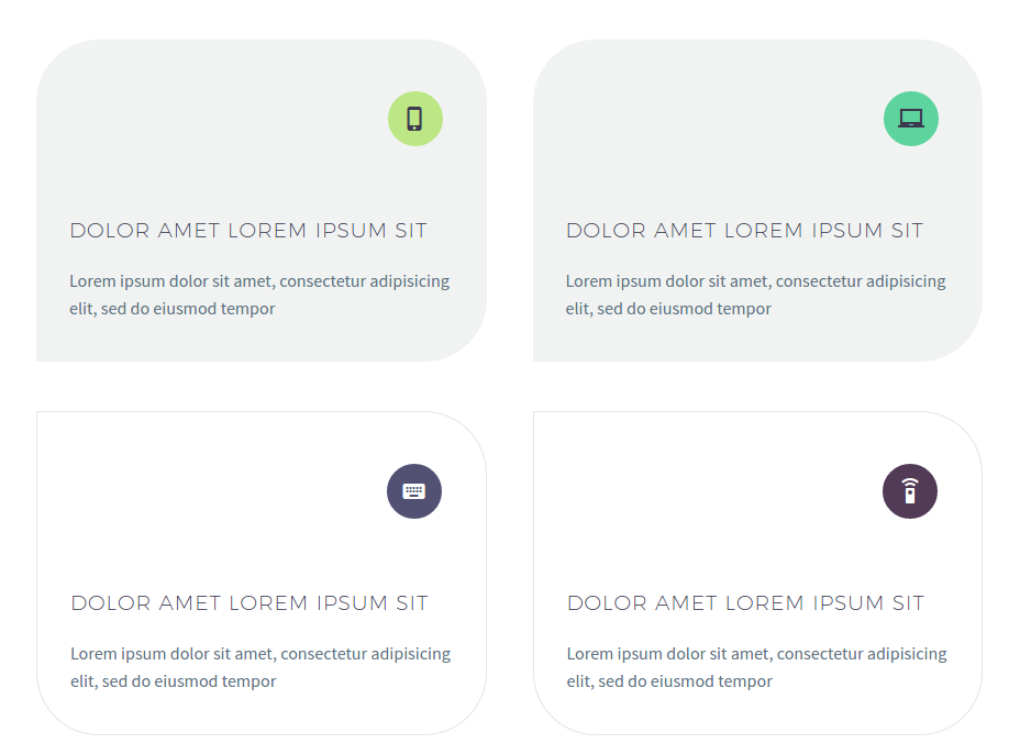
icon with text
This shortcode is quite similar to Icon shortcode described above, but it gives an option to insert a text container, starting with icon, and to control icon & text positions, margins and paddings very precisely. All settings are quite similar to the settings of Icon shortcode (see above). After inserting this element, you can then prepend or append text block inside this shortcode.
icon with title
This shortcode is quite similar to Icon shortcode described above, but it gives an option to insert some title in combination with the icon. All settings are quite similar to the settings of Icon shortcode (see above).
All icon element demos
styled & fancy textboxes
Styled boxes could be used to highlight some content parts, to attract the visitor’s attention to some important facts, to promote something. With this shortcode you can easily customize the colors of your box. To insert a styled box in your content use Textbox shortcode:


Style: you can select, if you wish to have a title bar in your textbox or not or if you wish to make a picture box (where the picture is placed above the textbox)
Content Text Color: Font color for the text in the textbox, Choose or enter color code, ex. #ffffff.
Content Background Color: here you can select the color for the background of your textbox
Content Background Image: if you wish to use an image as background of your textbox, here you can select this image from your media library
Background Style: choose a style of displaying background image
Background horizontal position: choose the horizontal position of your background imageBackground vertical position: choose the vertical position of your background image
Parallax: enable parallax effect if you wish to use parallax
If enabled:
Parallax type: choose parallax type you wish to use
Parallax overlay color: select overlay color for your parallax area
Padding top: set the top padding of the fullwidth area in pixel
Padding bottom: set the bottom padding of the fullwidth area in pixel
Padding left: set the left padding of the fullwidth area in pixel. NOTE: set this padding to “0” if you
wnat to avoid any paddings to the left
Padding right: set the right padding of the fullwidth area in pixel. NOTE: set this padding to “0” if
you wnat to avoid any paddings to the right
Border color: color of your CTA’s border
Border Width (px): width of the CTA’s border
Border Radius (px): radius for the rounded corners of the CTA’s border
Rectangle Corner: if you wish, you can select corners of the CTA’s border, which should stay non-rounded, like here
Top & Bottom Arеa Style: choose, which fancy style would you like to use for the top or for the bottom of your CTA. Be default fancy styles are disabled
Centered: Choose if you wish to center your icon / image / buttons inside the CTA container
Lazy Loading enabled: here you can enable a lazy loading animation for your button
If you choose to use a title in your textbox,

you can set following settings in „Title“ tab:
Icon pack: if you wish to use icon in your textbox’s title, here you can define the icon pack, where you wish to choose your icon from.
Icon: select the icon you wish to use in your textbox’s title by clicking on Show Icon Codes. The overview of all available icons will open. Select the code of the icon you wish to insert, copy it, close the overview and paste it in this field “Icon”.
Icon Shape: select the shape of the icon.
Icon Style: in Magna you can use bicolored icons. In this field “Style” you can select the angle of color splitting in bicolored icon. By default only one color will be applied.
Icon Color: select the main font color of your icon using the colorpicker or typing the hex value
Icon Color 2: select the second font color of your icon, if you wish to use bicolored icon. Your icon will then appear in two colors (color / color 2), splitted by the angle you have selected in Style field above
Icon Background Color: choose the color of icon’s background using the colorpicker or typing the hex value
Icon Border Color: choose the color of icon’s border using the colorpicker or typing the hex value
Icon Size: select the size of your icon
Title Area: here you can enter your textbox’s title. Note: you can use any HTML or shortcodes here.
Title Text Color: Font color for the title of the textbox
Title Background Color: Background color of the title area in your textboxAfter you have inserted your textbox, you can start filling it with content by simply clicking on “+” symbol above the textbox.
100% width & parallax areas
By using „Fullwidth Container“ shortcode you can insert and style 100% width areas with optional parallax anywhere on your page and add to this area any content & shortcodes you wih. To insert fullwidth container, choose this element from the list of Magna’s shortcodes here:

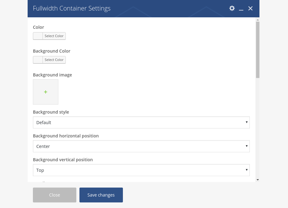
Color: select the font color for the text content you will insert in your fullwidth area
Background Color: select the background color for your fullwidth area
Background Image: select some image to be used as background image of fullwidth container. For parallax areas we advice to use large images in 1920 x 1200 px resolution
Background Style: choose a style of displaying background image
Background horizontal position: choose the horizontal position of your background imageBackground vertical position: choose the vertical position of your background image
Parallax: enable parallax effect if you wish to use parallax
Parallax type: choose parallax type you wish to use
Parallax overlay color: select overlay color for your parallax area
Padding top: set the top padding of the fullwidth area in pixel
Padding bottom: set the bottom padding of the fullwidth area in pixel
Padding left: set the left padding of the fullwidth area in pixel. NOTE: set this padding to “0” if you wnat to avoid any paddings to the left
Padding right: set the right padding of the fullwidth area in pixel. NOTE: set this padding to “0” if you wnat to avoid any paddings to the right
Container: enable this option if you don’t want to display the content inside your fullwidth area in 100% width layout, i.e. to display your content width limited to main website content width
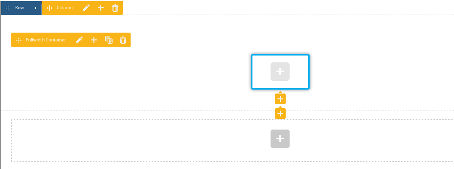
Top & Bottom styled marker: choose if you wish to dispaly a styled marker and on which position After adding a fullwidth container, you can add any content element inside it by simply clicking on “+” symbol on it:
video backgrounds
To insert video backgrounds in your 100% fullwidth area, use „Fullwidth Container“ with following options:
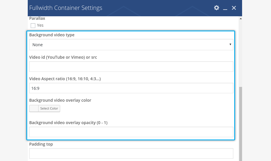
Background video type: select the source of your video
Link to video or video ID : here you can enter the URL to the HTML5 video or use Video ID of corresponding youtube or vimeo video
Video Aspect Ratio: here you can define the aspect ration for this video
Video Overlay Color: in case you wish some overlay, here you can select the color for that
Video Overlay Opacity (0 – 1): choose opacity for your video overlay
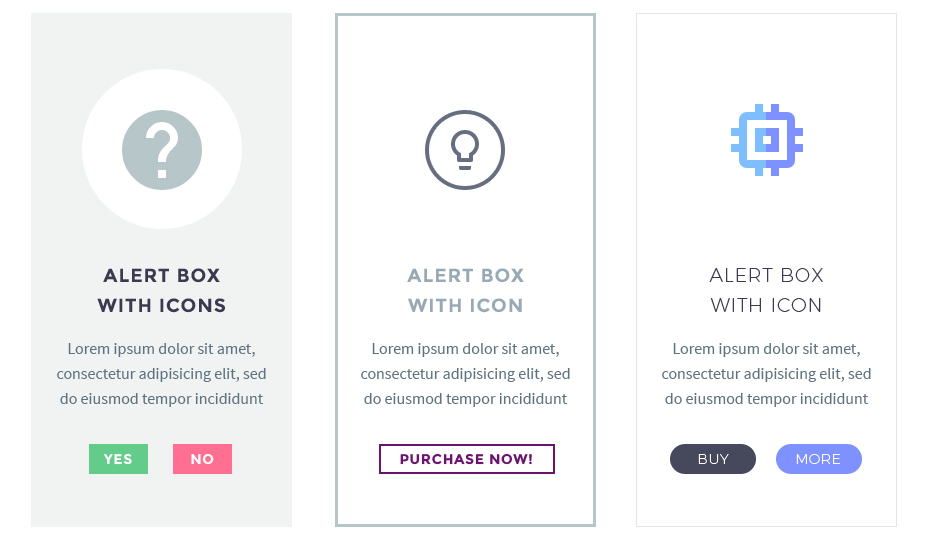
call-to-action & alert boxes
To insert an CTA / alert box in your content use Alert Box / CTA Shortcode:

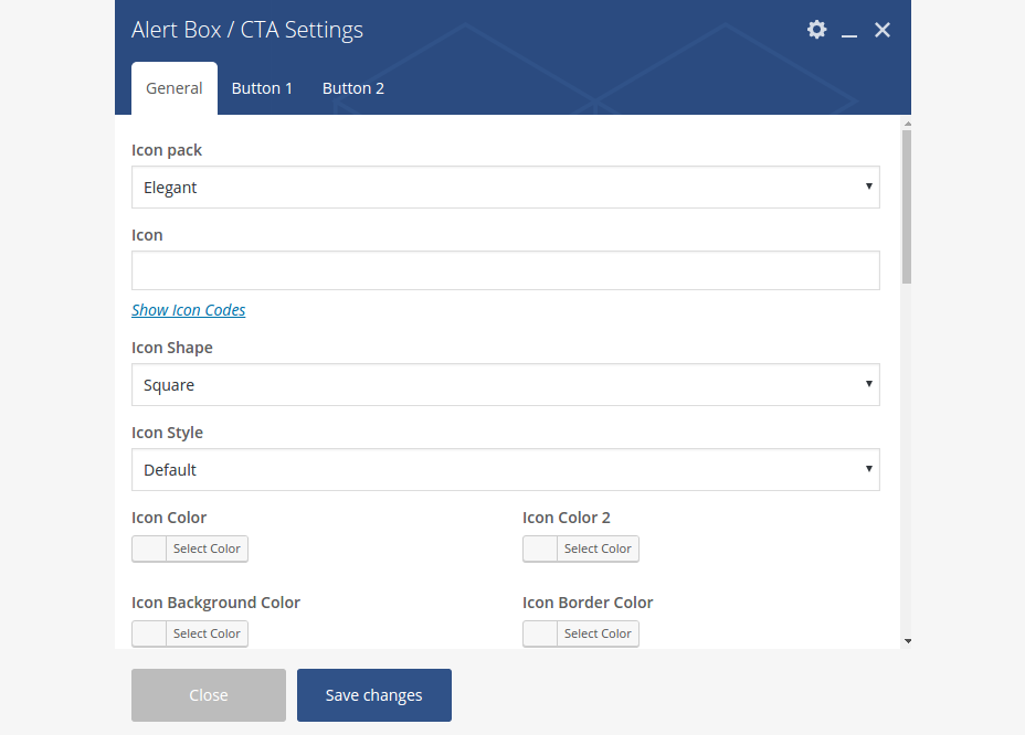
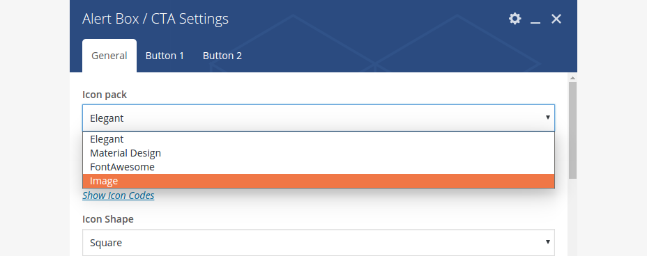
Icon pack: if you wish to use icon in your CTA block, here you can define the icon pack, where you wish to choose your icon from. Pls note: if you wish to use an image instead of an icon, choose „Image“ from this select box and select imahe from the media library:
Icon: select the icon you wish to use in your CTA by clicking on Show Icon Codes. The overview of all available icons will open. Select the code of the icon you wish to insert, copy it, close the overview and paste it in this field “Icon”.
Icon Shape: select the shape of the icon. Note, that this shape will also apply to your CTA image, if you have decided to use an image instead of an icon
Icon Style: in Magna you can use bicolored icons. In this field “Style” you can select the angle of color splitting in bicolored icon. By default only one color will be applied.
Icon Color: select the main font color of your icon using the colorpicker or typing the hex value
Icon Color 2: select the second font color of your icon, if you wish to use bicolored icon. Your icon will then appear in two colors (color / color 2), splitted by the angle you have selected in Style field above
Icon Background Color: choose the color of icon’s background using the colorpicker or typing the hex value
Icon Border Color: choose the color of icon’s border using the colorpicker or typing the hex value
Icon Size: select the size of your icon
Text color: select the color of your CTA’s text
Background color: you can use background color for your CTA’s background
Background image: if you wish to use an image as background of your CTA, here you can select this image from your media library
Background Style: choose a style of displaying background image
Background horizontal position: choose the horizontal position of your background image
Background vertical position: choose the vertical position of your background image
Border color: color of your CTA’s borderBorder Width (px): width of the CTA’s border
Border Radius (px): radius for the rounded corners of the CTA’s border
Rectangle Corner: if you wish, you can select corners of the CTA’s border, which should stay non-rounded, like here
Top & Bottom Arеa Style: choose, which fancy style would you like to use for the top or for the bottom of your CTA. Be default fancy styles are disabled
Centered: Choose if you wish to center your icon / image / buttons inside the CTA container
For inserting buttons in your CTA / Alert Box, use „Button 1“ and „Button 2“ tabs in Alert Box / CTA shortcode.
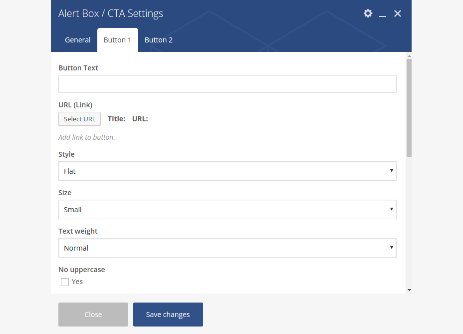
Pls note: here you have all the same button options as in „Button“ shortcode – description see above in section „Button“
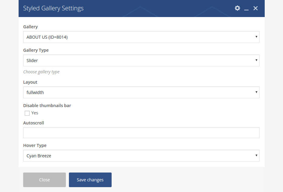
styled galleries

See detailed description of galleries in Chapter Galleries.
Magna has a number of different gallery types which you can use to display your images in content by inserting a Gallery element:
Gallery: here you can select a gallery to display, which you have created under „Galleries“ in your wp admin
Gallery type: Here you can select the type of your gallery. You can choose between:
- Slider – gallery in form of slider with thumbnail bar below
- Grid – gallery in form of classic grid
Depending on which gallery type you have selected you have different options.
Layout: choose the layout of your grid gallery
Style: For grid galleries: choose the style of your grid here
Gaps size (px): Here you can set a gaps size between images in your grid gallery. Set „0“ for no gaps.
Hover type: select the onhover style here
Border style: choose the style of image borders in your grid views.
Title: If you would like to insert the title to your gallery, use this field and enter your gallery’s title.
Loading Animation: set the loading animation for your gallery items (images).
Layout: choose the layout of your slider gallery Fullwidth means, your main image in the slider gallery will be wider in proportions; half-size is meant to be used on pages with sidebars andcolumns, here is the proportion of the main image in slider more quadratic
Disable thumbnails bar : with this option you can hide the tumbnails bar displayed below the main image in the slider gallery. If disabled you can then choose if you wish to enable a pagination or not
Autoscroll : here you can set an autoscroll speed for your gallery slider (in milliseconds). Leave empty if you wish to disable autoscroll
map with text

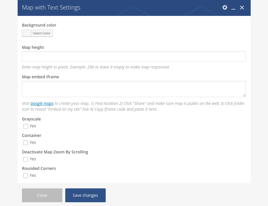
Map With Text shortcode helps you to easily publish your google maps, styled in Magna’s way and optionally enhanced with content layers above the map:
Background color: here yo can set a background color for your content container above the map
Map Height: Map height in pixels
Mab embed iframe: In this field you should paste a googlemaps embed code you have created in google maps. Just follow the steps described in the shortcode dialog
Grayscale: You can set here if you wish to show your google map in grayscale
Container: Choose this option if you don’t wish to display your map in 100% width if you have added it to fullwidth container
Deactivate Map Zoom By Scrolling: This option is useful especially for touch devices. If enabled, your added map will not scroll inside the iframe
Rounded Corners: Optionally add rounded colors to your map
After adding your map you can start inserting a content inside it. Just click on “+” symbol to open a shortcodes dialog.
news & blog
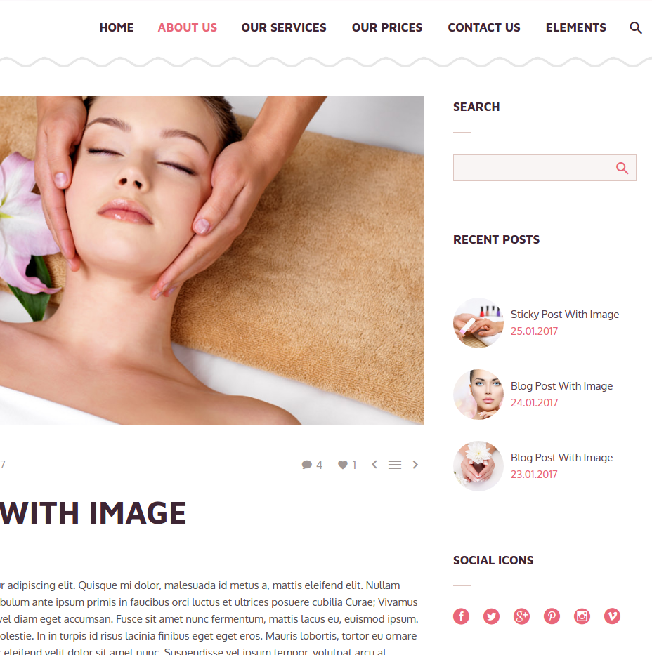
With this element you can insert your news or blog post lists anywhere in content, choosing among many different appearance styles.

Post types: select, which post types would you like to publish in this list – blog posts or/and news
Style: select the design style of presenting your blog / news list
You can select from this styles:

For examples of different blog / news list styles visit our demo website → About Us -> News & Blog
Select Categories: you can select categories for your blog / news list by clicking on „Select Categories“ Tab

Pagination: which pagination style should be used
- Normal: classic pagination using page numbers
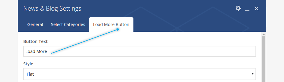
- Load More: by choosing this option your next posts will be loaded by clicking on „Load More“ button. Pls note: after choosing this option new settings tab „Load More Button“ appears, allowing you to style this load more button as you wish
- Infinite Scroll: lazy loadingof posts in the news/posts list by vertical scrolling
- Disable pagination: here you have an option to disable any pagination
Loading animation : choose the animation effect for appearing of blog / news posts in the list
Ignore Sticky Posts : with this option you can ignore displaying of sticky posts above at the top of posts/news lists
Hide date in title : this setting allows you to hide date in post title in your blog / news list
Hide author : this setting allows you to hide author in post in your blog / news list
Hide comments : this setting allows you to hide number of comments in post in your blog / news list
Hide likes : this setting allows you to hide likes in post in your blog / news list
pricing tables
Pricing tables shortcode helps you to insert styled pricing tables in different styles in your content.

Inserting pricing tables in your page consist of three steps.
Select “Pricing tables” shortcode from the shortcode list. Here you will get following options to set:
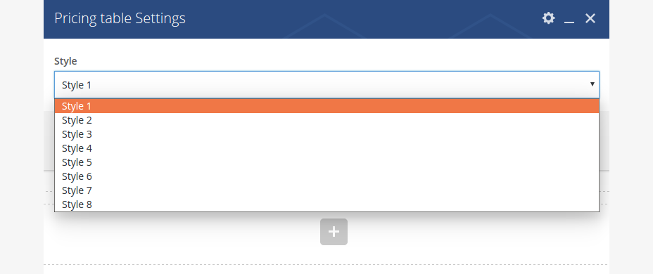
Style: Select one of eight pre-defined styles for your pricing table
Button Icon: Icon to display on the button in pricing table.
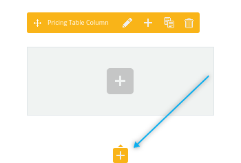
Click on “Save changes”. After that, click on “+” symbol in your added Pricing table element to start inserting pricing columns
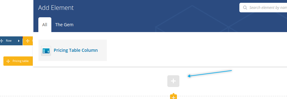
Select “Pricing table column” to insert a new column to your pricing table:
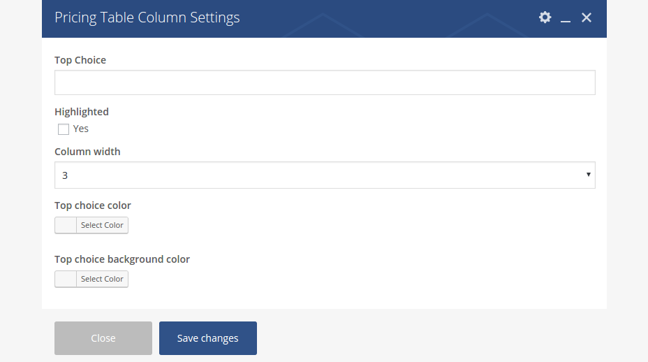
Top Choice: if you wish to set a marker label to your pricing column, you can write a short text here like “NEW!”
Highlighted: choose this option if you wish that this column will be highlighted / emphasized
Column width : here you can set the width of your column – should it be wider for 3 columns in the row or narrower for 4 columns in the row
Top Choice Color: set the font color for your „top choice“ text label
Top Choice Background: set the background color for your „top choice“ text label
Click on “Save changes” to insert your pricing column
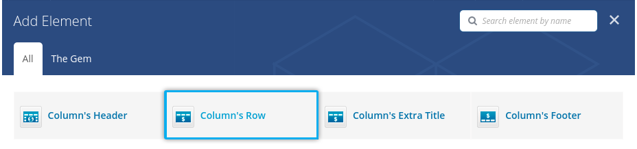
Now you can start filling your pricing column with content. To do this click on “+” symbol in your added pricing column and select the content element you wish to add.
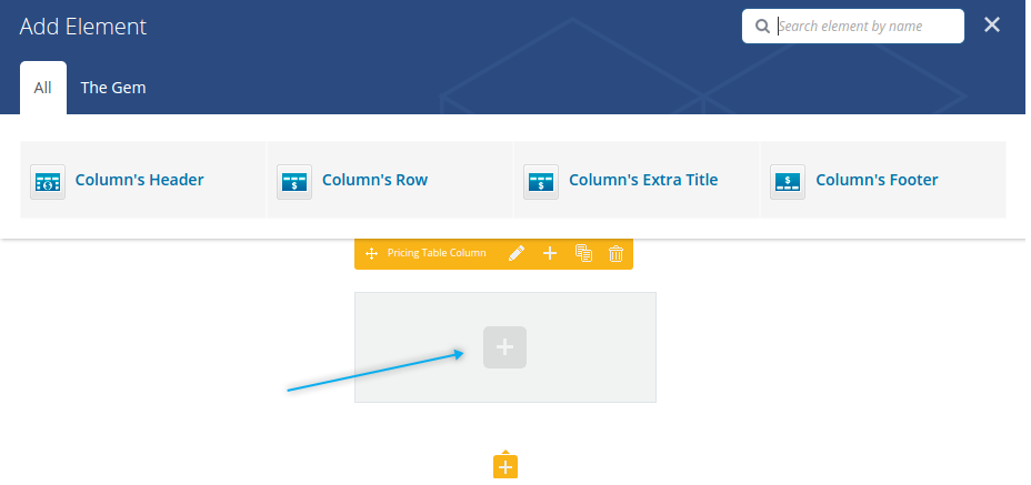
With this element you can define content and its style for the header of the pricing column:
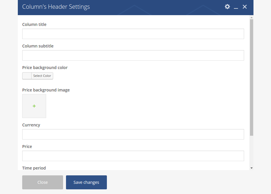
Column title: Type in the title of your pricing column
Column subtitle: Type in subtitle of your pricing column. Pls note: this subtitle works not for all styles; in few styles it is hidden
Price background color: Choose a background color for your price in header area
Price backgroun image: Or, alternatively, here you can choose a background image for your price in pricing column’s header area
Currency: Type in the currency symbol to be show
Price: Enter the price to be shownTime period: Enter the period of time for the price, i.e. “per month”
Styles: Here you can choose, if you wish to use default styles for title, subtitle, price and time period or if you wish to customize it’s colors:

After adding a column’s header with title, price etc. you can additionally add different rows with descriptions

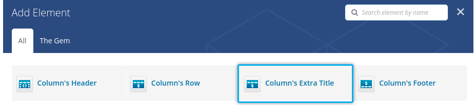
To add new row with column’s description, click on „+“ below tzhe header you have already added
and choose „Column’s Row“
After that you get a WYSIWYG editor, where you can start typing your decription. After saving, youcan clone this row several time in order to get additional rows with the same content – the easiest way to populate your column’s row:

And finally you would probably want to add a footer area to your pricing column with some button. In order to do this, choose following element:
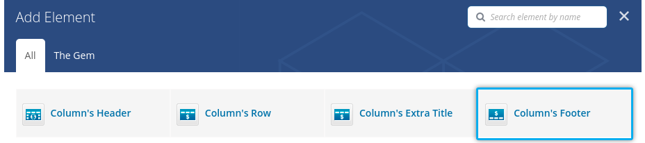
You will get a settings dialog, where you can customize the look of your pricing column’s button (see description above in section „Button“ )
Sometimes it is useful to use some additional titles in your pricing row, for example:
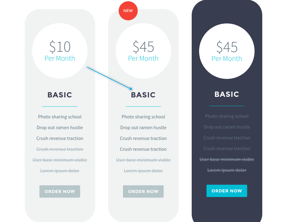
To do this, use „Column’s extra title“ element,
fill it with content and move it on the position in your pricing column, where you wish to have it.
portfolios
Magna comes with different styles to display your portfolio items on your content page by using Portfolio (for grids) or Portfolio Slider (for sliders) shortcode
portfolio grid


Select Portfolios: choose your desired portfolio set to be displayed. Click on „Select Portfolios“ tab:

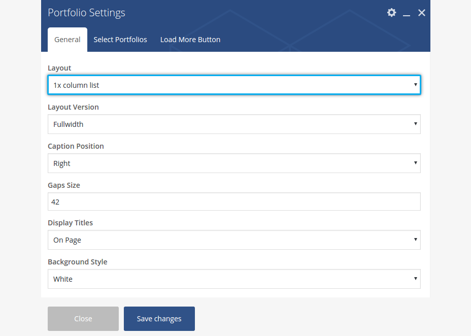
Layout: choose a grid layout for your portfolio overview. Choose 1x column list if you wish to display your portfolio as classic list
Style: choose a grid style. For grids you can choose between justified, masonry or metro grid styles
Columns 100% Width (1920x Screen): If you have selected 100% width layout previously, here you can set a number of columns to be displayed on 1920 pix screen resolution
Gaps size (px): Here you can set a gaps size between images in your grid gallery. Set „0“ for no gaps.
Display Titles: here you can select how the portfolio item’s title & description should be displayed. You can choose to display it under the item’s featured image or on mouse hover on featured image
Background Style: if you have selected „On Page“ in „Display Titles“ field previously, here you can select the backround style of the caption with project’s title and description, which is displayed under the project’s featured image
Hover Type: select the hover type you wish to use in your portfolio grid: Please note: if „Gradient“ or „Circular Overlay“ are selected, the project title and descripion will be displayed on project’s featured image if „On Page“ in „Display Titles“ is selected.
Pagination: select the pagination style to apply. You can choose between:
- Normal: classic numbered pagination
- Load More: by choosing this option your next posts will be loaded by clicking on „Load More“ button. Pls note: after choosing this option new settings tab „Load More Button“ appears, allowing you to style this load more button as you wish
- Infinite Scroll: lazy loadingof posts in the news/posts list by vertical scrolling
Loading animation : choose the animation effect for appearing of blog / news posts in the list
Items per page: Here you can define, how many portfolio items should be displayed at once on one page.
Show date & sets: select if you wish to show dates & portfolio categories in your grid overview
Disable sharing buttons: by activating this option you can disable a scoial sharing panel in your grid overviews
Activate filter: Select if you wish to display a filter bar above your portfolio grid
Title: If you would like to insert the title to your portfolio overview, use this field and enter your portfolio’s title.
Activate likes: Select if you wish to activate likes / like button for your portfolio items
Activate sorting: Select if you wish to activate sorting option for your portfolio items in your portfolio overview. Pls note: default sorting is by the date, descending
Max. row’s height in grid (px) : this setting appears only if Metro Style is selected. It could be useful for defining the maximal height of one row in the metro grid for selecting the optiomal metro appearance.
Max. row’s height in grid (px) : this setting appears only if Metro Style is selected. It could be useful for defining the maximal height of one row in the metro grid for selecting the optiomal metroappearance.
1x column list portfolios
If you wish to display your portfolio overview as a classic one column list, select „1x column list“ in „Layout“ option of the portfolio shortcode
In this case you have following additional settings:
Layout Version : here you can choose between „fullwidth“ layout (in this case the portfolio item will be wider) or „With Sidebar“ (the proportion of the portfolio item will be more quatratic).
Caption Position : where the caption with project’s title and description should be placed – to the left of the project’s featured image, to the right or should it combine in a zigzag way
portfolio slider
Another way to showcase your portfolio is to use „Portfolio Slider“ shortcode

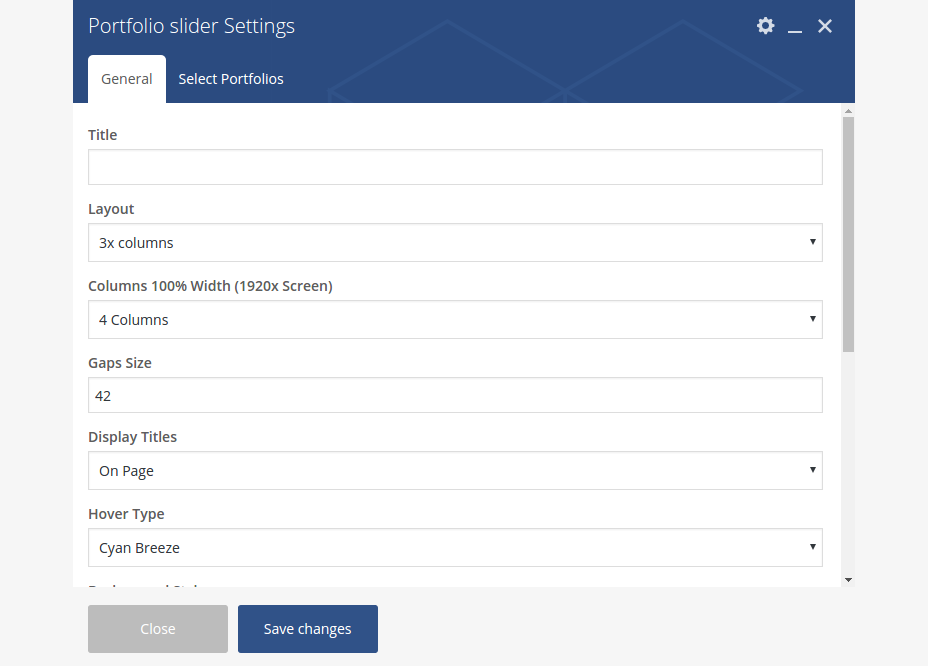
Title: If you would like to insert the title to your portfolio overview, use this field and enter your portfolio’s title.
Layout: choose a layout for your portfolio slider
Columns 100% Width (1920x Screen): If you have selected 100% width layout previously, here you can set a number of columns to be displayed on 1920x screen resolution
All other settings are similar to the settings of portfolio grid, described above.
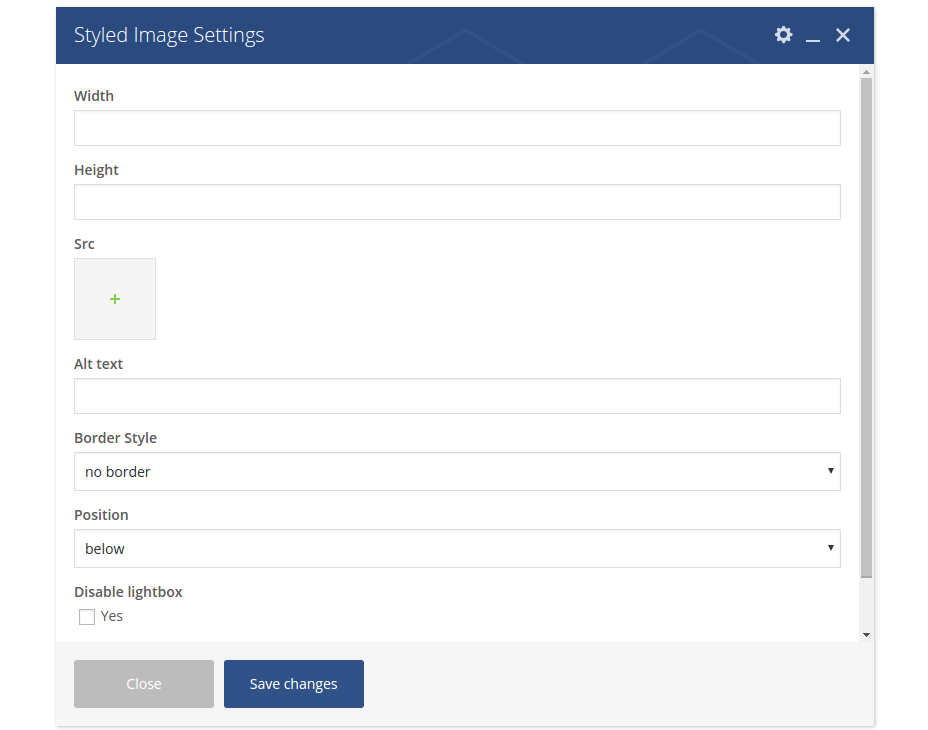
STYLED IMAGE
In Magna you can publish your images with awesome border and frames effects, making them look great and standing out. To do that use the Styled Image shortcode:

Width: Image width in pixels
Height: Image height in pixels
Choose Image: Select image from media library by clicking on Select or enter image URL
Alt: Enter image Alt-Attribute
Border Style: set the border/frame style for your image on the page.
Position: Here you can select the text alignment near your picture
Disable lightbox: activate this checkbox if you wish to disable the full-size image in lightbox
STYLED TABLE
To insert a styled table, use the “Table” shortcode.

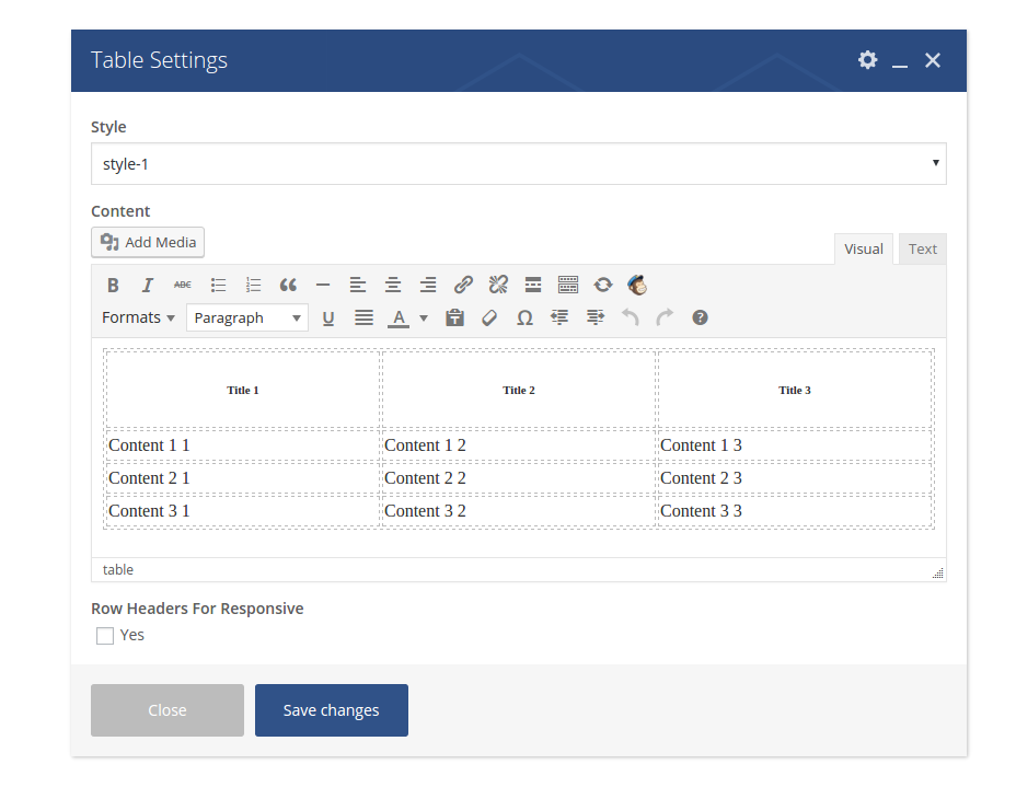
Style: choose the style you wish to use
Content: here you can edit your table as usually
Row headers for responsive: choose how to display your rows in on mobile devices
STYLED LISTS
To insert a styled list, use the “Styled List” shortcode.

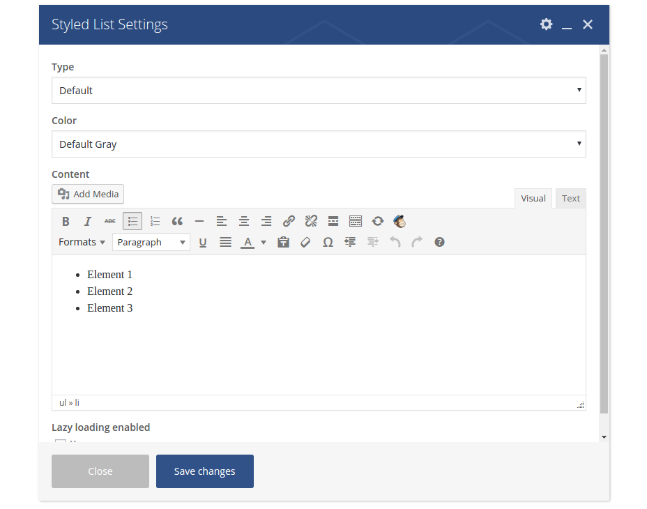
Type: choose a bullet icon you wish to use in your list
Color: choose a color for your bullet
Content: here you can edit your list as usually
TABS & TOURS
Tabs & tours are useful for grouping your content according its topical meaning and displaying it in a compact user-friendly form on the page.
TABS
In order to insert tabs in your content click on Tabs shortcode. This element is located in „Content“ tab of Visual Composer

Your tabs will be immediately added to your page.
Now you can start editing its settings. Just click on “edit” icon on your “Tabs” panel:

Style: Magna comes with four different tabs styles you can choose here
Shape: Select tabs shape.
Color: Select tabs color. Pls note: if you wish to use Magna pre-made colors, select „Magna“
here.
Spacing: Select tabs spacing.
Gap: Select tabs gap.
Position: Select tabs navigation position.
Alignment: Select tabs section title alignment.
Autoplay: Select auto rotate for tabs in seconds
Active section: Enter active section number
Pagination style: Select pagination style.
In order to edit the title and properties of one section, click on “edit” icon on your “Section” panel:
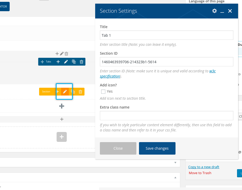
After that you are ready to insert any content in your tab by clicking on “plus” symbol on the appropriate tab.
I am text block. Click edit button to change this text. Lorem ipsum dolor sit amet, consectetur adipiscing elit. Ut elit tellus, luctus nec ullamcorper mattis, pulvinar dapibus leo.
TOURS
Tours are actully vertical tabs. They work in the same way. In order to insert tours in your content click on Tours shortcode.

Your tours will be immediately added to your page. Now you can start editing its settings just in the
same way, as by tabs (see above).
TEAMS
Team shortcode is a perfect feature to present your team inside your page content. Use Team
shortcode:

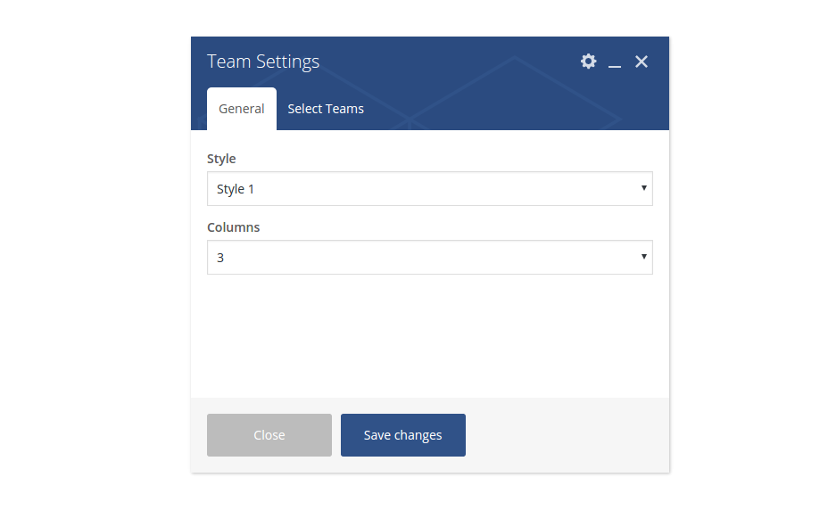
Your tours will be immediately added to your page. Now you can start editing its settings just in the
same way, as by tabs (see above).
Style: choose the style for displaying your team set
Columns: select the number of columns to be displayed in the team grid
TESTIMONIALS
Testimonials shortcode is a good to present your customers opinion about you and your work.

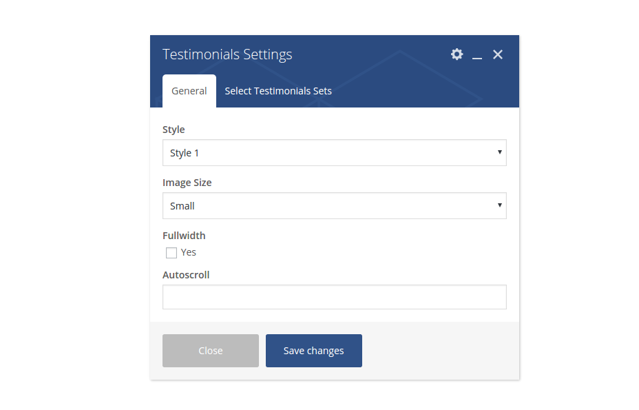
To select testimonials to be displayed, click on „Select Testimonial Sets“ tab and activate the
appropriate checkboxes.
Style: choose the style for displaying your testimonial set
Image Size: choose the size of the testimonial image to be displayed
Fullwith: select this option if you wish to display testimonial in fullwidth layout
Autoscroll: select the autoscroll speed in milliseconds. Leave blank if you don’t want to have any
autoscroll
COUNTERS
Inserting counters in your page consist of two steps.
Select “Counter box” shortcode from the shortcode list. Counter box will be immediately added to your page

Additionally you can make general settings for your counter:

Columns: for horizontal counters. Here you can choose number of columns in one row
Lazy loading enabled: here you can activate lazy loading animation for your counters
Number format: select the format for displaying your numbers in counter
Now click on “+” symbol on the added counter box. And then click on “Counter” shortcode


You will get following settings dialog:
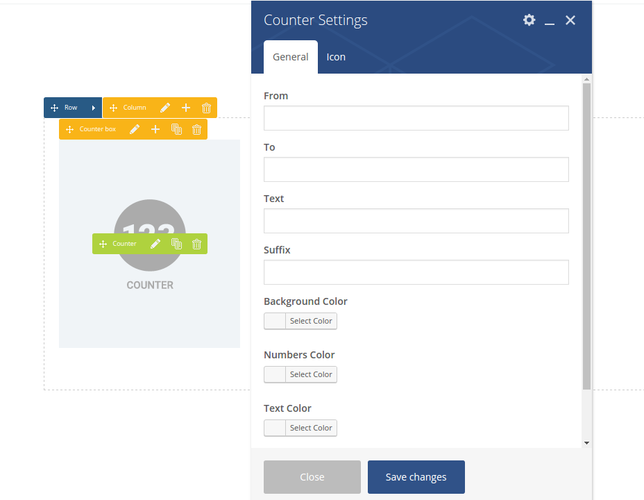
From: starting number to start counting animation, for example 0
To: final number to finish counting animation, for example 100
Text: title to be displayed under the number
Suffix: you can use it to display some symbol or unit for the numbers
Background Color: select background color for your counter element
Numbers Color: select font color for numbers
Text Color: select font color for title / text
URL (Link): you can link one counter element by defining a link here
To set some icon for your counter element, click on „Icon“ Tab above:
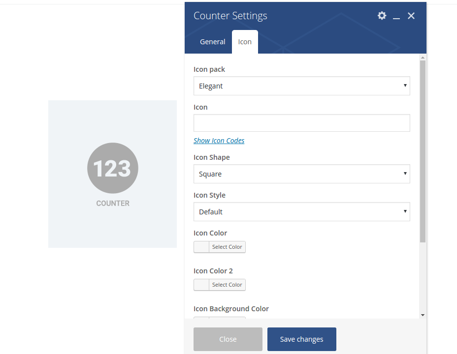
Here you have all same settings as in „Icon“ shortcode (explained above)
TOGGLES & ACCORDION
Accordions are useful to publish different additional content divided or grouped in different sections. In this way you can publish a lot of information in compact form, not blowing out the size of your page and attract the visitor’s attention on some special points in your article.
In order to insert tabs in your content click on Accordions shortcode. This element is located in „Content“ tab of Visual Composer

Your accordion will be immediately added to your page. Now you can start editing its settings. Just click on “edit” icon on your “Accordion” panel

Here you can make general accordions settings in the way as it is described for „Tabs & Tours“shortcode (see above)
In order to edit the settings of one accordion section, click on “edit” icon on your “Section” panel:
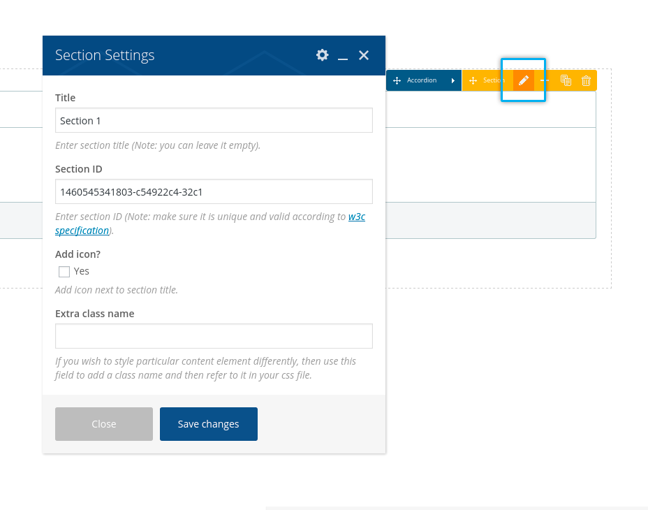
After that you are ready to insert any content in your accordion section by clicking on “plus” symbol on the appropriate tab.

DROPCAPS
Use Dropcap shortocode to insert a dropcap:

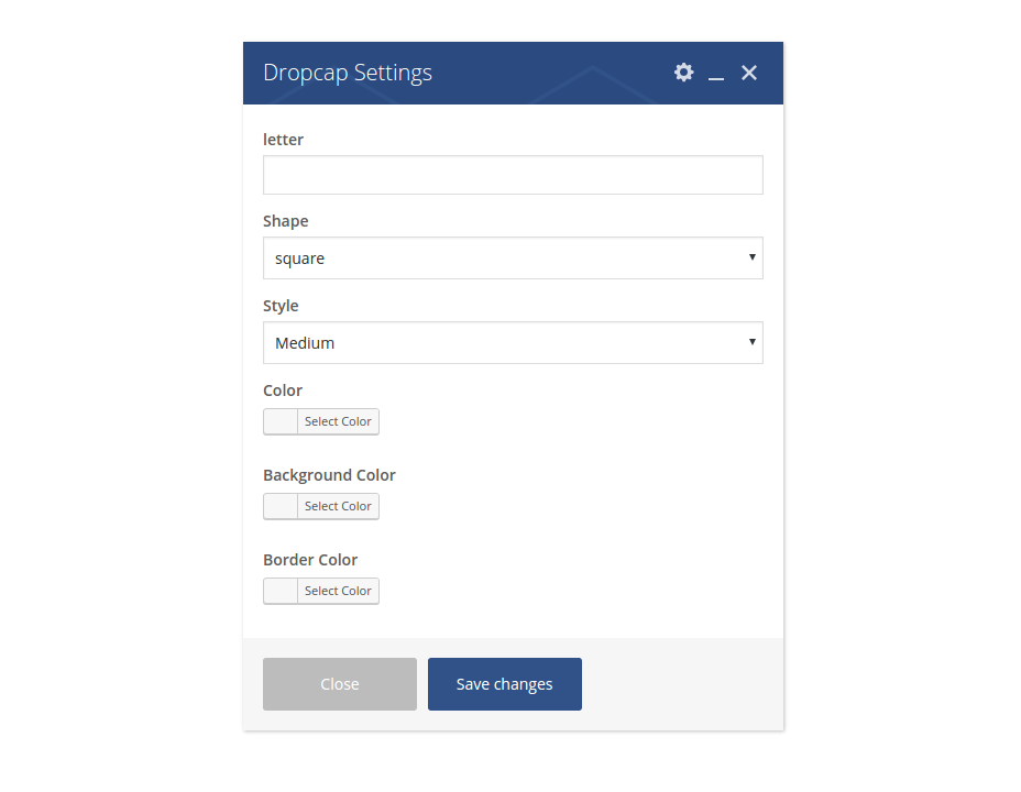
Letter: enter the symbol (number, letter etc.) for your dropcap
Shape: select the shape of your dropcap
Style: select the style of your dropcap
Color: use this option to customize default font color of your dropcap
Border Color: use this option to customize default border color of your dropcap
Background Color: use this option to customize default background color of your dropcap
QUOTED TEXT

To insert a quoted text in your page use Quoted Text shortcode:
Content: select the style for displaying your quoted text
VIDEOS
In Magna you can easily insert your video media at any position in your main content or in widgets – anywhere you wish. You can choose to use a youtube, vimeo or self-hosted video. You can set the size of video container and choose the border/frame you wish
YOUTUBE & VIMEO VIDEO
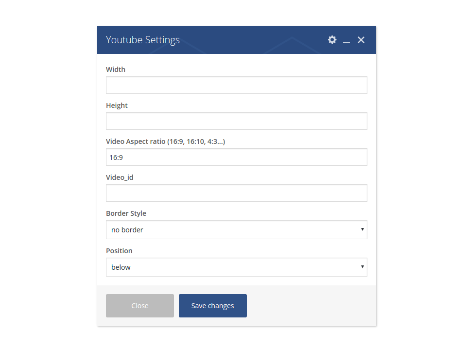
Width: Video width in pixels
Height: Video height in pixels
Video Aspect Ratio: here you can define the aspect ration for this video
Video_id: Youtube video ID something like Js9Z8UQAA4E. You can find out the video ID in youtube URL address
Border Style: set the border/frame style for your video on the page.
Position: set the position of your video in your content
SELF-HOSTED VIDEO
In case of self-hosted html5 video, in addition to the general video settings as described for youtube & vimeo, you have following options:
Height: Video height in pixels
Video URL in mp4 or flv format: Select your video from media library or type in the URL address of the video
Poster Image: Select the preview/cover image for your video from media library
Style: set the border/frame style for your video on the page.
Position: set the position of your video in your content
CLIENTS
See detailed description of clients in Chapter „Clients“
To insert clients overview in your page content use Clients shortcode:

To select clients sets to display, click on „Select Client Sets“ and activate corresponsing checkboxes.
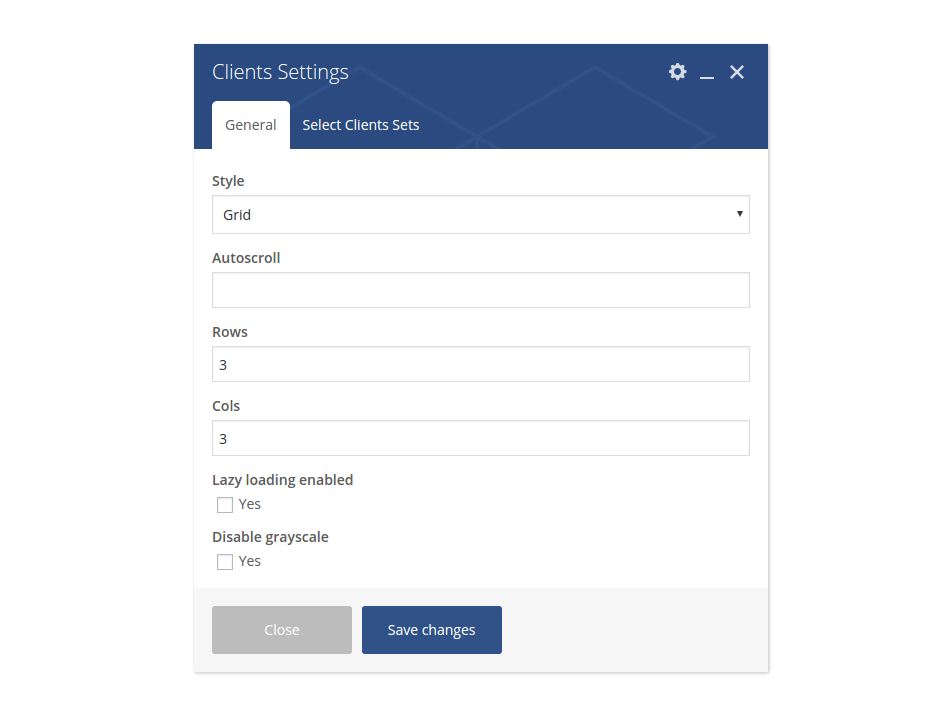
Style: choose whether to show your clients as grid or as slider/carousel
Autoscroll: here you can enable autoscroll and define autoscroll speed in milliseconds
Rows: in case you have selected “grid” for displaying your clients, here you can select number of rows for this grid
Columns: in case you have selected “grid” for displaying your clients, here you can select number of columns for this grid
DIAGRAMS
Use this shortcode to insert diagrams in your content:

Title: defines the title of your diagram
Summary: defines the summary text for your diagram
Type: choose the type of diagram to be displayed – lines/bars or circles.
Content: here you can edit the conten of your diagram by editing its shortcode
{"title":"Skill1","amount":"70","color":"#ff0000"}

{"title":"Skill2","amount":"70","color":"#ffff00"}

{"title":"Skill3","amount":"70","color":"#ff00ff"}

{"title":"Skill4","amount":"70","color":"#f0f0f0"}
- attribute “title” inside of tag [skill] defines the label/title of this parameter/skill
- attribute “color” defines the color whioch should be used in diagram to represent this parameter/skill
- attribute “amount” defines the value in percent of this parameter/skill
Style: choose one of three pre-made styles of displaying horizontal (line) diagrams
DEFINING DEFAULT SIDEBARS
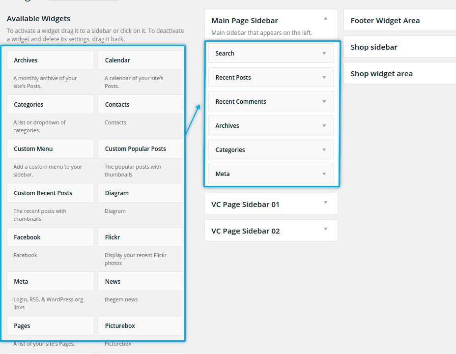
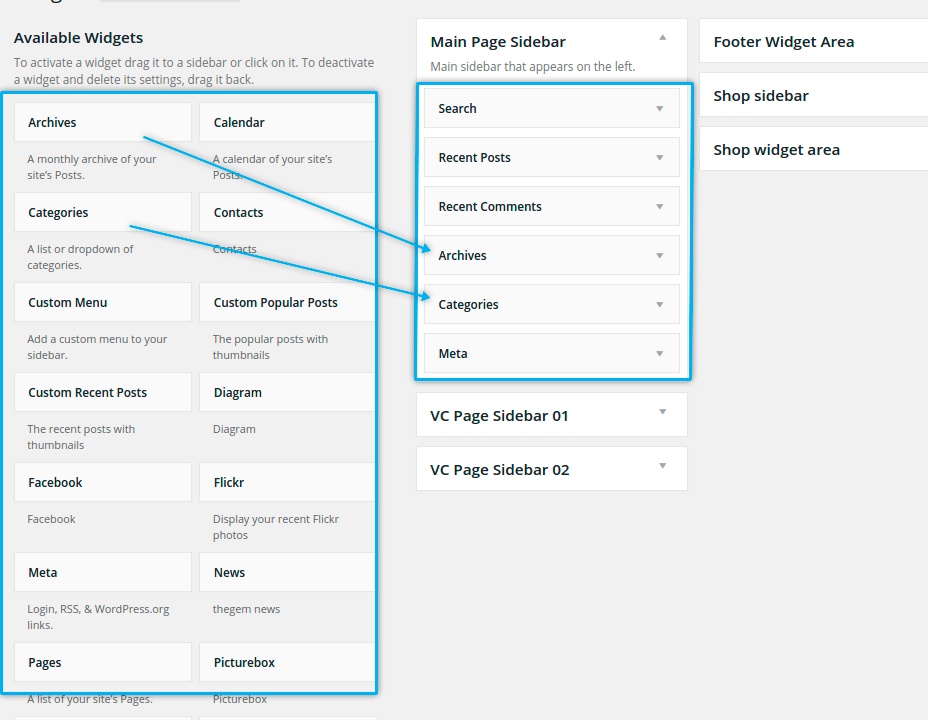
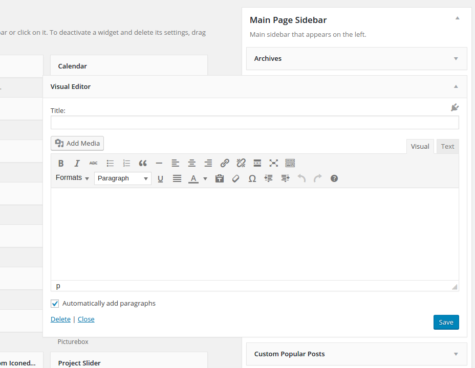
To define default widgets for your page sidebars, go to Appearance➜ Widgets.
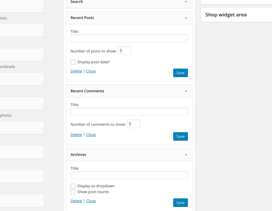
To the left you can see the big panel Available Widgets – all of these widgets you can use on your pages in sidebars (For description of widgets see chapter Widgets). To the right you see four sidebar panels – Main Page Sidebar, VC Page Sidebars and Footer Widget Sidebar. Now you can start filling your sidebars with the desired widgets – simply drag and drop the widget of your choice from Available Widgets to Page Sidebar (or if you fill your widgetised footer – to Footer Widget Area) panel. Now all the widgets you have dragged to your sidebar panels are automatically available in all default sidebars you have added in your pages.
CUSTOMIZING PAGE SIDEBARS
if you want to use a customized sidebar on your page, simply use the settings in Page Widgets panel in the page or portfolio item page. Here you should select Customize (is selected by default if you create new page) and then simply drag-and-drop any widgets of your choice from Available Widgets panel to the Sidebar panel. After setting up / filling your widgets don’t forget to click on [save] at the bottom of each widget to save your widget settings for this customized sidebar! For detailed description of all available widgets see chapter Widgets.
ADDING SIDEBARS
To add page sidebar, go to „Page Sidebar“ in your page options and select position of your sidebar: left or right. Additionally, if you wish to make your sidebar sticky, activate „Sticky Sidebar“ checkbox.
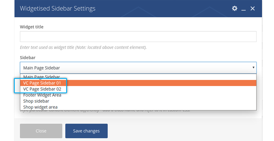
If you wish to add several sidebars to your page, you can use „Widgetised Sidebar“ shortcode in visual composer. Here you can just choose, which sidebar you want to use and where on yor page.
VISUAL EDITOR
This is a full-functional WYSIWYG Editor you can use to create some information boxes in the sidebar of your pages. As in any richt text editor, you can use any formatting or any media content you wish as well as all of the Magna shortcodes.
TEXT
Text is a simple textbox/infobox you can use to highlight some brief facts / information for you page article. Here you don’t have any editor for formatting your text – you can do it only via HTML code.
TEAMS
If you wish to show your team persons in the sidebar on some pages, use this widget. Just select one or multiple team sets by clicking on checkboxes. If you have several persons in the set, they will be shown on the page with a fading in / fading out effects. You can define autoscroll speed in milliseconds. For details concerning the adding and grouping your team members see chapter Team.
TESTIMONIALS
Just like your team members, you can show testimonials of your customers in the page sidebar. Just select one or multiple testimonial sets by clicking on checkboxes. If you have several testimonials in the set, they will be shown on the page with a fading in / fading out effects. In Magna there are two different styles of displaying testimonials in sidebar; you can choose between them in selectbox “Style”. Also you can define autoscroll speed in milliseconds.
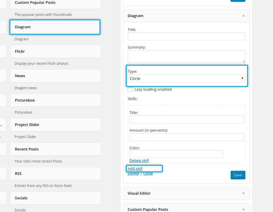
DIAGRAM
Diagrams are essential for demonstrating any kind of skills, developments, shares & ratios. Magna has a built-in widget for displaying two different kinds of diagrams: bars & circles. Bar diagrams are animated and circle diagrams are interactive on mouse-over:
- Type: here you choose what kind of diagram you would like to show – lines/bars or circles.
- Skills: in this block you define one digram’s value, its label and color.
- Add Skill: in order to add one more value to your diagram click on “Add Skill” and fill in the appropriate fields.
Display your recent tweets in the page sidebar. To enable this widget you should first create your twitter app for your website here
HTTP://DEV.TWITTER.COM/APPS
After creating and enablng your twitter app, type the following values in the widget settings to activate this widget: Consumer Key, Consumer Secret, Access Token, Access Token Secret, Twitter ID.
In the field Number of Tweets you can define the number of recent tweets you’d like to show in your sidebar.
CUSTOM RECENT POSTS / POPULAR POSTS
Show your recent or most popular blog posts in the sidebar – just select the number of posts to be shown in the widget box.
MAILCHIMP SIGNUP
Adds the newsletter signup form to your sidebar
PORTFOLIOS
WHAT IS PORTFOLIO
Portfolios are very useful custom post types in Magna, aimed to create and to highlight special content, different to usual pages and posts. Portfolios can be used to publish / demonstrate:
Portfolio can help you to emphasize the results of your company’s activities in some projects or to inform your customers about the successfull stories / case studies you have gained with your business by providing your services:
- you can describe, what kind of a project you have realized
- you can insert image galleries with some project outtakes/results
- you can add the project description, focusing on your skills and provided services
- you can publish media content like videos, showing your customers the development of the project
- you can introduce the development team, responsible for this project etc…
In the same way as projects and case studies you can use portfolios to highlight the products and services your company provides to customers. You can create the product descriptions (portfolio items) and structure it in different product groups / categories (portfolio sets), which than can be used in navigation or product filter.
Don’t waste time of your customers and show them what you can – just with one click! Portfolios give you the possibility to publish different media types and make it accessible in beautiful overviews. Layers with videos from youtube, vimeo, your own hosted videos or fullsize images in stylish lightboxes – all this can be done using different portfolio types.
Or you can use portfolios to give your website visitors the better overview about your articles, pages, posts. Different layouts of portfolio overviews in Magna are very helpful for creating comfortable navigation across your website content
In order to understand how it works it is very important to understand the nature of portfolio.
Portfolio consists of two major parts:
- Portfolio items
- Portfolio sets
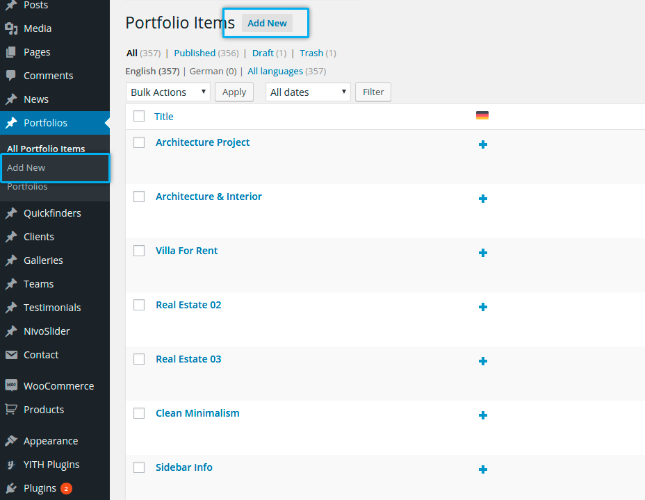
PORTFOLIO ITEMS
Portfolio items are custom posts. One portfolio item is like one page or one blog post – it is a single post used specially for representing your work, products, projects etc.
ADDING NEW ITEM
You can create new portfolio item using leftside wordpress menu or the button above the list of existing portfolio items (Add New Item)
TYPES OF PORTFOLIO ITEMS
There are different types of portfolio items you can use to demonstrate / publish your content:
This is a custom single post for describing / showing your project, case study, product etc. It works like a page: you can put the title, decription and images of your project, insert galleries, slideshows, related projects and so on. After creating the new portfolio item this type is selected per default.
Your portfolio item could be a link to some other page on your website – it is useful for redirecting the visitor from some overviews to specific articles, not situated in the same website category as the overview.
You can use any external URL to redirect your visitor to another website. It is useful for demonstrating the created projects on the web, or some galleries on external website or maybe some press releases in online magazines.
Use this in order to show your visitors some full-size images per one click. In this way you can use portfolio like a gallery – in an overview your visitors see a small thumbnails of the images, clicking on that opens the lightbox layer with original full-size image.
If you want to show your visitors some youtube videos just onpage, with one click – use this type of portfolio item. By clicking on this item in portfolio overview the vistor gets a lightbox layer with youtibe video – immediately on your website’s page, without redirecting to youtube website.
Use it in the same way, as YouTube Video type of portfolio item.
If you save all you videos directly in wordpress media library and want to stream it directly from here, use this type of portfolio item. In this case, just like in case of youtube or vimeo video, your visitor wioll get a layer with video player, streaming video content directly from your media library
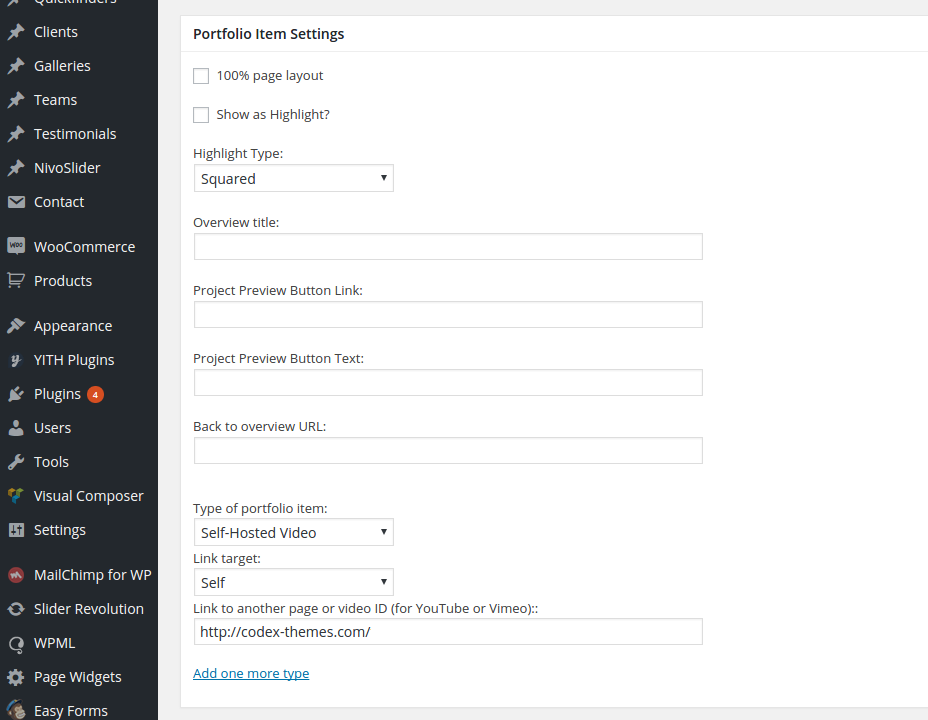
In order to define the type of portfolio item use the select box Type of portfolio item in the panel General Settings in portfolio item
- Portfolio Page: you can start editing your page by entering your content and choosing the page options (see description below)
- Internal Link: use the field Link to another page or video ID to enter the relative URL (without the domain name, for example /content/page.html) of the page you would like to redirect your visitor to
- Full-Size Image: in this case the fullsize image of your Featured Image would be shown in the lightbox layer
- YouTube Video: use the field Link to another page or video ID to enter the YouTube Video ID (like for example YE7VzlLtp-4, you can find it in the youtube video’s URL) of the youtube video you like to show
- Vimeo Video: use the field Link to another page or video ID to enter the Video ID (like for example 1084537, you can find it in the vimeo video’s URL) of the vimeo video you like to show
- Self-Hosted Video: use the field Link to another page or video ID to enter the relative URL of the video in your media library. You can find the URL of the video, if you go in media library, choose the video and take a look at its properties
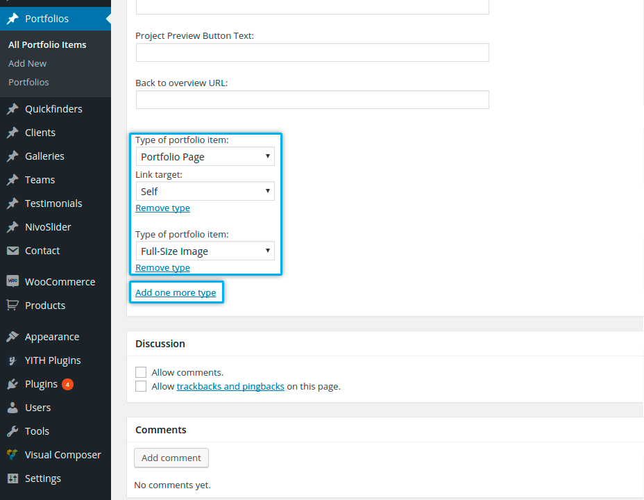
more type”
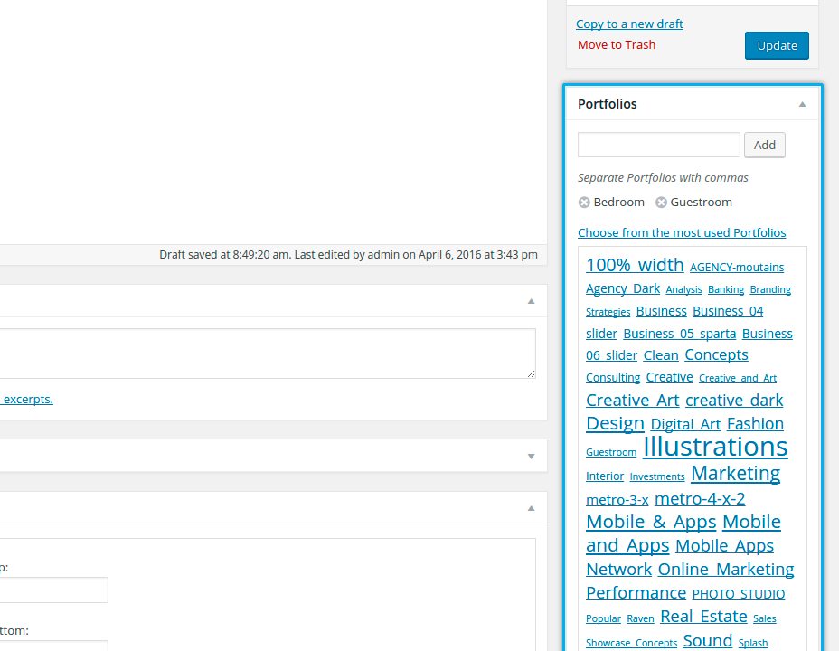
ASSIGNING PORTFOLIO SETS
In order to define, to which portfolio set the portfolio item belongs, you should select the
corresponding portfolio sets in the panel Sets to the right.
You can make a multiple choice if your portfolio item suits to multiple different portfolio sets.
Of course you can create a new portfolio set from here by clicking on Add new set.
DEFINING SORT ORDER
It is possible to define the sort order of the portfolio item in one set by entering the order number in the field Sort Order in the right panel
Notice: if your portfolio item belongs to multiple portfolio sets, in all of them it will be on the same order position as entered in this field.
PORTFOLIO PAGE: CONTENT ELEMENTS & OPTIONS
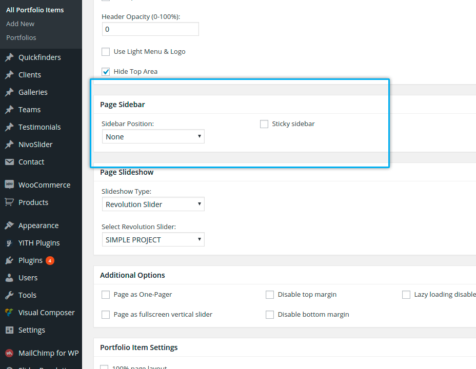
generally portfolio page has all the same layout & template settings as a usual page. To activate a sidebar on your portfolio page, just select whoch sidebar position (left or right) you would like to have in the “Page Sidebar” setting
Just like by any page you can start editing your portfolio page by entering the title and main text in the WYSIWYG editor. You have an option to use Visual Composer (backend and / or frontend editor) to build your portfolio page with any Magna’s shortcodes (see description of shortcodes in chapter
“Shortcodes”).
- 100% page layout: by activating this checkbox you define 100% width layout for your portfolio
page - Show as Highlight: this option is useful for making packery style of portfolio overviews. Packery overview consists of different portfolio items (their featured images), which are highlighted – they have a bigger size (double size) compared with the normal portfolio items. If you wish to display your portfolio item as highlighted (double size featured images), you can activate this option. Next, in the selectbox „Highlight Type“ you can choose, which orientation your highlighted item (its featured image) should have. „Squared“ means the featured image will have double width and double height of the normal item’s image. „Horizontal“ means your image will have a double width, and „vertical“ – double height of the normal item’s featured image in the portfolio overview.
- Overview title: here you can enter the alternative title of your portfolio page to be displayed in portfolio overviews (grids & sliders) – this could be useful if your portfolio page has a very long title, which doesn’t suit in to the item box in portolio overview.
- Project Preview Button Link: if you wish to add some project preview button on your project page, here you can enter the URL where the button should link. Note: this button will be used also in „one column“ style of portfolio overview.
- Project Preview Button Text: here you can enter the title of your button
- Back to overview URL: here you can define the url of the overview page with your portfolio sets, where this icon on portfolio page should link

- Type of portfolio item: here you can define the type of portfolio item (see description
above)
PORTFOLIO SETS
Portfolio Sets are the categories or groups of portfolio items and are useful to structure your portfolio items. In this way you can create different scopes of your activities as different portfolio sets and assign your projects/products/case studies/reviews/media content (say your portfolio items) to these different activity scopes.
ADDING NEW PORTFOLIO SET
You can create new portfolio set by going in Portfolios ➜ Sets on the leftside wordpress menu.
After that you are already on the page of creating the new portfolio set. On the right side in the table you see the list of all existing portfolio sets – you can edit their properties by clicking on the title of the corresponding portfolio set.
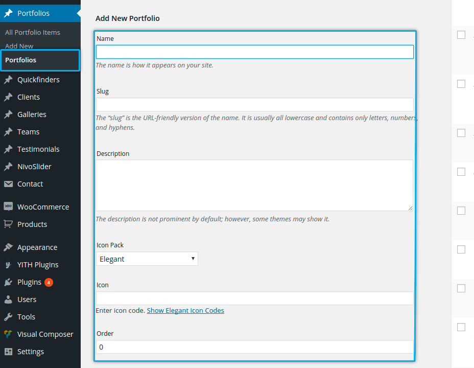
Name
enter here the name of your portfolio set. This name will be used in the list of available portfolio sets in portfolio item (see above) Notice: this name will be also used as a filter name in portfolio overviews – in the case you publish your portfolio overview with the filter above.
Slug
slug is a userfriendly version of the name. Slug is important, because it is used in the shortcode Portfolio. So don’t forget to fill it if you are creating new portfolio set.
Description
just a brief description of your set, usually it is not needed
Icon
if you want to decorate your filter in portfolio overviews with some handsome icons, just click on Show Icon Codes, choose your icon, copy its code and paste it in Icon field.
Order
here you can set the sort order position of your portfolio set. With this field you can make sorting of your portfolio sets.
That’s all – don’t forget to submit your changes by clicking on Add New Set
PUBLISHING PORTFOLIOS
Inserting portfolios in a page is very simple. Use Visual Composer and „Portfolios“ shortcodes as described in details in chapter „Shortcodes – Portfolios“
CUSTOMIZING PORTFOLIO STYLES
Just like all other elements of Magna theme you can easily customize your portfolio styles using the theme option panel of Magna. To open the admin panel go to Appearance ➜ Theme Options.
FONTS
You can customize the fonts which are used to display the title text and description text of one portfolio item in portfolio overviews. To do this go to “Fonts” and use following panels:
Portfolio Title Font
Portfolio Description Font
Here you can choose standard fonts as well as a plenty of google fonts and their styles
COLORS
In order to customize all main portfolio colors navigate to “Colors” and open “Portfolio Colors” panel.
Following color settings could be customize:
Portfolio Overview Title Text
Color of portfolio item’s title text in overviews (inside content).
Portfolio Overview Description Text
Color of portfolio item’s description text in overviews (inside content).
PAGINATION COLORS
To change the color of pager buttons used for navigation through portfolio overviews inside content, go to “Colors” and open “Bullets, Icons, Dropcaps & Pagination” panel. Then use following options:
GALLERIES & SLIDERSHOWS
Galleries are essential part of any business website. They give the possibility to illustrate some topics or information with a set of images, grouped together in a nice overviews of thumbnails with fullsize on-click lightboxes. In Magna there are different kinds of galleries you can use on your pages in a flexible way.
CREATING NEW GALLERY
STEP 1
To add new gallery go to “Galleries” in the leftside WP navigation and choose “Add New Gallery”
(1).
Now you should enter the title of your gallery (2) and then click on “Add images” (3) in order to add images to your gallery.
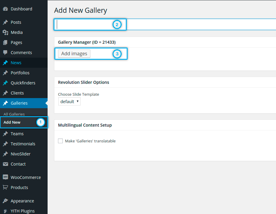
ADDING IMAGES TO A GALLERY / SORTING / EDITING
Click on “Add Images” button and new layer with media library will appear. Now you can choose images from your media library or upload them from your computer. Note: you can choose multiple images by holding “Shift” or “Control” button on your keyboard and clicking on appropriate images. Also in the same way you can choose images for multiple upload from your computer.
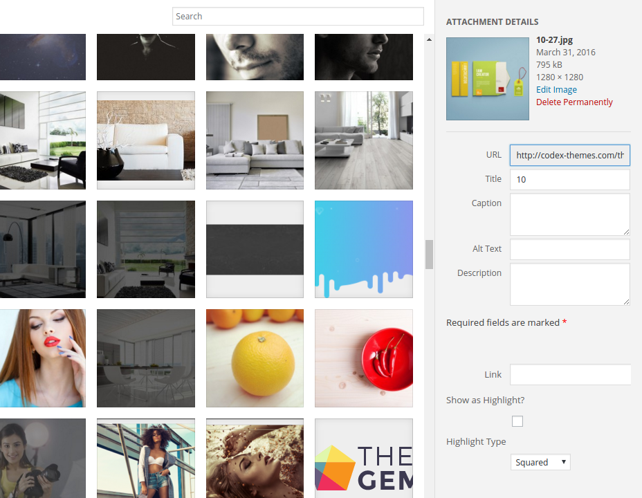
In the right sidebar in media layer you can edit different image properties. Here you can enter the meta information (title, alt).
- If you want a title to be appeared on your image in the gallery, use the field “Caption“.
- If you want to insert a short description to your image to be appeared in the gallery, use the field “Description“.
- Show as Highlight: this option is useful for making packery style of galleries. This gallery consists of different images, which are highlighted – they have a bigger size (double size) compared with the normal images. If you wish to display your image as highlighted (double size featured images), you can activate this option. Next, in the selectbox „Highlight Type“ you can choose, which orientation your highlighted image should have. „Squared“ means the image will have double width and double height of the normal image. „Horizontal“ means your image will have a double width, and „vertical“ – double height of the normal image in the gallery
- By clicking on “Edit image” button you have a possibility to resize, crop, rotate, move your image or create a custom thumbnail.
After making your selection and editing image properties click on “Add images”. After that the selected images will be added to your gallery.
Now you have the possibility to define the sort order of your images in the gallery just per drag-and-drop:
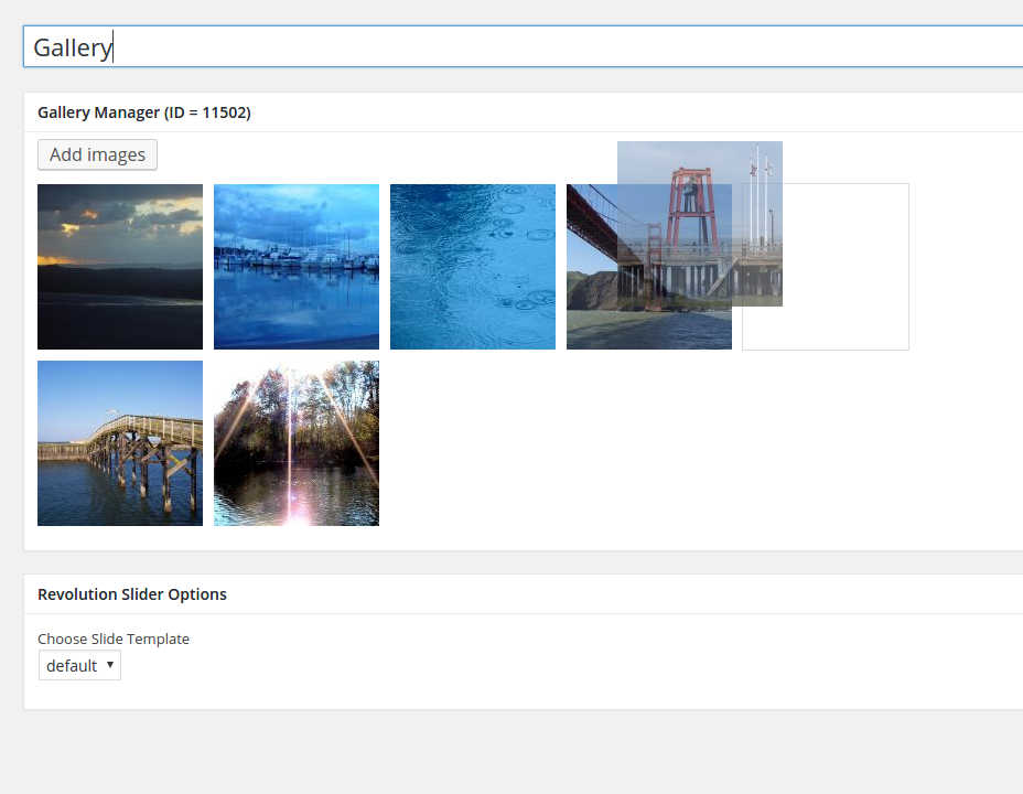
If you want to remove some specific images from your gallery, click on “X” icon in the top right corner of the image.
If you want to edit properties of specific image from your gallery, just click on it. New tab will be opened, where you can edit image properties. After editing just save your changes and close this tab.
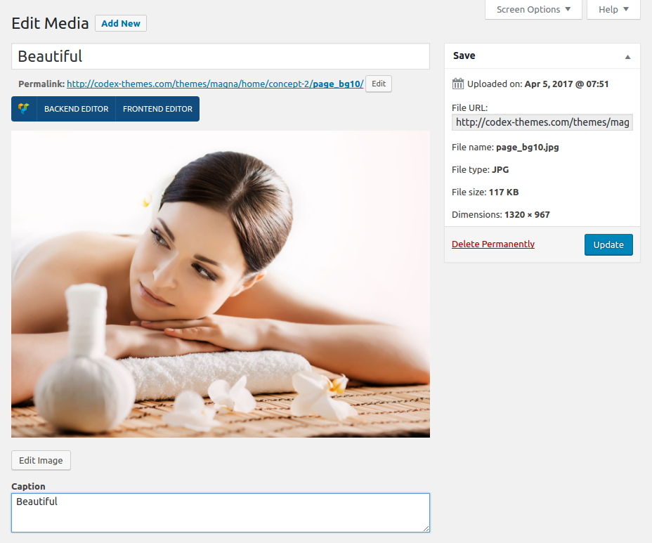
SAVING YOUR GALLERY
When you are done creating and editing your new gallery, click on “Publish” button in the right sidebar. Your gallery will be saved and image thumbnails will be created and shown instead of original scaled images.
PUBLISHING GALLERIES ON A PAGE
Inserting galleries in a page is very simple. Use Visual Composer and „Styled Gallery“ shortcode as described in details in chapter
„Shortcodes – Styled Gallery“
CUSTOMIZING GALLERY STYLES
You can easily customize your galleries styles using the theme option panel of Magna (Admin Panel). To open the admin panel go to Appearance ➜ Theme Options .
FONTS
You can customize the fonts which are used to display the title text and description text on the images inside your gallery. To do this go to “Fonts” and use following panels:
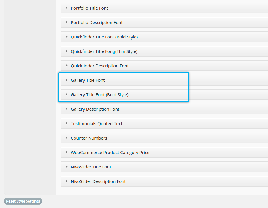
Gallery Title Font – Note: in Magna there are two styles for gallery titles – Bold and Thin (depending on the chosen hover)
Gallery Description Font
COLORS
In order to customize all main gallery colors navigate to “Colors” and open “Slideshow, Gallery And Image Box Colors” panel.
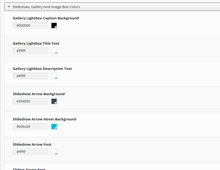
SLIDESHOWS
Slideshows are useful for teasing some special informations, highlights, promotions and activities using nice and attractive key visuals just in the header part of your page. For example you can use the slideshow on your homepage to immediately catch your visitors attention and to guide them directly to the needed information / pages. In slideshows you can combine the visual message (using some attractive images) with text message (using some significant slogans) and link it with the pages you like.
Magna is delivered with three different types of sliders
Gallery Title Font – Note: in Magna there are two styles for gallery titles – Bold and Thin (depending on the chosen hover)
Gallery Description Font
SLIDER REVOLUTION
Premium and most popular slider for wordpress created by Themepunch. You can find the documentation on how to set up and use this slider https://www.themepunch.com/revslider-doc/slider-revolution-documentation/
After creating a slider / slideshow with Slider Revolution, you have two options on how to publish / insert it in your page.
Option 1: Publish using Page Options
To insert a slider to the top of your page, use „Page Slideshow“ setting in page options:
Gallery Title Font – Note: in Magna there are two styles for gallery titles – Bold and Thin (depending on the chosen hover)
Gallery Description Font
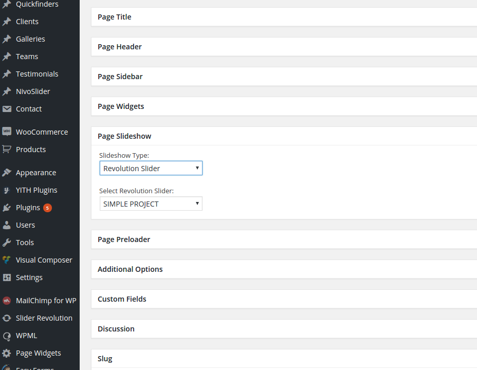
First select „Revolution Slider“ in „Slideshow Type“ selectbox. After that you can choose thedesired slider from „Select Revolution Slider“ selectbox.
Option 2: Publish using shortcode
Another way ist to use „Revolution Slider“ shortcode with Visual Composer. In this way you can insert your slider on any position in content of your page.

LAYERSLIDER
LayerSlider is a premium wordpress slider plugin, created by Kreatura Media. You can find the documentation on how to set up and use this slider in the LayerSlider WP admin area. Note, that this documentation is context-based, so help topics change depending on the layeslider admin page you have selected. You can access diffenrent help topics with the “Help” menu item on the top right corner of the page.
After creating a slider / slideshow with Slider Revolution, you have two options on how to publish / insert it in your page.
Option 1: Publish using Page Options
To insert a slider to the top of your page, use „Page Slideshow“ setting in page options:
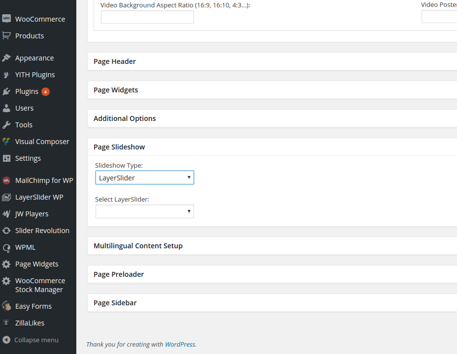
First select „Layer Slider“ in „Slideshow Type“ selectbox. After that you can choose the desiredslider from „Select Layer Slider“ selectbox.
Option 2: Publish using shortcode
Another way ist to use „Layer Slider“ shortcode with Visual Composer. In this way you can insert your slider on any position in content of your page.
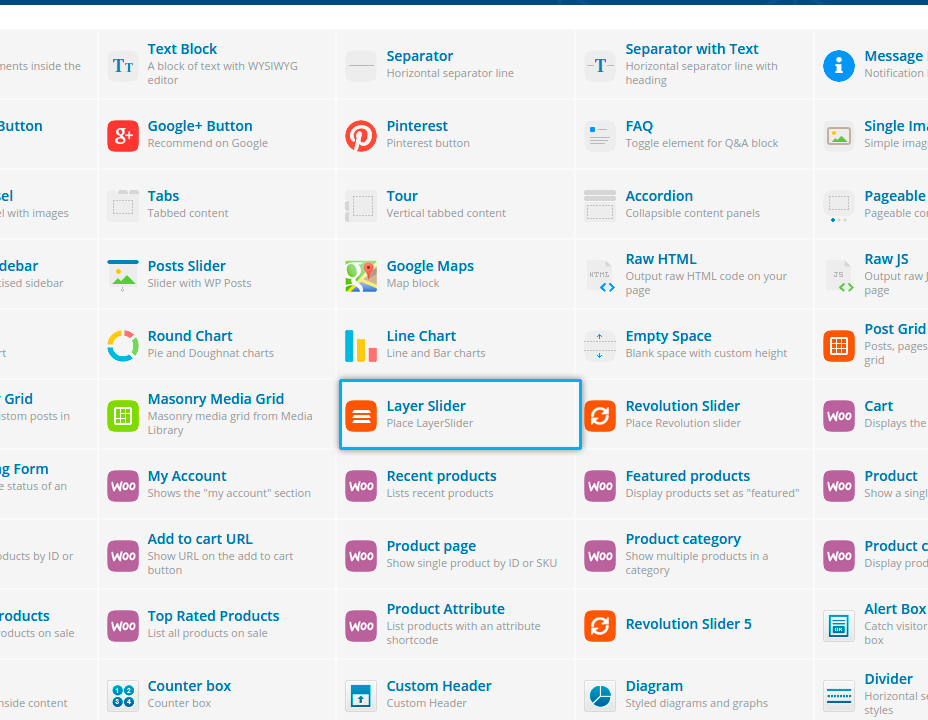
NIVOSLIDER
The advantage of using such premium sliders like Slider Revolution & LayerSlider is a power of visual effects it brings in your slideshow. However it is a more complicated in understanding, setting up and managing as more simple Nivoslider. If you need to make a nice slideshow in just five simple
steps, you can use this slider.
Nivoslider is a built-in slider plugin of Magna. It consists of two major elements:
Slides
Slideshows
You can create new slideshow by going in Slideshows ➜ Slideshow on the leftside wordpress menu. After that you are already on the page of creating the new slideshow. On the right side in thetable you see the list of all existing slideshows – you can edit their properties by clicking on the title of the
corresponding slideshow. By editing the slideshow you have following fields:
Name
enter here the name of your slideshow. This name will be used in the list of available slideshows in slides and in page options (see above)
Slug
slug is a userfriendly version of the name.
Description
just a brief description of your set, usually it is not needed
After clicking on “Add New Slideshow” your new slideshow will be saved.
STEP 2. ADDING NEW SLIDE
You can create new slide using leftside wordpress menu or the button above the list of existingslides.
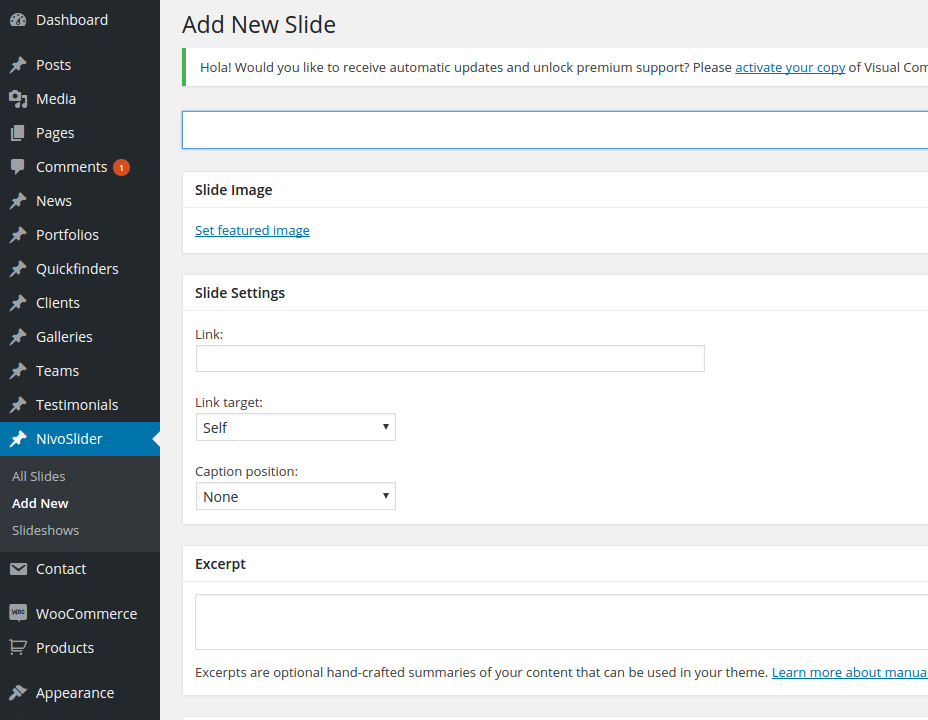
By creating a new slide you should fill following content fields:
Title
This is the title of the slide, which could be shown on the slide in slideshow
Excerpt
This is a description text, which could be shown on the slide under the title in slideshow
Slide Settings: Slide Link
Here you can link your slide with some internal or external page / url
Slide Settings: Slide text position
Here you define, whether the text (title and excerpt) should be shown on your slide and if yes – in which position:
- None: no text will be displayed on the slide
- Left: Text will be displayed on the leftside of the slide image
- Right: Text will be displayed on the rightside of the slide image
Featured Image
Here you select the image for your slide via Media Library
Here you select the slideshow, where this slides belong. You can assign multiple slideshows to the slide, so it will be shown in different slideshows. Of course you can create a new slideshow just from here by simply clicking on “Add new slideshow”
It is possible to define the sort order of the slide in a slideshow by entering the order number in the field “Sort Order” in the right panel Notice: if your slide belongs to multiple slideshows, in all of them it will be on the same order position as entered in this field.
You can insert a slideshow on the page using the page options under “Page Slideshow” panel.
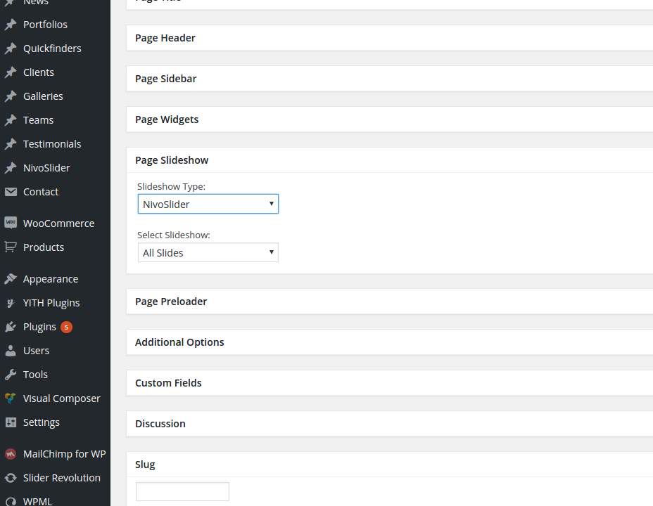
Slideshow Type: select Nivoslider as the slider type you would like to insert on your page
Select Slideshow: after that select the slideshow you have created previously.
You can define different parameters like change effect, visibility time etc. for you slideshow using the theme option panel of Magna (Admin Panel). To open the admin panel go to Appearance ➜ Theme Options. Here you should select “NivoSlider Options” to get the slideshow settings. You
can define following parameters:
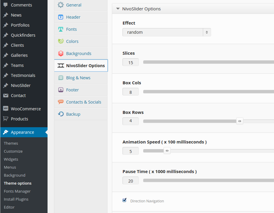
Effect
choose an effect you would like to use for sliding / image changes
Slices
choose number of slices for slices effects
Box Cols & Box Rows
choose number of columns and rows for box effects
Animation Speed ( x 100 milliseconds )
animation speed for slide effects
Pause Time ( x 1000 milliseconds )
for how long one slide will be shown before chaning to another
Direction Navigation
arrows will be used as navigation symbols
Control Navigation
small radio buttons in slide footer will be shown as navigation symbols
You can easily customize your slideshow styles using the theme option panel of Magna (AdminPanel). To open the admin panel go to Appearance ➜ Theme Options.
You can customize the fonts which are used to display the title text and excerpt/description text on the slide images in your slideshow . To do this go to “Fonts” and use following panels:
NivoSlider Title Font
NivoSlider Description Font
In order to customize slideshow text colors use settings in style.css of Magna (to find here: wp-content\themes\Magna\style.css)
Search for following strings which define the colors for title and description on a slide:
.slideshow .nivocaption .title {

backgroundcolor: #000;

backgroundcolor: rgba(0, 18, 28, 0.77);

color: #f1f5f8;

}

.slideshow .nivocaption .description {

backgroundcolor: #fff;

backgroundcolor: rgba(241, 245, 248, 0.77);

color: #0b1217;

}
CLIENTS, TEAMS, TESTIMONIALS
CLIENTS
“Clients” are useful to show your “Hall Of Fame”: Clients/customers, for whom you have made projects, provided services etc. The usual way to do this is to show an overview of your customers logos/identities.
However you can alos use any images to depict your customers – logos, icons, photos etc.
Like Quickfinders, Clients consist of two major parts:
Clients
Sets
ADDING NEW CLIENT
“Clients” are useful to show your “Hall Of Fame”: Clients/customers, for whom you have made projects, provided services etc. The usual way to do this is to show an overview of your customers logos/identities.
However you can alos use any images to depict your customers – logos, icons, photos etc.
Like Quickfinders, Clients consist of two major parts:
Clients
Sets
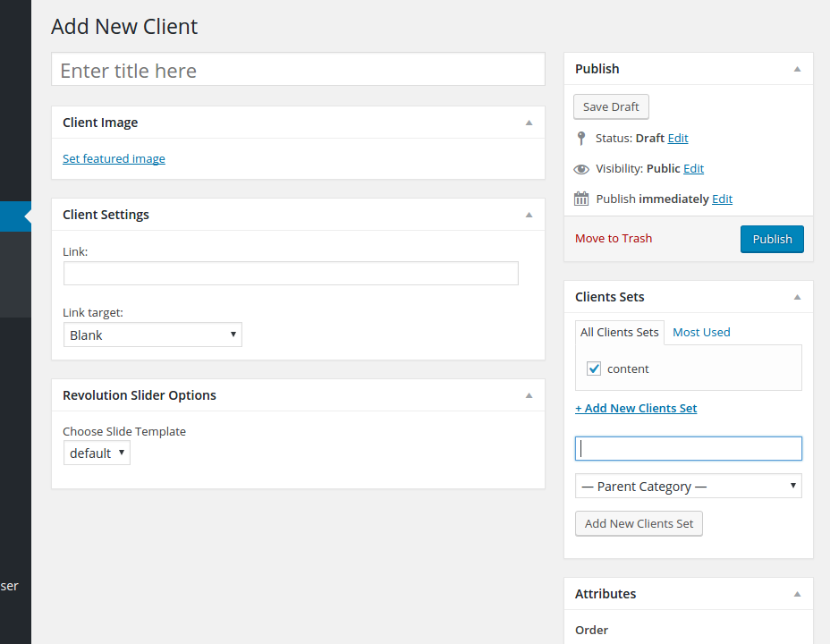
ou can create new client using leftside wordpress menu or the button above the list of existing clients. By creating a new client item you should fill following content fields:
Title
This is the name of your customer
Client Image
Here you can upload an image, depicting your customer (logo or photo)
Client Settings
Here you can enter the URL of the page, which should be associated with this Client
Clients Sets
Here you can assign the given client to some existing or new client set (see below). In order to define, to which set this client item belongs, you should select the corresponding sets in the panel “Sets” to the right. You can make a multiple choice if your client item suits to multiple different sets. Of course you can create a new client set from here by clicking on “Add new set“.
Sort Order
It is possible to define the sort order of the client item in one set by entering the order number in the field “Sort Order” in the right panel. Notice: if your client item belongs to multiple quickfinder sets, in all of them it will be on the same order position as entered in this field.
PUBLISHING CLIENTS ON A PAGE
Inserting clients in a page is very simple. Use Visual Composer and „Clients“ shortcodes as described in details in chapter „Shortcodes – Clients“
TEAM
ADDING NEW TEAM PERSON
To add new person to your teams, go to Team ➜ Add New Person in the leftside wordpress menu. You will get a page for adding the new person. Here you can define:
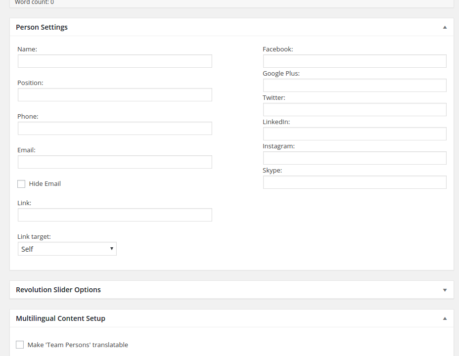
Title
it is a person’s title, which is used intern only for wordpress admin, for example in persons list
Text Editor
here you can enter some brief description or some quoted text concerning your person. This text will be displayed in one of team styles
In Person Settings you define the visible public settings, which will be displayed in person’s information on the website:
- Name: Person’s name
- Position: Position of person in your team / company
- Phone: telephone number for direct contact
- Email: email address for direct contact. If you don’t want to display the email directly onyour webpage, you can hide it by choosing “Hide Email option – in this case instead of emailaddress the link to contact will be displayed
- Link: here you can link your team person
- Social Profiles: here you can enter links to person’s social profiles
In panel Teams to the right you can select, to which teams in your company this person belongs. You can create new teams by going to “Team ➜ Sets” or directly here by clicking on “Add New Set”. You can make multiple selection if this person works in multiple teams
Featured Image is a picture of your contact person, which will be shown on the website while displaying teams. Click on “Set featured image” to select your person’s image from the media library or from your local hdd.
ADDING NEW TEAM
To add new team use Team ➜ Teams in the leftside wordpress menu. Sets are teams. Here you candefine following data:
Name
team’s name. Is used for team’s widget, where you can select teams to be displayed
Slug
slug is used in team shortcode, so be sure to fill this field properly with URL-friendly version of the
team’s name
Description
brief description of the team, is used only intern
After you are finished with filling the team’s data click on “Add New Set” and you are done – your new team will appear in the list of available teams in the right table.
PUBLISHING TEAM ON A PAGE
Inserting teams in a page is very simple. Use Visual Composer and „Teams“ shortcodes as
described in details in chapter
„Shortcodes – Teams“
TEAM WIDGET
You can also publish / display your team in a page sidebar or blog post sidebar on your website.
To activate the team widget go to “Page Sidebar” panel in page options below, choose the Team widget from the list of “Available Widgets” and rag it to the right panel “Page Sidebar”. Then open this widget “Team” by clicking on its title. Now you can fill your widget with general title -it is title of your widget, for instance “Key Accounts”. Under the general title you can select the team sets which you would like to show in your team widget. You can select multiple teams to be displayed.
When you are finished with setting up your widget, please DON’T FORGET to click on “Save” button at the widget’s bottom in order to save your content. Only after saving you widget you can publish your article.
TESTIMONIALS
To add new testimonial, go to Testimonials ➜ Add New Testimonial in the leftside wordpress menu. You will get a page for adding the new testimonial. Here you can define:
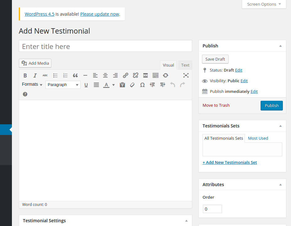
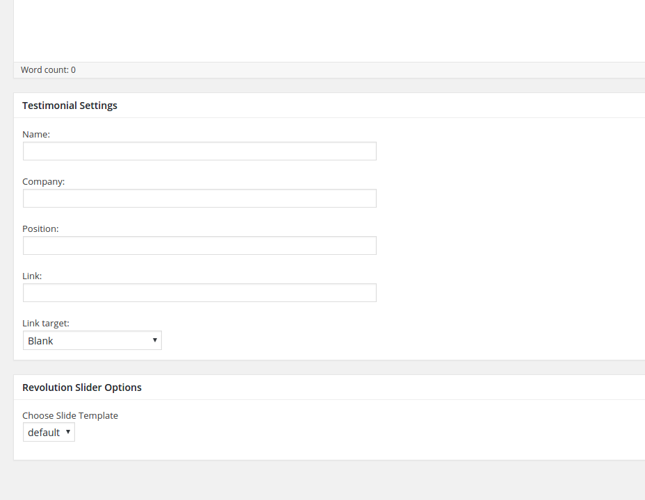
Title
it is a testimonial’s title, which is used intern only for wordpress admin, for example in testimonial lists
Text Editor
here you can enter the quoted text or brief description concerning your testimonial. It will be displayed in your testimonial on page
In Testimonial Settings you define the visible public settings, which will be displayed in
testimonial’s information on the website:
- Name: Name of the person, who has written this testimonial
- Position: Position of this person in your customer’s company
- Company: Company’s name of your customer
- Link to Company: URL of your customer’s website
In panel “Testimonial Sets” to the right you can select, to which testimonial sets this testimonial belongs. You can create new sets by going to Testimonials ➜ Sets or directly here by clicking on “Add New Set”. You can make multiple selection if this testimonial should be assigned to multiple sets.
“Featured Image” is a picture of your testimonial’s contact person, which will be shown on the
website while displaying teams.
ADDING NEW TESTIMONIAL SET
Testimonial sets are are useful to group a number of topical related testimonials in one set in order to show it on the certain website page. For example if you are editing a page with some industry specific product / service description, it would be beneficial to show a set of testimonials from this industry.
To add new testimonial set use Testimonials ➜ Sets in the leftside wordpress menu. Here you can
define following data:
Name
set’s name. Is used for testimonial widget, where you can select testimonial sets to be displayed
Slug
slug is a URL-friendly version of the sets’s name
Description
brief description of the set, is used only intern After you are finished with filling the set’s data click on “Add New Set” and you are done – your new testimonial set will apper in the list of available sets in the right table.
PUBLISHING TESTIMONIALS ON A PAGE
Inserting testimonials in a page is very simple. Use Visual Composer and „Testimonials“
shortcodes as described in details in chapter „Shortcodes –Testimonials“
TESTIMONIAL WIDGET
Just like your team members, you can show testimonials of your customers in the page sidebar. Just select one or multiple testimonial sets by clicking on checkboxes. If you have several testimonials in the set, they will be shown on the page with a fading in / fading out effects. In Magna there are two different styles of displaying testimonials in sidebar; you can choose between them in selectbox “Style”. When you are finished with setting up your widget, please DON’T FORGET to click on “Save” button at the widget’s bottom in order to save your content. Only after saving you widget you can publish your article.
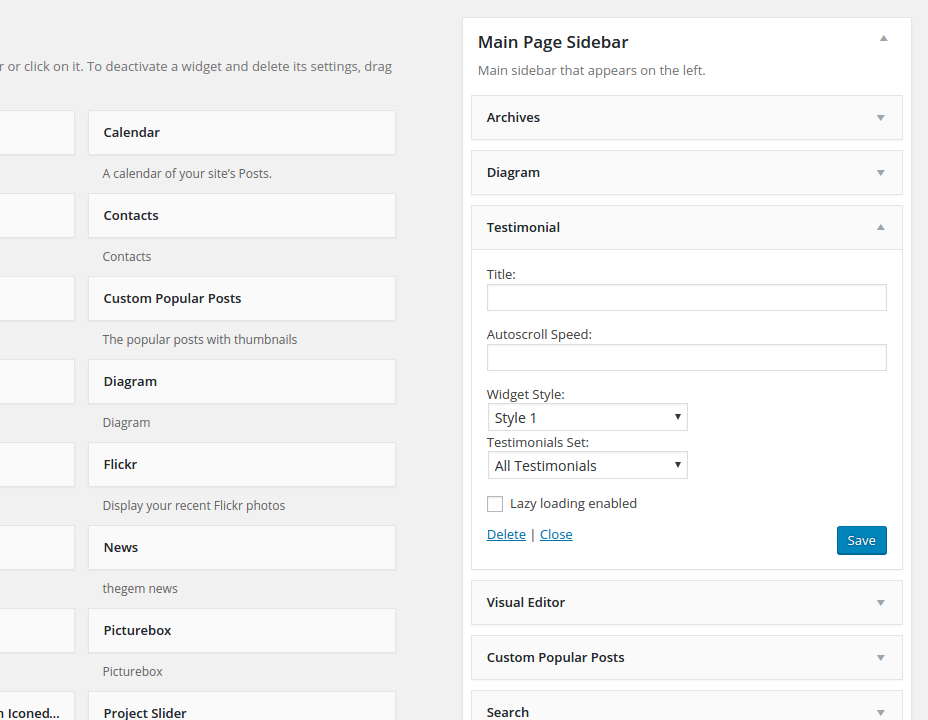
BLOG & NEWS
ADDING NEW BLOG POST
Just like in any wordpress installation you can create new blog post by choosing “Posts” and then “Add New” in leftside wordpress menu. A page for adding new blog post will open. Here you have:
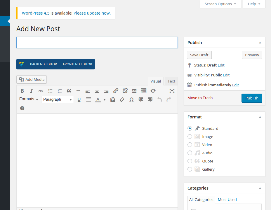
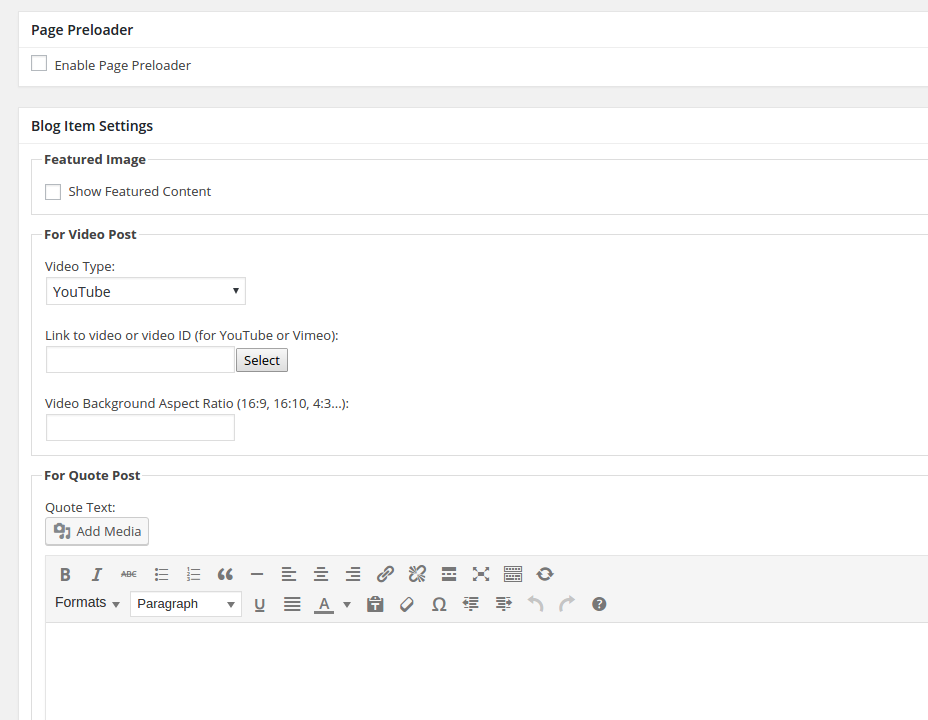
Title
Title of your blog post
Text Editor
Content of your blog post. Here you can use all of the Magna shortcodes by using Visual Composer
Blog Item Settings
- Featured Image: here you can choose if you wish to show your featured content in your post or not
this is a set of settings for video blog post. They will be applied, if you choose „Video“ in format settings to the right
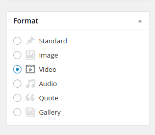
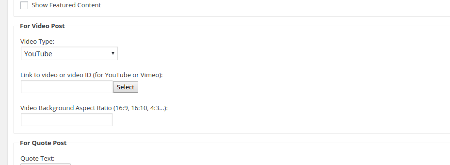
- Video Type: select the source of your video – self-hosted html5 video,
youtube or vimeo video - Link to video or video ID: here you can enter the URL to the HTML5
video or use Video ID of corresponding youtube or vimeo video - Video Background Aspect Ratio: here you can define the aspect ration
for this video
this is a set of settings for video blog post. They will be applied, if you choose„Video“ in format settings to the right
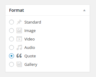
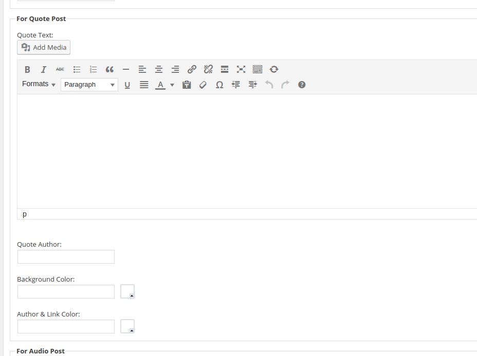
- Quote Text: you can use rich content (HTML formatting, Magna shortcodes) to create the quote in WYSIWYG editor
- Quote Author: type the author’s name here
- Background Color: define background color for this quote
- Author & Link Color: choose the font color for displaying author’s name and link here
this is a set of settings for audio blog post. They will be applied, if you choose
„Audio“ in format settings to the right
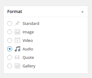
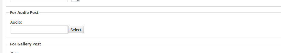
- Audio: here you can select an audio track for your audio post
this is a set of settings for gallery blog post. They will be applied, if you
choose „Gallery“ in format settings to the right
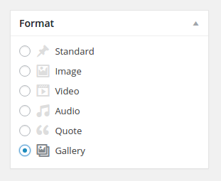
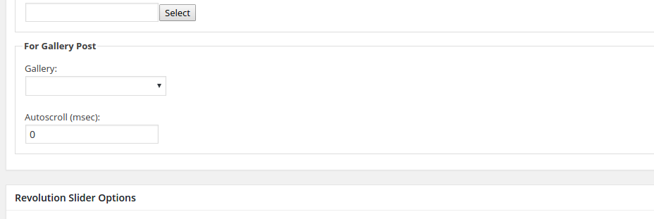
- Gallery: select the gallery which you wish to display (choose from the galleries you have created under „Galleries“ – see description above)
Here you can set multiple options for your blog post title including excerpt. It works in the same way, as in pages (see chapter „Pages -> Custom / Fancy Page Title“)
Various settings post header. Pls refer to – “Pages -> Transparent Page Header” for details.
Settings for enabling sidebar in your post. For details pls refer to – „Pages -> Enabling Sidebar“as well as „SIDEBARS & WIDGETS“
Here you can define, to which post categories belongs your post. You can add new blog categories in Posts ➜ Categories or directly here in Categories panel by clicking on “Add New Category”
In this panel you can tag your post. This feature is useful for “Tag Cloud” widget and for blog search
If you want to equip your blog post with some title image, which will appear in the list of blog posts and on the top of your blog post, use “Set featured image” to select an image from media library or to upload it from your hdd
In addition you can set if your blog post should be highlighted / emphasized in blog list by checking the option “Stick this post to the front page”.
After you are finished click on “Publish” to publish your blog post
PUBLISHING BLOG LIST ON A PAGE
Inserting blog lists in a page is very simple. Use Visual Composer and „News & Blog“ shortcodes as described in details in chapter „Shortcodes – News & Blog“
GENERAL BLOG SETTINGS
In order to customize some of blog settings use Theme Options of Magna. Go to Appearance ➜Theme Options and you will get our Admin Panel. Here select “Blog & News” to get the blog options:
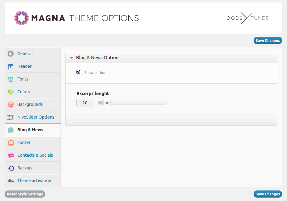
Here you define whether to show the author’s info in your blog posts or not
Number of symbols to be shown in blog excerpt on the list page
ADDING NEWS
News are very similar to standard blog posts. The main purpose of this custom posttype is to separate company’s news from company’s blog in a clear user-friendly way. Of course you can always create a special blog category like „News“ and make it as your news list, but why to mess news with blogs? The better way would be to use „news“ posttype.
You can create new “News” post by choosing “News” and then “Add New News” in leftside wordpress menu. A page for adding new “news” post will open.
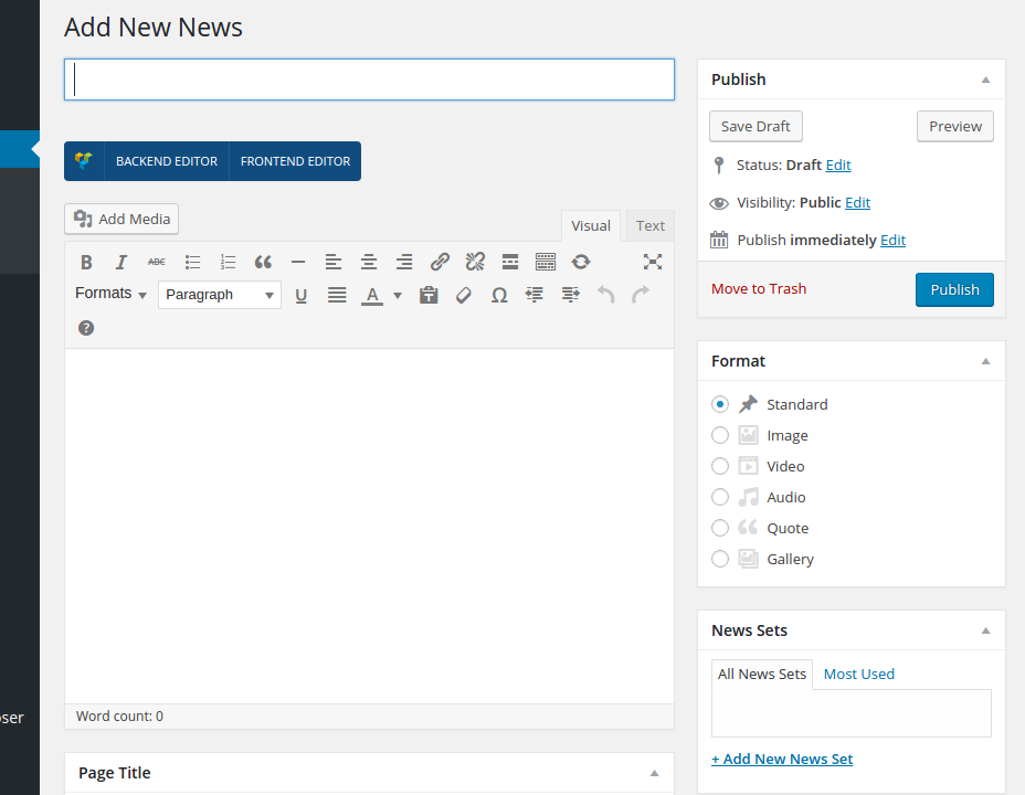
Here you can define all the same settings as described in section „Pages“ .
In addition to usual page settings you have here following settings:
Here you can define, to which news sets belongs your news post. You can add new sets in News ➜ News Sets or directly here in News Sets panel by clicking on “Add New News Set”
If you want to equip your news post with some title image, which will appear in the news list, use “Set featured image” to select an image from media library or to upload it from your hdd
After you are finished click on “Publish” to publish your news post
PUBLISHING NEWS LIST ON A PAGE
Inserting news lists in a page is very simple. Use Visual Composer and „News & Blog“ shortcodes as described in details in chapter „Shortcodes – News & Blog“
EXTRAS
WPML
If you need to make your website multilingual, WPML could be the best solution to do it. WPML is the set of plugins, allowing you to easily translate your website in other languages. Magna was carefully tested and is fully compatible with WPML. In order to use WPML you need to purchase the
license for this plugin here http://wpml.org/purchase/
On the WPML.org website you can find very detailed documentation about using this plugin, check this link http://wpml.org/documentation/getting-started-guide/. After purchasing WPML you will get free support from WPML team, you can use their support forum here http://wpml.org/forums/forum/english-support/.
Below you will find some specific aspects of using WPML with Magna.
FIRST STEPS / SETTING UP WMPL
1. Install and activate following core WPML Plugins:
- WPML Multilingual CMS
- WPML String Translation
- WPML Translation Management
2. Go to “WPML->Languages” and make initial WPML setup. Check WPML documentation for general description here http://wpml.org/documentation/getting-started-guide/ . For “Language URL format” we recommend to choose the first option “Different languages in directories”. In order to get this properly work, you will need to adjust your .htaccess file in your WP website root-directory on FTP as follows:
# BEGIN WP
RewriteEngine On
RewriteBase /
RewriteCond %{REQUEST_FILENAME} !-f
RewriteCond %{REQUEST_FILENAME} !-d
RewriteRule . /index.php [L]
# END WP
In order to enable language selector in the top menu, go to “WPML -> Languages”, section “Language switcher options” and make following selection:
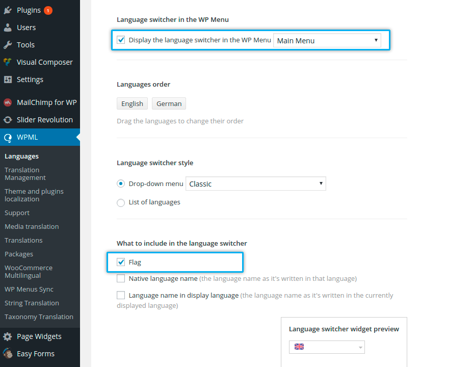
Magna is provided with the set of country flags, styled in flat style suitable for Magna design. You can find all flags in folder PSD, “Flags”. You can use these flags to display them in languge selector.
To do this:
1. Go to “WMPL -> Languages”, here look for “Site Languages” and click on “Edit languages”. You will get this page:
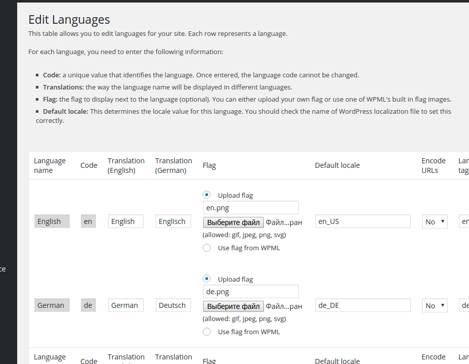
Here you can upload Magna flags using “Upload flag” option in column “Flag” As WPML resizes all flag images to its default size, you need to overwrite these automatic resize by copying your original PNG flags using FTP in folder “wp-content/uploads/flags” on your hosting
TRANSLATING
Go to “Pages” -> “All Pages”. You see columns for each active language, with a pencil icon (for ‘edit translation’) or a ‘+’ icon (for ‘add translation’) next to each page. Using these icons you can add a new language version of this page or edit the exiting one. The easiest way to start is to edit the original language page and here to check “duplicate” checkbox in “translate” box and then to click on “Duplicate”. In this way you create a copy of your page in other language version with all the content from original language, so you can easily translate it
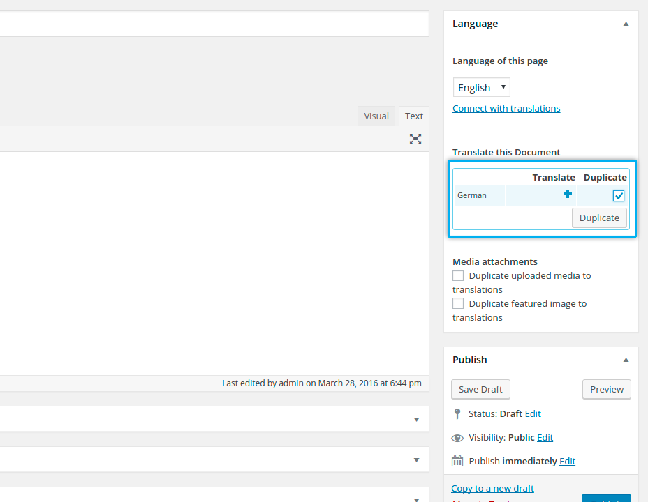
You’ll probably be interested in the process of batch duplication of pages and posts. To use this feature, go to WPML->Translation Management, and from the Translation Dashboard, select the filter you want (Pages/Posts), and click ‘Display’. Select the pages or posts you want to translate or duplicate (you can select them all by clicking the checkbox besides the ‘Title’ header or footer):
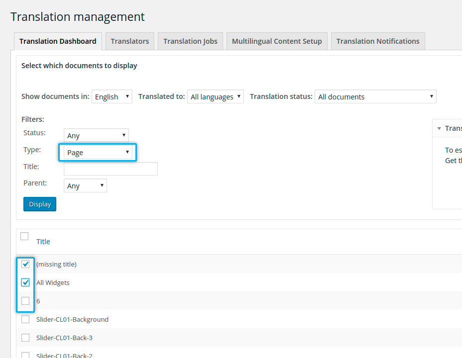
Then, at the bottom of the page, choose languages for which you want to translate or duplicate, and ‘Submit Documents’:
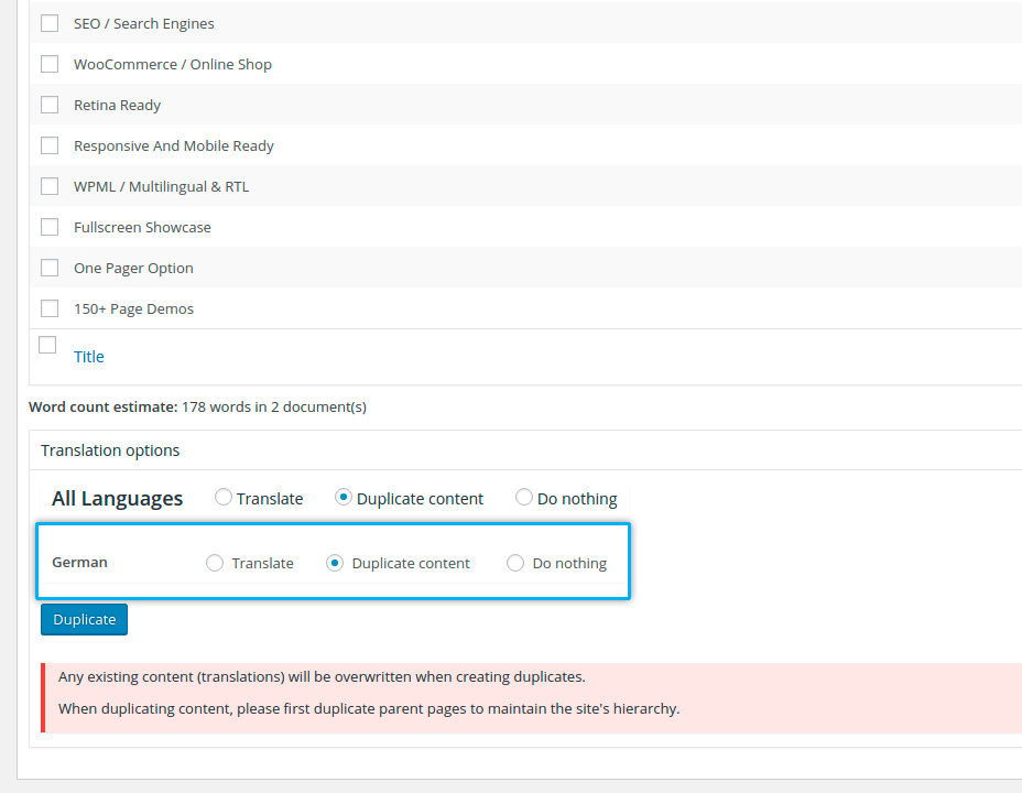
In general, with WPML you can always choose between ‘translating’ or ‘duplicating’ content. If you do the former but want to import content from the original you can always use the buttons to ‘copy content from the original’ in their edit page; if you do the latter, you can always choose later ‘Translate independently’ so that you can save your edits. Try both procedures to see which one you find better for your workflow.
PORTFOLIOS, TESTIMONIALS, TEAMS ETC
Magna comes with a rich set of custom post types such as portfolios, quickfinders, testimonials etc. and custom taxonomies. In order to get a similar interface & workflow for translation/duplication as for posts and pages (see description above), you need to go to WPML->Translation Management, and select the tab ‘Multilingual Content Setup’. At the bottom of the page you’ll see:
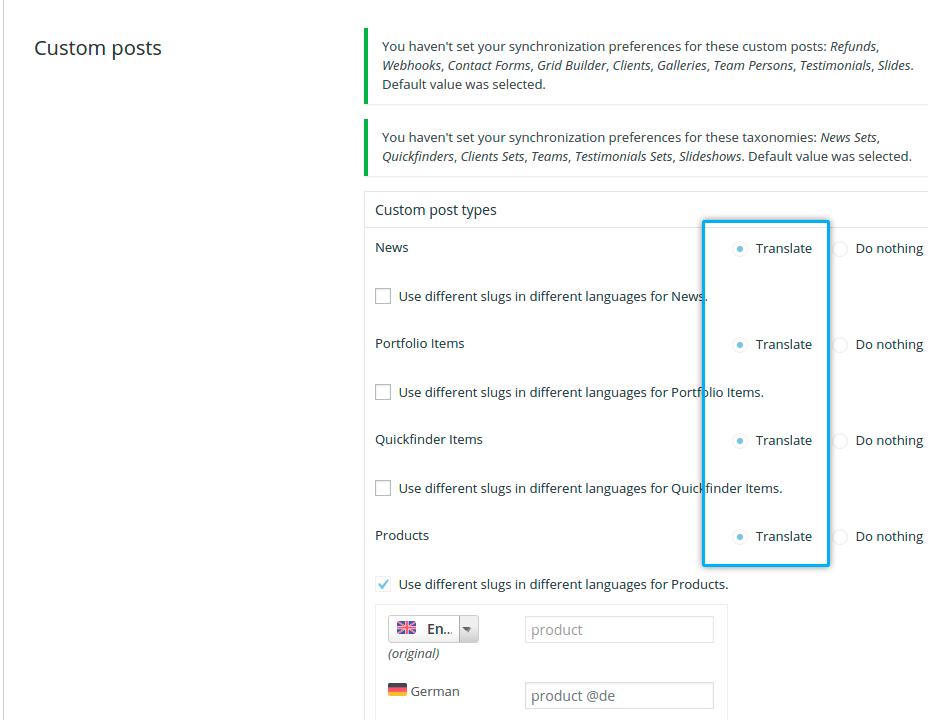
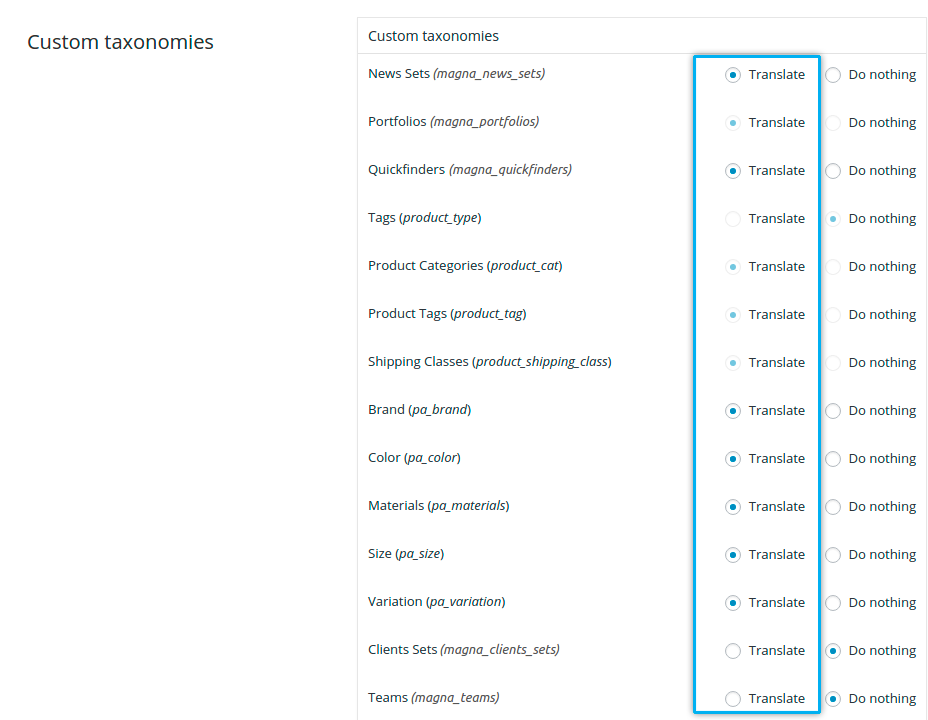
You need to select ‘translate’ for the custom post types you want to make translatable.
TRANSLATING MENUS
WPML can synchronize menus. This means that if some entries, for example some pages, posts or categories, are in the English menu, WPML can generate and keep in synch menus for other languages pointing to the translated versions of these pages, posts or categories. NOTE: before synchronising menus be sure you have translated all of the pages you would like to appear in the new language version. Only translated pages will be synchronised! Go to Appearance->Menus and look at “Synchronize menu” link on the top.
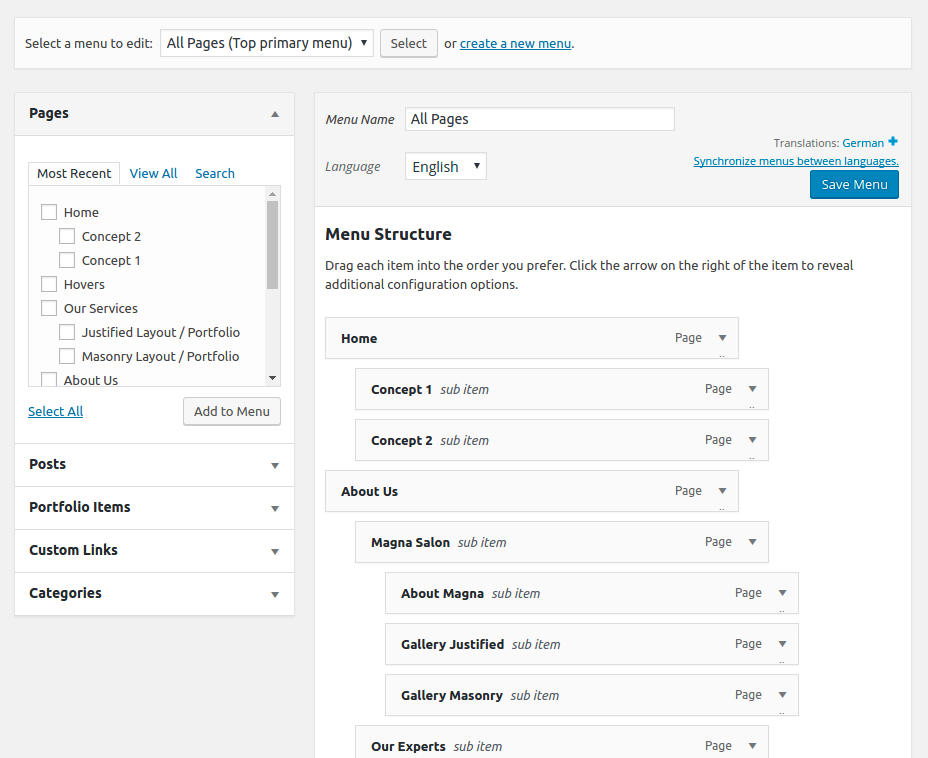
By clicking on it you will get following screen:
By clicking on the Sync button at the bottom of the page (with its informative legends by its side) you’ll be presented with a set of menu items that can be translated; select them all, and go ahead to apply the changes. After the synching operation you can individually edit the menus in each language from WordPress “Appearance->Menus”.
After translating your website content you would be probably interested in translating some theme specific phrases or words like “Next” button in testimonial or “Follow Us” title in “Follow & Contact Us” area. To do this, proceed as follows:
Go to “WPML -> Theme and plugins localization”
In the first section “Select how to localize the theme” choose “Translate by WPML.” and then “Save” In section “Select how to get translations for WordPress core” select “I will download translations for WordPress and save .mo files in wp-includes/languages”, then “Save”
At the bottom of section “Strings in the theme” you will find a checkbox “Load translations if found in the .mo files. (it will not override existing translations)” – activate and and hit the button “Scan the theme for strings”
ONE-PAGE WEBSITE
In Magna you have an option to create one-page website. If you click on main menu items above, you will be slightly scrolled down to the needed section.
The process of making one-page site is very simple and consist of two steps:
STEP 1
Create your page as described above in section „BUILDING PAGES“
While creating your page, choose sections you would like to be your main page sections and should be linked via main menu. Use „Row“ element of Visual Composer, click on „Edit row settings“ and use „Row ID“ field to insert an „anchor“ / unique block identifier for this section, like in this way:
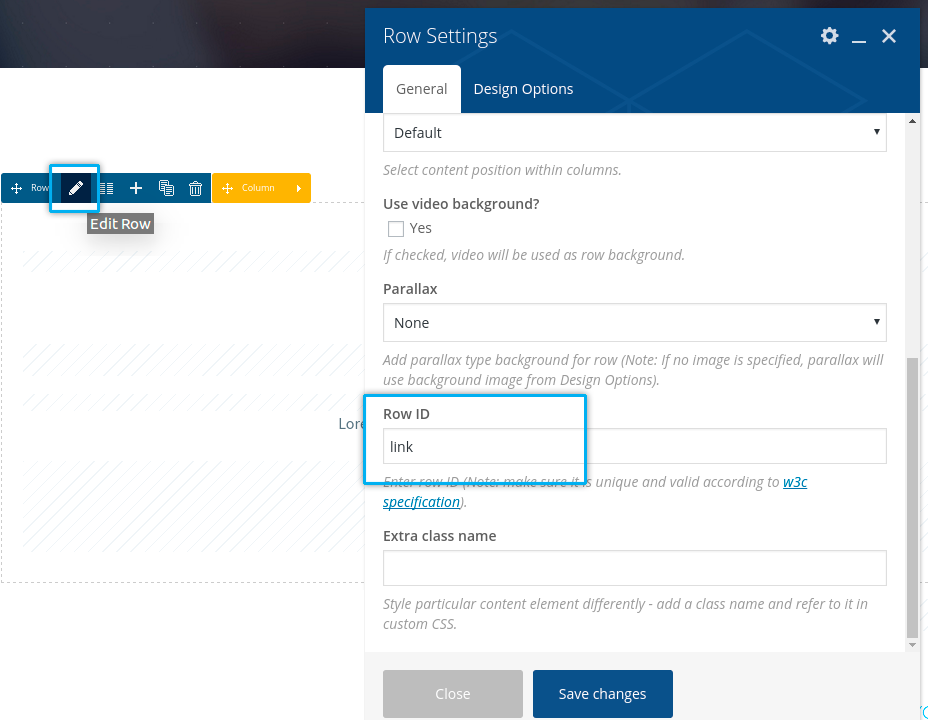
While editing your page, go to “Additional Options” in page settings and activate checkbox “Page as One-Pager”
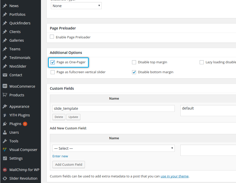
After you are done with building your page, save your changes and go to Appearance -> Menus. Here make your main menu using “Links” type of menu items. Pls note, that as “URL” you should type in the appropriate “Row ID” you have used in Rows settings in Step 1 previously.After you are done with building your page, save your changes and go to Appearance -> Menus. Here make your main menu using “Links” type of menu items. Pls note, that as “URL” you should type in the appropriate “Row ID” you have used in Rows settings in Step 1 previously.
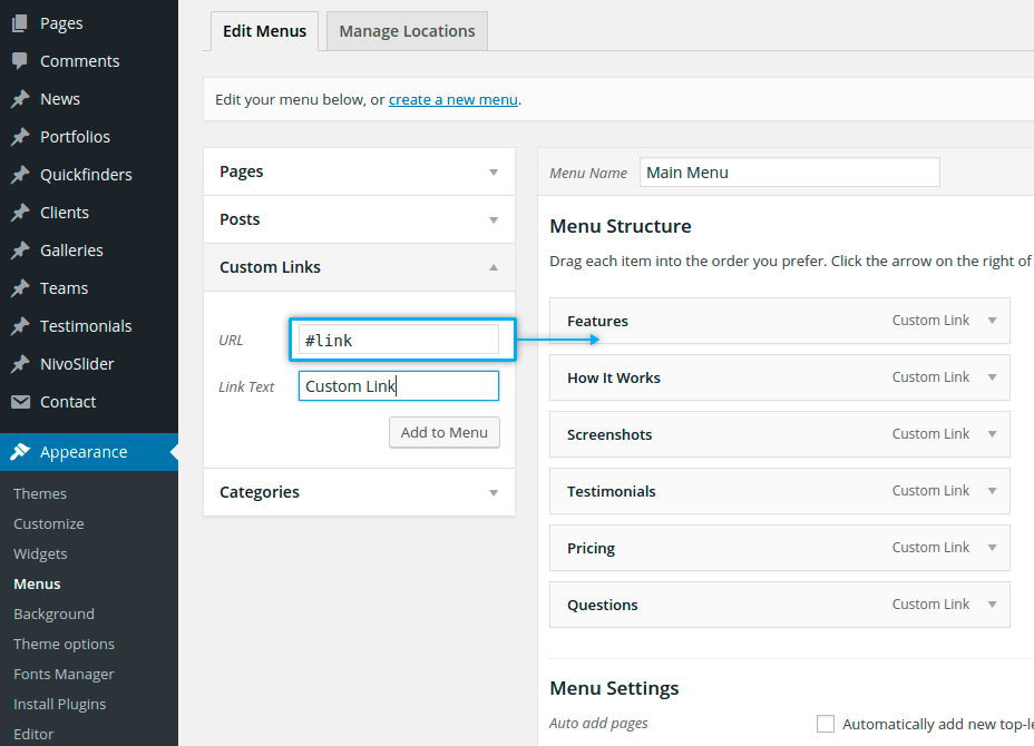
MEGA MENUS
Magna comes with built-in mega menu in two different styles. With this feature you can create stunning & impressive flyout menus with grouped structures for better usability.
Go to Appearance -> Menus. Create your menus as described in section „Menu / Navigation“ –
NOTE: In order to make mega menus, your menu structure must contain min. 3 levels, where your:
1. first level represents your main menu item
2. second level would be a title of the grouped submenu items
3. third level would coontain the actual submenu items
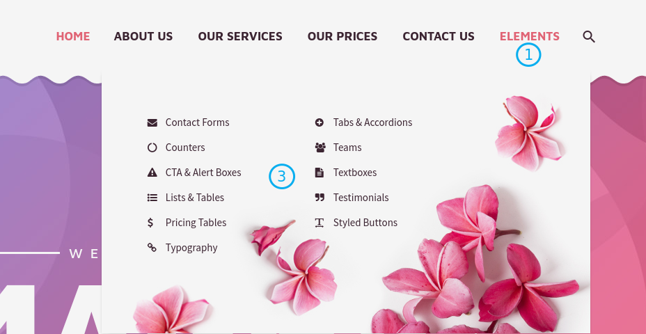
Now open your first level menu item. Here you can make general settings for your mega menu. You will see following options:
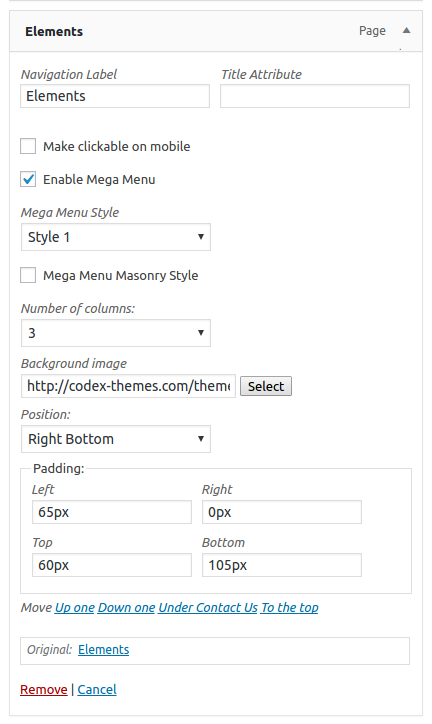
Enable Mega Menu
With this option you enable the mega menu for this menu item.
Mega Menu Style
Here you can choose between two styles of mega menu appearance
Mega Menu Masonry Style
By default mega menus in Magna have justified grid. With this option you can enable masonry grid
Number of columns
Here you can define the number of columns to be displayed in your mega menu
Background image
If you wish to use a background image in your mega menu, here you can define this image.
Position
Here you set the position of the background image you have chosen previously
Padding
In these field you can set paddings for your mega menu
Now open your second level menu item.
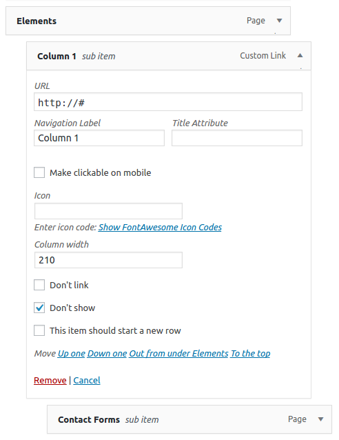
Icon
If you wish to set an icon for your submenu title, you can make it here by selecting the icon code and pasting it in this field.
Column width
Define the width of your first column in mega menu layout
Don’t link
If you don’t want to make your submenu title clickable, here you can deactivate it
Don’t show
In case you don’t want to display the submenu title, here you can hide it
This item should start a new row
If enabled, this option moves this submenu title to the new row in your mega menu layout
The last step – go to the third level menu item.
Icon
If you wish to set an icon for your menu item, you can make it here by selecting the icon code and pasting it in this field
Label
This option enables you to add some highlighted markers/labels like “NEW”, “HOT” etc. to your menu item.
That’s all. Now make the same with the rest of your menu items and save your mega menu.
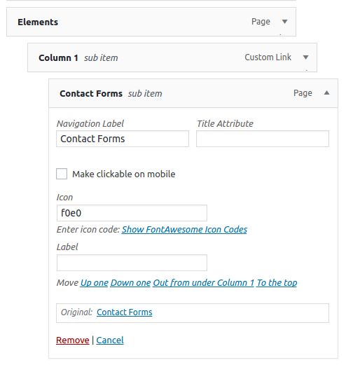
MOBILE MENUS
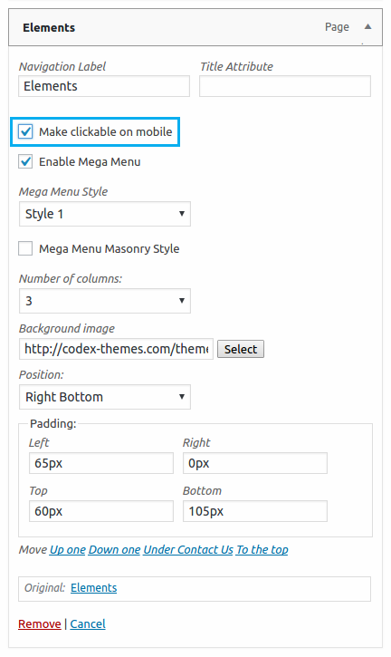
Magna transforms your menus to responsive style automatically, so you don’t need to make some special settings at this point. The only thing you might know is, that in responsive menu all menu items, which have submenu items, are not clickable by default. So if you click on such menu item, it will open the submenu without loading the actual page.
If you don’t need this behaviour for some of your menu items (i.e. you wish to make them clickable), use this option in your menu item (in “Appearance -> Menus”):
Make clickable on mobile
If enabled, after you click on this menu item on mobile device, you will see an additional option “Show this page” in mobile menu. In this way your website visitor can decide, whether he would like to see this page or to go further to submenu items.
Adding your own icons
Magna comes with three powerful icon packs (material design icons, font awesome and elegant icons), resulting in more than 2.500 icons in total. However, you have always an option to add additional icon pack – your own. To do this, you need to use the child theme „Magna_child_user_icons“, included in theme. Proceed as follows:
- Step 1: Install child theme
Install and activate „Magna_child_user_icons“ child theme, included in theme’s main package.
For installation instruction please refer to chapter „Installation“
- Step 2: Create your own icon pack.
You can use any online service, allowing to create icon fonts, for example https://icomoon.io/app/#/select
1. Create your own icon package. For details on how to do this pls refer to icomoon’s documentation here https://icomoon.io/#docs
2. After you are done with preparing your icon package, click on „Generate Font“
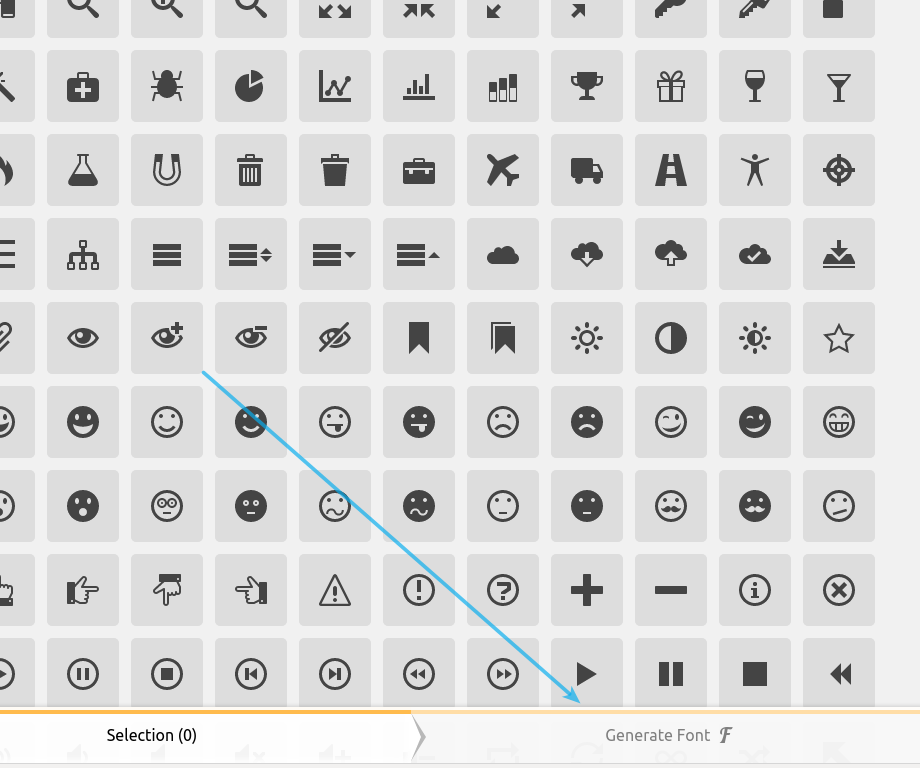
Optionally you can reset the numeration of the icons in your package to make it serially numbered
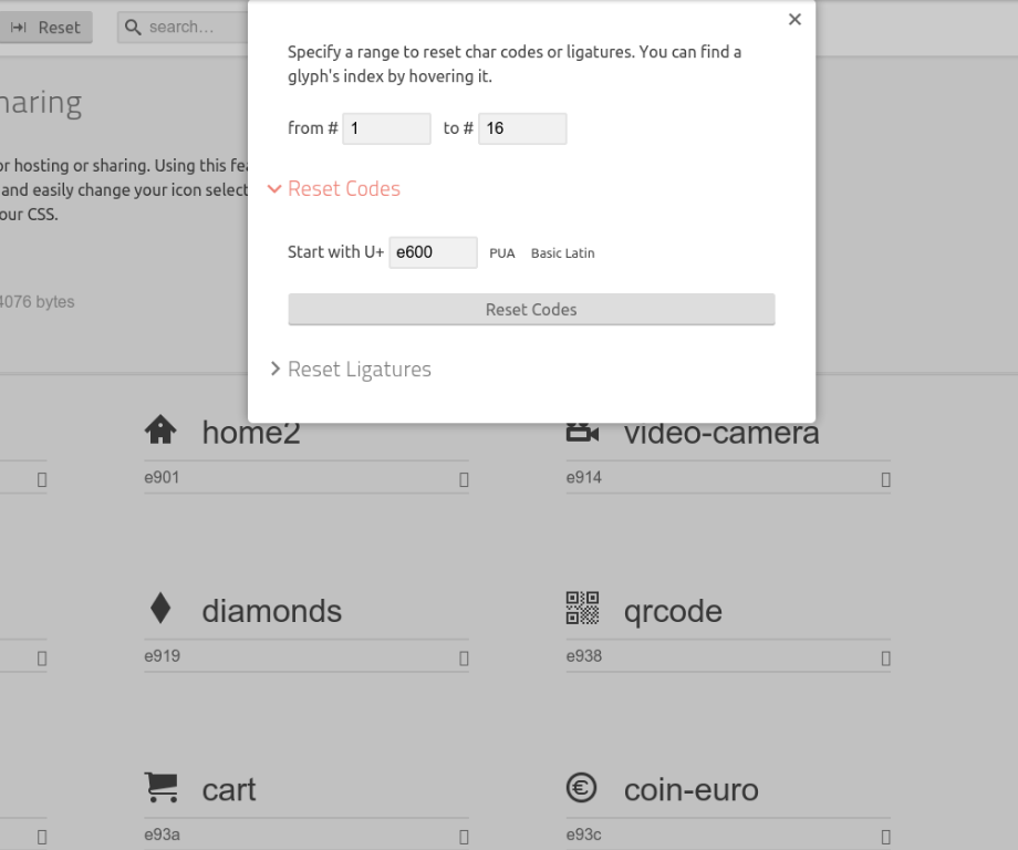
3. IMPORTANT: In the settings of the icon package you need to definee the Font Name as „UserPack“
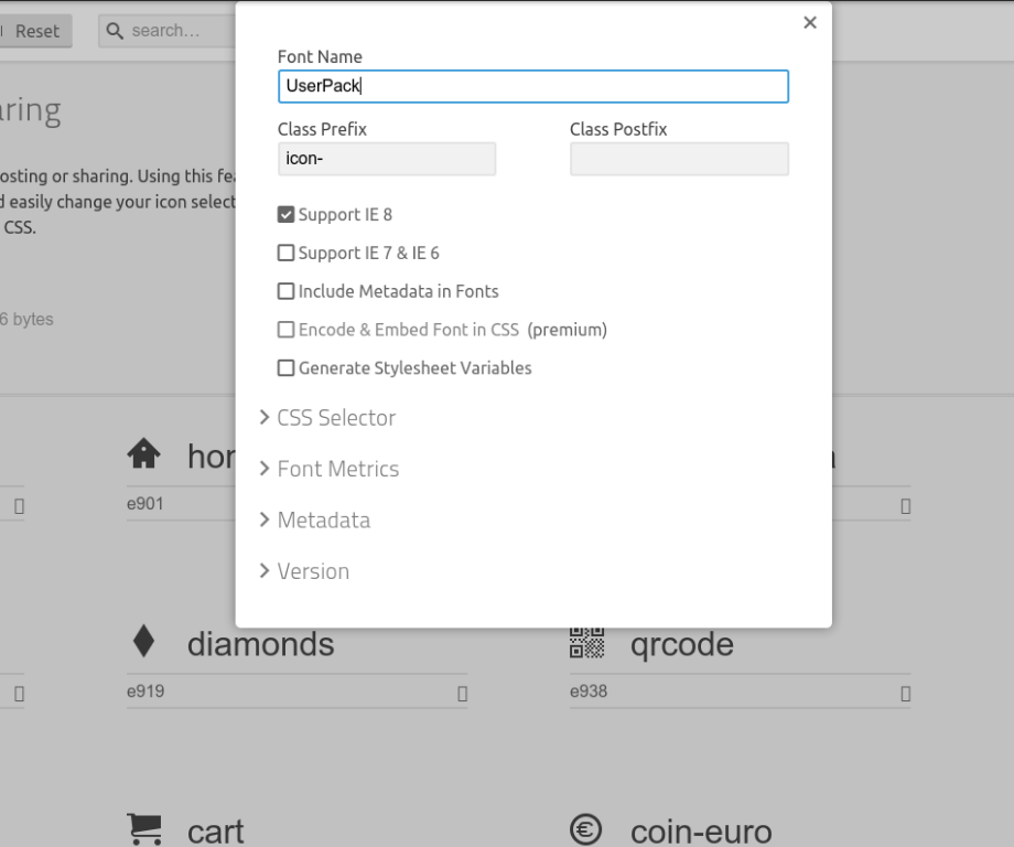
4. After that, click on „Download“ to download the zip archive with your icon fonts „UserPack“. Unzip after downloading in a separate folder to get corresponding woff, svg, ttf, oet font files
5. Upload the unzipped woff, svg, ttf, oet files via FTP to the child theme’s folder „fonts/UserPack“ You will find this folder in the child theme „Magna_child_user_icons“, which you have installed and activated in Step 1.
After you are done, you will get an additional icon pack „UserPack“ in the select box for selecting icon packs:
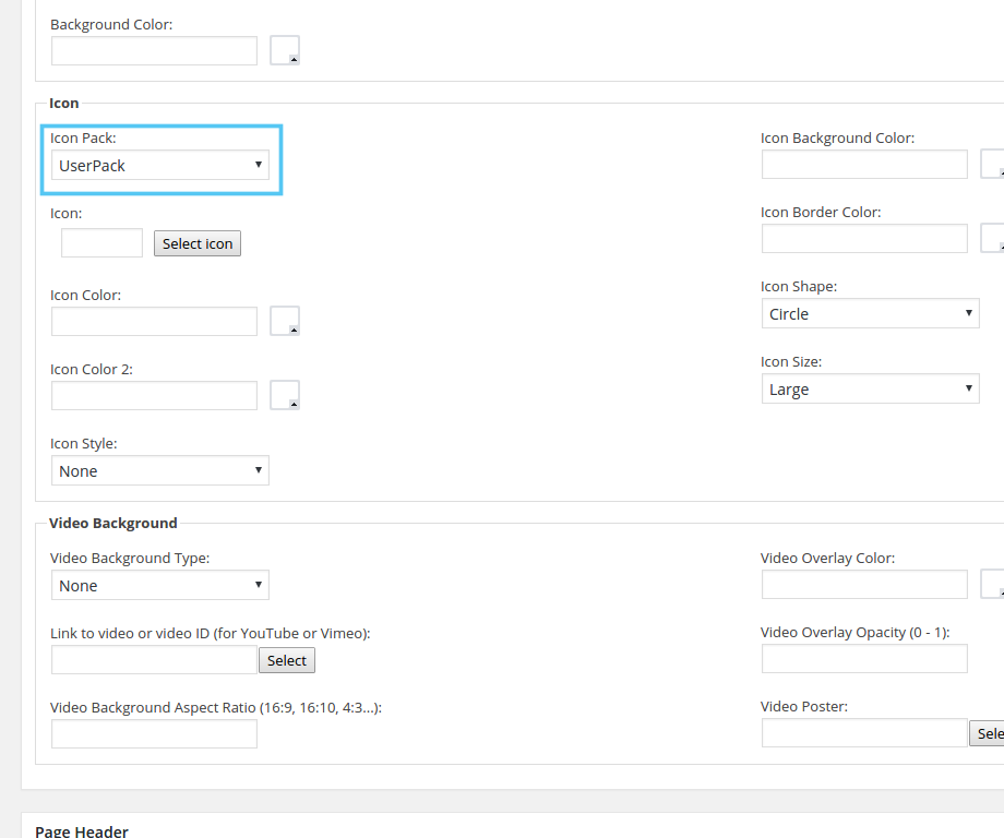
That’s all
LEGAL NOTES
DISCLAIMER
Magna was tested to work in different browsers and wordpress versions (see Theme’s Page on themeforest.net). However we cannot guarantee, that Magna will function with all third party plugins and server environments. We cannot provide support solving any conflicts with third party plugins.
CREDITS
Icons:
Free icon packs from Elegant Icons, Font Awesome and Material icons
Images on theme demo website:
Graphicriver.net (regular license), IDs: 6691601, 6993268, 7345815, 3484320, 6468313, 5705964
Photodune.net (regular license), IDs: 4555418, 3256414, 1689745, 914953, 6734927, 5848717, 5578933, 1373187, 1837889, 3307270, 5248341, 3979249, 1861062, 4555418, 369318, 358198, 353390, 5757567, 5652496, 2360811, 4807316, 1714557, 4016845, 5345409, 3419961, 514671, 5692739, 4807316
Images With Creative Commons Attribution License 3.0
Shutterstock.com (regular license), IDs: 179473799, 161730896, 166441373, 212589148, 153626741, 225388861, 183006680, 228152602, 183009029, 133300961, 182603093, 183009773, 128238317, 113168935, 114041509, 148724891, 159326039, 132366848, 230047054, 189842585, 230780998, 126492314, 173727986, 154766285, 197558105, 182603069, 214814665, 196294955, 206695300, 212621287, 159672671, 147893546, 141236470, 238047637, 88315597, 51719998, 133786706, 233683780, 184342181, 215470309, 99256976, 152291621, 96103796, 218526937, 155808509, 231299968, 207559387, 170924099
Fonts:
Coding:
Jquery http://jquery.com/
JS:
html5.js /** *
@preserve HTML5 Shiv v3.6.2 | @afarkas @jdalton @jon_neal @rem | MIT/GPL2 Licensed
*/
jquery.carouFredSel.js
/* * jQuery carouFredSel 6.2.1
* Demo’s and documentation:
* caroufredsel.dev7studios.com
*
*
Copyright (c) 2013 Fred Heusschen
* www.frebsite.nl
*
* Dual licensed under the MIT and GPL licenses.
* http://en.wikipedia.org/wiki/MIT_License
* http://en.wikipedia.org/wiki/GNU_General_Public_License
*/
jquery.galleriffic.js
/**
* jQuery Galleriffic plugin
*
* Copyright (c) 2008 Trent Foley (http://trentacular.com)
* Licensed under the MIT License:
* http://www.opensource.org/licenses/mit-license.php *
* Much thanks to primary contributer Ponticlaro http://www.ponticlaro.com)
*/
colorpicker
/**
*
* Color picker
* Author: Stefan Petre www.eyecon.ro
*
* Dual licensed under the MIT and GPL licenses
*
*/
fancyBox /*!
* fancyBox – jQuery Plugin
* version: 2.1.4 (Thu, 10 Jan 2013)
* @requires jQuery v1.6 or later
*
* Examples at http://fancyapps.com/fancybox/
* License: www.fancyapps.com/fancybox/#license
*
* Copyright 2012 Janis Skarnelis – janis@fancyapps.com
*
*/
jquery-ui
/*! jQuery UI – v1.10.2 – 2013-03-14
* http://jqueryui.com
* Includes: jquery.ui.core.js, jquery.ui.widget.js, jquery.ui.mouse.js, jquery.ui.draggable.js, jquery.ui.droppable.js, jquery.ui.resizable.js, jquery.ui.selectable.js, jquery.ui.sortable.js, jquery.ui.effect.js, jquery.ui.accordion.js, jquery.ui.autocomplete.js, jquery.ui.button.js, jquery.ui.datepicker.js, jquery.ui.dialog.js, jquery.ui.effect-blind.js, jquery.ui.effect-bounce.js, jquery.ui.effect-clip.js, jquery.ui.effect-drop.js, jquery.ui.effect-explode.js, jquery.ui.effect-fade.js, jquery.ui.effect-fold.js, jquery.ui.effect-highlight.js, jquery.ui.effect-pulsate.js, jquery.ui.effectscale.js, jquery.ui.effect-shake.js, jquery.ui.effect-slide.js, jquery.ui.effect-transfer.js, jquery.ui.menu.js, jquery.ui.position.js, jquery.ui.progressbar.js, jquery.ui.slider.js, jquery.ui.spinner.js, jquery.ui.tabs.js, jquery.ui.tooltip.js
* Copyright 2013 jQuery Foundation and other contributors; Licensed MIT */
tinymce-widget
/* Version: 1.1.1
Author: Black Studio
Author URI: http://www.blackstudio.it
License: GPL2
*/
nivo-slider
/*
* jQuery Nivo Slider v3.2
* http://nivo.dev7studios.com
*
* Copyright 2012, Dev7studios
* Free to use and abuse under the MIT license.
* http://www.opensource.org/licenses/mit-license.php
*/
LayerSlider WP
/*
* Plugin Name: LayerSlider WP
* License: Extended License
* Plugin URI: http://codecanyon.net/user/kreatura/
* Description: LayerSlider is the most advanced responsive WordPress slider plugin with the famous Parallax
* Effect and over 200 2D & 3D transitions.
* Version: 5
* Author: Kreatura Media
* Author URI: http://kreaturamedia.com/
Visual Composer
/* Plugin Name: WPBakery Visual Composer
* Plugin URI: http://vc.wpbakery.com
* License: Extended License
* Description: Drag and drop page builder for WordPress. Take full control over your WordPress site, build any layout you can imagine – no programming knowledge required.
* Version: 4.4.2
* Author: Michael M – WPBakery.com
* Author URI: http://wpbakery.com