
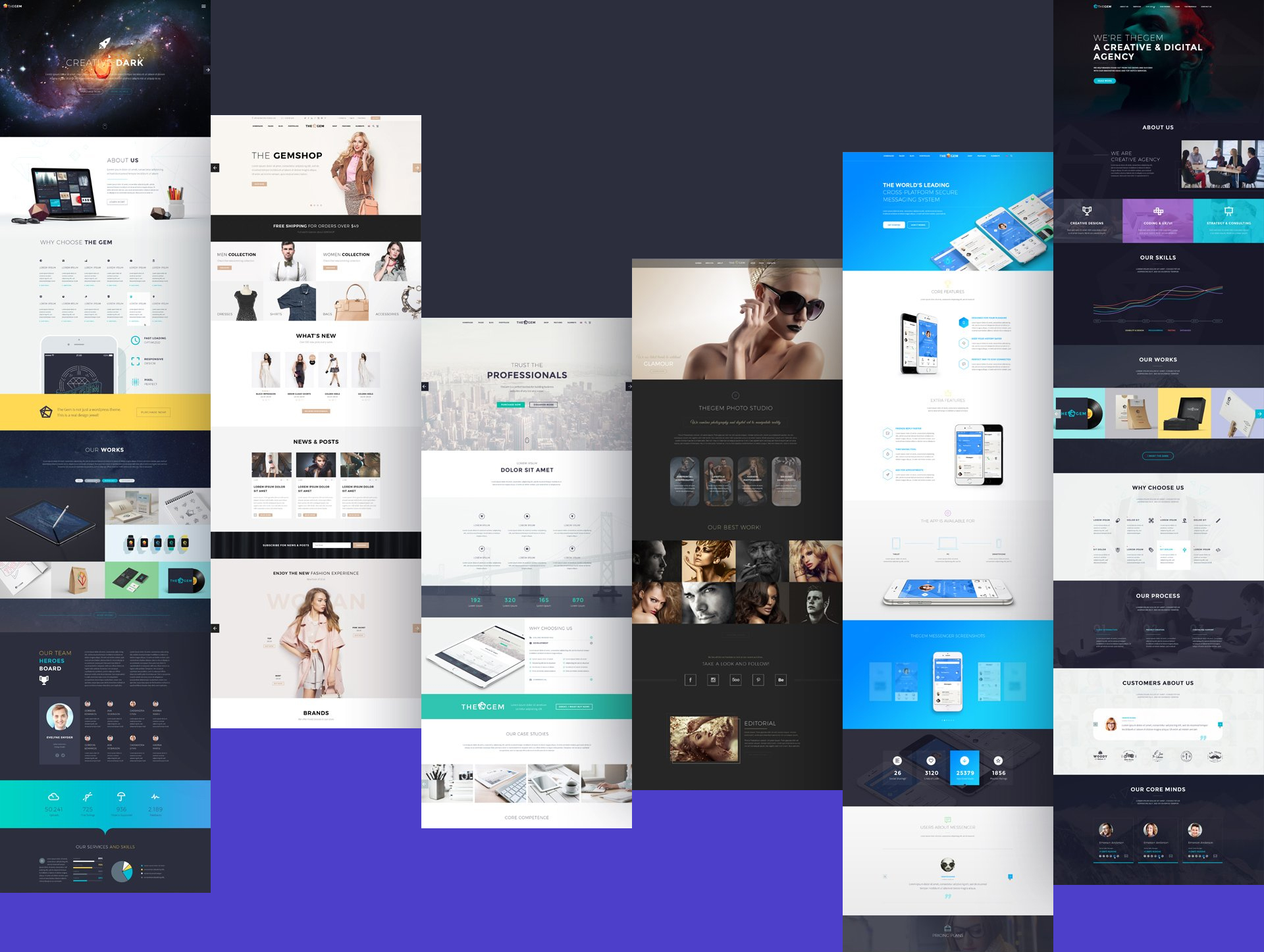
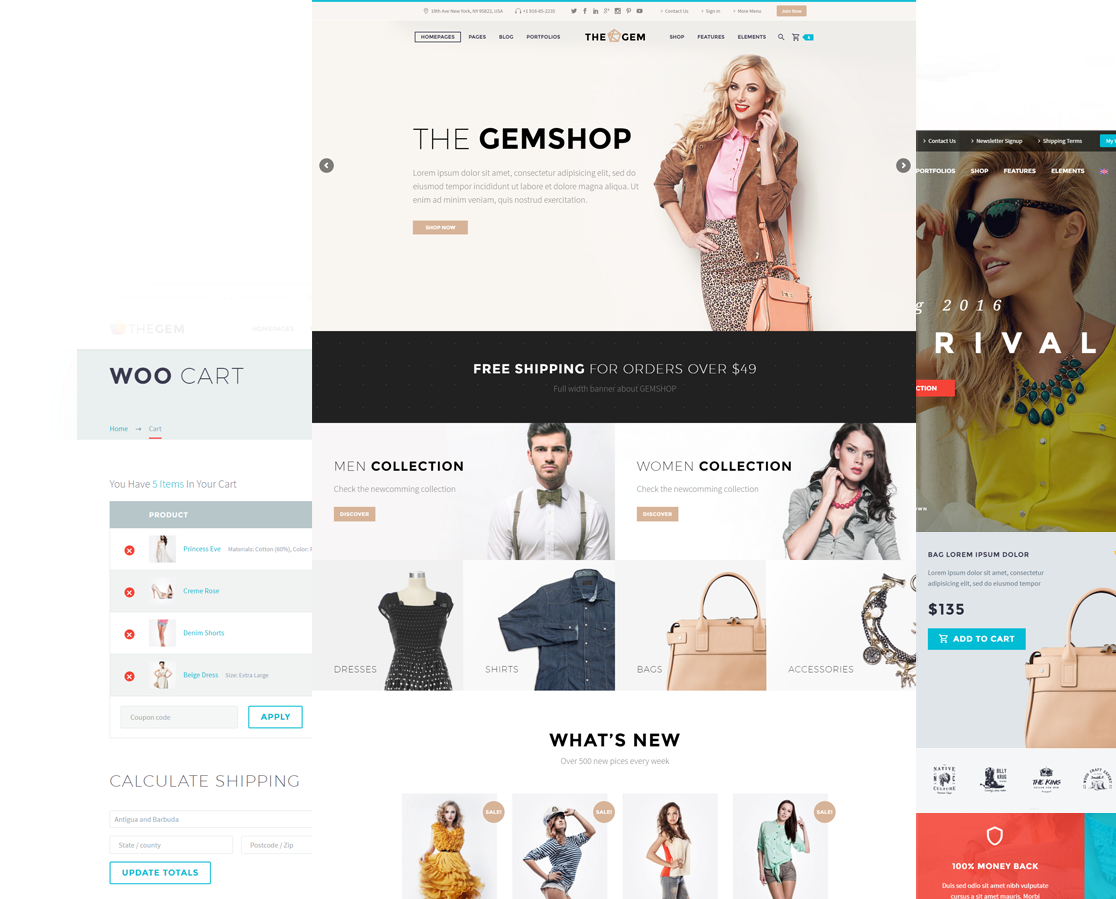
Designed for creatives. Made for high performance. Optimized for SEO. The Gem is most versatile WordPress theme with largest range of styles.


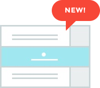
CREATIVE TEMPLATES

-
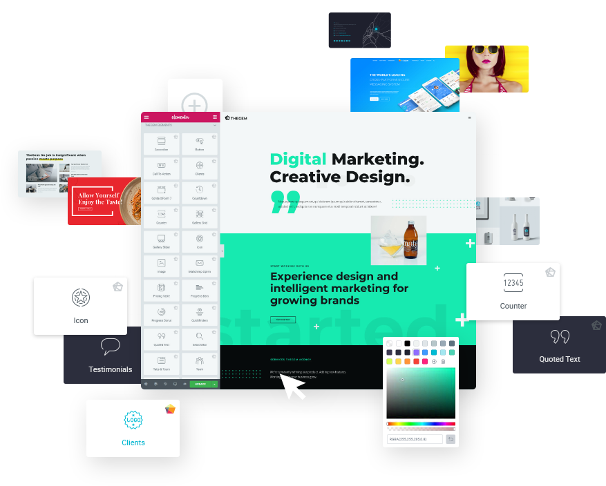
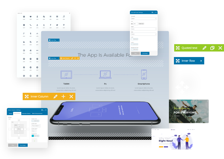
Best frontend page builder for WordPress
-
Extremely intuitive & performant
-
With endless customization options
-
Fully integrated with TheGem
-
Incl. premium elements & extensions
-
No need for Elementor Pro, SAVE $49/year

-
Popular premium page builder
-
100% compatible with TheGem and updatable
-
Drag’n’drop, easy-to-use
-
Frontend or backend editing
-
Included in theme price, SAVE $64!
-
Popular premium page builder
-
100% compatible with TheGem and updatable
-
Drag’n’drop, easy-to-use
-
Frontend or backend editing
-
Included in theme price, SAVE $64!
* Elementor version will be released soon

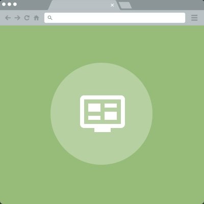
TheGem includes versatile settings for website header, menu and navigation. It delivers 8 navigation concepts in total of 20+ pre-made styles for main menu and top area bar, which you can freely combine with each other. And you can adjust all this styles – change colors, fonts, backgrounds etc. In addition you can set individual settings for selected pages of your site. Enable transparency for main menu & top area. Control header opacity. Use customized colors for menu & logo. Use images and videos as backgrounds. Enable or disable sticky headers and navigation. And much more.
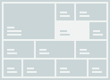
Logo Position

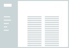

Menu Layouts
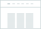
The classic horizontal navigation layout, perfect for any corporate website or online shop
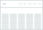
Horizontal navigation with 100% width layout, ideally suitable for creative websites
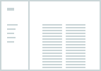
Vertical navigation layout, good for portfolio and photography websites
Hamburger menu navigation for minimalistic and modern layouts. Excellent for any website
This navigation layout is a good choice for agencies and any other creative websites
A fresh, creative and unique navigation layout with unusual page transformation effect
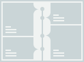
Mobile Menu Layouts

Classic responsive drop down navigation with rolling out hierarchies

Responsive navigation via an overlay representation, ideal for any touchscreen

Mobile menu sliding from the left side. Perfect for depicting complex hierarchies

Similar to slide left mobile navigation, but sliding from the top of the screen
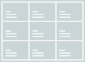
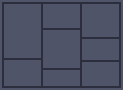
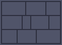
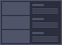
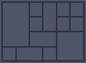
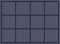
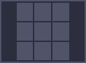
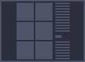
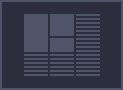
page layout options
With TheGem you can create any imaginable page layouts in minutes. Due to a plenty of flexible layout options, you can create 100% width, fullwidth, boxed layouts, use any number of sidebars on any layout position, mixed different layout approaches with each other while creating your own unique layout style. Enjoy the absolute creative freedom and build layouts which will stand out and impress!


friendly
theme
TheGem is fully responsive. It was designed with mobile first approach. It means, it can automatically adapt to different screen sizes, no matter which device your website visitors use. It looks great on any device & screen.

friendly
theme
TheGem is fully responsive. It was designed with mobile first approach. It means, it can automatically adapt to different screen sizes, no matter which device your website visitors use. It looks great on any device & screen.
Everything
you need
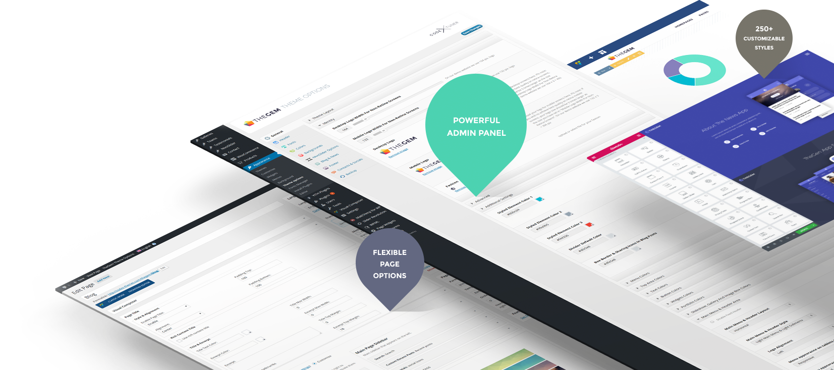
TheGem comes with extended powerful theme options and flexible page options, allowing to customize just anything in look of your website in minutes.
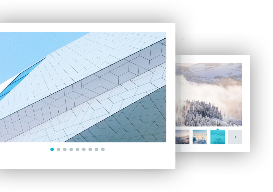
Fascinate your website visitors with stunning variety of galleries delivered with TheGem. Grids & sliders in 20+ flexible styles, 6 hovers & tons of layout options. Highlighted images. And much more options.
With TheGem you can animate most of content elements and choose the animation you like to make your website looks alive and get the viewer attention. You can activate lazy loading content on page level for optimizing the loading performance.


* We speak English Deutsch Русский Polski
- Extremely Customizable
- One-Click Demo Import
- All Demos Are Included In One Price
- Fullscreen Sliders
- Smooth Scroll
- Child Theme Ready
- Clean Code
- Unlimited Sidebars
- 20+ Custom Widgets
- Backup Options
- Transparent Headers
- Widgetised Footer
- One Pager Option
- Fullscreen Showcase
- Free Updates & Support
- Extended Typography
- DE, FR, ES, RU packs incl.
- 12 columns layouts
- Infinite single portfolios
- 6 Hover Effects