Scalia THEME DOCUMENTATION
Thank you for purchasing Scalia. In case of any questions please do not hesitate to contact us via
themeforest.
Please be so kind to rate Scalia - click on "Rate Scalia" to see how to rate your download on Themeforest:
Please be so kind to rate Scalia - click on "Rate Scalia" to see how to rate your download on Themeforest:
GETTING STARTED
INSTALLING WORDPRESS
To install this theme you must have a working version of WordPress already installed. If you need help installing
WordPress, follow the instructions here:
REQUIREMENTS
To use Scalia, you must be running Wordpress 3.8 or higher. We have
tested it with Mac, Windows and Linux.
It has been tested on Chrome, Firefox, Safari, Opera, Internet Explorer 10+
INSTALLING Scalia
Download the Scalia.zip file from themeforest.net. In this zip file you have everything you need:
There are two ways to install the Scalia theme:
Scalia_theme.zip
the main theme zip file you need to upload to your Wordpress in order to install Scalia. In this zip you will find the theme itself. NOTE: Do not upload the entire ZIP file you get from ThemeForest, upload ONLY the Scalia_theme.zipChild_Themes
here you will find all of the Scalia's child themes: Zaro Online Shop, One-Page Website, Scrollex Parallax Presentation as well as Dear Diary Stylish Blog. These child themes have predefined unique styles which you can use out-of-the-box. In addition we have also included the child theme for the main multipurpose theme (in the same style as the main theme). In order to use them first you need to install the main theme (Scalia_theme.zip) - see instructions below.PSD
psd design sources of Scalia layoutsDemo_Content
in this folder you will find XML Files with demo content for main default demo as well as all the child themes demos from our preview website. For main default demo there is a quick one-click installation available (pls see below). Also you will find here all demo slides for LayerSlider.There are two ways to install the Scalia theme:
INSTALLING IN WORDPRESS ADMIN
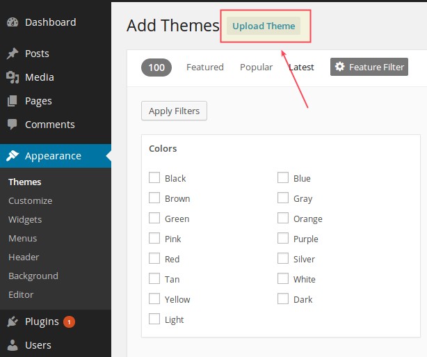
- Open Appearance→ Themes
- Click "Add New Theme" and hit upload link
- Find the the file “Scalia_theme.zip” on your hdd and hit install now button
- After the theme is installed click on "Activate"
INSTALLING PLUGINS
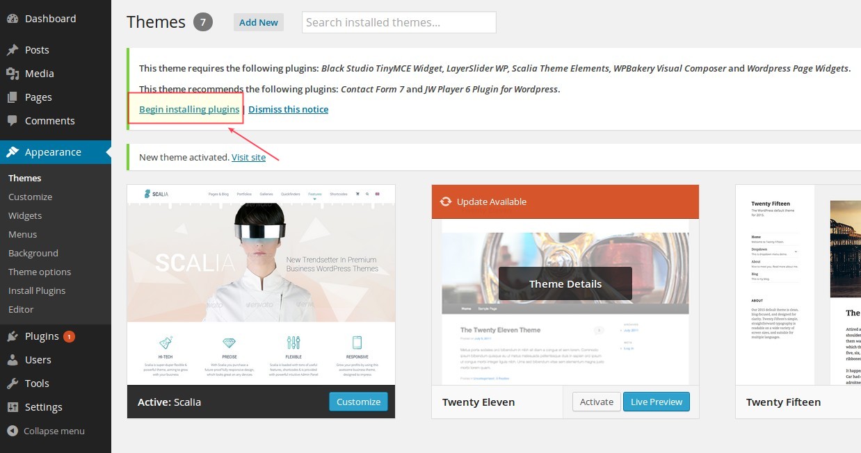
In order to get Scalia properly work you need to install some useful plugins. After the theme is installed
successfully you will get following message about installation of required and recommended plugins:
 That's all! Now you are ready to go on with Scalia, installed on your WP.
- Click on "Begin installing plugins"
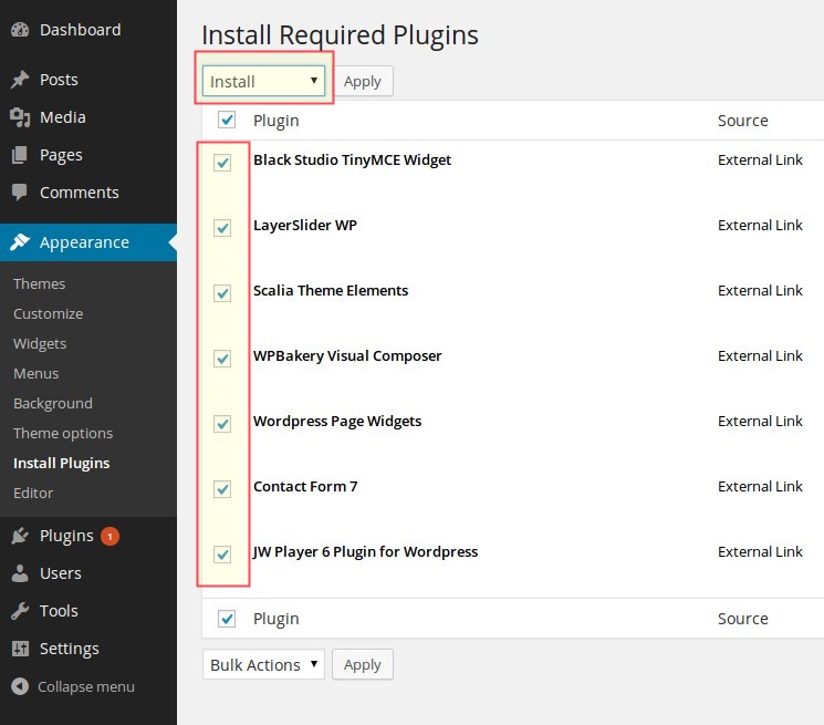
- Check all plugins, select "Install" and click on "Apply"
UPLOAD BY FTP
Login to your hosting space via an FTP Client and upload the theme folder into wp-content/themes/ under your
wordpress installation. Once you've uploaded the theme you can open Appearance→ Themes page and activate the
theme from list. After that you need to install and activate the plugins as described above.
INSTALLING CHILD THEMES
Scalia comes with four awesome child themes in pre-configured unique designs: Zaro (Online Shop Style), Scrollex (Parallax Landing Page Style), One-Page Scalia (One-Page Website Style) and Dear Diary (Stylish Blog) . If you want to use one of them,
you
need to install it as well. In order to install these child themes, first you need to install main theme as
described
above.
IMPORTANT: After installing main theme, DON'T ACTIVATE IT, just proceed with installing the appropriate child theme of your choice!
After main Scalia (Scalia_theme.zip) is installed, proceed with the same steps as by installing the main theme, however this time by choosing the appropriate ZIP file for the child theme of your choice. In Scalia.zip file you will find folder "Child_Themes" following ZIPs for child themes:
In addition we have included one child theme in the same style as our main multipurpose parent theme. If you plan to modify the source code of the main parent theme (php, js, style.css) we strongly recommend to install this child theme and make such modifications inside this child theme in order to avoid any possible problems & issues by installing updates of Scalia's main parent theme in future. You can find this child theme in the same folder as other child themes: scalia-default-child.zip
IMPORTANT: DON'T TRY TO INSTALL CHILD THEMES IF THE MAIN THEME IS NOT INSTALLED - THIS WILL GIVE NO RESULT
That's all, the child theme of your choice is activated and ready to run!
IMPORTANT: After installing main theme, DON'T ACTIVATE IT, just proceed with installing the appropriate child theme of your choice!
After main Scalia (Scalia_theme.zip) is installed, proceed with the same steps as by installing the main theme, however this time by choosing the appropriate ZIP file for the child theme of your choice. In Scalia.zip file you will find folder "Child_Themes" following ZIPs for child themes:
- scalia-zaro-child.zip is Zaro Scalia child
- scalia-scrollex-child.zip is Scrollex Scalia child
- scalia-one-page-child.zip is One-Page Scalia child
- scalia-dear-diary-child.zip is Dear Diary Scalia child
In addition we have included one child theme in the same style as our main multipurpose parent theme. If you plan to modify the source code of the main parent theme (php, js, style.css) we strongly recommend to install this child theme and make such modifications inside this child theme in order to avoid any possible problems & issues by installing updates of Scalia's main parent theme in future. You can find this child theme in the same folder as other child themes: scalia-default-child.zip
IMPORTANT: DON'T TRY TO INSTALL CHILD THEMES IF THE MAIN THEME IS NOT INSTALLED - THIS WILL GIVE NO RESULT
That's all, the child theme of your choice is activated and ready to run!
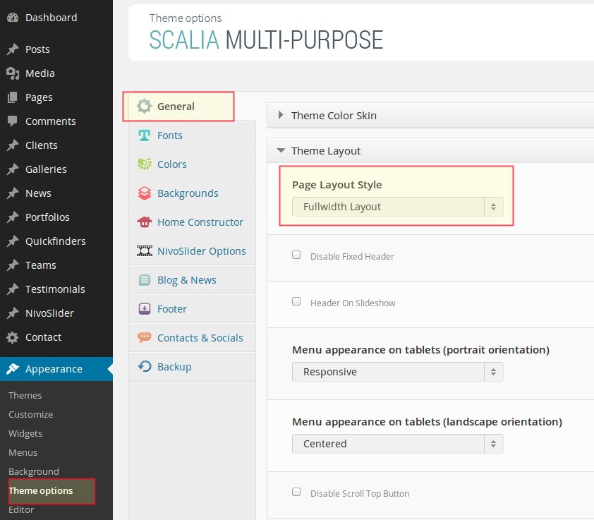
MAKING GENERAL SETTINGS
First thing after installing Scalia would be to make the main general settings of your website. Go to Appearance
- Theme Options to get the admin panel of Scalia. Let's start with the first set of settings - General.
NOTE: after making any changes in theme settings don't forget to click on "Save Changes" in order to
save your selections.
THEME LAYOUT & BACKGROUNDS
You can choose between fullwidth or boxed layout for your pages. If you like to use the boxed version,
you can further configure the color or image for the general website background.
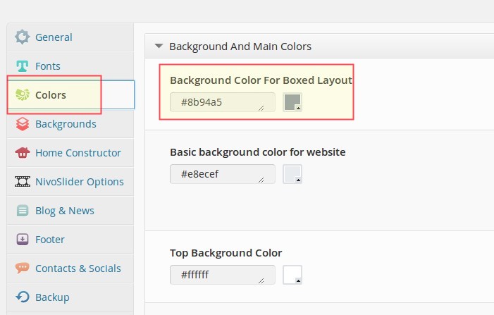
 To configure background color choose "Colors" leftside in Scalia admin panel and here use the "Background
Color For Boxed Layout" field in "Background And Main Colors" panel to choose the appropriate boxed
background color.
To configure background color choose "Colors" leftside in Scalia admin panel and here use the "Background
Color For Boxed Layout" field in "Background And Main Colors" panel to choose the appropriate boxed
background color.
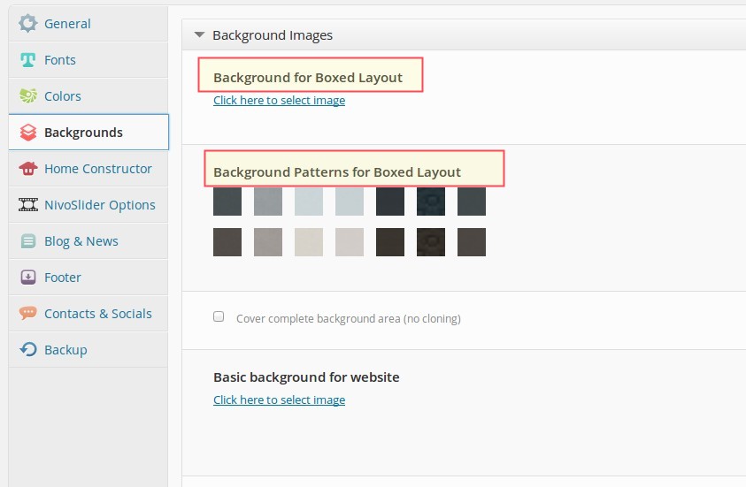
 To configure background image choose "Backgrounds" leftside in Scalia admin panel and here use the "Background
for Boxed Layout" field to upload your background image. Or you can choose one of the included patterns by
choosimng one in "Background Patterns for Boxed Layout"
To configure background image choose "Backgrounds" leftside in Scalia admin panel and here use the "Background
for Boxed Layout" field to upload your background image. Or you can choose one of the included patterns by
choosimng one in "Background Patterns for Boxed Layout"
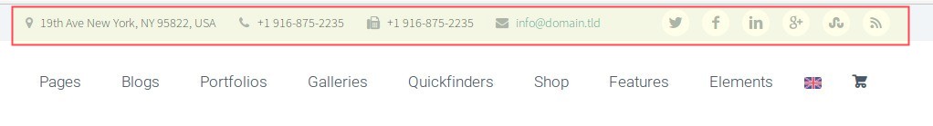
TOP AREA
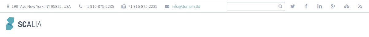
In Scalia you can use top area above menu and logo bar to show your contacts & links to social profiles. You can
choose
between two styles of top area or you can disable it.

 To configure the appearance of your top area, go to "General - Top Area" and select the style you wish to use:
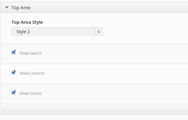 Here you can also choose, which elements you wish to display in your top area. The content for "Contacts" &
"Socials"
comes from "Contacts & Socials" settings (see description below).
Here you can also choose, which elements you wish to display in your top area. The content for "Contacts" &
"Socials"
comes from "Contacts & Socials" settings (see description below).
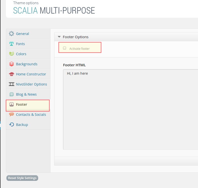
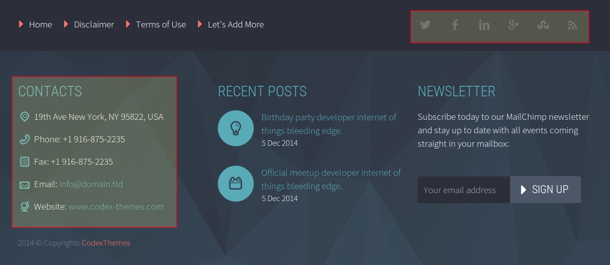
FOOTER & WIDGETISED FOOTER AREA
By default the whole footer area is enabled in Scalia. But you can easily disable footer area by going to "Footer"
and
unchecking "Activate footer" option.
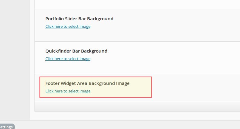
 In the same way you can select a custom background color for widgetised area or you can set a background image. To
do
this, go to "Backgrounds" and select or upload your image in "Footer Widget Area Background Image"
In the same way you can select a custom background color for widgetised area or you can set a background image. To
do
this, go to "Backgrounds" and select or upload your image in "Footer Widget Area Background Image"
 NOTE: not all widgets are optimised to be displayed in footer widget area
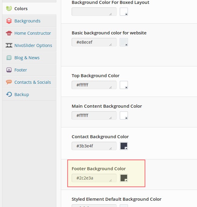
Setting up colors
You can set a custom background color for footer area by going to "Colors - Footer Background Color"
Setting up widgets
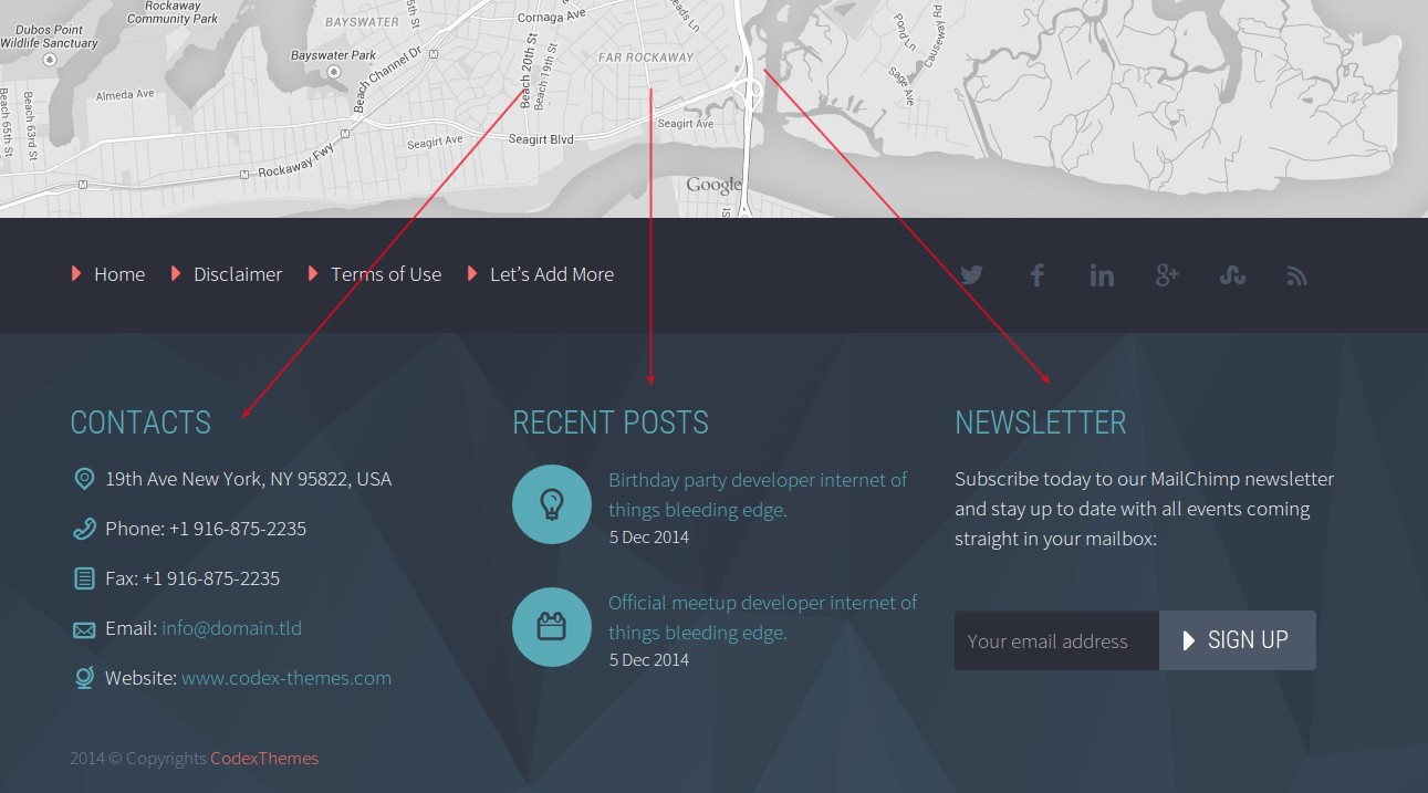
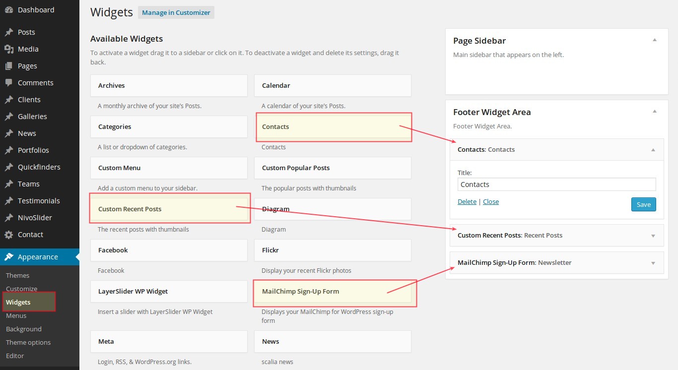
In Scalia you can add different widgets to your footer widgetised area.
- Go to "Appearance -> Widgets"
- Select widgets of your choice from "Available Widgets" panel and drag'n'drop them to the "Footer Widget Area" panel
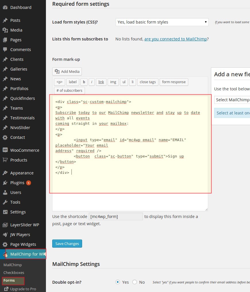
Styling Mailchimp Signup Form
In order to get the same look of the newsletter signup form in footer, as on our demo website, make following:- Go to "MailChimp for WP -> Forms "
- Replace the code in "Form mark-up" field with following:
<div class="sc-custom-mailchimp"> <p> Subscribe today to our MailChimp newsletter and stay up to date with all events coming straight in your mailbox: </p> <p> <input type="email" id="mc4wp_email" name="EMAIL" placeholder="Your email address" required /> <button class="sc-button" type="submit">Sign up </button> </p> </div>
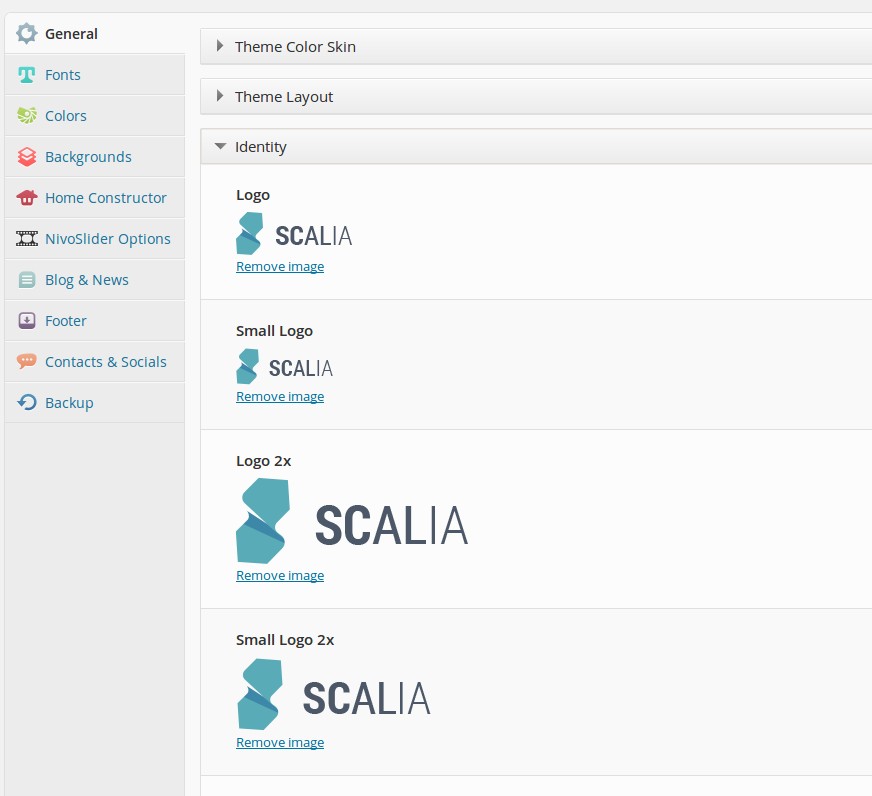
IDENTITY
Next step is to define identity of your website:
Default Logo: here you can upload your logo to use in the website's header
Smaller Logo For Fixed Header & Mobile Devices: your logo in smaller size to be shown on mobile devices or in fixed on-scroll header
After that you can set different retina logos as well.
Logo position: choose where to position your logo in the website header - left, right or centered above ypur menus
Favicon: upload a favicon for your website
CONTACTS & SOCIALS
Next step would be to set up your contact details and links to your social profiles to show them in:
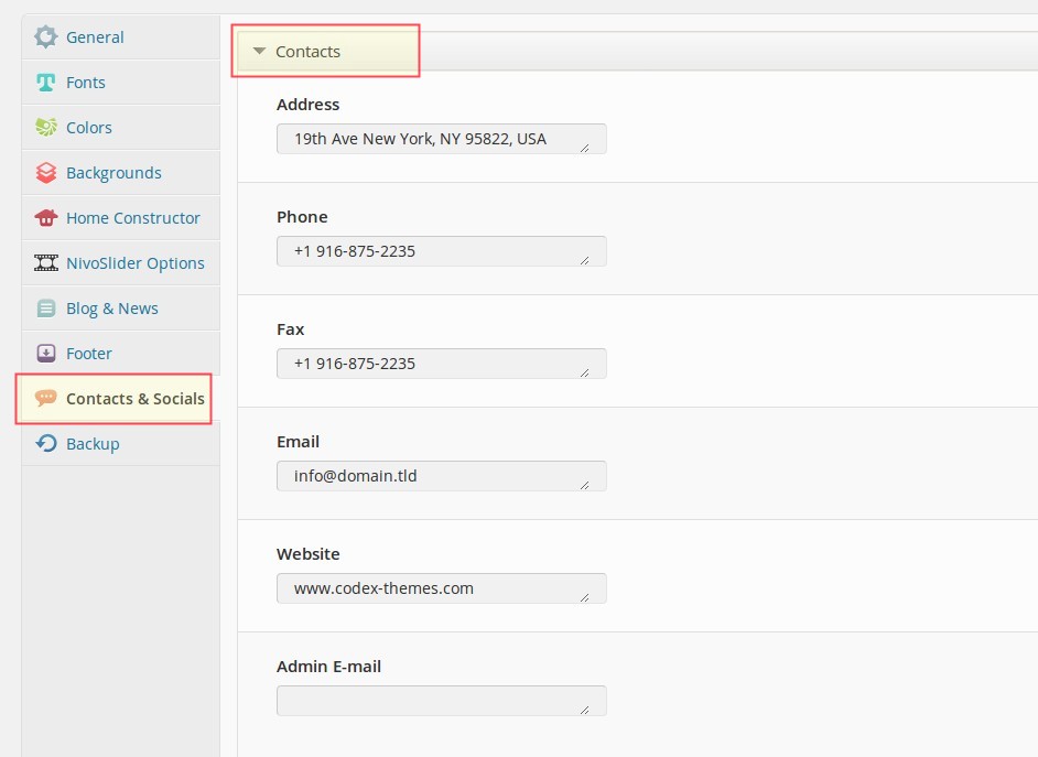
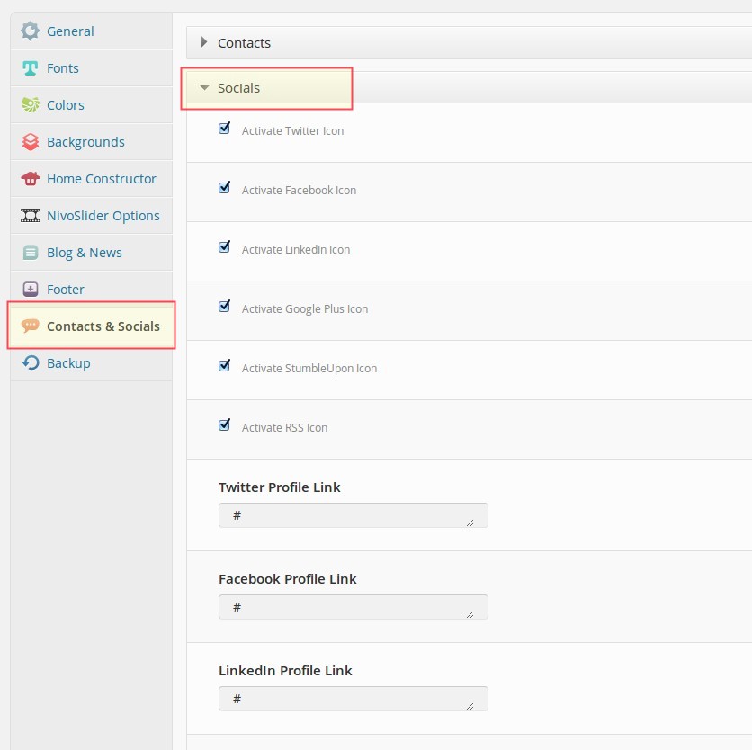
- Top Area (if selected)
- Footer (social icons)
- "Contact" widget (both in sidebar & in footer widgetised area)
Setting contacts
Go to "Contacts & Socials" and select here "Contacts" section. Here you have a number of contact data fields you can feel with your contacts.Admin Email
Email address of website admin. All feedbacks from contact forms will be forwarded on this email addressSetting social profiles
In "Socials" panel you can define the links to popular social networks where you maybe have profile pages. This links will be shown as icons in website footer & top area (if selected)MENUS
There are two embeded menus in Scalia:
Primary Menu: main navigation in website's header
Footer Navigation: navigation in website's footer
To edit these menus do the following: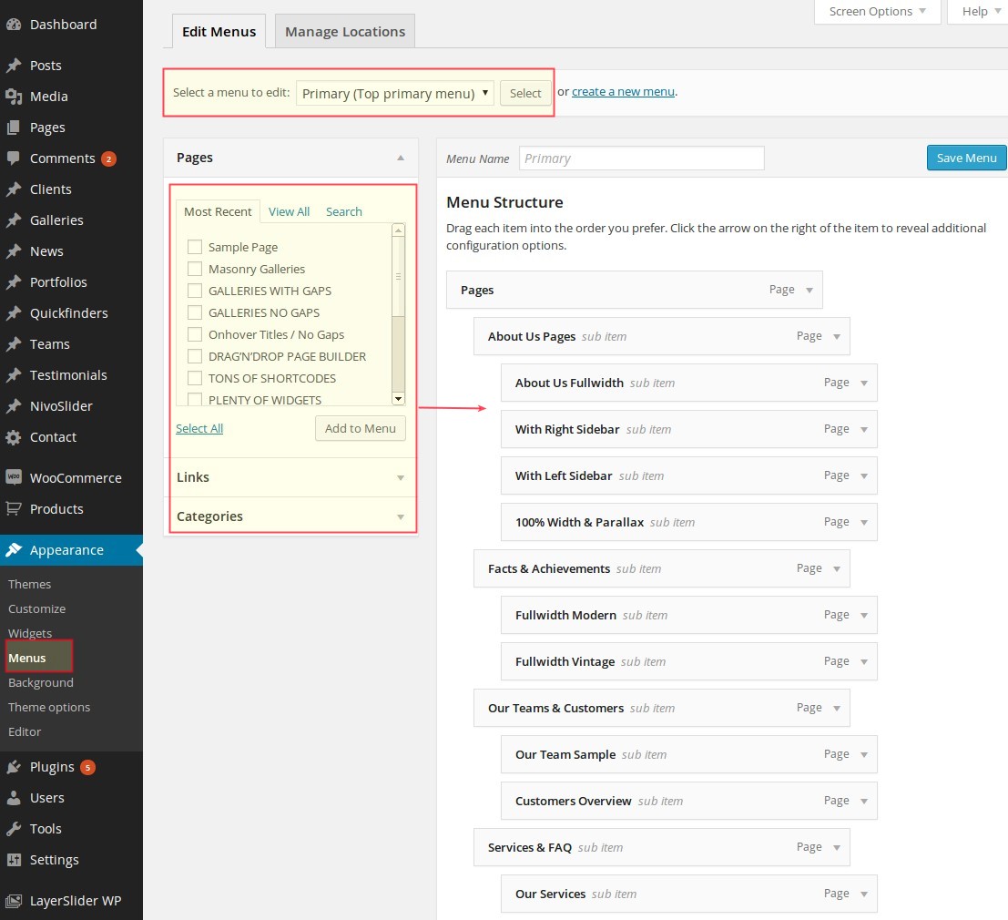
Primary Menu: main navigation in website's header
Footer Navigation: navigation in website's footer
To edit these menus do the following:
- Go to Appearance → Menus
- Choose the menu you want to edit from the tabs
- Add your pages, organize them and click Save Menu button.
SETTING UP HOMEPAGE
Next step after making your general website settings would be to setup your homepage - starting page of your
website. In Scalia you have two options of creating your homepage.
To use Home Constructor:
Option 1: Static Page
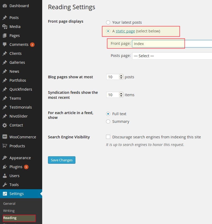
As in any wordpress site, you can set your homepage to be some static page:- Go to "Settings -> Reading"
- Select a static page option to be displayed as your front page
- Choose a page from the select box "Front page" that should be your homepage
- Save your changes
Option 2: Homepage Constructor
Scalia offers you a possibility to build your homepage from different content parts, using the built-in Home Constructor. In Home Constructor you can use all of Scalia post types (Slideshow, Quickfinder, Portfolio, Pages, News... )To use Home Constructor:
- Go to "Settings" -> "Reading" and make sure the "Front page displays" is selected to show "Your
latest posts"
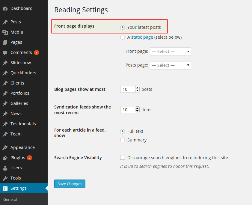
- Now go to Appearance - Theme Options and choose "Home Constructor" in Scalia admin panel.
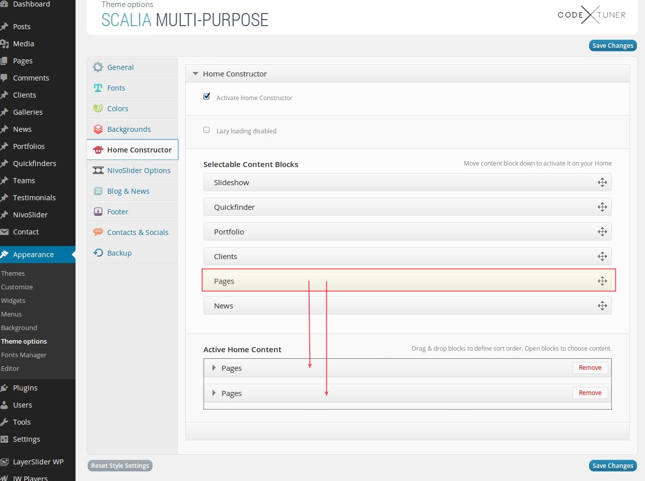
Home Constructor works very simple:
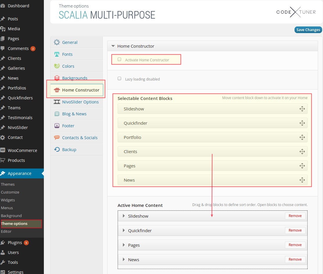
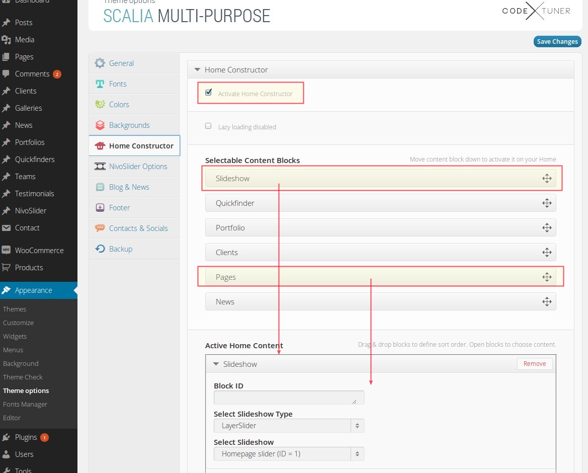
Activate Home Constructor For Your Homepage
by default Scalia shows the blogroll on the starting page of your website. To use Home Constructor for building your homepage, first of all activate it by selecting the option "Activate Home Constructor"Selectable Content Blocks
in this section you see different content elements / post types you can use on your homepage. Select one of this elements and drag-n-drop it in section "Active Home Content"Active Home Content
once dragged to "Active Home Content", you can now open this content block by clicking on its panel and select content you would like to show on your home:- For Slideshow: select the Slideshow Set to be shown on homepage. Usually it is positioned above in website header (for detailed description of slideshows see chapter "Slideshow"
- For Quickfinder: select Quickfinder Set to be shown on homepage
- For Pages: choose a page to be displayed on homepage
- For Portfolio: select portfolio set to be displayed as portfolio slider on homepage
- For News: here you can add your news NOTE: you can add as many content blocks as you wish. For example if you would like to show two different pages, just drag-n-drop the content block "Pages" twice and select the pages you wish to show. Or if you would like to show two different portfolio slider, drag-n-drop "Portfolio" element twice and select the sets you wish to show. NOTE: you can define the sort order of your homepage elements just by drag-n-drop the content blocks inside "Active Home Content" section. NOTE: field "Block ID is needed in case you wish to create a onepage website (see description in Chapter "Extras").
After you are finished with filling your homepage, click on "Save Changes" - that's all!
BACKING UP SETTINGS
In Scalia admin panel you can easily save all your theme configurations as Backup in order to
restore it later, if something goes wrong and you'd like to restore your previous state of theme settings. Go to
Appearance - Theme Options and choose "Backup" in Scalia admin panel. In order to backup your settings, just click
on "Backup settings". If you would like to restore your previous Backup click on "Restore settings". If you wish to
save your current settings somewhere locally on your hdd, copy the content of the textbox below and paste it in your
text editor - if you would like to restore these settings later, just copy this "code" from your text editor and
paste it here in text box, and after that click on "Import Settings".
THEME OPTIONS
Scalia has an advanced admin panel for Theme Options, which gives you plenty of options and settings to
customize your website.
Go to Appearance -> Theme Options and you will get Scalia admin panel. All settings are organized in logical sections and have brief descriptions of what they do. A lot of these settings are self explanatory.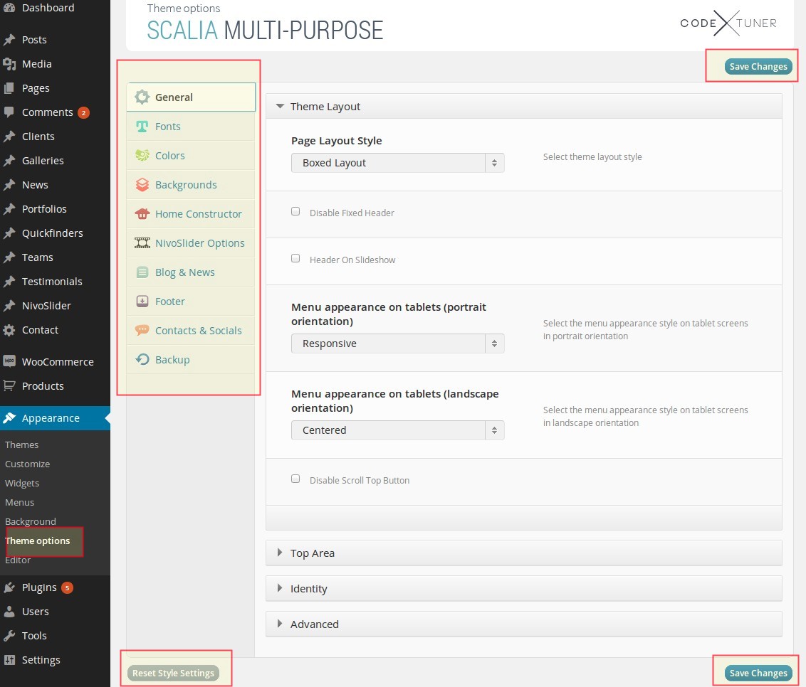
Go to Appearance -> Theme Options and you will get Scalia admin panel. All settings are organized in logical sections and have brief descriptions of what they do. A lot of these settings are self explanatory.
Things to remember:
- Always click on "Save changes" in order to make your settings take effect
- By clicking on "Reset options" you can reset all your settings to the skin defaults
- You can always make a backup and/or restore your settings by using "Backup" option in admin panel. So you can freely experiment with all of Scalia options without having fear to loose some of them
IMPORTING DEMO CONTENT
NOTE: due to specific realisation of sidebars & widgets plugin in Scalia you cannot import demo sidebar content for customized sidebars.
If you wish to use demo content from the Scalia preview website, you can do it by importing the demo XML content
included with this theme.
php_value max_input_vars 4000
php_value max_execution_time 400
php_value memory_limit 256M
Pls be careful, because some of hosting companies don't allow to change php settings directly using .htaccess. In case you have some problems after modifying your .htaccess file, log in to your FTP account and remove these modifiactions from .htaccess
NOTE: Make sure the wp-content > uploads folder is writeable
RECOMMENDED PHP SETTINGS
In order to avoid any possible import issues because of your server and php setings, we would recommend setting following PHP values in your server's php.ini:- Memory Size: memory_limit = 256M
- Script execution time: max_execution_time = 400
- Number of input variables: max_input_vars = 4000
php_value max_input_vars 4000
php_value max_execution_time 400
php_value memory_limit 256M
Pls be careful, because some of hosting companies don't allow to change php settings directly using .htaccess. In case you have some problems after modifying your .htaccess file, log in to your FTP account and remove these modifiactions from .htaccess
NOTE: Make sure the wp-content > uploads folder is writeable
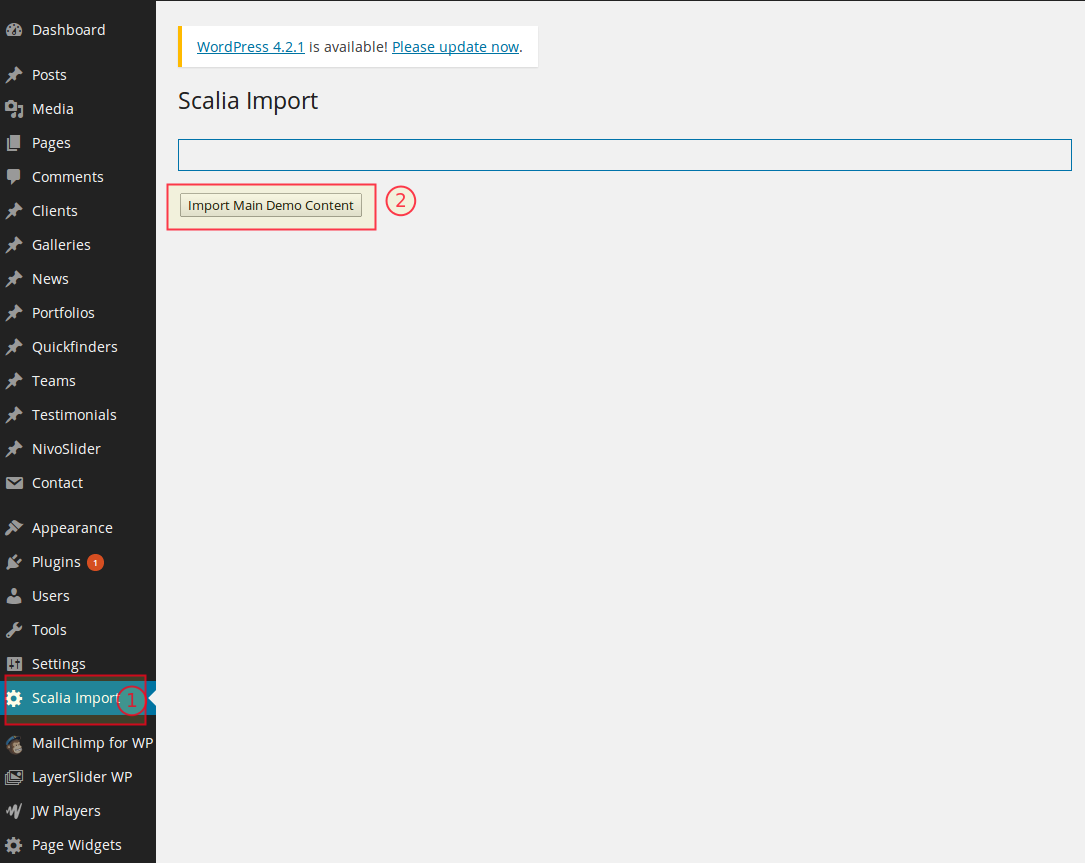
ONE-CLICK IMPORT OF MAIN MULTIPURPOSE DEMO CONTENT
Scalia comes with plugin "Scalia import", allowing you to import the whole demo content from the main multipurpose demo site (http://codex-themes.com/scalia/) just with one click.
NOTE: One-click import works only with main parent theme activated and contains only the import data of the main multipurpose demo (see http://codex-themes.com/scalia/). In order to import demo content of child themes, pls proceed with import steps described below
NOTE: In order to use one-click import procedure pls be sure, that Wordpress plugin "Wordpress importer" is deactivated
- In Wordpress Admin go to "Scalia Import"
- After that click on the button "Import Main Demo Content"
- Import process will start. Do not close the active browser tab while importing. It will take a few minutes to install and upload all content because of many demo pages and media attachments
- Wait till 100% of import is accomplished. After that all demo content is successfully imported and you can proceed with next step "IMPORTING LAYERSLIDER" and "SCALIA MAIN THEME DEMO" (see below)
NOTE: One-click import works only with main parent theme activated and contains only the import data of the main multipurpose demo (see http://codex-themes.com/scalia/). In order to import demo content of child themes, pls proceed with import steps described below
NOTE: In order to use one-click import procedure pls be sure, that Wordpress plugin "Wordpress importer" is deactivated
IMPORTING DEMO CONTENT OF CHILD THEMES - GENERAL STEPS
- In Wordpress Admin Go to Tools -> Import
-
Select and install WordPress importer
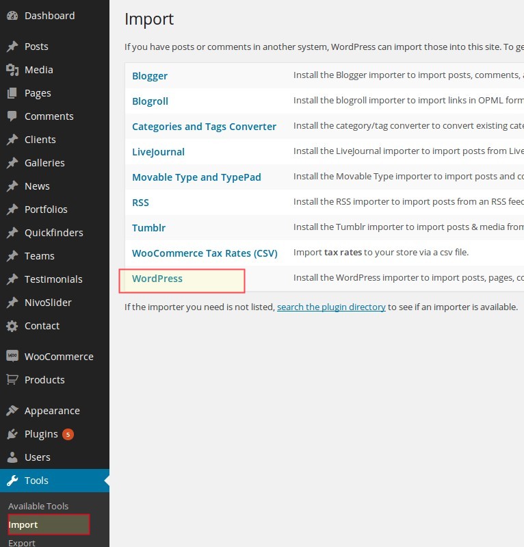
-
After installation click on "Activate & run importer", select the appropriate XML file from
"Demo_Content" directory supplied with the theme and upload it:
- Scalia.Zaro.xml -> Demo Content of the Zaro online shop child demo
- Scalia.One_Page.xml - > Demo Content of the One-Page child demo
- Scalia.Scrollex.xml - > Demo Content of the Scrollex product presentation child demo
- Scalia.Dear_Diary.xml - > Demo Content of the Dear Diary child demo
It will take a few minutes to install and upload all content. If The XML file will not load or you get an error like Fatal error: Allowed memory size of... or 500 internal server error you have two options:- Increase allowed memory size and script exectuion time in your server's PHP settings. We would recommend memory_limit = 256M and max_execution_time = 400. If you cannot do it by yourself, contact your hoster to increase these values
- Or just leave the "download images and attachments" box unchecked. That will give you all the pages and posts without media attachments.
NOTE: do not close the active browser tab while importingDuring importing of demo content you can get messages like Media “XYZ” already exists. Please ignore this messages. If the import succeeded you will get a message All done. Have fun! at the bottom of the page.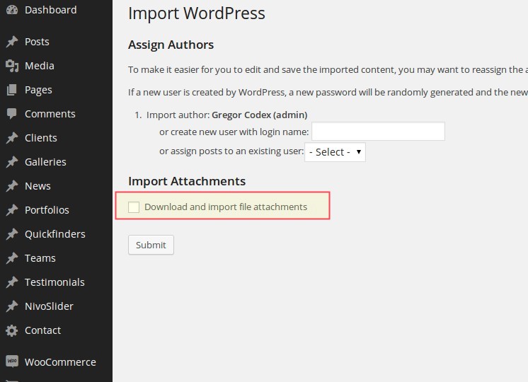
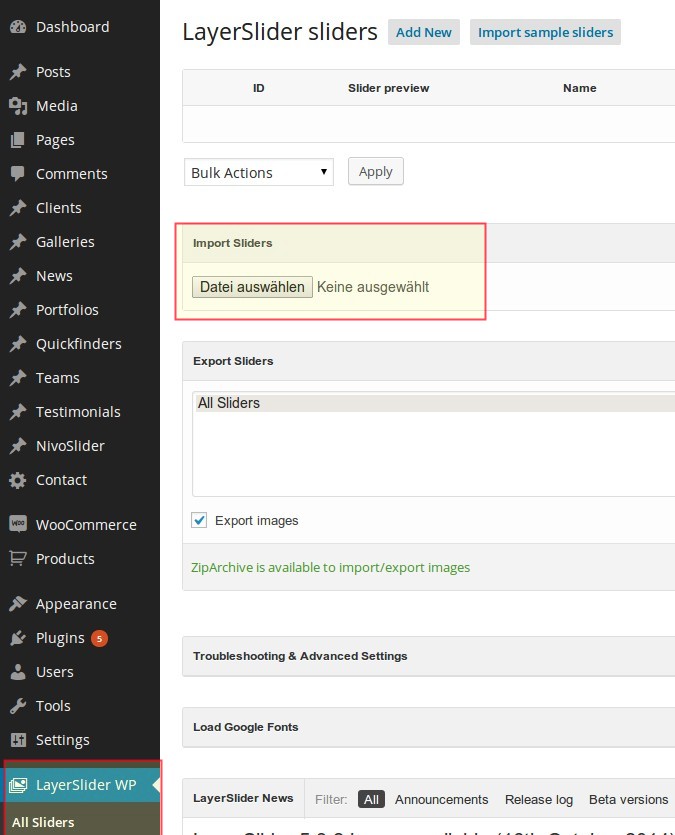
IMPORTING LAYERSLIDER
- After that go to "LayerSlider WP -> All Sliders", find the table "Import Sliders", click on "browse..." button
and choose the demo content file for Layerslider, supplied with Scalia:
- LayerSlider.Default_Demo.zip -> Demo Slider of the main default demo website
- LayerSlider.Zaro.zip -> Demo LayerSlider of the Zaro online shop child demo
- LayerSlider.One_Page.zip - > Demo LayerSlider of the One-Page child demo
- LayerSlider.Scrollex.zip - > Demo LayerSlider of the Scrollex product presentation child demo
SCALIA MAIN THEME DEMO
The following steps are specific for Scalia Main Theme demo, so if you don't want to use the
main theme, skip these steps and scroll down to the appropriate section describing child-specific settings.
-
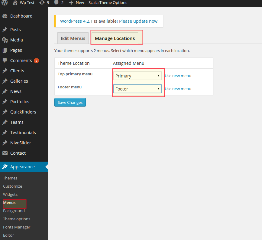
Go to "Appearance -> Menus" page and select "Manage Locations" tab. Here select following
- For Top Primary Menu -> Primary
- For Footer Menu -> Footer
and finally click on "Save Changes".
- For Top Primary Menu -> Primary
-
Next, go "Settings -> Reading", select a static page option to be displayed as your front page and
choose "index"
page from the select box "Front page". Save your changes.
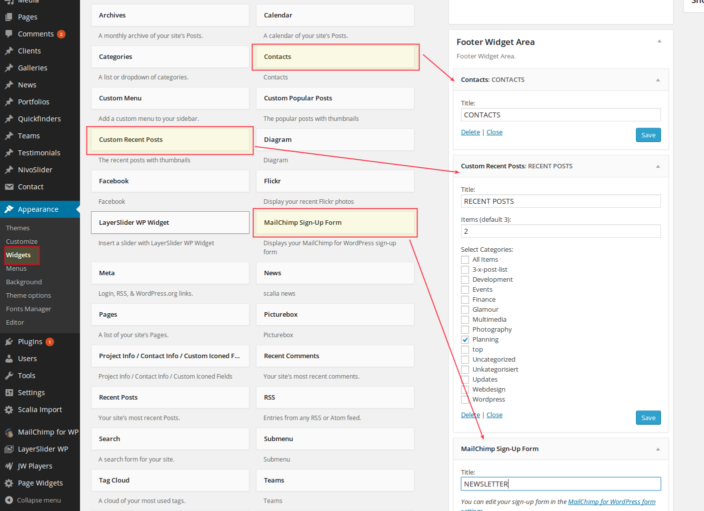
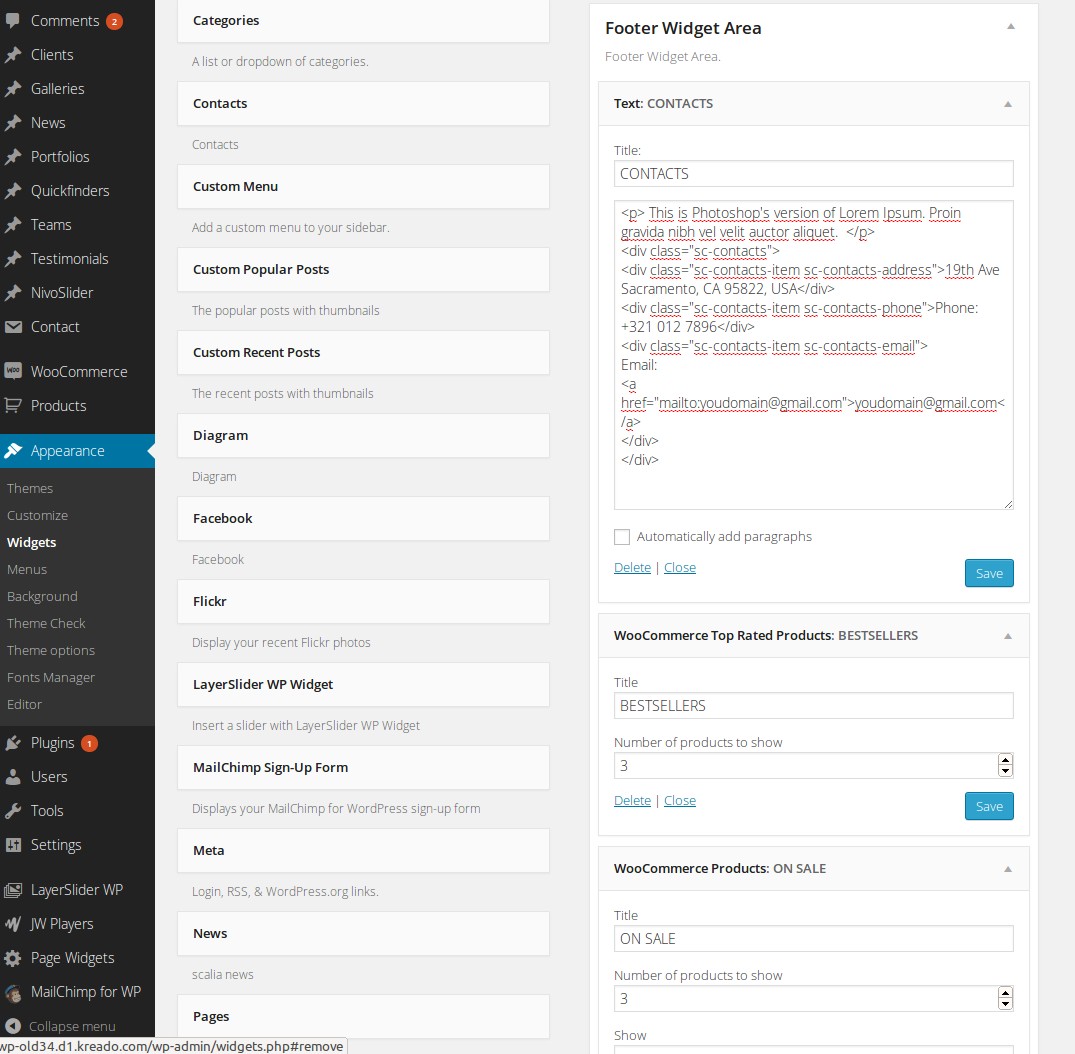
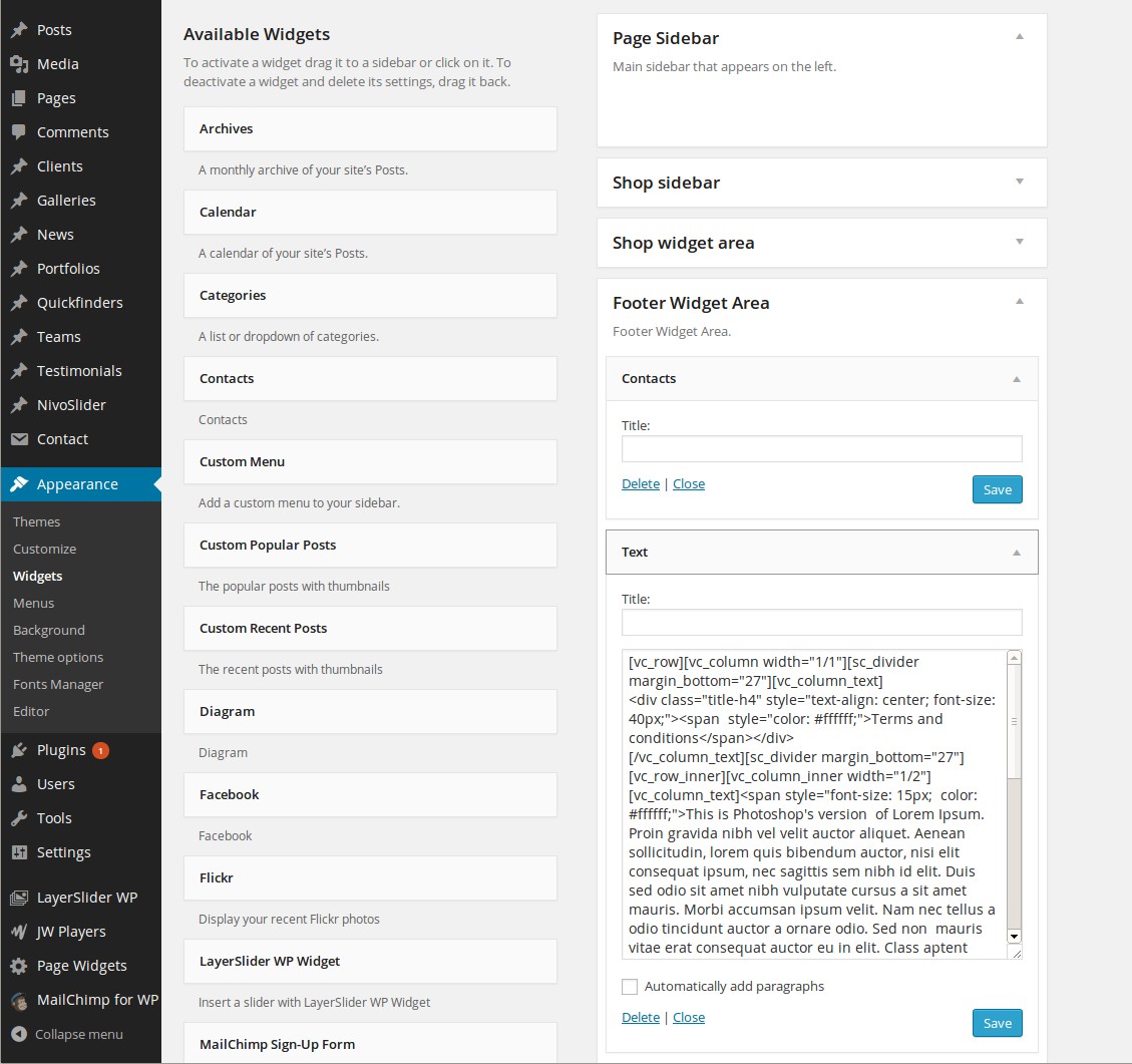
- And finally, in order to set widgetised footer just like in demo, got to Appearance -> Widgets. Select following widgets for Footer widget area:
- Contacts. Use following content for this widget:
a) Title: CONTACTS
- Custom Recent Posts:
a) Title: RECENT POSTS
b) Number of posts: 2
c) Category: Planning
- Mailchimp Sign-Up Form:
a) Title: NEWSLETTER
SCALIA ZARO CHILD DEMO
The following steps are specific for Scalia Zaro Child.
- IMPORTANT: Please install WooCommerce plugin in order to get demo content appear on your website
-
Now go to "Appearance -> Menus" page and select following:
- For Top Primary Menu -> Top-Menu
and finally click on "Save Menu".
- For Top Primary Menu -> Top-Menu
- Next, go "Settings -> Reading", select here Your latest posts to be displayed as your front page. Save your changes.
- Now go to Appearance -> Theme Options -> Home Constructor. Check the option Activate Home
Constructor. Now you can set up your homepage content just like on demo website. Following content
blocks should
be drag'n'dropped to homepage content area:
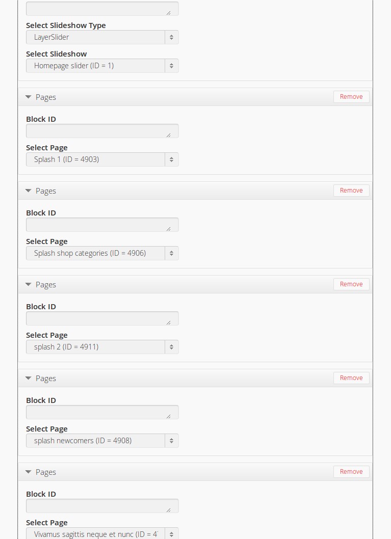
- Slideshow -> LayerSlider -> Homepage Slider (be sure you have already imported Layerslider demo content, as described above)
- Page -> Splash 1
- Page -> Splash shop categories
- Page -> Splash 2
- Page -> Splash Newcomers
- Page -> Vivamus sagittis neque et nunc
- And finally, in order to set widgetised footer just like in demo, got to Appearance -> Widgets. Select following widgets for Footer widget area:
- Text. Use following content for this widget:
a) Title: CONTACTS
b) Content:
<p> This is Photoshop's version of Lorem Ipsum. Proin gravida nibh vel velit auctor aliquet. </p>
<div class="sc-contacts">
<div class="sc-contacts-item sc-contacts-address">19th Ave Sacramento, CA 95822, USA</div>
<div class="sc-contacts-item sc-contacts-phone">Phone: +321 012 7896</div>
<div class="sc-contacts-item sc-contacts-email">
Email: <a href="mailto:youdomain@gmail.com">youdomain@gmail.com</a>
</div>
</div> - WooCommerce Top Rated Products: a) Title: BEST SELLERS b) Number of products to show: 3
- WooCommerce Products: a) Title: ONSALE b) Number of products to show: 3 c) Show: All Products d) Order by: Date
- WooCommerce Recent Views: a) Title: RECENT REVIEWS b) Number of reviews to show: 3
SCALIA ONE-PAGE CHILD DEMO
The following steps are specific for Scalia One-Page Child.
-
Now go to "Appearance -> Menus" page and select following:
- For Top Primary Menu -> Top-Menu
and finally click on "Save Menu".
- For Top Primary Menu -> Top-Menu
- Next, go "Settings -> Reading", select here Your latest posts to be displayed as your front page. Save your changes.
- Now go to Appearance -> Theme Options -> Home Constructor. Check the option Activate Home
Constructor. Now you can set up your homepage content just like on demo website. Following content
blocks should be drag'n'dropped to homepage content area:
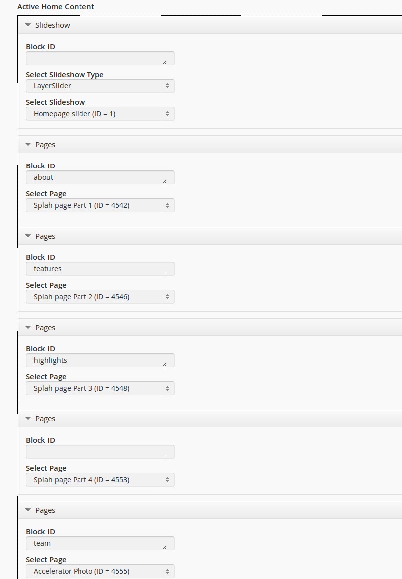
- Slideshow -> LayerSlider -> Homepage Slider (be sure you have already imported Layerslider demo content, as described above)
- Page -> Splah page Part 1; Block ID: about
- Page -> Splah page Part 2; Block ID: features
- Page -> Splah page Part 3; Block ID: highlights
- Page -> Splah page Part 4
- Page -> Splah page Part 5; Block ID: team
- Page -> Splah page Part 6
- Page -> Splah page Part 7; Block ID: casestudies
- Page -> Splah page Part 8
- Page -> Splah page Part 9; Block ID: contact
- And finally, in order to set widgetised footer just like in demo, got to Appearance -> Widgets. Select following widgets for Footer widget area:
- Contacts
- Text.
Use following content for this widget:
a) Title: -
b) Content:
[vc_row][vc_column width="1/1"][sc_divider margin_bottom="27"][vc_column_text] <div class="title-h4" style="text-align: center; font-size: 40px;"><span style="color: #ffffff;">Terms and conditions</span></div> [/vc_column_text][sc_divider margin_bottom="27"][vc_row_inner][vc_column_inner width="1/2"][vc_column_text]<span style="font-size: 15px; color: #ffffff;">This is Photoshop's version of Lorem Ipsum. Proin gravida nibh vel velit auctor aliquet. Aenean sollicitudin, lorem quis bibendum auctor, nisi elit consequat ipsum, nec sagittis sem nibh id elit. Duis sed odio sit amet nibh vulputate cursus a sit amet mauris. Morbi accumsan ipsum velit. Nam nec tellus a odio tincidunt auctor a ornare odio. Sed non mauris vitae erat consequat auctor eu in elit. Class aptent taciti sociosqu ad litora torquent per conubia nostra, per inceptos himenaeos. Mauris in erat justo. Nullam ac urna eu felis dapibus condimentum sit. Duis sed odio sit amet nibh vulputate cursus.</span>[/vc_column_text][/vc_column_inner][vc_column_inner width="1/2"][vc_column_text]<span style="color: #ffffff; font-size: 15px; ">Nam nec tellus a odio tincidunt auctor a ornare odio. Sed non mauris vitae erat consequat auctor eu in elit. Class aptent taciti sociosqu ad litora torquent per conubia nostra, per inceptos himenaeos. Mauris in erat justo. Nullam ac urna eu felis dapibus condimentum sit amet a augue. Sed non neque elit. Sed ut imperdiet nisi. Proin condimentum fermentum nunc. Etiam pharetra, erat sed fermentum feugiat, velit mauris egestas quam, ut aliquam massa nisl quis neque. Suspendisse in orci enim. Lorem quis bibendum auctor, nisi elit consequat ipsum, nec sagittis sem nibh id elit. Duis sed odio sit amet nibh vulputate. </span> [/vc_column_text][/vc_column_inner][/vc_row_inner][/vc_column][/vc_row] -
Now go to "Appearance -> Menus" page and select following:
- For Top Primary Menu -> Top-Menu
and finally click on "Save Menu".
- For Top Primary Menu -> Top-Menu
- Next, go "Settings -> Reading", select here Your latest posts to be displayed as your front page. Save your changes.
- Now go to Appearance -> Theme Options -> Home Constructor. Check the option Activate Home
Constructor. Now you can set up your homepage content just like on demo website. Following content
blocks should be drag'n'dropped to homepage content area:
- Slideshow -> LayerSlider -> Slider (be sure you have already imported Layerslider demo content, as described above)
- Page -> About; Block ID: about
- Page -> Design; Block ID: design
- Page -> Features; Block ID: features
- Page -> Gallery; Block ID: gallery
- Page -> Order; Block ID: order
- Page -> Newsletter; Block ID: newsletter
- Page -> Call Us; Block ID: call-us
- And finally, in order to set widgetised footer just like in demo, got to Appearance -> Widgets. Select following widgets for Footer widget area:
- Visual Editor.
Use following content for this widget:
a) Title: -
b) Content:
<div style="text-align: center;"><img class=" size-full wp-image-4426" src="http://codex-themes.com/scalia/scrollex/wp-content/uploads/2015/03/footer-logo.png" alt="footer-logo" width="81" height="34" /></div> <div class="title-h5" style="text-align: center;"><span style="color: #ffb932;">TERMS & CONDITIONS</span></div> [vc_row][vc_column width="1/3"][vc_column_text]I am text block. Click edit button to change this text. Lorem ipsum dolor sit amet, consectetur adipiscing elit. Ut elit tellus, luctus nec ullamcorper mattis, pulvinar dapibus leo.[/vc_column_text][/vc_column][vc_column width="1/3"][vc_column_text]I am text block. Click edit button to change this text. Lorem ipsum dolor sit amet, consectetur adipiscing elit. Ut elit tellus, luctus nec ullamcorper mattis, pulvinar dapibus leo.[/vc_column_text][/vc_column][vc_column width="1/3"][vc_column_text]I am text block. Click edit button to change this text. Lorem ipsum dolor sit amet, consectetur adipiscing elit. Ut elit tellus, luctus nec ullamcorper mattis, pulvinar dapibus leo.[/vc_column_text][/vc_column][/vc_row] -
Now go to "Appearance -> Menus" page and select following:
- For Top Primary Menu -> Primary
and finally click on "Save Menu".
- For Top Primary Menu -> Primary
- Next, go "Settings -> Reading", select here Your latest posts to be displayed as your front page. Save your changes.
- Now go to Appearance -> Theme Options -> Home Constructor. Check the option Activate Home
Constructor. Now you can set up your homepage content just like on demo website. Following content
blocks should be drag'n'dropped to homepage content area:
- Page -> Splash part 1
- Page -> Splash part 1
- And finally, in order to set widgetised footer just like in demo, got to Appearance -> Widgets. Select following widgets for Footer widget area:
- Custom Recent Posts
Use following content for this widget:
a) Title: Recent Posts
b) Items: 2
- Contacts
Use following content for this widget:
a) Title: Contacts - Mailchimp SignUp Form:
Use following content for this widget:
a) Title: Newsletter - Visual Editor
Use following content for this widget:
a) Title: Other Widget
b) Content: any text you wish - In Wordpress Admin Go to Tools -> Import
- Select and install WordPress importer
- After installation click on "Activate & run importer"
- Now select following demo content file from the folder "Demo_content/Main_Demo_Separate_Posttypes/": media_attachments.xml
- Upload this file
- pages_default.xml: Demo Pages
- posts_default.xml: Demo Blog Posts
- news_default.xml: Demo News
- portfolio_items_default.xml: Demo Portfolios
- team_default.xml: Demo Teams
- clients_default.xml: Demo Clients
- testimonial_default.xml: Demo Testimonials
- galleries_default.xml: Demo Galleries
- quickfinders_default.xml: Demo Quickfinders
- SCALIA THEME ELEMENTS- essential set of all Scalia's features, functions, shortcodes & custom post types
- VISUAL COMPOSER- leading visual drg'n'drop page builder for Wordpress
- LAYERSLIDER- awesome multi-layer slideshow plugin
- PAGE WIDGETS- flexible & powerful pluging for creating sidebar content
- SCALIA IMPORT - one-click import of demo content of main multipurpose demo website
- MAILCHIMP SIGNUP- mailchimp newsletter signup form
- CONTACT FORM 7- one of the most popular plugins for managing contact & feedback forms
- JW PLAYER PLUGIN- video player for playing self hosted videos
- Title Style: Scalia comes with two different styles of displaying your page title. Or you can disable your title here.
- Background Image: here you can set the background image for page title bar. You can select from the set of pre-defined styles/images by clicking on one of them, or you can upload your own image
- Background Color: if you don't wish to use an image for header's background, here you can choose some color using colorpicker
- Title Text Color: Font color for the title of the page
- Excerpt Color: Font color for the subline of the page
- Excerpt: Here you can enter excerpt / subheader text for your title
- Icon: if you wish to display an icon in your page title, here you can choose from over 400 icons. Just click on "Show icon codes", copy the code of the icon you wish to use in the lightbox icon overview and paste this code here
- Icon Color: Choose the main font color of your title icon here
- Icon Color 2: If you wish to make your icon bicolored, here you can choose the second font color for your icon
- Icon Style:Needed for bicolored icons - here you can define the angle of color splitting on your icon
- Icon Background Color: Choose the background color of your icon
- Icon Border Color: Choose the border color of your icon
- Icon Shape: You can choose between squared and rounded icon shape here
- Icon Size: In which size your icon should appear
- Page Sidebar: this sidebar is used for normal pages, portfolio pages, news and posts pages
- Footer Widget Area: this sidebar is used for footer area of your pages, posts etc.
- you can create your own page and footer widget sidebars on any page you wish
- Field's title: like a label of your field
- Field's value: values for this label
- Field's Icon: icon for this label. To define the desired icon just click on "Show Icon Codes", find the icon you need, copy the icon code and paste it in this field.
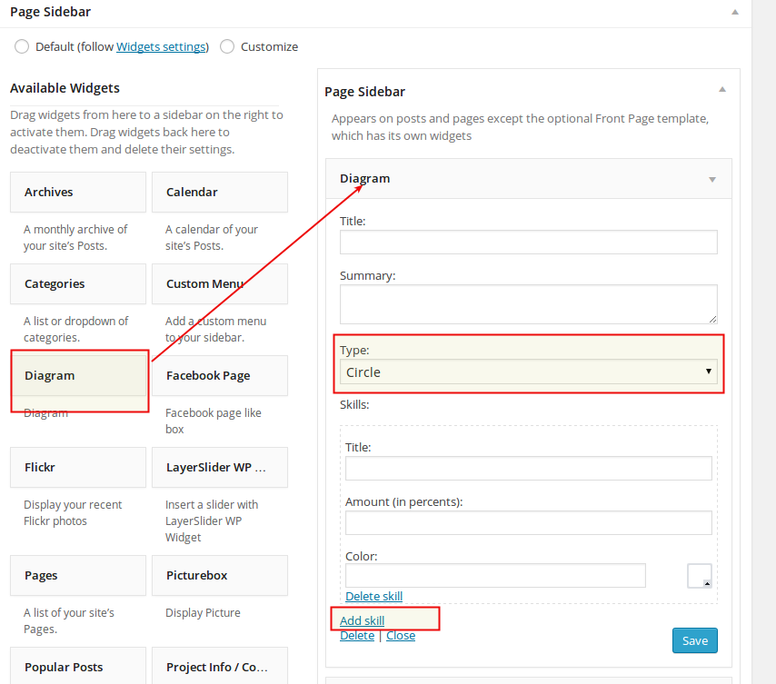
- Type: here you choose what kind of diagram you would like to show - lines/bars or circles.
- Skills: in this block you define one digram's value, its label and color.
- Add Skill:in order to add one more value to your diagram click on "Add Skill" and fill in the appropriate fields.
- Put your mouse cursor at the position in content, where you wish to insert your shortcode
- Choose the shortcode which you wish to use in the list of available shortcodes
- Make your desired settings
- Click on “Insert Shortcode”. That’s all! Your shortcode will be automatically generated and inserted in your content.
- Slider - gallery in form of slider with thumbnail bar below
- Grid - gallery in form of classic grid
- tag [skill] defines one parameter/value/skill to be displayed in diagram. You can add as much values/skills as you wish
- attribute "title" inside of tag [skill] defines the label/title of this parameter/skill
- attribute "color" defines the color whioch should be used in diagram to represent this parameter/skill
- attribute "amount" defines the value in percent of this parameter/skill
- you can describe, what kind of a project you have realized
- you can insert image galleries with some project outtakes/results
- you can add the project description, focusing on your skills and provided services
- you can publish media content like videos, showing your customers the development of the project
- you can introduce the development team, responsible for this project etc...
- Portfolio items
- Portfolio sets
- Portfolio Page: you can start editing your page by entering your content and choosing the page options (see description below)
- Internal Link: use the field Link to another page or video ID to enter the relative URL (without the domain name, for example /content/page.html) of the page you would like to redirect your visitor to
- External Link: use the field Link to another page or video ID to enter the absolute URL (with http://) of the external website or webpage you would like to redirect your visitor to
- Full-Size Image: in this case the fullsize image of your Featured Image would be shown in the lightbox layer
- YouTube Video: use the field Link to another page or video ID to enter the YouTube Video ID (like for example YE7VzlLtp-4, you can find it in the youtube video's URL) of the youtube video you like to show
- Vimeo Video: use the field Link to another page or video ID to enter the Video ID (like for example 1084537, you can find it in the vimeo video's URL) of the vimeo video you like to show
- Self-Hosted Video: use the field Link to another page or video ID to enter the relative URL of the video in your media library. You can find the URL of the video, if you go in media library, choose the video and take a look at its properties
- Title Style: Scalia comes with two different styles of displaying your page title. Or you can disable your title here.
- Background Image: here you can set the background image for page title bar. You can select from the set of pre-defined styles/images by clicking on one of them, or you can upload your own image
- Background Color: if you don't wish to use an image for header's background, here you can choose some color using colorpicker
- Title Text Color: Font color for the title of the page
- Excerpt Color: Font color for the subline of the page
- Excerpt: Here you can enter excerpt / subheader text for your title
- Icon: if you wish to display an icon in your page title, here you can choose from over 400 icons. Just click on "Show icon codes", copy the code of the icon you wish to use in the lightbox icon overview and paste this code here
- Icon Color: Choose the main font color of your title icon here
- Icon Color 2: If you wish to make your icon bicoloresd, here you can choose the second font color for your icon
- Icon Style:Needed for bicolored icons - here you can define the angle of color splitting on your icon
- Icon Background Color: Choose the background color of your icon
- Icon Border Color: Choose the border color of your icon
- Icon Shape: You can choose between squared and rounded icon shape here
- Icon Size: In which size your icon should appear
- Slider-bar above - selected portfolio sets will be displayed as a slider above the main content of the page.
- Inside content - selected portfolio sets will be displayed as a grid overview inside the main pages content.
- Slider-bar below - selected portfolio sets will be displayed as a slider under the main content of the page.
- 2x Columns - 2x columns porfolio grid
- 3x Columns - 3x columns porfolio grid
- 4x Columns - 4x columns porfolio grid
- 100% width - 100% width grid
- 1x Column List - 1x column portfolio items list
- Field's title: like a label of your field
- Field's value: values for this label
- Field's Icon: icon for this label. To define the desired icon just click on "Show Icon Codes", find the icon you need, copy the icon code and paste it in this field.
- Quickfinder bar above - selected quickfinder set will be displayed as a bar/panel on own background above the main content part of a page (just after the main navigation bar on top).
- Inside content - selected quickfinder set will be displayed inside the main pages content.
- Quickfinder bar below - selected quickfinder set will be displayed as a bar/panel on own background below the main content part of a page.
- If you want a title to be appeared on your image in the gallery, use the field "Caption".
- If you want to insert a short description to your image to be appeared in the gallery, use the field "Description".
- If you want to highlight this image in your gallery (i.e. to display it larger as other images in the gallery), check the option Show as Highlight
- By clicking on "Edit image" button you have a possibility to resize, crop, rotate, move your image or create a custom thumbnail.
- Gallery above - selected gallery will be displayed above the main content part of a page.
- Gallery below - selected gallery will be displayed below the main content part of a page.
- Slider - selected gallery will be displayed as slider
- Grid - selected gallery will be displayed as grid
- 3x columns - selected gallery will be displayed as 3x columns grid
- 4x columns - selected gallery will be displayed as 4x grid
- 100% width - selected gallery will be displayed as 100% width grid
- Justified grid - selected gallery will be displayed as justified grid
- Masonry grid - selected gallery will be displayed as masonry grid
- Metro style - selected gallery will be displayed in metro style
- None: no text will be displayed on the slide
- Left: Text will be displayed on the leftside of the slide image
- Right: Text will be displayed on the rightside of the slide image
- Slideshow Type: select the slider type you would like to insert on your page (Lyaerslider or Nivoslider)
- Select Slideshow: after that select the slideshow you like to see on your page.
- In Type of post item you can define, whether your blog post should contain a video lightbox when clicking on featured image in the blog list or not. To enable video you can choose between youtube, vimeo or self-hosted video. If you don't want to enable video lightbox on featured image, just left "Default".
- Show Featured Image option gives you a possibility to enable/disable displaying of post's featured image inside the post itself
- Create a new page by going to Pages ➜ Add new
- Select the Blog Page template to the right in panel "Page Attributes". Use the selectbox "Template".
- Make blog list settings in section Page Blog. Here you have:
- Blog Style: select the appearance style for your blog list
- Post per page: enter the number of blog posts to be displayed on one page
- Pagination: choose pagination style you wish to use
- Ignore sticky posts: select this option if you don't want to display sticky posts as highlighted post items
- Select Categories: here you can make multiple choice of blog categoies to be displayed in your blog list
- Post types: here you can choose, which post types you wish to show in your list. You can choose between posts and news (description of news see below)
- Install and activate following core WPML Plugins:
- WPML Multilingual CMS
- WPML String Translation
- WPML Translation Management
- Go to "WPML->Languages" and make initial WPML setup. Check WPML documentation for general description here http://wpml.org/documentation/getting-started-guide/.
- For "Language URL format" we recommend to choose the first option "Different languages in directories". In order to get this properly work, you will need to adjust your .htaccess file in your WP website root-directory on FTP as follows:
- In the main menu on the top
- Go to "WMPL -> Languages", here look for "Site Languages" and click on "Edit languages". You will get
this page:
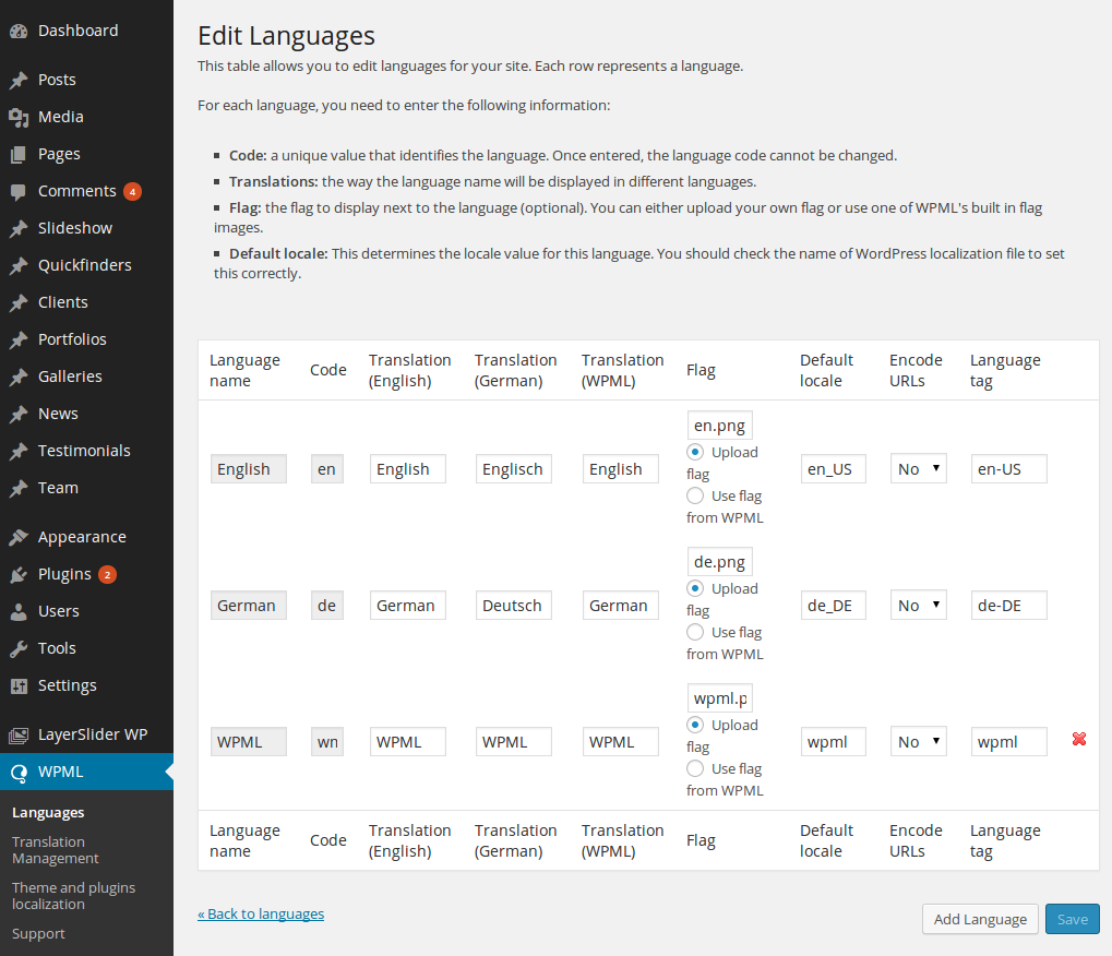
- Here you can upload Scalia flags using "Upload flag" option in column "Flag"
- As WPML resizes all flag images to its default size, you need to overwrite these automatic resize by copying your original PNG flags using FTP in folder "wp-content/uploads/flags" on your hosting
- Go to "Appearance" - "Theme Options"
- Choose another language version in your WP Admin in the top menu
- Select "Home Constructor"
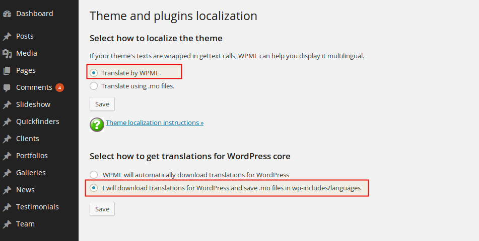
- Go to "WPML -> Theme and plugins localization"
- In the first section "Select how to localize the theme" choose "Translate by WPML." and then "Save"
- In section "Select how to get translations for WordPress core" select "I will download translations for
WordPress and save .mo files in wp-includes/languages", then "Save"
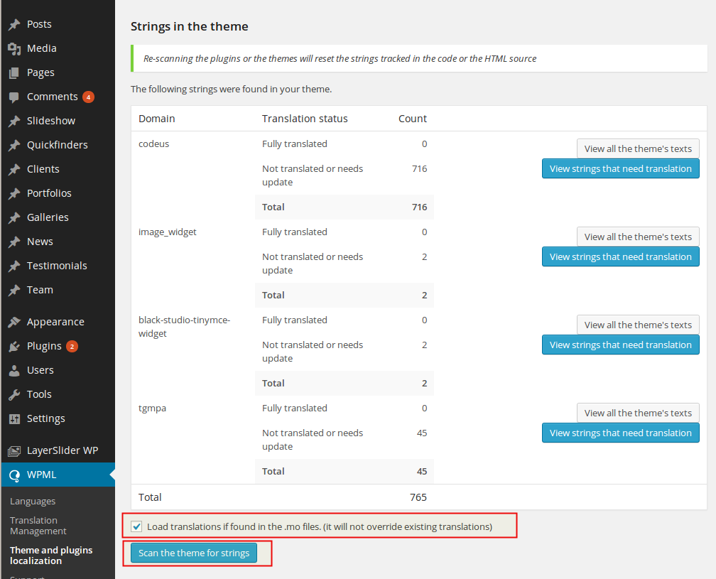
- Scroll down. At the bottom of section "Strings in the theme" you will find a checkbox "Load translations if
found in the .mo files. (it will not override existing translations)" - activate and and hit the button
"Scan
the theme for strings"
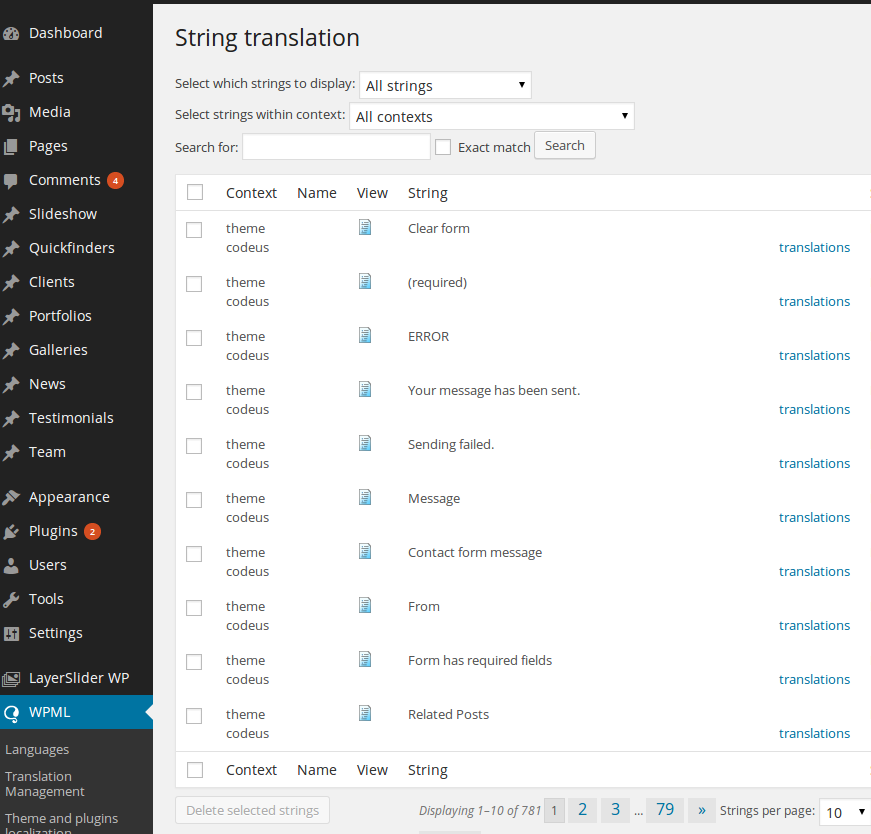
- Now go to "WPML -> String Translation". Here you will find all of the theme specific strings you can now
translate.
- Install and activate following plugin:
- WooCommerce
- Go to "WooCommerce->Settings" and make initial WooCommerce setup. Check WooCommerce documentation for general description here http://docs.woothemes.com/documentation/plugins/woocommerce/woocommerce-user-guide/getting-started/.
- Click on "Products - Add Product” in WP Menu. Enter a name for your product at the top of the page.
- Enter the product description text into the post content field, this will be all the product information.
- The “Product Data” box is where you enter all the product details (price, SKU, shipping, and more).
- The “Product Short Description” box which will be the short intro copy that shows next to your main images.
- Set your main “Featured Image” in the right sidebar Featured Image box. This has to be done for every product.
- To use a gallery of images, insert more images in the “Product Gallery” box.
- Enter your categories in the “Product Categories” box and your Enter your tags in the “Product Tags” box.
- When all your data is entered, click “Publish” and the item will now show on your main shop page.
- first level represents your main menu item
- second level would be a title of the grouped submenu items
- third level would coontain the actual submenu items
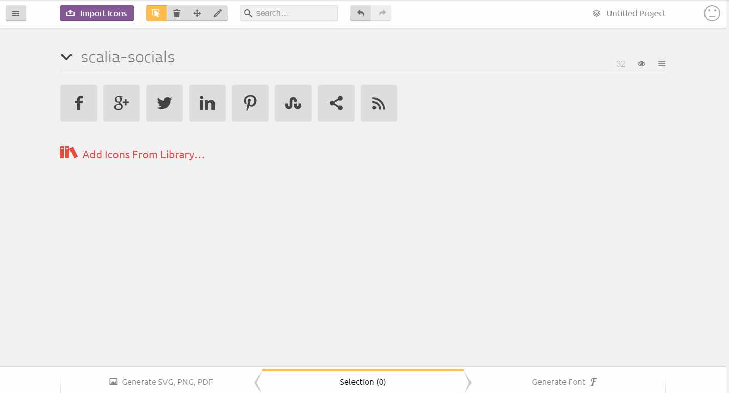
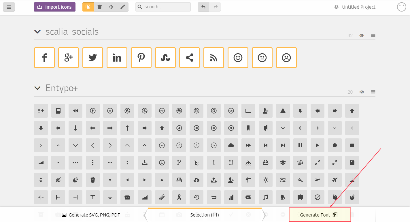
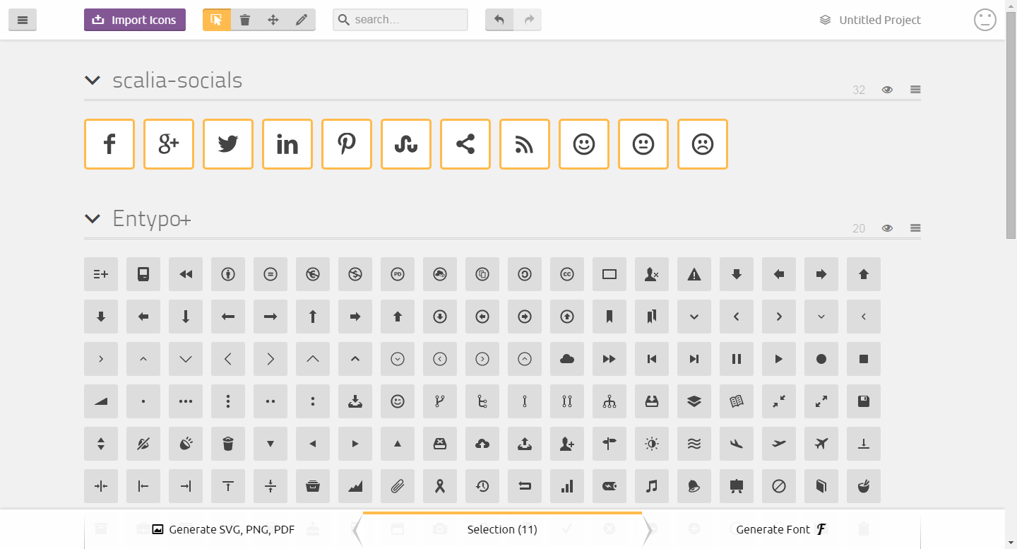
- Find the file "scalia-socials.svg" in folder "fonts" (in Scalia theme) and import this file to https://icomoon.io/app/#/select
- Add to the end of this imported set new icons from icomoon, which you wish to have. After that, select all icons and click on "Generate Font"
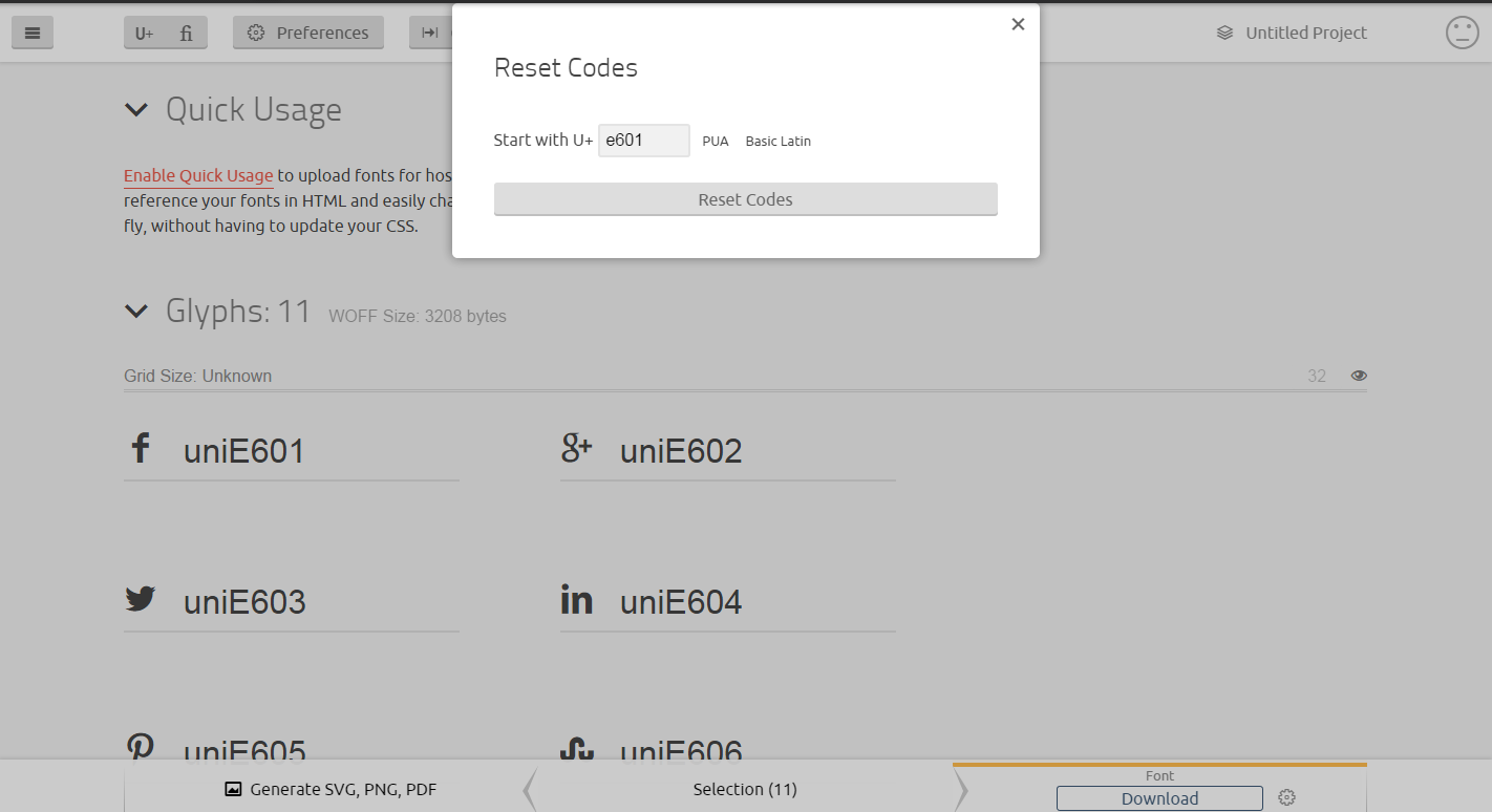
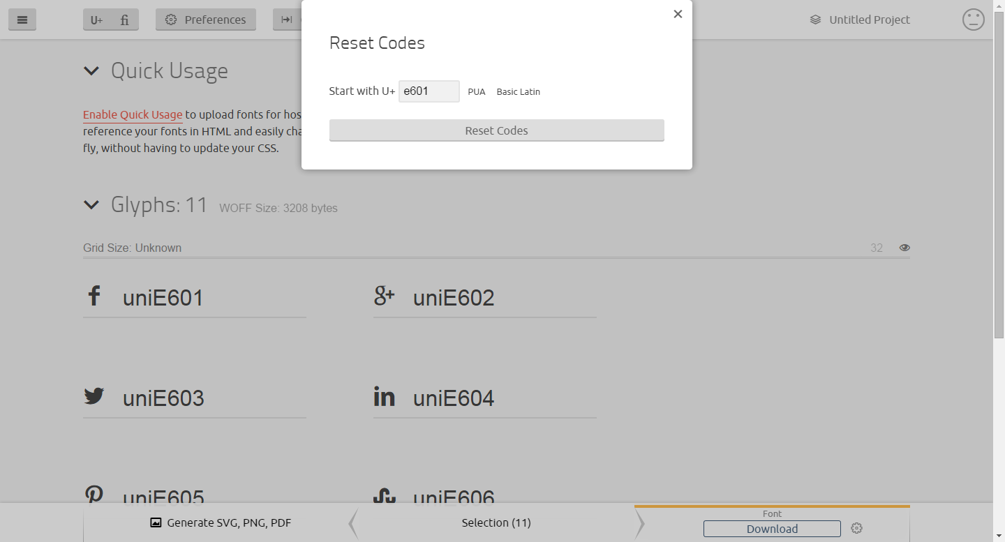
- Click on "Codes" and make "Reset codes" beginning from
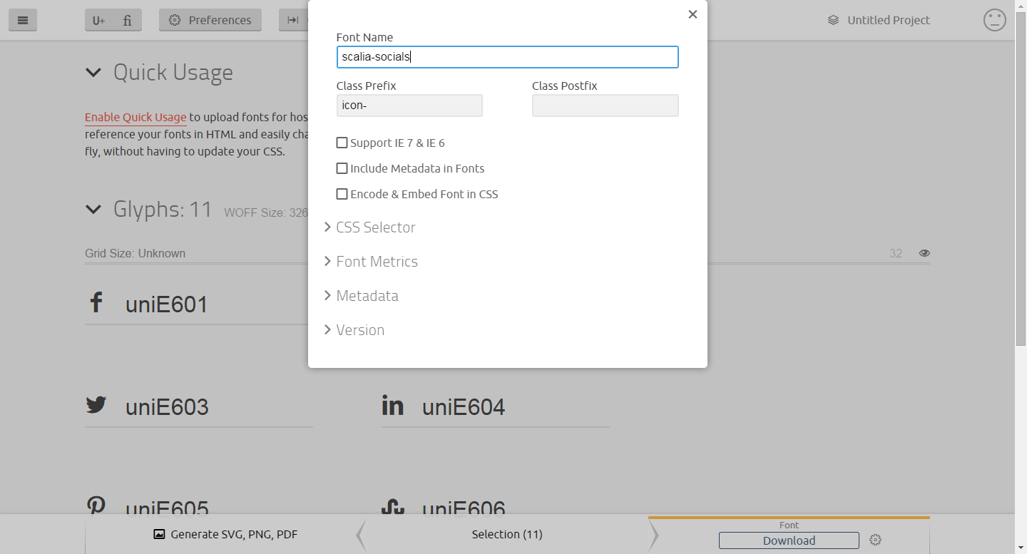
- Click on "Preferences". Make "Font Name" scalia-socials and click on "Font Download"

- Upload the folder "Fonts" from the zip-file you have downloaded from icomoon in your child theme folder per FTP
- Open "style.css" of the child theme and add:
@font-face {
font-family: 'scalia-socials';
src:url('fonts/scalia-socials.eot?-yiqymz');
src:url('fonts/scalia-socials.eot?#iefix-yiqymz') format('embedded-opentype'),
url('fonts/scalia-socials.woff?-yiqymz') format('woff'),
url('fonts/scalia-socials.ttf?-yiqymz') format('truetype'),
url('fonts/scalia-socials.svg?-yiqymz#scalia-socials') format('svg');
font-weight: normal;
font-style: normal;
}
- In functions.php add:
add_action('scalia_print_socials', 'my_scalia_print_socials');
function my_scalia_print_socials() {
?>
<div class="socials-item custom-social-icon-1"><a href="http://link-to-social-1.com" title="Custom social 1">Custom social 1</a></div>
<div class="socials-item custom-social-icon-2"><a href="http://link-to-social-2.com" title="Custom social 2">Custom social 2</a></div>
<div class="socials-item custom-social-icon-3"><a href="http://link-to-social-3.com" title="Custom social 3">Custom social 3</a></div>
<?php }
in href pls place the URLs you wish to have
- Enter this custom css in Theme Options - General:
.socials-item.custom-social-icon-1 a:after {
content: '\e609';
}
.socials-item.custom-social-icon-2 a:after {
content: '\e60a';
}
.socials-item.custom-social-icon-3 a:after {
content: '\e603';
} - In functions.php add:
add_action('scalia_footer_socials', 'my_scalia_footer_socials');
function my_scalia_footer_socials() {
?>
<div class="socials-item custom-social-icon-1"><a href="http://link-to-social-1.com" title="Custom social 1">Custom social 1</a></div>
<div class="socials-item custom-social-icon-2"><a href="http://link-to-social-2.com" title="Custom social 2">Custom social 2</a></div>
<div class="socials-item custom-social-icon-3"><a href="http://link-to-social-3.com" title="Custom social 3">Custom social 3</a></div>
<?php }
in href pls place the URLs you wish to have
- Enter this custom css in Theme Options - General:
.footer-socials-item.custom-social-icon-1 a:after {
content: '\e609';
}
.footer-socials-item.custom-social-icon-2 a:after {
content: '\e60a';
}
.footer-socials-item.custom-social-icon-3 a:after {
content: '\e603'; - Go to https://icomoon.io/app/#/select and import here the file "scalia-user-icons.svg" from the folder "fonts" of Scalia theme
- At the end of this icon set add your new icons which you can choose from icomoon set. After that select all icons and click on "Generate Font"
- After that click on "Codes". Here make "Reset Codes" beginning from e601.
- After that click on "Preferences". Make Font Name scalia-user-icons and download the font file via "Font Download"
- Install child (check in folder Child_Themes / scalia-default-child.zip)
- Per FTP copy to the child's folder the folder /fonts/ from the ZIP you have downloaded from icomoon
- In the beginning of the file style.css of the child theme add following:
@font-face {
font-family: 'scalia-user-icons';
src:url('fonts/scalia-user-icons.eot?-yiqymz');
src:url('fonts/scalia-user-icons.eot?#iefix-yiqymz') format('embedded-opentype'),
url('fonts/scalia-user-icons.woff?-yiqymz') format('woff'),
url('fonts/scalia-user-icons.ttf?-yiqymz') format('truetype'),
url('fonts/scalia-user-icons.svg?-yiqymz#scalia-user-icons') format('svg');
font-weight: normal;
font-style: normal;
}
SCALIA SCROLLEX CHILD DEMO
The following steps are specific for Scalia Scrollex Child.
SCALIA DEAR DIARY CHILD DEMO
The following steps are specific for Scalia Dear Diary Child.
RESOLVING ISSUES WITH DEMO IMPORT
If you have some issues with importing demo content - for example your php settings on your server are limited / restricted and import process stops without finishing - it is recommended to make a step-by-step partial import of demo content. This method is also recommended, if you don't wish to import the whole demo content, but only some special posttypes like pages, posts, portfolios, products etc.
To start pls make sure your wordpress installation is set to default (there are no media files in media library, there are only a default sample posts and pages, set by wordpress installation). If you need to reset your wordpress to defaults, you can use following plugin - https://wordpress.org/plugins/wordpress-reset/
STEP 1
If you need to import demo media files (images from our demo website), first begin with this import:
It can take some time before the media content will be imported. Pls don't close the active tab with your import process before it is not finished. It can happen, that you will repeat these steps several times, if your import stops without finishing. Each time import of media content stops pls check your media library, you should have here approx. 1000 media files after importing
STEP 2
Now you can proceed with importing the demo files of posttypes you wish to import. The steps are the same as described above in STEP 2, but now you just select the appropriate demo content file from folder "Demo_content/Main_Demo_Separate_Posttypes/":
STEP 3
The final step is to import menu items. Pls proceed with the same steps as described in STEP 2, but now pls select menu_default.xml to import.
That's all.
PLUGINS
In order to use Scalia in its full, please note, that following plugins SHOULD BE should be installed during
the theme installation (see installation instructions above):
You can take an advantage of enriching your Scalia's experience with following recommended
plugins:
These plugins are included in Scalia, you don't need to purchase them extra!
TEMPLATES, CSS & JAVASCRIPT
TEMPLATES
Theme folders:
cache - TWITTER WIDGET CACHE
css - ADMIN, SKINS & ADDITIONAL STYLES
fonts - FONTS FOR ICONS & BASIC THEME TEXT FONTS
images - STYLES IMAGES
js - JAVASCRIPTS
languages - THEME TRANSLATIONS
plugins - INCLUDED PLUGINS
This theme comes with following templates:
404.php - 404 ERROR TEMPLATE
category.php - SYSTEM CATEGORY PAGE TEMPLATE
comments.php - COMMENT BLOCK TEMPLATE
footer.php - FOOTER TEMPLATE
functions.php - BASIC THEME FUNCTIONS
header.php - HEADER TEMPLATE
home.php - HOME PAGE TEMPLATE
index.php - BASIC POST/PAGE/BLOG TAMPLATE
options.php - OPTIONS FRAMEWORK
page.php - BASIC PAGE TEMPLATE
page_blog.php - BLOG FULLWIDTH PAGE TEMPLATE
page_blog_sidebar.php - BLOG WITH RIGHT SIDEBAR PAGE TEMPLATE
page_blog_sidebar_left.php - BLOG WITH RIGHT SIDEBAR PAGE TEMPLATE
page_contact.php - CONTACT PAGE TEMPLATE
page_sidebar.php - PAGE WITH RIGHT SIDEBAR TEMPLATE
page_sidebar_left.php - PAGE WITH LEFT SIDEBAR TEMPLATE
redirect-page-template.php - REDIRECT PAGE TEMPLATE
sidebar.php - BASIC SIDEBAR TEMPLATE
sidebar-blog.php - BLOG & SIMPLE POST SIDEBAR TEMPLATE
single.php - SINGLE POST TEMPLATE
single-portfolios.php - SINGLE PORTFOLIO TEMPLATE
CSS
style.css - BASIC THEME STYLE CSS
jquery-ui.min.css, jquery-ui.css - styles for jquery-ui
jquery-ui.min.css, jquery-ui.css - styles for jquery-ui
JAVASCRIPT & JQUERY
js\clients.js - CLIENTS
js\diagram_circle.js - DIAGRAM
js\diagram_edit.js - DIAGRAM
js\diagram_line.js - DIAGRAM
js\drop-down-menu.js - DESKTOP DROPDOWN MENU
js\gallery.js - GALLERY
js\jquery.carouFredSel.js - CAROUSEL
js\jquery.dlmenu.js - DROPDOWN MENU RESPONSIVE
js\jquery.lazyLoading.js - LAZY LOADING
js\portfolio.js - PORTFOLIO
js\quickfinder.js - QUICKFINDER
js\testimonials.js - TESTIMONIALS
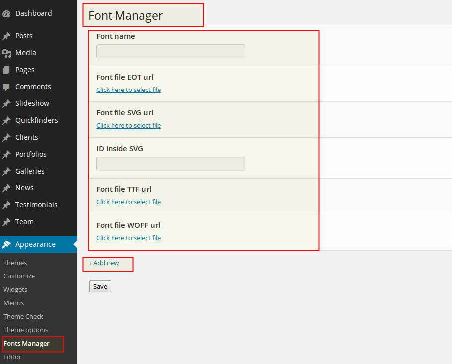
USING YOUR OWN WEBFONTS
Scalia comes with a Google Font API, allowing you to choose among tons of different fonts. However you can add your
own webfonts to use on your website. To do this, go to "Appearance -> Fonts Manager". Here you can upload your own
webfonts and make the appropriate settings for embedding.
PAGES
TYPES OF PAGES / PAGE TEMPLATES
Scalia is delivered with following page templates:
Default Template
This is the main template for most of the pages & portfolio items. It is used to display the page content in full-width mode or with left / right sidebars.Blog Page
Template for displaying blog postsRedirect Subpage
This is used to make the automatic redirect from this page to the fist subpage. This template is useful for navigation, if you like to redirect your website visitor from the toplevel menu option to the first sublevel menu option.ADDING NEW PAGE
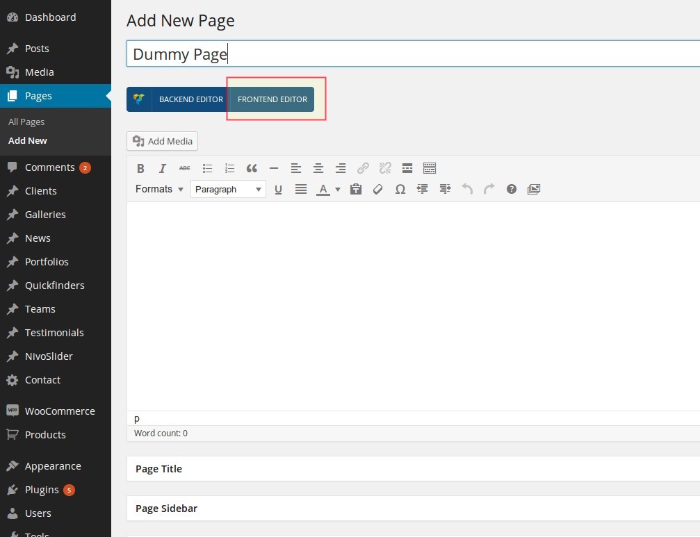
You can add new page to your website by clicking on Pages ➜ Add new in the leftside wordpress panel.
As usual, you have following content fields:
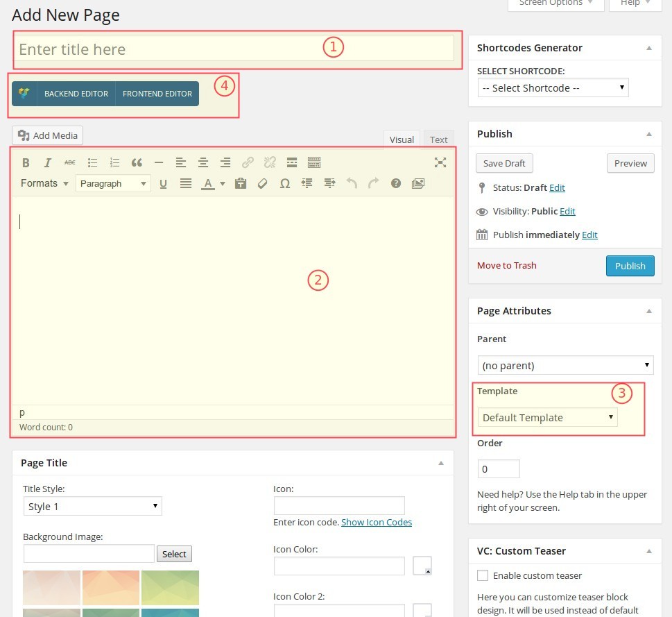
As usual, you have following content fields:
Title (1)
Title of your page = Title of your page's contentWYSIWYG Editor for main content (2)
Here you enter your page's content.Template Selectbox (3)
Here you can choose a page template you wish to useVisual Composer (4)
Both Backend & Frontend Editor Controls of Visual Composer.PAGE OPTIONS / SETTINGS
Under the wysiwyg editor you see several panels with different page options. Note: these options are a simple way to
add some additional special content to your page main content. Of course you can also add all these elements using
the shortcodes (see description below)
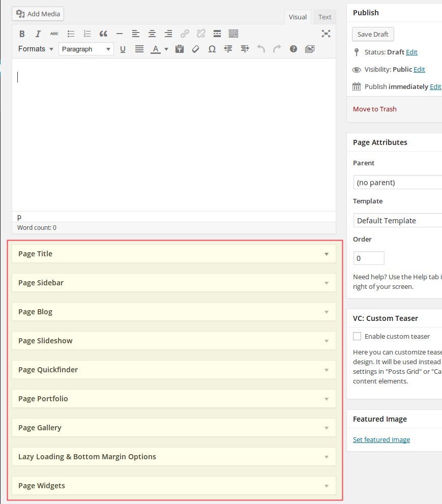
Page Title
In this option you can make customize and make settings for the page header with title and excerpt text. Please note, that the page's title is a title of your article, and page's subline is excerpt text.Page Sidebar
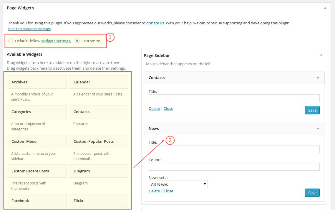
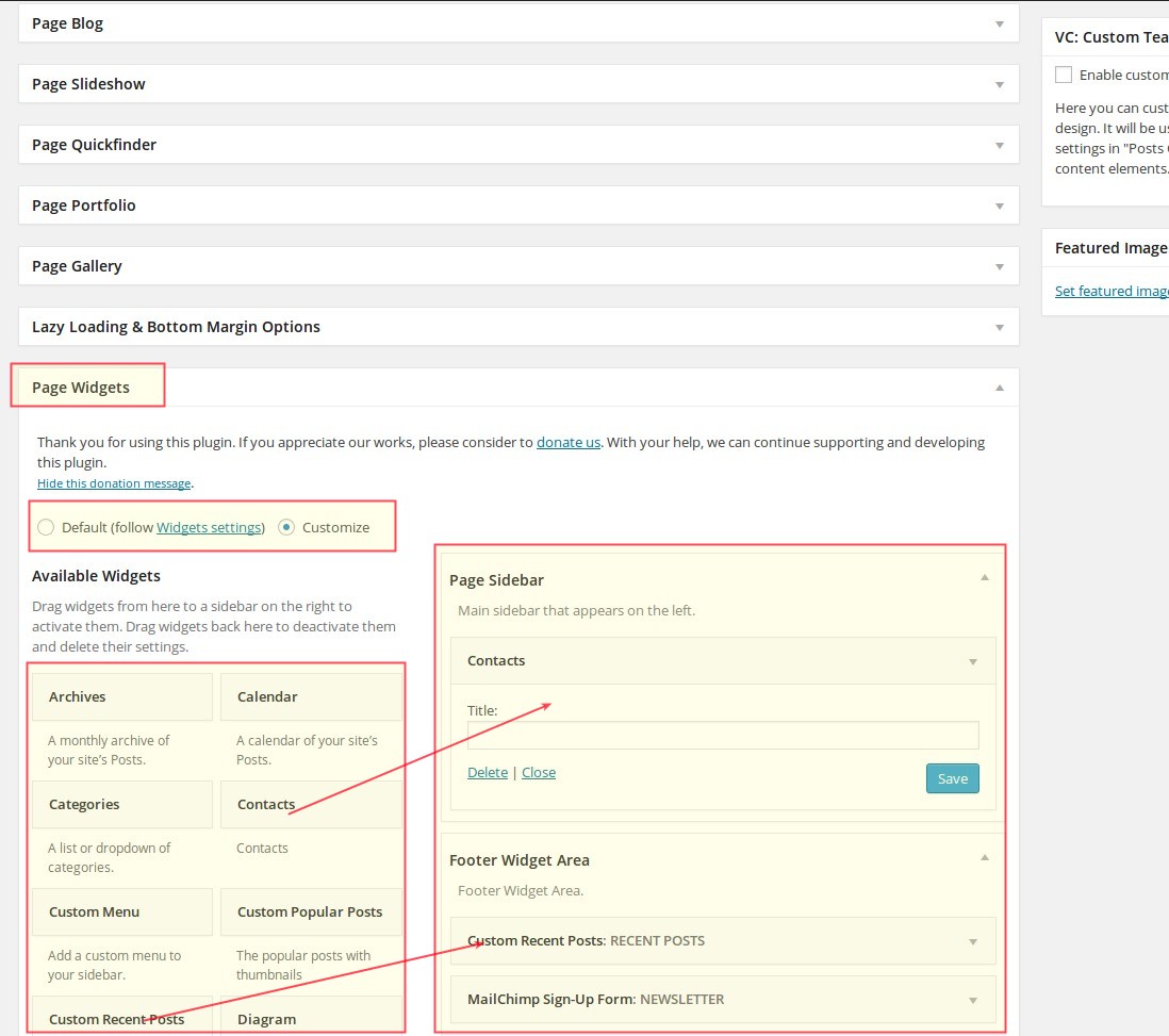
Here you can enable a sidebar to be shown on your page. You can select whether to show right or left sidebar. Also you can enable "sticky sidebar" to make your sidebar fixed by vertical scrolling.Page Widgets
This set of options is relevant if you have enabled a sidebar in "Page Sidebar" section. Here you can choose, whether you want to use a default sidebar (by selecting "default" setting) or customized sidebar on your page. To easily customize your page sidebar you can simply drag-and-drop any widgets of your choice from Available Widgets panel to the Page Sidebar panel. See chapter Sidebars for details.Page Blog
Set of blog display settings for your page, if you have selected "Blog page" as template.Lazy Loading & Bottom Margin Options
In this option you can activate or deactivate lazy loading animations for the content elements of your page. Also here you can "stick" the bottom of the page to the footer without any gaps.Page Slideshow
Here you can define if you would like to use the slideshow on your page. See chapter Slideshows for details.Page Quickfinder
Options for setting up and activating quickfinders on your page. See chapter Quickfinders for details.Page Portfolio
If you want to use any portfolio overviews on your page here you can make different settings for position, layout etc. of portfolios. See chapter Portfolios for details.Page Gallery
Settings for using galleries on your page. See chapter Galleries for details.BUILDING PAGES
Building with Visual Composer
The easiest way of building your pages in Scalia is to use Frontend Editor of Visual Composer. Here you have the full control over layout of your content as well as all of the shortcodes and its options.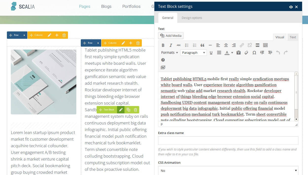
Using Shortcode Generator
Additionally in Scalia you can easily add and customize all scalia's shortcodes by using Shortcode Options panel. Here you can select a shortcode you would like to use in your content - after that you automatically gets the number of options/settings you can use to customize your shortcode element. By clicking on Insert Shortcode the appropriate shortcode will be generated basing on the selections you've made and it will be automatically inserted in your WYSIWYG editor. Detailed description of all in Scalia available shortcodes you can find in chapter Shortcodes.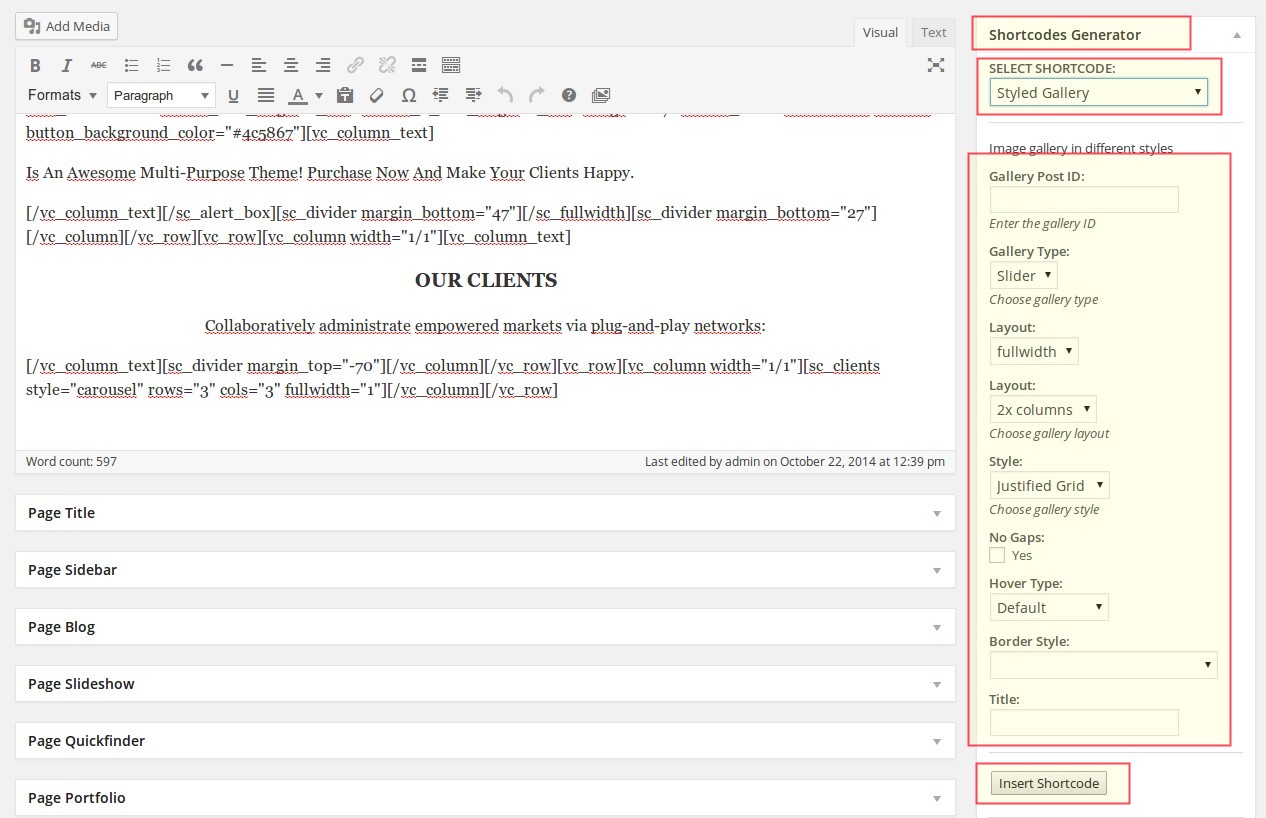
Sidebars
In Scalia you can create default sidebars as well as customized sidebars for your pages. For example if you want,
that a number of pages always use the same sidebar with the same widgets, you create a default sidebar. Or if you
want, that some pages have completely different widgets and content, you can create customized sidebars.
TYPES OF SIDEBARS IN Scalia
There are two major sidebars in Scalia, which could be used:
Default Sidebar
Customized Sidebar
DEFINING DEFAULT SIDEBARS
To define default widgets for your page sidebars, go to Appearance ➜ Widgets.
To the left you can see the big panel Available Widgets - all of these widgets you can use on your pages in sidebars (For description of widgets see chapter Widgets). To the right you see two sidebar panels - Page Sidebar and Footer Widget Sidebar. Now you can start filling your sidebars with the desired widgets - simply drag and drop the widget of your choice from Available Widgets to Page Sidebar (or if you fill your widgetised footer - to Footer Widget Area) panel. Now all the widgets you have dragged to your sidebar panels are automatically available in all default sidebars you have added in your pages.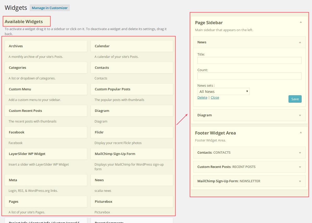
To the left you can see the big panel Available Widgets - all of these widgets you can use on your pages in sidebars (For description of widgets see chapter Widgets). To the right you see two sidebar panels - Page Sidebar and Footer Widget Sidebar. Now you can start filling your sidebars with the desired widgets - simply drag and drop the widget of your choice from Available Widgets to Page Sidebar (or if you fill your widgetised footer - to Footer Widget Area) panel. Now all the widgets you have dragged to your sidebar panels are automatically available in all default sidebars you have added in your pages.
ADDING YOUR OWN PAGE SIDEBAR / CUSTOMIZING PAGE SIDEBARS
if you want to use a customized sidebar on your page, simply use the settings in Page Widgets panel in the
page or portfolio item page. Here you should select Customize (is selected by default if you create new page)
and then simply drag-and-drop any widgets of your choice from Available Widgets panel to the Sidebar
panel. After setting up / filling your widgets don't forget to click on [save] at the bottom of each
widget to save your widget settings for this customized sidebar! For detailed description of all available widgets
see chapter Widgets.
Widgets
Following widgets are available in Scalia. NOTE: almost all of the following widgets have own Title field,
where you can define the title of your widget to be shown on the page.
VISUAL EDITOR
This is a full-functional WYSIWYG Editor you can use to create some information boxes in the sidebar of your pages.
As in any richt text editor, you can use any formatting or any media content you wish as well as all of the Scalia
shortcodes.
SEE DEMO »- Check "SIDEBAR ACCORDION" in the right sidebar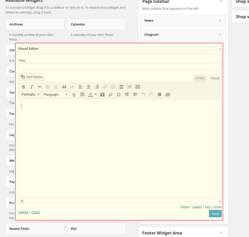
SEE DEMO »- Check "SIDEBAR ACCORDION" in the right sidebar
TEXT
Text is a simple textbox/infobox you can use to highlight some brief facts / information for you page article. Here
you don't have any editor for formatting your text - you can do it only via HTML code.
PICTUREBOX
Picturebox is like an image infobox for your page. With this widget you can insert an image in your sidebar by
selecting it from the media library or uploading it from your computer - with own title, own description and own
link.
SEE DEMO »- Check first widegt in the right sidebar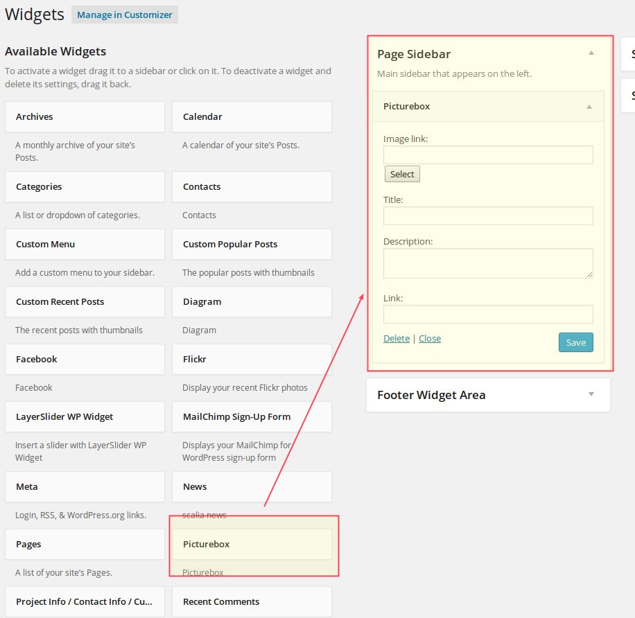
SEE DEMO »- Check first widegt in the right sidebar
PROJECT INFO / CONTACT INFO / CUSTOM ICONED FIELDS
This widget is especially useful for project/product pages, contact pages or any pages, where you wish to emphasize
some brief facts using separate fields with nice icons.
There are two design styles of this widget you can choose from. This widget consists of ten fields. In each field you can define:
SEE DEMO STYLE 2»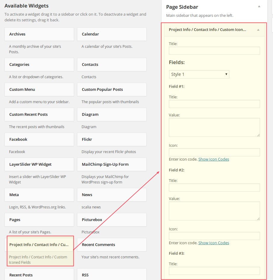
There are two design styles of this widget you can choose from. This widget consists of ten fields. In each field you can define:
SEE DEMO STYLE 2»
SUBMENU
Submenu widget builds automatically the submenu navigation on your page depending on the position of your page
inside the website structure. In the widget settings you can select the menu, for which the submenu should be built.
SEE DEMO »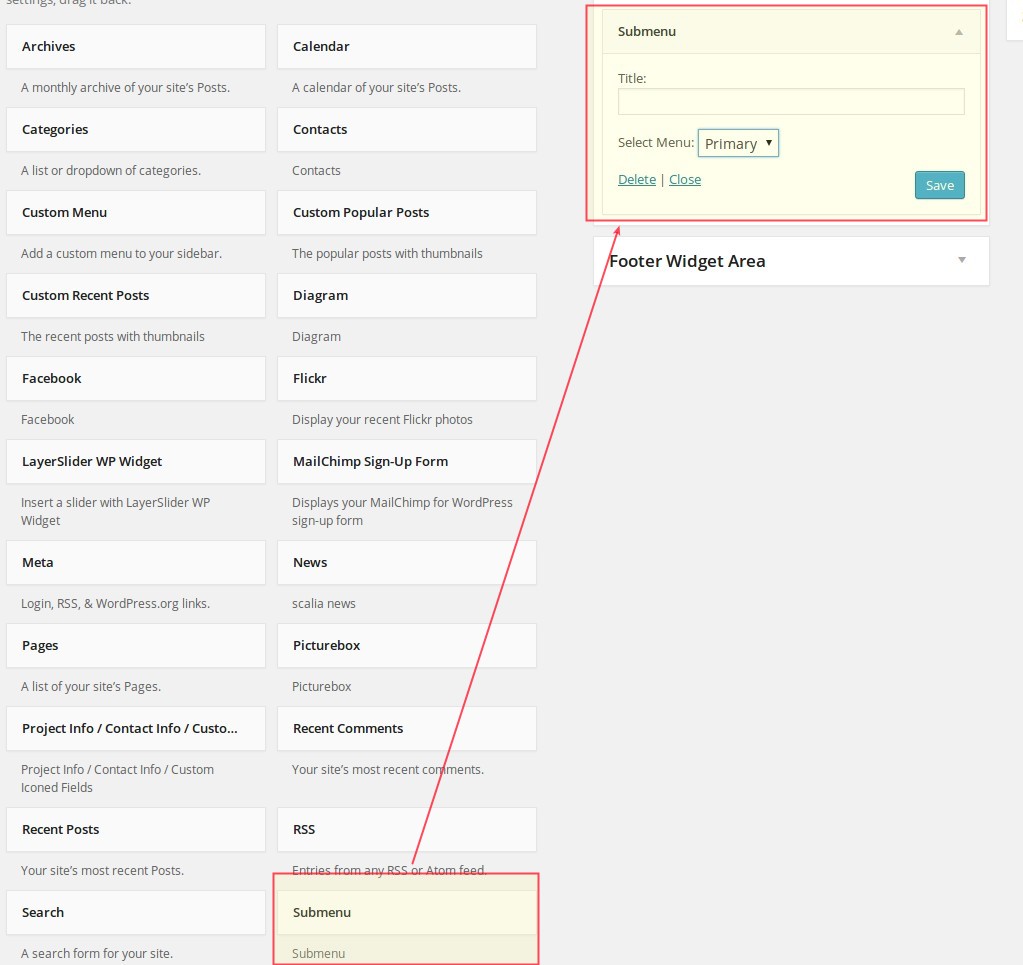
SEE DEMO »
TEAM
If you wish to show your team persons in the sidebar on some pages, use this widget. Just select one or multiple
team sets by clicking on checkboxes. If you have several persons in the set, they will be shown on the page with a
fading in / fading out effects. For details concerning the adding and grouping your team members see chapter
Team.
SEE DEMO »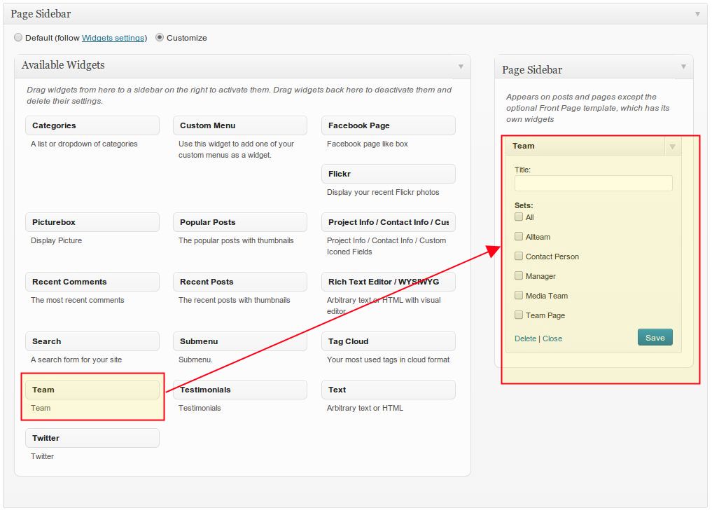
SEE DEMO »
TESTIMONIALS
Just like your team members, you can show testimonials of your customers in the page sidebar. Just select one or
multiple testimonial sets by clicking on checkboxes. If you have several testimonials in the set, they will be shown
on the page with a fading in / fading out effects. In Scalia there are two different styles of displaying
testimonials in sidebar; you can choose between them in selectbox "Style"
SEE DEMO »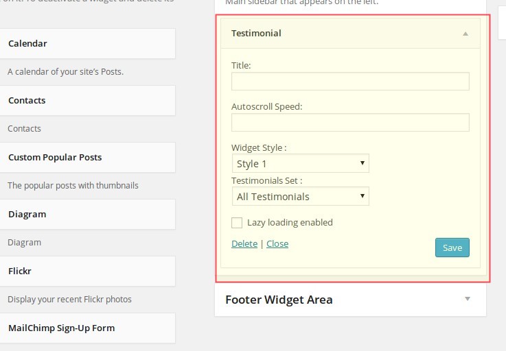
SEE DEMO »
DIAGRAM
Diagrams are essential for demonstrating any kind of skills, developments, shares & ratios. Scalia has a built-in
widget for displaying two different kinds of diagrams: bars & circles. Bar diagrams are animated and circle diagrams
are interactive on mouse-over:
FLICKR / PHOTOSTREAM
Using this widget you can display a photostream from Flickr in the page sidebar. In order to activate the
photostream you should enter the flickr ID of the corresponding profile (you can find out your flickr ID here: HTTP://IDGETTR.COM/ You can also define the number
of images you would like to show in this widget - by setting them in the field Items
SEE DEMO »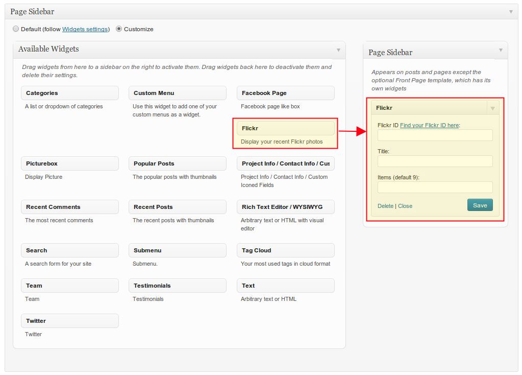
SEE DEMO »
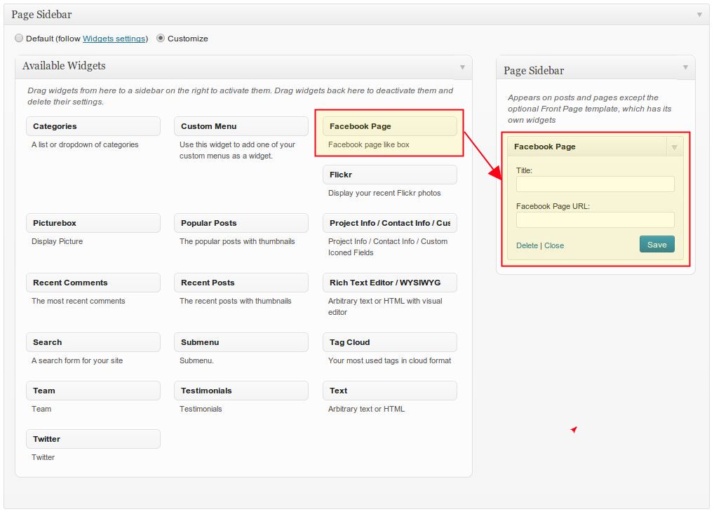
FACEBOOK PAGE
To add facebook plugin in your sidebar, use this widget. Just type the URL of your facebook profile page and you are
done.
Display your recent tweets in the page sidebar. To enable this widget you should first create your twitter app for
your website here
HTTP://DEV.TWITTER.COM/APPS
After creating and enabling your twitter app, type the following values in the widget settings to activate this widget: Consumer Key, Consumer Secret, Access Token, Access Token Secret, Twitter ID.
In the field Number of Tweets you can define the number of recent tweets you'd like to show in your sidebar.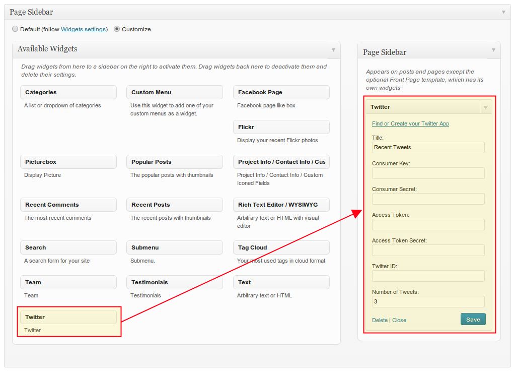
CUSTOM RECENT POSTS / POPULAR POSTS
Show your recent or most popular blog posts in the sidebar - just select the number of posts to be shown in the
widget box.
CUSTOM MENU
Create your custom navigation menu in your sidebar. Like in Submenu widget you should only choose the menu
which you have created under Appearance ➜ Menus
CONTACTS
Display your contact information you have defined in theme options
MAILCHIMP SIGNUP
Adds the newsletter signup form to your sidebar
Page Builder
Scalia includes two powerful tools to make your work on page building and layouting as simple as possible. You can
choose between powerful Visual Composer (the best frontend and backend drag & drop page builder for Wordpress) and
built-in Shortcode Generator (which enables you to create and insert any shortcodes in just few clicks). In this
chapter we will cover both page builders and explain all shortcodes used in Scalia in details.
VISUAL COMPOSER
Visual Composer is a great tool for creating page layouts and content "on-the-fly", in backend or in frontend mode
by simple drag&drop of different content and page elements. Visual Composer is a required plugin and should be
installed in the process of Scalia's theme installation (see Chapter "Installing Scalia")
BUILDING PAGES
Before getting started with building layouts with Visual Composer, it is necessary to take a look at its
documentation here: http://kb.wpbakery.com/index.php?title=Visual_Composer.
Please note, that Visual Composer inside Scalia is optimised for this theme, so all content elements and shortcodes
you have here are Scalia-related.
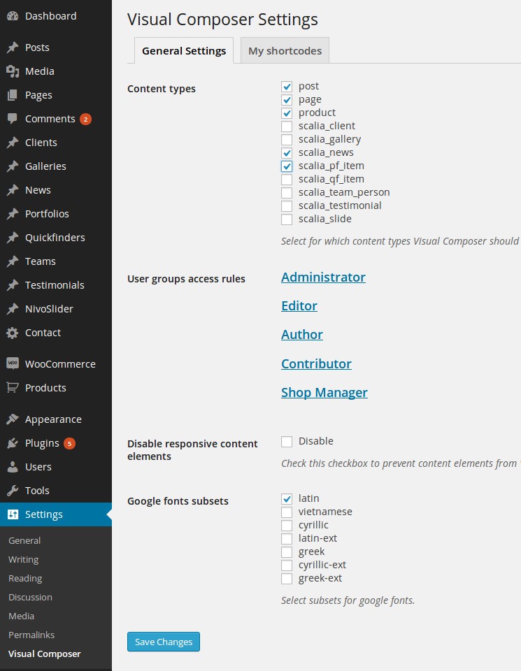
By default, Visual Composer is enabled for Pages, Portfolio, Products, Posts & News; however you
can also enable it for other post types, if you need it. To do this go to "Settings > Visual Composer” and make your
selection.
To start creating new page layout you can choose wether to do it in backend or in frontend editor. We recommend to
use Frontend Editor, because it is a real "What You See Is What You Get" way to build your pages. Click on "Front
End Editor"
and you will be switched to Visual Composer Frontend Editor:
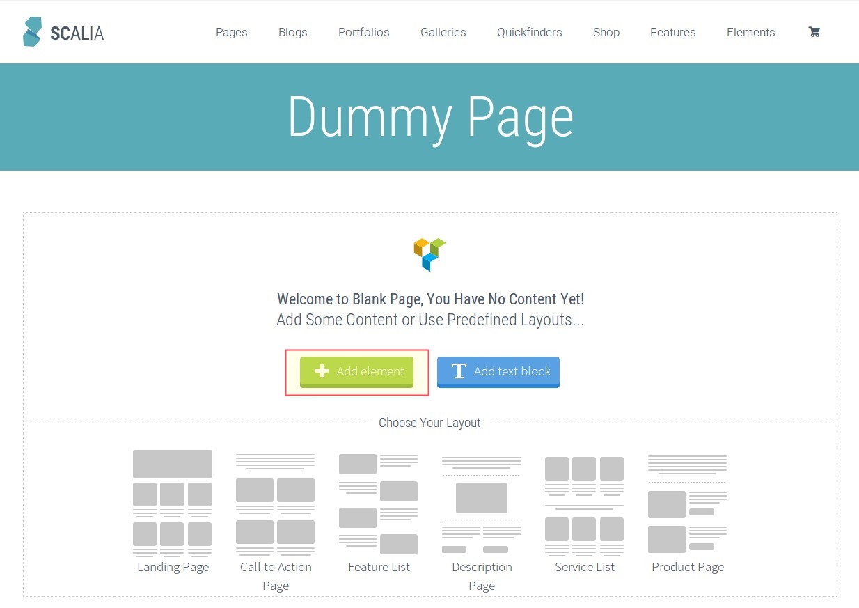
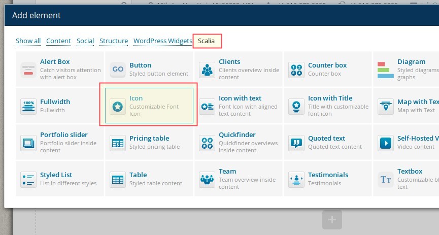
Here you might want to begin with adding a new content element by clicking on "Add element".
After that the overview of all content elements will be displayed:
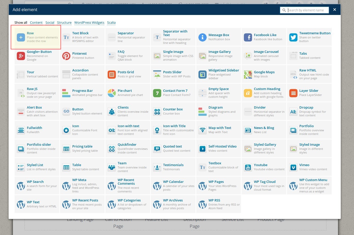
You can begin with adding a new content row in your page; choose "Row". You will be switched to
your page with added row element. Now you can edit its properties like for example number of columns and layout:
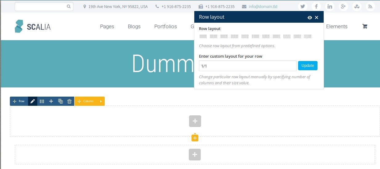
In this way you can add and edit all other elements; you can combine them with each other and
drag-n-drop them:
If you like to create your pages in backend mode, click on "Backend Editor" and your WYSIWYG
editor change to Visual Composer canvas
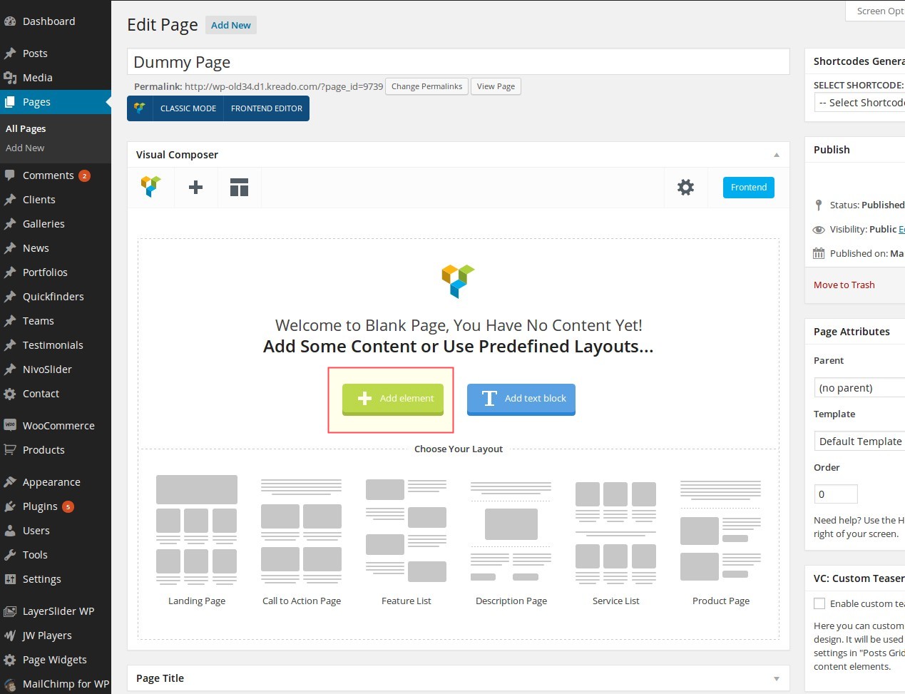
Now you can begin to build your layout by clicking on "Add element" - the same way as in Fronend
Editor (described above)
SHORTCODE GENERATOR
If you don't like Visual Composer or prefer to work in another way, you can take a use of Shortcode Generator Scalia
comes with. Shortcode Generator enables you to create and insert any shortcodes in just few clicks. This works in
three steps:
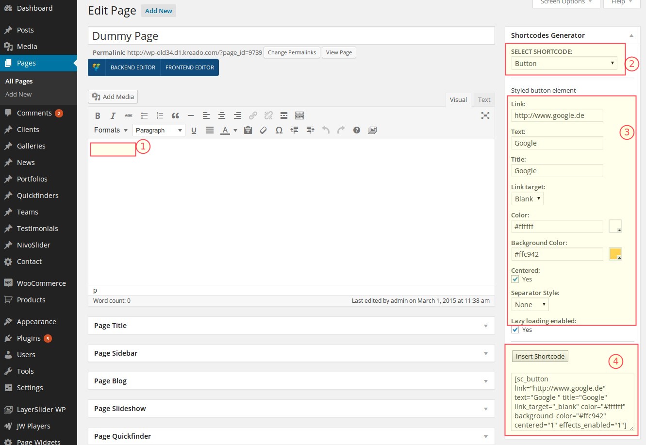
Following shortcodes are included in Scalia:
DIVIDER / SEPARATOR
This is probably the most importarnt element / tool to make your pages pixel perfect. With this element you can
manage
your horizontal margins & paddings very precisely. Another useful feature of this shortcode is to insert nice
colorful
content dividers SEE
DEMO
»
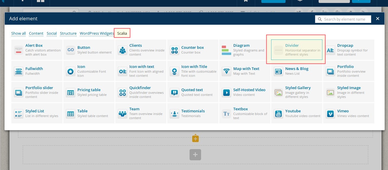
To insert divider / separator, choose this element from the list of Scalia's shortcodes here:
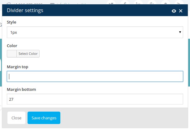 Style:select the style of your separator. If you wish to use divider to set horizontal margins, use
preselected "1px" style
Style:select the style of your separator. If you wish to use divider to set horizontal margins, use
preselected "1px" style
Color: select the color of your separator. Note, that Zigzag & Wave separators are made as pngs and it is not possible to set its color here
Margin top: set the top margin in px. NOTE: you can also use negative values (i.e. -27) to reduce margins!
Margin bottom: set the bottom margin in px. NOTE: you can also use negative values (i.e. -27) to reduce margins!
Shortcode Syntax:
[sc_divider margin_bottom="27" color="#ffffff" margin_top="-27" style="2"]
FONT ICONS
Scalia has a set of more than 400 built-in icons, which you can easily insert into your content.
ICON
To insert some icon into your content, use Icon shortcode.
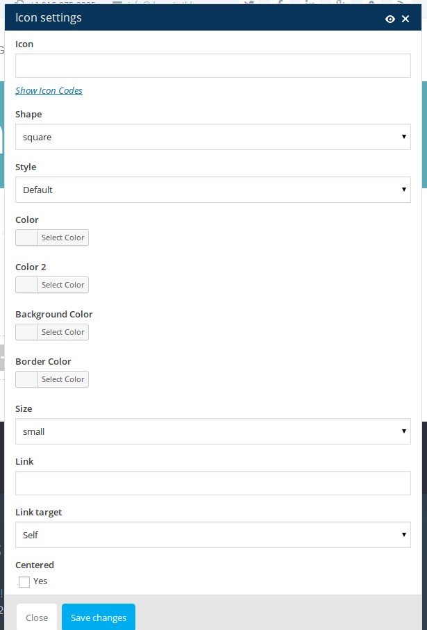 Icon: select the icon you wish to use by clicking on Show Icon Codes. The overview of all available
icons will open. Select the code of the icon you wish to insert, copy it, close the overview and paste it in this
field "Icon".
Icon: select the icon you wish to use by clicking on Show Icon Codes. The overview of all available
icons will open. Select the code of the icon you wish to insert, copy it, close the overview and paste it in this
field "Icon".
Shape: select the shape of the icon
Style: in Scalia you can use bicolored icons. In this field "Style" you can select the angle of color splitting in bicolored icon. By default only one color will be applied.
Color: select the main font color of your icon using the colorpicker or typing the hex value
Color 2: select the second font color of your icon, if you wish to use bicolored icon. Your icon will then appear in two colors (color / color 2), splitted by the angle you have selected in Style field above
Background Color: choose the color of icon's background using the colorpicker or typing the hex value
Border Color: choose the color of icon's border using the colorpicker or typing the hex value
Size: select the size of your icon
Link: if you wish to link your icon, type in the desired URL here
Link target: select the link target for your icon's link here
Centered: activate this checkbox if you wish to center your icon in content
Shortcode Syntax:
[sc_icon shape="circle" style="angle-90deg" size="big" link_target="_blank" centered="1" icon="e610" color="#e52020" color_2="#ff7c3a" background_color="#ffffff" border_color="#ffffff" link="http://www.google.de"]
SEE DEMO »
TITLE WITH ICON
This shortcode is quite similar to Icon shortcode described above, but it gives an option to insert some
title in combination with the icon. All settings are quite similar to the settings of Icon shortcode (see
above).
ICON WITH TEXT
This shortcode is quite similar to Icon shortcode described above, but it gives an option to insert a text
container, starting with icon. All settings are quite similar to the settings of Icon shortcode (see above).
href="http://www.codex-themes.com/Scalia/shortcodes/font-icons/" target="_blank" class="gray">SEE DEMO »
FULLWIDTH & PARALLAX AREA
By using this shortcode you can insert and style 100% width areas with optional parallax anywhere on your page and
add
to this area any content & shortcodes you wih.
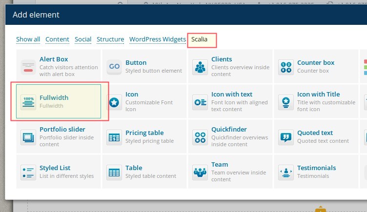
To insert fullwidth container, choose this element from the list of Scalia's shortcodes here:
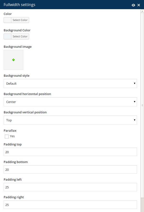 Color:select the font color for the text content you will insert in your fullwidth area
Background Color: select the background color for your fullwidth area
Background Image: or select some image to be used as background image of fullwidth container. For parallax areas we advice to use large images in 1902 x 1200 px resolution
Background Style: choose a style of displaying background image
Background horizontal position: choose the horizontal position of your background image
Background vertical position: choose the vertical position of your background image
Parallax: enable parallax effect if you wish to use parallax
Padding top: set the top padding of the fullwidth area in pixel
Padding bottom: set the bottom padding of the fullwidth area in pixel
Padding left: set the left padding of the fullwidth area in pixel. NOTE: set this padding to "0" if you wnat to avoid any paddings to the left
Padding right: set the right padding of the fullwidth area in pixel. NOTE: set this padding to "0" if you wnat to avoid any paddings to the right
Container: enable this option if you don't want to display the content inside your fullwidth area in 100% width layout, i.e. to display your content width limited to main website content width
 Styled marker: choose if you wish to dispaly a styled marker and on which position
After adding a fullwidth container, you can add any content element inside it by simply clicking on "+" symbol on it:
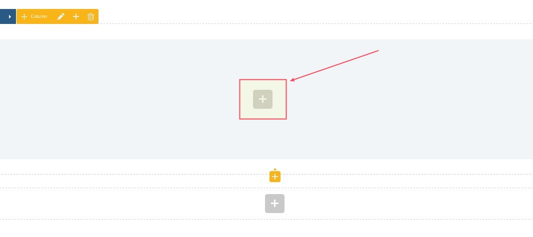 Shortcode Syntax:
[sc_fullwidth background_color="#f1f5f8" background_style="cover" background_position_horizontal="center" background_position_vertical="center" background_parallax="1" padding_top="120" padding_bottom="120" padding_left="0" padding_right="0" styled_marker="top" color="#7a7a7a" background_image="9185" container="1"][/sc_fullwidth]
SEE DEMO »
Background Color: select the background color for your fullwidth area
Background Image: or select some image to be used as background image of fullwidth container. For parallax areas we advice to use large images in 1902 x 1200 px resolution
Background Style: choose a style of displaying background image
Background horizontal position: choose the horizontal position of your background image
Background vertical position: choose the vertical position of your background image
Parallax: enable parallax effect if you wish to use parallax
Padding top: set the top padding of the fullwidth area in pixel
Padding bottom: set the bottom padding of the fullwidth area in pixel
Padding left: set the left padding of the fullwidth area in pixel. NOTE: set this padding to "0" if you wnat to avoid any paddings to the left
Padding right: set the right padding of the fullwidth area in pixel. NOTE: set this padding to "0" if you wnat to avoid any paddings to the right
Container: enable this option if you don't want to display the content inside your fullwidth area in 100% width layout, i.e. to display your content width limited to main website content width
After adding a fullwidth container, you can add any content element inside it by simply clicking on "+" symbol on it:
[sc_fullwidth background_color="#f1f5f8" background_style="cover" background_position_horizontal="center" background_position_vertical="center" background_parallax="1" padding_top="120" padding_bottom="120" padding_left="0" padding_right="0" styled_marker="top" color="#7a7a7a" background_image="9185" container="1"][/sc_fullwidth]
SEE DEMO »
BUTTONS & ALERT BOXES
BUTTON
Link: define the link of your button
Text: define the label of your button
Title: Value for title attribute
Link Target: Value for target attribute
Color: Select the font color of the button's label
Background color:Select the background color of the button
Centered:Choose if you wish to center your button inside the content container
Separator Style:Optionally you can select an additional separator to be displayed around your button
Shortcode Syntax:
[sc_button link_target="_self" centered="1" separator_style="double" effects_enabled="1" link="http://www.google.de" text="MY BUTTON" title="Button" color="#ffffff" background_color="#39baad"]
SEE DEMO »
CUSTOMIZING DEFAULT BUTTON COLORS
If you wish to customize default button colors, use Theme Options under Appearance. Here choose Colors
and Button Colors panel. Here you have following options:
Basic Text Color: Font color of button's label
Hover Text Color: Font color of button's label if hovered
Active Text Color: Font color of button's label if clicked
Basic Background Color: Button's background color
Hover Background Color: Button's background color if hovered
Active Background Color: Button's background color if clicked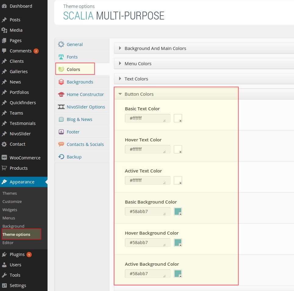
CTA / ALERT BOX
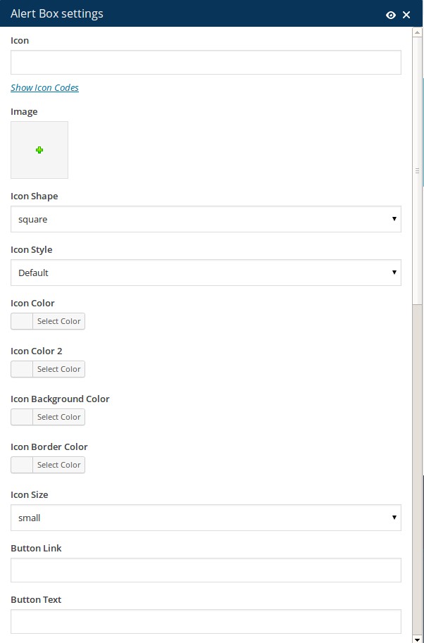
Icon: select the icon you wish to use in your CTA by clicking on Show Icon Codes. The overview of all available icons will open. Select the code of the icon you wish to insert, copy it, close the overview and paste it in this field "Icon".
Image: you can also use an image instead of icon to be displayed in your CTA by clicking on Image. Media library will open and here you can choose the desired image
Icon Shape: select the shape of the icon. Note, that this shape will also apply to your CTA image, if you have decided to use an image instead of an icon
Icon Style: in Scalia you can use bicolored icons. In this field "Style" you can select the angle of color splitting in bicolored icon. By default only one color will be applied.
Icon Color: select the main font color of your icon using the colorpicker or typing the hex value
Icon Color 2: select the second font color of your icon, if you wish to use bicolored icon. Your icon will then appear in two colors (color / color 2), splitted by the angle you have selected in Style field above
Icon Background Color: choose the color of icon's background using the colorpicker or typing the hex value
Icon Border Color: choose the color of icon's border using the colorpicker or typing the hex value
Icon Size: select the size of your icon
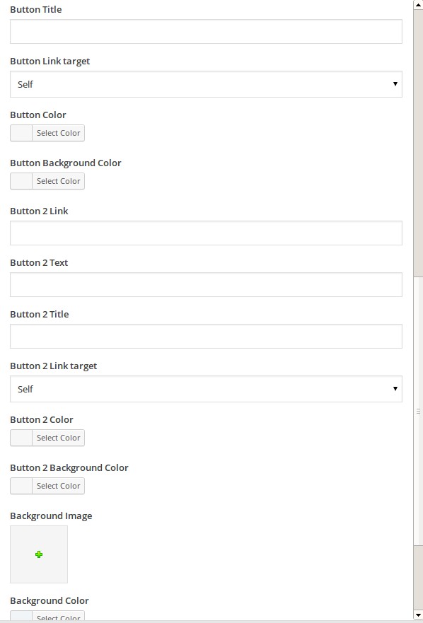
Button Text: define the label of your main CTA button
Button Title: Value for title attributeof your main CTA button
Button Link Target: Value for target attribute
Button Color: Select the font color of the button's label
Button Background color:Select the background color of the button
Button 2 Link: optionally define the link of your second CTA button
Button 2 Text: optionally define the label of your second CTA button
Button 2 Title: optionally Value for title attribute of your second CTA button
Button 2 Link Target: optionally Value for target attribute of your second CTA button
Button 2 Color: optionally Select the font color of the button's label of your second CTA button
Button 2 Background color:optionally Select the background color of your second CTA button
Background image:if you wish to use an image as background of your CTA, here you can select this image from your media library
Border color:color of your CTA's border
Shadow:select this checkbox if you wish to add a shadow to your CTAr
Centered:Choose if you wish to center your icon / image / buttons inside the CTA container
Shortcode Syntax:
[sc_alert_box icon_shape="circle" icon_style="angle-90deg" icon_size="big" button_link_target="_self" button_2_link_target="_blank" background_color="#f1f5f8" shadow="1" centered="1" icon="e6e3" icon_color="#dd3333" icon_color_2="#ff9999" icon_background_color="#ffffff" icon_border_color="#ffffff" button_link="http://www.google.de" button_text="Button 1" button_title="Button 1" button_color="#ffffff" button_background_color="#37b29d" button_2_link="http://www.bing.com" button_2_text="Button 2" button_2_title="Button 2" button_2_color="#ffffff" button_2_background_color="#add81e" border_color="#d6d6d6"][/sc_alert_box]
STYLED GALLERIES
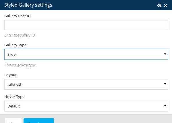
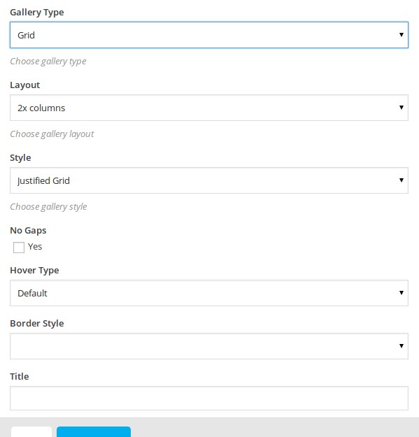
Scalia has a number of different gallery types which you can use to display your images in content by inserting a simple shortcode Gallery:
Gallery Post ID: Enter the ID number of the gallery you wish to insert. ID number you can find in Galleries - click on the desired gallery - in panel Gallery Manager you see the ID number
Gallery type: Here you can select the type of your gallery. You can choose between:
Layout: choose the layout of your gallery depending on the gallery type you have selected previously
Style: For grid galleries: choose the style of your grid here
No Gaps: For grid galleries: activate this option if you don't want to have gaps between images in your grid overviews
Hover type: select the onhover style here
Border style: choose the style of image borders in your grid views.
SEE DEMO OF DIFFERENT BORDER STYLES »
Title: If you would like to insert the title to your gallery, use this field and enter your gallery's title.
Shortcode Syntax:
[sc_gallery gallery_type="grid" gallery_slider_layout="fullwidth" gallery_layout="3x" gallery_style="metro" gallery_no_gaps="1" gallery_hover="zooming-blur" gallery_item_style="5" gallery_gallery="747" gallery_title="Gallery's Title"]
MAPS WITH TEXT
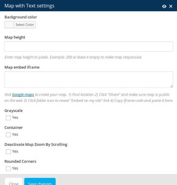
Background color: here yo can set a background color for your content container above the map
Map Height: Map height in pixels
Mab embed iframe: In this field you should paste a googlemaps embed code you have created in google maps. Just follow the steps described in the shortcode dialog
Grayscale: You can set here if you wish to show your google map in grayscale
Container: Choose this option if you don't wish to display your map in 100% width if you have added it to fullwidth container
Deactivate Map Zoom By Scrolling: This option is useful especially for touch devices. If enabled, your added map will not scroll inside the iframe
Rounded Corners: Optionally add rounded colors to your map
After adding your map you can start to insert a content inside it. Just click on "+" symbol to open a shortcode dialog.
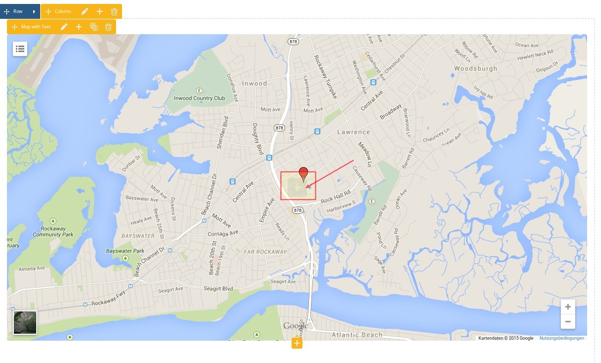
[sc_map_with_text disable_scroll="1" rounded_corners="1" background_color="rgba(255,58,111,0.59)" size="500" link="YOUR IFRAME CODE HERE" grayscale="1" container="1"][/sc_map_with_text]
SEE DEMO »
NEWS & BLOG
With this shortcode you can insert your news or blog post lists anywhere in content, choosing among many different
appearance styles.
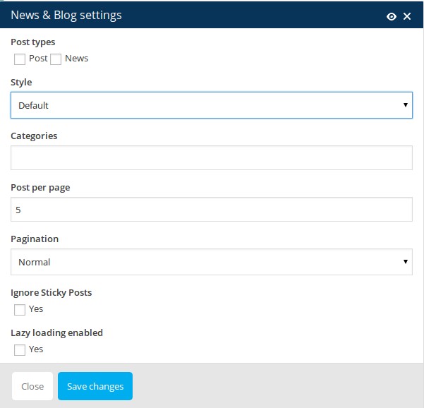
Post types: select, which post types would you like to publish in this list - blog posts or/and news
Style: select the design style of presenting your blog / news list
Categories: enter the slugs of the categories you wish to publish in this list
Posts per page: how many posts should be displayed on one page
Pagination: which pagination style should be used
Shortcode Syntax:
[sc_news post_types="post" style="default" post_per_page="5" post_pagination="normal" categories="category1, category2"]
PRICING TABLES
Pricing tables shortcode helps you to insert styled pricing tables in your content. Scalia includes three
pre-defined styles of pricing tables with additional customization options.
Inserting pricing tables in your page consist of three steps.
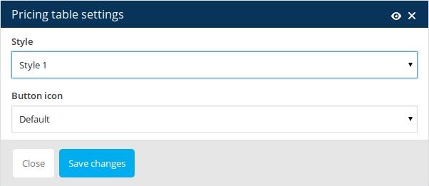 STEP 1.
Select "Pricing tables" shortcode from the shortcode list. Here you will get following options to set:
Style: Select one of three pre-defined styles for your pricing table
Button Icon: Icon to display on the button in pricing table.
Click on "Save changes". After that, click on "+" symbol in your added Pricing table element to start inserting pricing columns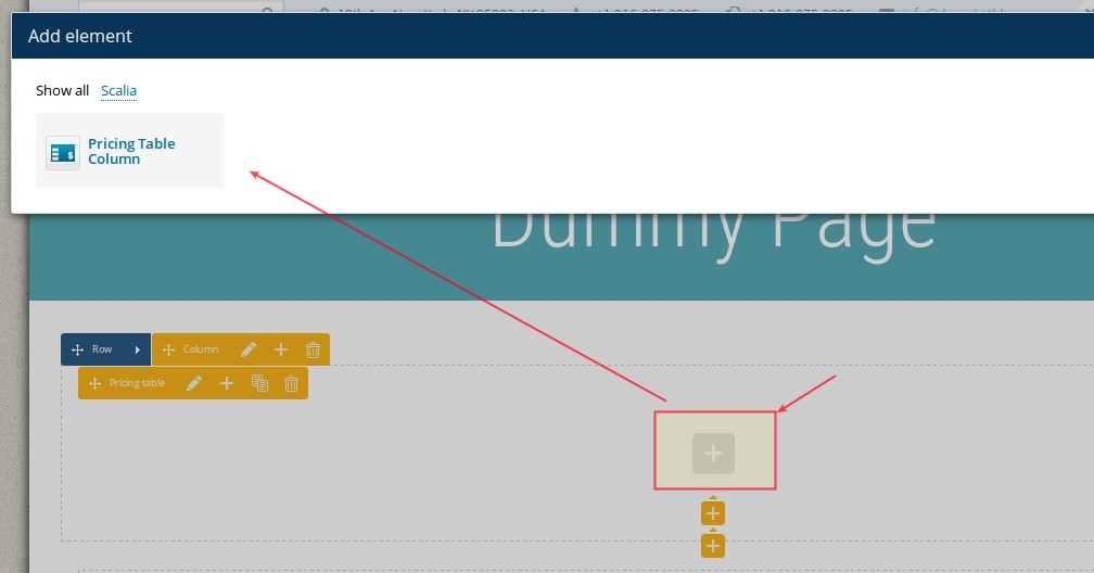
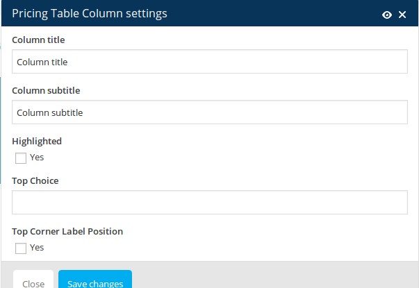 STEP 2.
Select "Pricing table column" to insert a new column to your pricing table:
Column title: Type in the title of your column
Column subtitle: Type in subtitle of your column
Highlighted: choose this option if you wish that this column will be highlighted / emphasized
Top Choice: if you wish to set a marker label to your pricing column, you can write a short text here like "NEW!"
Top Corner Label Position: Activate this option if you wish to pistion your marker label in the top corner of your pricing column
Click on "Save changes" to insert your pricing column
STEP 3.
Now you can start filling your pricing column with content. To do this click on "+" symbol in your added pricing column and select the content element you wish to add.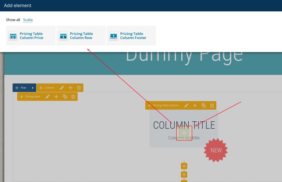
Pricing Column Price
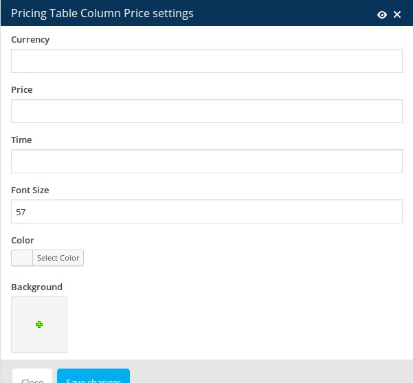 Currency: Type in the currency symbol to be show
Price: Enter the price to be shown
Time: Enter the period of time for the price, i.e. "per month"
Font Size: Select the font size for your price
Color: Select the font color for your price
Backgroun image: Choose a background image if you wish to use one as background for your price
Pricing Column Row
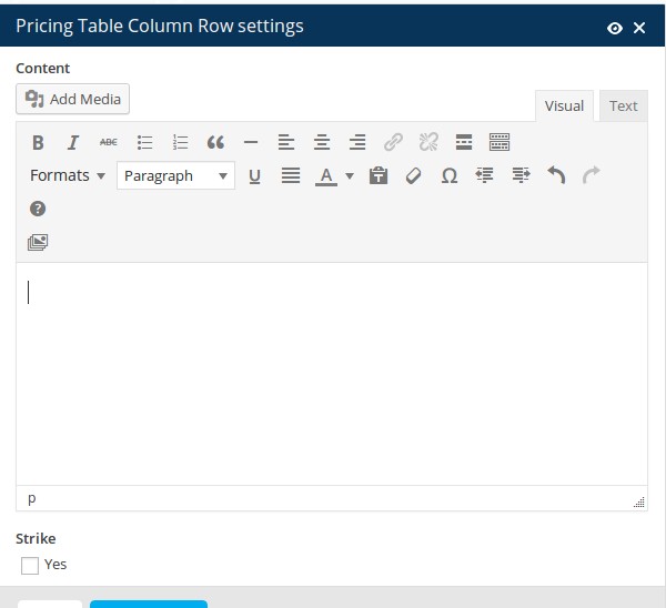 Here you can just enter any text content you wish in the Text editor. You can add as many rows as you wish
Pricing Column Footer
Here you should enter the label of your pricing table column's button and select the link
Shortcode Syntax:
[sc_pricing_table style="1" button_icon="default"][sc_pricing_column title="Column title" subtitle="Column subtitle" highlighted="1" top_choice="NEW" label_top_corner="1"][sc_pricing_price font_size="57" currency="$" price="58" time="per month" color="#dd3333" background="9185"][sc_pricing_row]Lorem ipsum dolorem[/sc_pricing_row][sc_pricing_footer href="#"]Lorem ipsum[/sc_pricing_footer][/sc_pricing_column]
SEE DEMO »
Inserting pricing tables in your page consist of three steps.
Select "Pricing tables" shortcode from the shortcode list. Here you will get following options to set:
Style: Select one of three pre-defined styles for your pricing table
Button Icon: Icon to display on the button in pricing table.
Click on "Save changes". After that, click on "+" symbol in your added Pricing table element to start inserting pricing columns
Select "Pricing table column" to insert a new column to your pricing table:
Column title: Type in the title of your column
Column subtitle: Type in subtitle of your column
Highlighted: choose this option if you wish that this column will be highlighted / emphasized
Top Choice: if you wish to set a marker label to your pricing column, you can write a short text here like "NEW!"
Top Corner Label Position: Activate this option if you wish to pistion your marker label in the top corner of your pricing column
Click on "Save changes" to insert your pricing column
STEP 3.
Now you can start filling your pricing column with content. To do this click on "+" symbol in your added pricing column and select the content element you wish to add.
Pricing Column Price
Price: Enter the price to be shown
Time: Enter the period of time for the price, i.e. "per month"
Font Size: Select the font size for your price
Color: Select the font color for your price
Backgroun image: Choose a background image if you wish to use one as background for your price
Pricing Column Row
Pricing Column Footer
Here you should enter the label of your pricing table column's button and select the link
Shortcode Syntax:
[sc_pricing_table style="1" button_icon="default"][sc_pricing_column title="Column title" subtitle="Column subtitle" highlighted="1" top_choice="NEW" label_top_corner="1"][sc_pricing_price font_size="57" currency="$" price="58" time="per month" color="#dd3333" background="9185"][sc_pricing_row]Lorem ipsum dolorem[/sc_pricing_row][sc_pricing_footer href="#"]Lorem ipsum[/sc_pricing_footer][/sc_pricing_column]
SEE DEMO »
PORTFOLIOS
See detailed description of portfolios in Chapter Portfolios.
Scalia comes with different styles to display your portfolio items on your content page by using Portfolio or Portfolio Slider shortcode
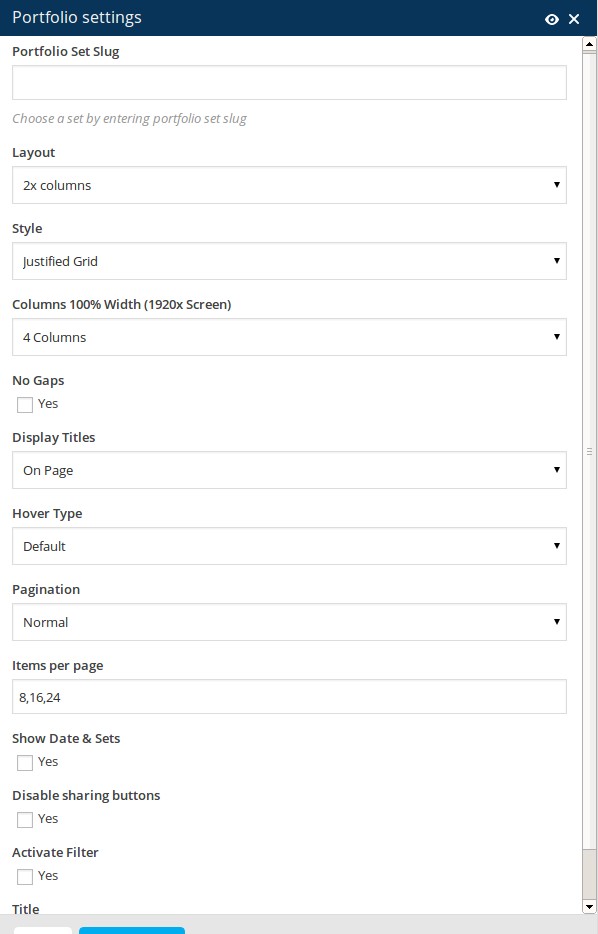
Portfolio Set Slug: choose your desired portfolio set to be displayed using the slug you have defined in Portfolios ➜ Sets
Layout: choose a grid layout for your portfolio overview
Style: choose a grid style. You can choose between justified or masonry grid styles
Columns 100% Width (1920x Screen): If you have selected 100% width layout previously, here you can set a number of columns to be displayed on Full HD screen resolution
No gaps: choose this option, if you don't wish to have a margins / gaps between yoiur portfolio items in the grid
Display Titles: here you can select how the portfolio item's title & description should be displayed. You can choose to display it under the item's featured image or on mouse hover on featured image
Hover Type: select the hover type you wish to use in your portfolio grid
Pagination: select the pagination style to apply. You can choose between a classic numbered pagination or to use "load more" pagination
Items per page: Here you can define, how many portfolio items should be displayed at once on one page.
Show date & sets: select if you wish to show dates & portfolio categories in your grid overview
Disable sharing buttons: by activating this option you can disable a scoial sharing panel in your grid overviews
Activate filter: Select if you wish to display a filter bar above your portfolio grid
Title: If you would like to insert the title to your portfolio overview, use this field and enter your portfolio's title.
Shortcode Syntax:
[sc_portfolio portfolio_layout="3x" portfolio_style="masonry" portfolio_fullwidth_columns="4" portfolio_no_gaps="1" portfolio_display_titles="hover" portfolio_hover="horizontal-sliding" portfolio_pagination="normal" portfolio_items_per_page="8,16,24" portfolio_show_info="1" portfolio_disable_socials="1" portfolio_with_filter="1" portfolios="portfolio"]
Scalia comes with different styles to display your portfolio items on your content page by using Portfolio or Portfolio Slider shortcode
Portfolio Grid
Portfolio Set Slug: choose your desired portfolio set to be displayed using the slug you have defined in Portfolios ➜ Sets
Layout: choose a grid layout for your portfolio overview
Style: choose a grid style. You can choose between justified or masonry grid styles
Columns 100% Width (1920x Screen): If you have selected 100% width layout previously, here you can set a number of columns to be displayed on Full HD screen resolution
No gaps: choose this option, if you don't wish to have a margins / gaps between yoiur portfolio items in the grid
Display Titles: here you can select how the portfolio item's title & description should be displayed. You can choose to display it under the item's featured image or on mouse hover on featured image
Hover Type: select the hover type you wish to use in your portfolio grid
Pagination: select the pagination style to apply. You can choose between a classic numbered pagination or to use "load more" pagination
Items per page: Here you can define, how many portfolio items should be displayed at once on one page.
Show date & sets: select if you wish to show dates & portfolio categories in your grid overview
Disable sharing buttons: by activating this option you can disable a scoial sharing panel in your grid overviews
Activate filter: Select if you wish to display a filter bar above your portfolio grid
Title: If you would like to insert the title to your portfolio overview, use this field and enter your portfolio's title.
Shortcode Syntax:
[sc_portfolio portfolio_layout="3x" portfolio_style="masonry" portfolio_fullwidth_columns="4" portfolio_no_gaps="1" portfolio_display_titles="hover" portfolio_hover="horizontal-sliding" portfolio_pagination="normal" portfolio_items_per_page="8,16,24" portfolio_show_info="1" portfolio_disable_socials="1" portfolio_with_filter="1" portfolios="portfolio"]
Portfolio Slider
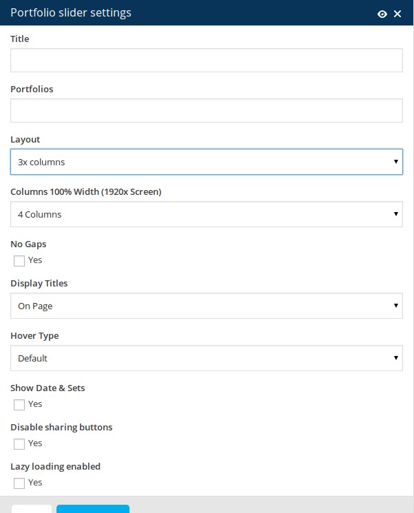
Title: If you would like to insert the title to your portfolio overview, use this field and enter your portfolio's title.
Portfolios: choose your desired portfolio set to be displayed using the slug you have defined in Portfolios ➜ Sets
Layout: choose a layout for your portfolio slider
Columns 100% Width (1920x Screen): If you have selected 100% width layout previously, here you can set a number of columns to be displayed on Full HD screen resolution
No gaps: choose this option, if you don't wish to have a margins / gaps between yoiur portfolio items in the grid
Display Titles: here you can select how the portfolio item's title & description should be displayed. You can choose to display it under the item's featured image or on mouse hover on featured image
Hover Type: select the hover type you wish to use in your portfolio grid
Show date & sets: select if you wish to show dates & portfolio categories in your grid overview
Disable sharing buttons: by activating this option you can disable a scoial sharing panel in your grid overviews
STYLED BOXES
Styled boxes could be used to highlight some content parts, to attract the visitor’s attention to some important
facts, to promote something. With this shortcode you can easily customize the colors of your box. To insert a styled
box in your content use Textbox shortcode:
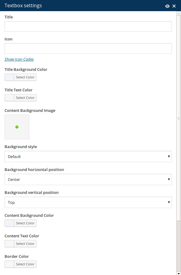 Title: if you wish you can enter the title of your styled box
Icon: select the icon you wish to use in your textbox title by clicking on Show Icon Codes. The overview of all available icons will open. Select the code of the icon you wish to insert, copy it, close the overview and paste it in this field "Icon".
Title Background Color: Choose or enter color code, ex. #ffffff. You can also use the built-in color picker.
Title Text Color: Choose or enter color code, ex. #ffffff.
Content Background image: if you wish to use an image as background of your textbox, here you can select this image from your media library
Background: choose the style of inserting your textbox background
Background horizontal position: choose the horizontal position of your background image
Background vertical position: choose the vertical position of your background image
Background color: or you can use just some color for your textbox background
Border color: color of your textbox border
Content Background Color: Choose or enter color code, ex. #ffffff.
Content Text Color: Choose or enter color code, ex. #ffffff
 Shadow: select if you wish to add shadow to your textbox
Centered:Choose if you wish to center your content inside textbox
Shortcode Syntax:
[sc_textbox title_background_color="#aaafae" content_background_style="cover" content_background_position_horizontal="left" content_background_position_vertical="center" content_background_color="#f1f5f8" shadow="1" centered="1" title="Textbox Title" icon="e61e" title_text_color="#ffffff" content_background_image="9734" content_text_color="#d1d1d1" border_color="#878787"][/sc_textbox]
After you have inserted your textbox, you can start filling it with content by simply clicking on "+" symbol above the textbox. SEE DEMO »
Icon: select the icon you wish to use in your textbox title by clicking on Show Icon Codes. The overview of all available icons will open. Select the code of the icon you wish to insert, copy it, close the overview and paste it in this field "Icon".
Title Background Color: Choose or enter color code, ex. #ffffff. You can also use the built-in color picker.
Title Text Color: Choose or enter color code, ex. #ffffff.
Content Background image: if you wish to use an image as background of your textbox, here you can select this image from your media library
Background: choose the style of inserting your textbox background
Background horizontal position: choose the horizontal position of your background image
Background vertical position: choose the vertical position of your background image
Background color: or you can use just some color for your textbox background
Border color: color of your textbox border
Content Background Color: Choose or enter color code, ex. #ffffff.
Content Text Color: Choose or enter color code, ex. #ffffff
Centered:Choose if you wish to center your content inside textbox
Shortcode Syntax:
[sc_textbox title_background_color="#aaafae" content_background_style="cover" content_background_position_horizontal="left" content_background_position_vertical="center" content_background_color="#f1f5f8" shadow="1" centered="1" title="Textbox Title" icon="e61e" title_text_color="#ffffff" content_background_image="9734" content_text_color="#d1d1d1" border_color="#878787"][/sc_textbox]
After you have inserted your textbox, you can start filling it with content by simply clicking on "+" symbol above the textbox. SEE DEMO »
STYLED IMAGES
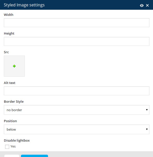
Width: Image width in pixels
Height: Image height in pixels
Choose Image: Select image from media library by clicking on Select or enter image URL
Alt: Enter image Alt-Attribute
Border Style: set the border/frame style for your image on the page.
Position: Here you can select the text alignment near your picture
Disable lightbox: activate this checkbox if you wish to disable the full-size image in lightbox
Shortcode Syntax:
[sc_image style="3" position="centered" disable_lightbox="1" width="500" height="500" src="9734" alt="alt text"]
SEE DEMO »
STYLED LISTS & TABLES
Scalia includes several shortcodes to help you with adding tables and styled lists on your
pages.
STYLED TABLE
To insert a styled table, use the "Table" shortcode.
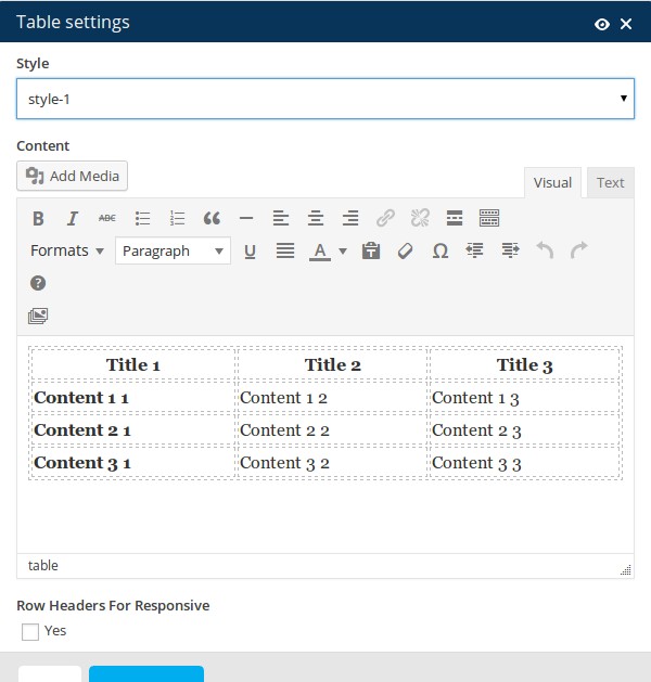
Style: choose the style you wish to use
Content: here you can edit your table as usually
Row headers for responsive: choose how to display your rows in on mobile devices
SEE DEMO »
Style: choose the style you wish to use
Content: here you can edit your table as usually
Row headers for responsive: choose how to display your rows in on mobile devices
SEE DEMO »
STYLED LISTS
To insert a styled list, use the "Styled List" shortcode.
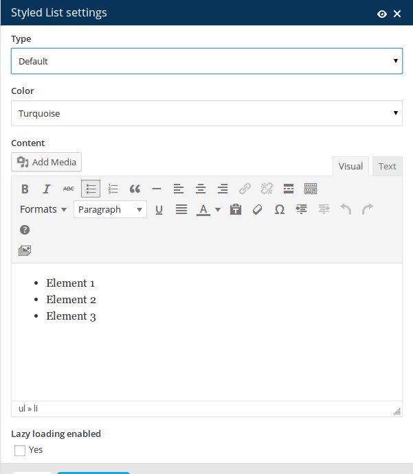
Type: choose a bullet icon you wish to use in your list
Color: choose a color for your bullet
Content: here you can edit your list as usually
Type: here you can choose the bullet style for your list: circle, check, arrow, minus
SEE DEMO »
Type: choose a bullet icon you wish to use in your list
Color: choose a color for your bullet
Content: here you can edit your list as usually
Type: here you can choose the bullet style for your list: circle, check, arrow, minus
SEE DEMO »
TABS & TOURS
Tabs & tours are useful for grouping your content according its topical meaning and displaying it in a compact
user-friendly form on the page.
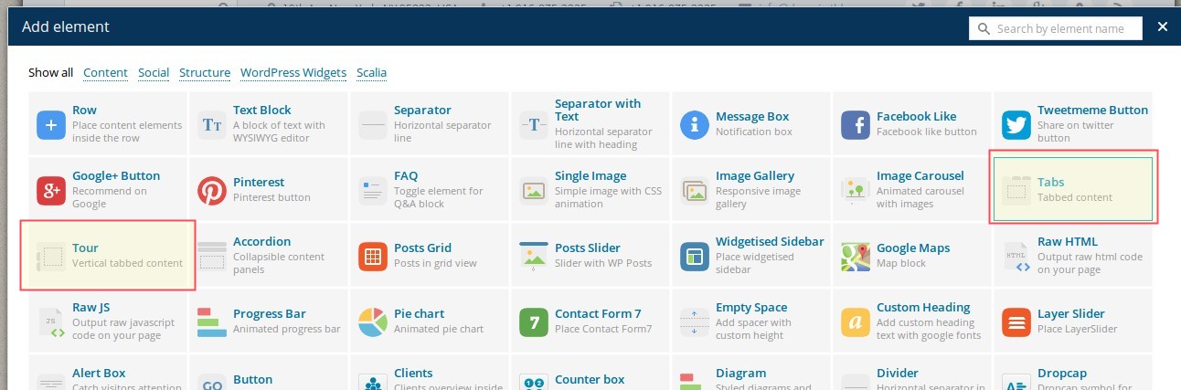
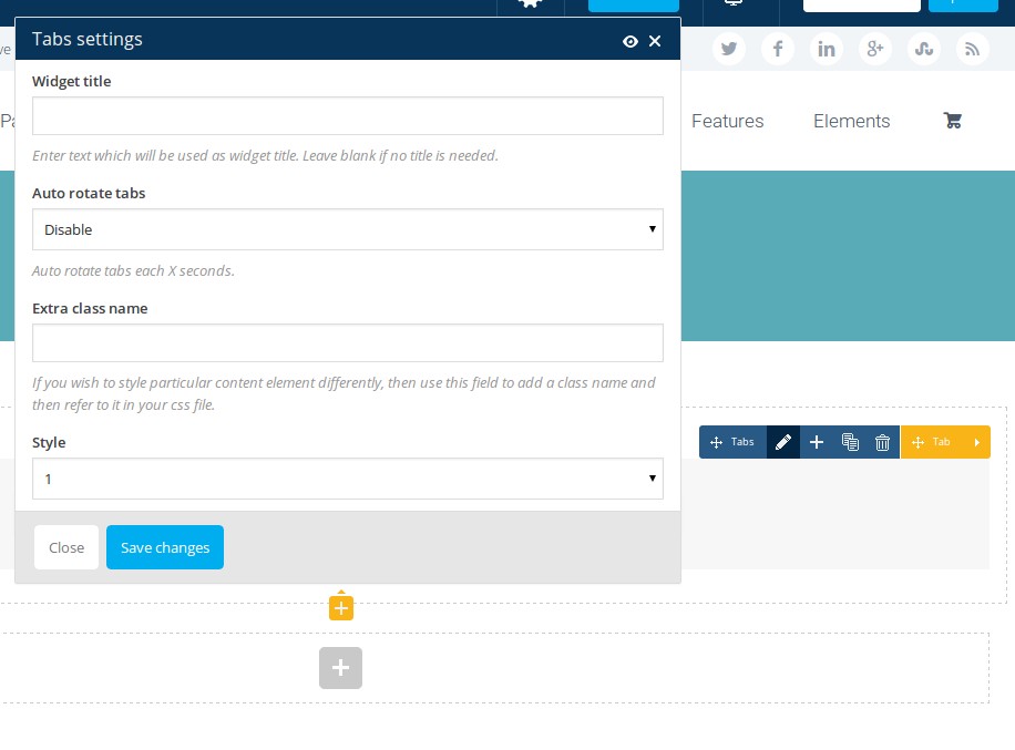 Style: Scalia comes with two different tabs styles you can choose here
In order to edit the title of your tab, click on "edit" icon on your "Tab" panel:
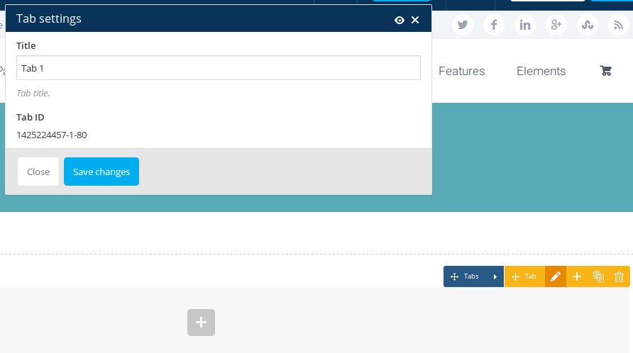 After that you are ready to insert any content in your tab by clicking on "plus" symbol on the appropriate tab.
SEE DEMO »
TABS
In order to insert tabs in your content click on Tabs shortcode. Your tabs will be immediately added to your page. Now you can start editing its settings. Just click on "edit" icon on your "Tabs" panel:In order to edit the title of your tab, click on "edit" icon on your "Tab" panel:
SEE DEMO »
TOURS
In order to insert tours in your content click on Tours shortcode. Your tours will be immediately added to your page. Now you can start editing its settings kust in the same way, as by tabs (see above).TEAM
Team shortcode is a perfect feature to present your team inside your page content.
Use Team shortcode:
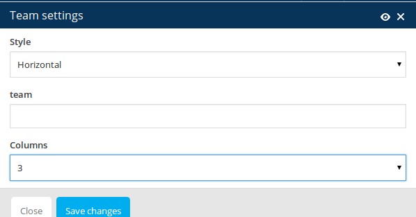 Style: choose the style of displayoing your team set
Team: choose the team set to be displayed by entering the slug of team's set (see Team ➜ Sets)
Columns: select the number of columns to be displayed in the team grid
Shortcode syntax:
[sc_team style="horizontal" columns="3" team="team-slug"]
SEE DEMO »
Team: choose the team set to be displayed by entering the slug of team's set (see Team ➜ Sets)
Columns: select the number of columns to be displayed in the team grid
Shortcode syntax:
[sc_team style="horizontal" columns="3" team="team-slug"]
SEE DEMO »
TESTIMONIALS
Testimonials shortcode is a good to present your customers opinion about you and your work.
Set: choose the testimonial set to be displayed by entering the slug of customer's set (see Clients ➜ Sets)
Fullwith: select this option if you wish to display testimonial in fullwidth layout
Shortcode syntax:
[sc_testimonials fullwidth="1" set="clients"]
SEE DEMO »
Set: choose the testimonial set to be displayed by entering the slug of customer's set (see Clients ➜ Sets)
Fullwith: select this option if you wish to display testimonial in fullwidth layout
Shortcode syntax:
[sc_testimonials fullwidth="1" set="clients"]
SEE DEMO »
COUNTERS
Inserting counters in your page consist of two steps.
STEP 1.
Select "Counter box" shortcode from the shortcode list. Counter box will be immediately added to your page
STEP 2.
Now click on "+" symbol on the added counter box. And the click on "Counter" shortcode
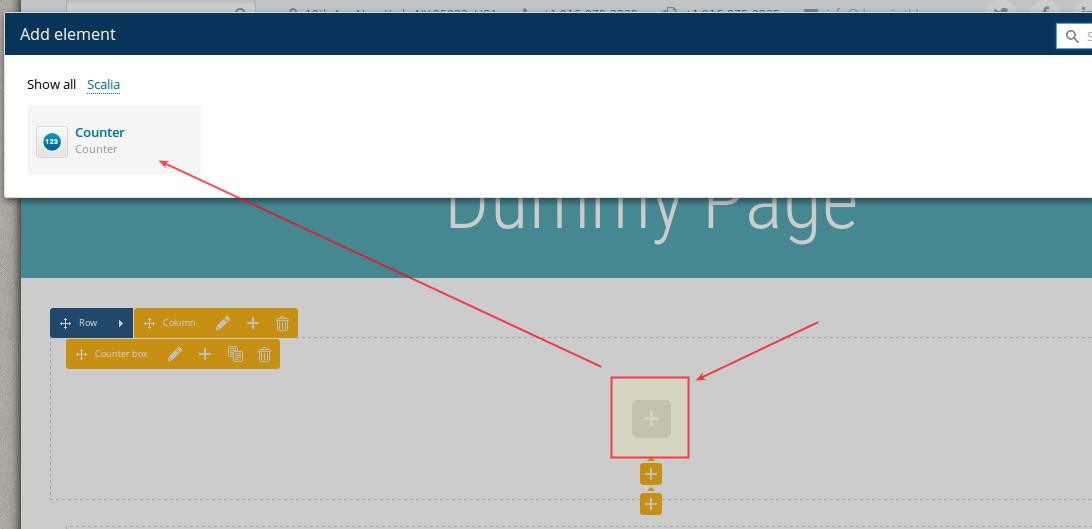
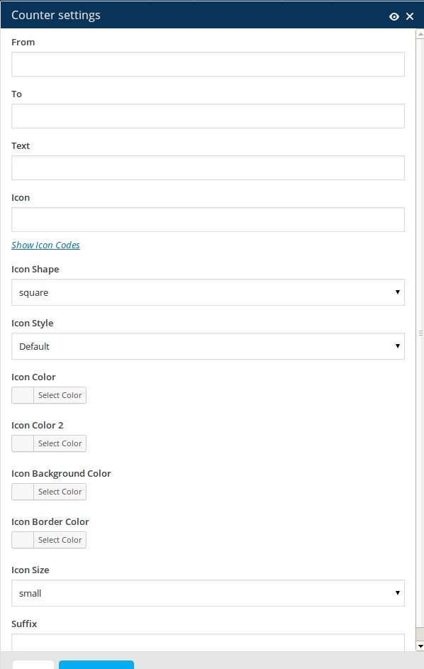 From: starting number to start counting animation, for example 0
To: final number to finish counting animation, for example 100
Text: title to be displayed under the number
Icon: select the icon you wish to use in your counter by clicking on Show Icon Codes. The overview of all available icons will open. Select the code of the icon you wish to insert, copy it, close the overview and paste it in this field "Icon".
Icon Shape: select the shape of the icon
Icon Style: in Scalia you can use bicolored icons. In this field "Style" you can select the angle of color splitting in bicolored icon. By default only one color will be applied.
Icon Color: select the main font color of your icon using the colorpicker or typing the hex value
Icon Color 2: select the second font color of your icon, if you wish to use bicolored icon. Your icon will then appear in two colors (color / color 2), splitted by the angle you have selected in Style field above
Icon Background Color: choose the color of icon's background using the colorpicker or typing the hex value
Icon Border Color: choose the color of icon's border using the colorpicker or typing the hex value
Icon Size: select the size of your icon
In the same way you can add as many counters in your counter box as you wish.
SEE DEMO »
STEP 1.
Select "Counter box" shortcode from the shortcode list. Counter box will be immediately added to your page
STEP 2.
Now click on "+" symbol on the added counter box. And the click on "Counter" shortcode
To: final number to finish counting animation, for example 100
Text: title to be displayed under the number
Icon: select the icon you wish to use in your counter by clicking on Show Icon Codes. The overview of all available icons will open. Select the code of the icon you wish to insert, copy it, close the overview and paste it in this field "Icon".
Icon Shape: select the shape of the icon
Icon Style: in Scalia you can use bicolored icons. In this field "Style" you can select the angle of color splitting in bicolored icon. By default only one color will be applied.
Icon Color: select the main font color of your icon using the colorpicker or typing the hex value
Icon Color 2: select the second font color of your icon, if you wish to use bicolored icon. Your icon will then appear in two colors (color / color 2), splitted by the angle you have selected in Style field above
Icon Background Color: choose the color of icon's background using the colorpicker or typing the hex value
Icon Border Color: choose the color of icon's border using the colorpicker or typing the hex value
Icon Size: select the size of your icon
In the same way you can add as many counters in your counter box as you wish.
SEE DEMO »
TOGGLES & ACCORDION
Accordions are useful to publish different additional content divided or grouped in different sections. In this way
you can publish a lot of information in compact form, not blowing out the size of your page and attract the
visitor’s attention on some special points in your article.
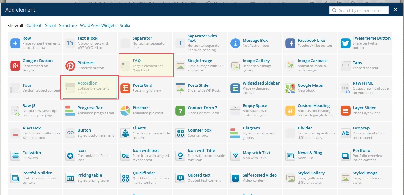
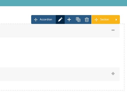 In order to insert accordions in your content click on Accordion shortcode. Your accordion will be
immediately added to your page. Now you can start editing its settings. Just click on "edit" icon on your
"Accordion" panel
In order to insert accordions in your content click on Accordion shortcode. Your accordion will be
immediately added to your page. Now you can start editing its settings. Just click on "edit" icon on your
"Accordion" panel
In order to edit the title of your accordion, click on "edit" icon on your "Section" panel and fill the "Title" field":
After that you are ready to insert any content in your accordion section by clicking on "plus" symbol on the appropriate tab.
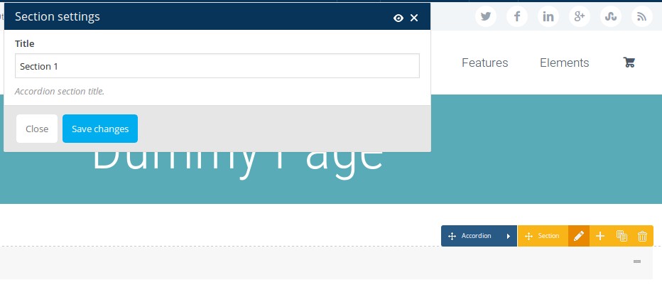 SEE DEMO
»
SEE DEMO
»
In order to edit the title of your accordion, click on "edit" icon on your "Section" panel and fill the "Title" field":
After that you are ready to insert any content in your accordion section by clicking on "plus" symbol on the appropriate tab.
TYPOGRAPHY
Following shortcode can be used to display headings, dropcaps, quoted text and divider:
HEADINGS
Just use the simple <h1></h1>, <h2></h2>, <h3></h3>, <h4></h4>,
<h5></h5>, <h6></h6> tags to display predefined styles for heading levels from 1 to
6.
You can customize your heading colors in Appearance ➜ Theme options ➜ Colors ➜ Text Colors
You can customize the fonts, sizes and line heights of your heading in Appearance ➜ Theme options ➜ Fonts
You can customize your heading colors in Appearance ➜ Theme options ➜ Colors ➜ Text Colors
You can customize the fonts, sizes and line heights of your heading in Appearance ➜ Theme options ➜ Fonts
DROPCAPS
Use Dropcap shortocode to insert a dropcap:
Letter: enter the symbol (number, letter etc.) for your dropcap
Shape: select the shape of your dropcap
Style: select the style of your dropcap
Color: use this option to customize default font color of your dropcap
Border Color: use this option to customize default border color of your dropcap
Background Color: use this option to customize default background color of your dropcap
Shortcode syntax:
[sc_dropcap shape="circle" style="big" letter="L" color="#ffffff" background_color="#d1d1d1" border_color="#a0a0a0"]
QUOTED TEXT
To insert a quoted text in your page use Quoted Text shortcode:
Content: enter the text content of your quoted text in the text editor. It can be normal text, HTML code or shortcode
Shortcode syntax:
[sc_quote]lorem ipsum[/sc_quote]
SEE TYPOGRAPHY DEMO
»
Content: enter the text content of your quoted text in the text editor. It can be normal text, HTML code or shortcode
Shortcode syntax:
[sc_quote]lorem ipsum[/sc_quote]
VIDEOS
In Scalia you can easily insert your video media at any position in your main content or in widgets – anywhere you
wish. You can choose to use a youtube, vimeo or self-hosted video. You can set the size of video container and
choose the border/frame you wish
YOUTUBE VIDEO
Height: Video height in pixels
Video_id: Youtube video ID something like Js9Z8UQAA4E. You can find out the video ID in youtube URL address
Border Style: set the border/frame style for your video on the page.
Position: set the position of your video in your content
Shortcode syntax:
[sc_youtube style="3" position="left" width="500" height="500" video_id="7463532"]
VIMEO VIDEO
Width: Video width in pixels
Height: Video height in pixels
Video_id: Vimeo video ID something like 9380243. You can find out the video ID in vimeo URL address
Border Style: set the border/frame style for your video on the page.
Position: set the position of your video in your content
Shortcode syntax:
[sc_vimeo style="4" position="below" video_id="232342"]
SELF-HOSTED VIDEO
Width: Video width in pixels
Height: Video height in pixels
Video_src: Select your video from media library or type in the URL address of the video
Image_src: Select the preview/cover image for your video from media library
Style: set the border/frame style for your video on the page.
Position: set the position of your video in your content
QUICKFINDER
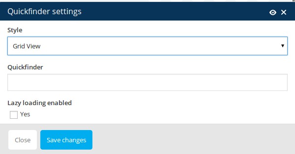
To insert quickfinders in your page content use Quickfinder shortcode:
Style: Scalia comes with three different styles of displaying your quickfinders. Here you can choose one of them
Quickfinder: choose your desired quickfinder set to be displayed using the slug you have defined in "Sets"
Shortcode syntax:
[sc_quickfinder style="default" quickfinder="quick_set"]
CLIENTS
See detailed description of clients in Chapter Clients.
To insert clients overview in your page content use Clients shortcode:
Set: choose your desired client set to be displayed using the slug you have defined in "Sets"
Style: choose whether to show your clients as grid or as slider/carousel
Autoscroll: in case you have selected "Carousel" as clients style, here you can enable autoscroll and define autoscroll speed
Rows: in case you have selected "grid" for displaying your clients, here you can select number of rows for this grid
Columns: in case you have selected "grid" for displaying your clients, here you can select number of columns for this grid
Shortcode syntax:
[sc_clients style="grid" rows="3" cols="3" set="client_set"]
DIAGRAMS
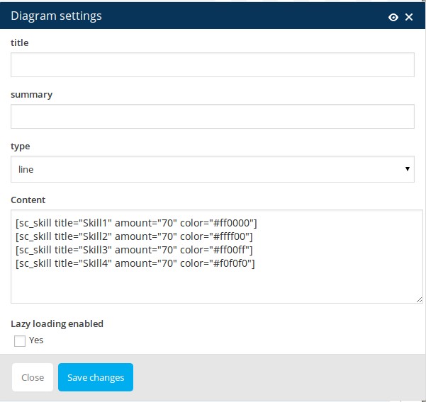
Title: defines the title of your diagram
Summary: defines the summary text for your diagram
Type: choose the type of diagram to be displayed - lines/bars or circles.
Content: here you can edit the conten of your diagram by editing its shortcode
[skill title="Skill1" amount="70" color="#ff0000"]
[skill title="Skill2" amount="70" color="#ffff00"]
[skill title="Skill3" amount="70" color="#ff00ff"]
[skill title="Skill4" amount="70" color="#f0f0f0"]
LAYERSLIDER
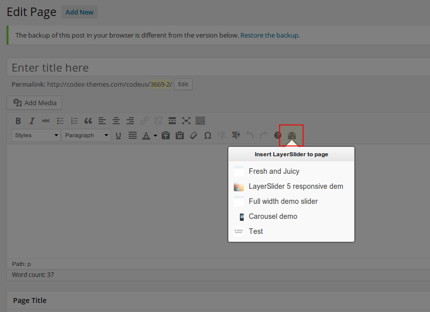
Shortcode syntax:
[layerslider id="11"]
Portfolios
INTRODUCTION / UNDERSTANDING PORTFOLIO
Portfolios are very useful custom post types in Scalia, aimed to create and to highlight special content, different
to usual pages and posts. Portfolios can be used to publish / demonstrate:
In order to understand how it works it is very important to understand the nature of portfolio. Portfolio consists of two major parts:
Projects / Case Studies
Portfolio can help you to emphasize the results of your company's activities in some projects or to inform your customers about the successfull stories / case studies you have gained with your business by providing your services:Products / Services
In the same way as projects and case studies you can use portfolios to highlight the products and services your company provides to customers. You can create the product descriptions (portfolio items) and structure it in different product groups / categories (portfolio sets), which than can be used in navigation or product filter.Media Content (videos, images)
Don't waste time of your customers and show them what you can - just with one click! Portfolios give you the possibility to publish different media types and make it accessible in beautiful overviews. Layers with videos from youtube, vimeo, your own hosted videos or fullsize images in stylish lightboxes - all this can be done using different portfolio types.Content visual navigation
Or you can use portfolios to give your website visitors the better overview about your articles, pages, posts. Different layouts of portfolio overviews in Scalia are very helpful for creating comfortable navigation across your website contentIn order to understand how it works it is very important to understand the nature of portfolio. Portfolio consists of two major parts:
PORTFOLIO ITEMS
Portfolio items are custom posts. One portfolio item is like one page or one blog post - it is a single post used
specially for representing your work, products, projects etc.
CREATING NEW PORTFOLIO ITEM
You can create new portfolio item using leftside wordpress menu or the button above the list of existing portfolio
items (Add New Item)
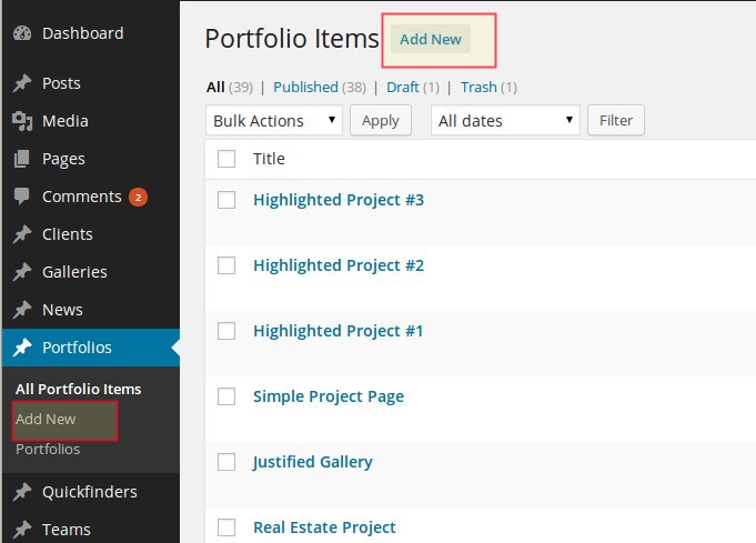
TYPES OF PORTFOLIO ITEMS
There are different types of portfolio items you can use to demonstrate / publish your content:
In order to define the type of portfolio item use the select box Type of portfolio item in the panel General Settings in portfolio item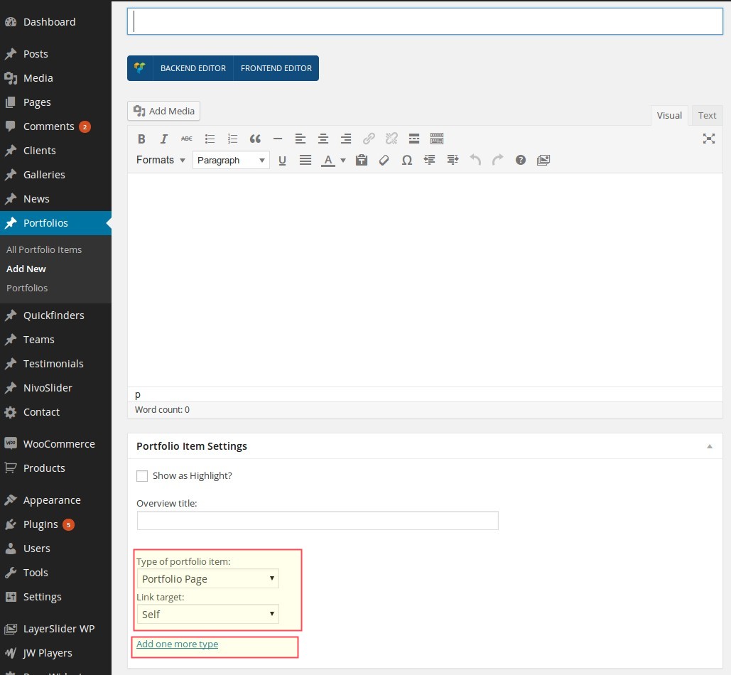
NOTE: you can assign multiple types to one item by clicking on "Add one more type"
Portfolio Page
This is a custom single post for describing / showing your project, case study, product etc. It works like a page: you can put the title, decription and images of your project, insert galleries, slideshows, related projects and so on. After creating the new portfolio item this type is selected per default.Internal Link
Your portfolio item could be a link to some other page on your website - it is useful for redirecting the visitor from some overviews to specific articles, not situated in the same website category as the overview.External Link
You can use any external URL to redirect your visitor to another website. It is useful for demonstrating the created projects on the web, or some galleries on external website or maybe some press releases in online magazines.Full-Size Image
Use this in order to show your visitors some full-size images per one click. In this way you can use portfolio like a gallery - in an overview your visitors see a small thumbnails of the images, clicking on that opens the lightbox layer with original full-size image.YouTube Video
If you want to show your visitors some youtube videos just onpage, with one click - use this type of portfolio item. By clicking on this item in portfolio overview the vistor gets a lightbox layer with youtibe video - immediately on your website's page, without redirecting to youtube website.Vimeo Video
Use it in the same way, as YouTube Video type of portfolio item.Self-Hosted Video
If you save all you videos directly in wordpress media library and want to stream it directly from here, use this type of portfolio item. In this case, just like in case of youtube or vimeo video, your visitor wioll get a layer with video player, streaming video content directly from your media libraryIn order to define the type of portfolio item use the select box Type of portfolio item in the panel General Settings in portfolio item
ASSIGNING PORTFOLIO SETS FOR PORTFOLIO ITEM
In order to define, to which portfolio set the portfolio item belongs, you should select the corresponding portfolio
sets in the panel Sets to the right.
You can make a multiple choice if your portfolio item suits to multiple different portfolio sets.
Of course you can create a new portfolio set from here by clicking on Add new set.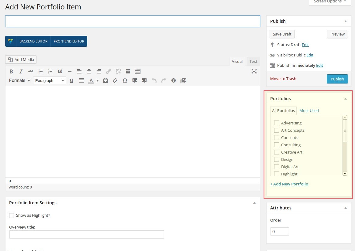
You can make a multiple choice if your portfolio item suits to multiple different portfolio sets.
Of course you can create a new portfolio set from here by clicking on Add new set.
DEFINING SORT ORDER
It is possible to define the sort order of the portfolio item in one set by entering the order number in the field
Sort Order in the right panel
Notice: if your portfolio item belongs to multiple portfolio sets, in all of them it will be on the same order position as entered in this field.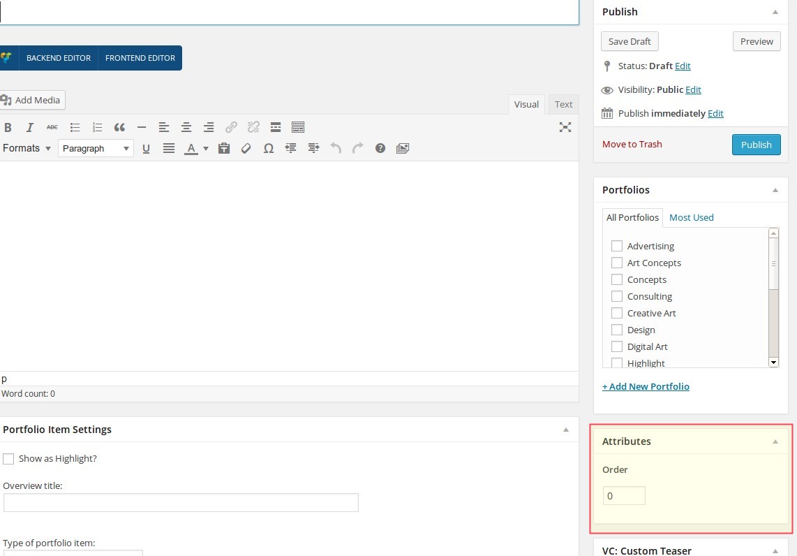
Notice: if your portfolio item belongs to multiple portfolio sets, in all of them it will be on the same order position as entered in this field.
PORTFOLIO PAGE: CONTENT ELEMENTS & OPTIONS
Layouts / Templates
generally portfolio page has all the same layout & template settings as a usual page. To activate a sidebar on your portfolio page, just select whoch sidebar position (left or right) you would like to have in the "Page Sidebar" setting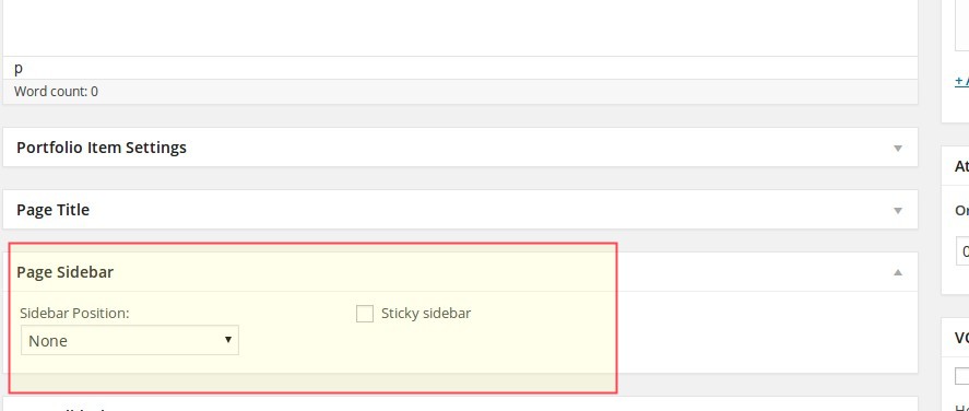
Editing content / Using Shortcodes
Just like by any page you can start editing your portfolio page by entering the title and main text in the WYSIWYG editor. You have an option to use Visual Composer (backend and / or frontend editor) to build your portfolio page with any Scalia's shortcodes (see description of shortcodes in chapter “Page Builder”).Making general settings
In general settings panel below the WYSIWYG editor you can define the type of portfolio item (see description above). Also you can enter the alternative title of your portfolio page to be displayed in portfolio overviews (grids & sliders) - this could be useful if your portfolio page has a very long title, which doesn't suit in to the item box in portolio overview. In addition you can set your portfolio item to be highlighted / emphasized in portfolio overviews by checking the option "Show as Highlight".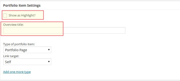
Title & Excerpt
In this option you can customize and make settings for the item's header with title and excerpt text. Please note, that the item's title is a title of your portfolio item, and item's subline is excerpt text.Slideshow | Quickfinder | Additional Portfolio Sets | Gallery
You can insert additional content elements in your portfolio page by using the panels Slideshow / Quickfinder / Portfolio Sets / Gallery. It works here in the same way as it works in normal page (see above).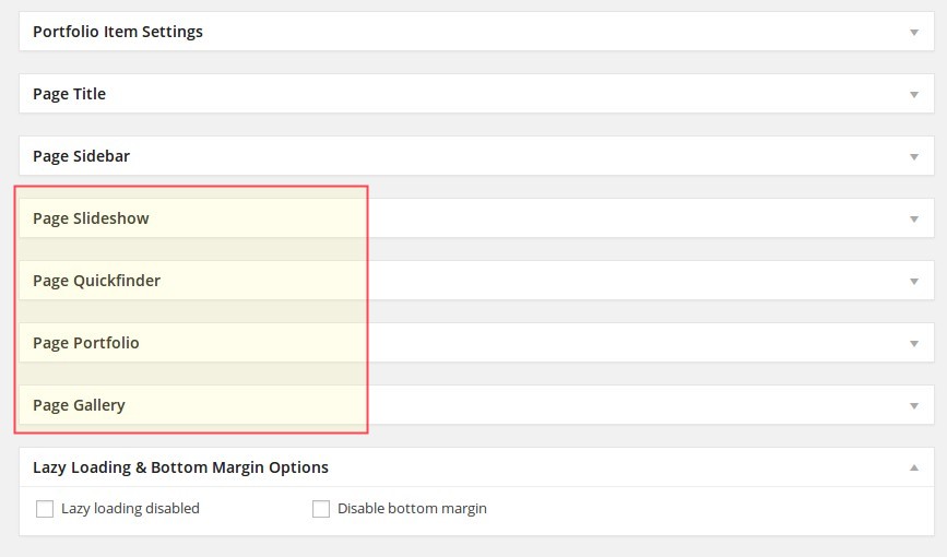
Sidebar | Widgets | Project Info
Like on a normal page, you can add a custom sidebar in the portfolio page and fill it with the widgets of your choice - for example contact person (Team), customers opinion (Testimonial) etc. One widget is especially interesting for using on portfolio pages - Project Info / Custom Iconed Fields. Here you can add your own data field, fill it with the corresponding values and decorate it with some icons. For detailed information about the widgets see the section WidgetsNOTE: you can use this widget anywhere on you site in the sidebar and not only on portfolio page - for example to underline some brief facts, to publish abstracts of the main content etc.
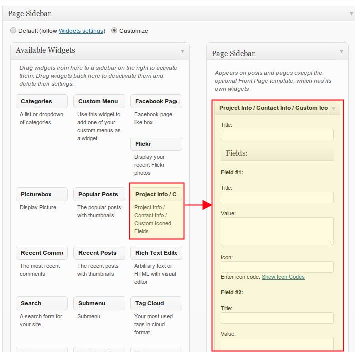
PORTFOLIO SETS
Portfolio Sets are the categories or groups of portfolio items and are useful to structure your portfolio items. In
this way you can create different scopes of your activities as different portfolio sets and assign your
projects/products/case studies/reviews/media content (say your portfolio items) to these different activity scopes.
CREATING NEW PORTFOLIO SET
You can create new portfolio set by going in Portfolios ➜ Sets on the leftside wordpress menu.
After that you are already on the page of creating the new portfolio set. On the right side in the table you see the list of all existing portfolio sets - you can edit their properties by clicking on the title of the corresponding portfolio set.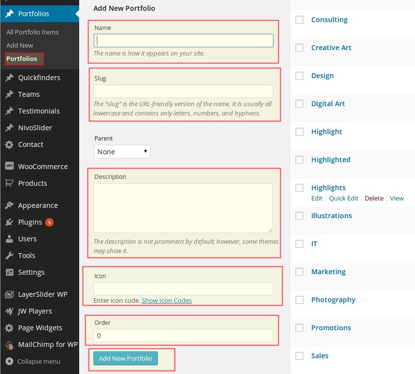
After that you are already on the page of creating the new portfolio set. On the right side in the table you see the list of all existing portfolio sets - you can edit their properties by clicking on the title of the corresponding portfolio set.
ELEMENTS & OPTIONS
by editing the portfolio set you have following fields:
That's all - don't forget to submit your changes by clicking on Add New Set
Name
enter here the name of your portfolio set. This name will be used in the list of available portfolio sets in portfolio item (see above) Notice: this name will be also used as a filter name in portfolio overviews - in the case you publish your portfolio overview with the filter above.Slug
slug is a userfriendly version of the name. Slug is important, because it is used in the shortcode Portfolio. So don't forget to fill it if you are creating new portfolio set.Parent
with this select box you can group the sets in subsets and make a kind of hierarchy inside the portfolio sets. Usually it is not neededDescription
just a brief description of your set, usually it is not neededIcon
if you want to decorate your filter in portfolio overviews with some handsome icons, just click on Show Icon Codes, choose your icon, copy its code and paste it in Icon field.Order
here you can set the sort order position of your portfolio set. With this field you can make sorting of your portfolio sets.That's all - don't forget to submit your changes by clicking on Add New Set
PUBLISHING / SHOWING PORTFOLIOS ON WEBSITE
There are several ways you can use and publish your portfolio overviews and pages on your
website.
INSERTING PORTFOLIO SETS USING PAGE OPTIONS
You can insert a portfolio slider or portfolio grid overview on the page using the page options. Each page has
several portfolio settings under Page Portfolio panel.
Following options can be set:
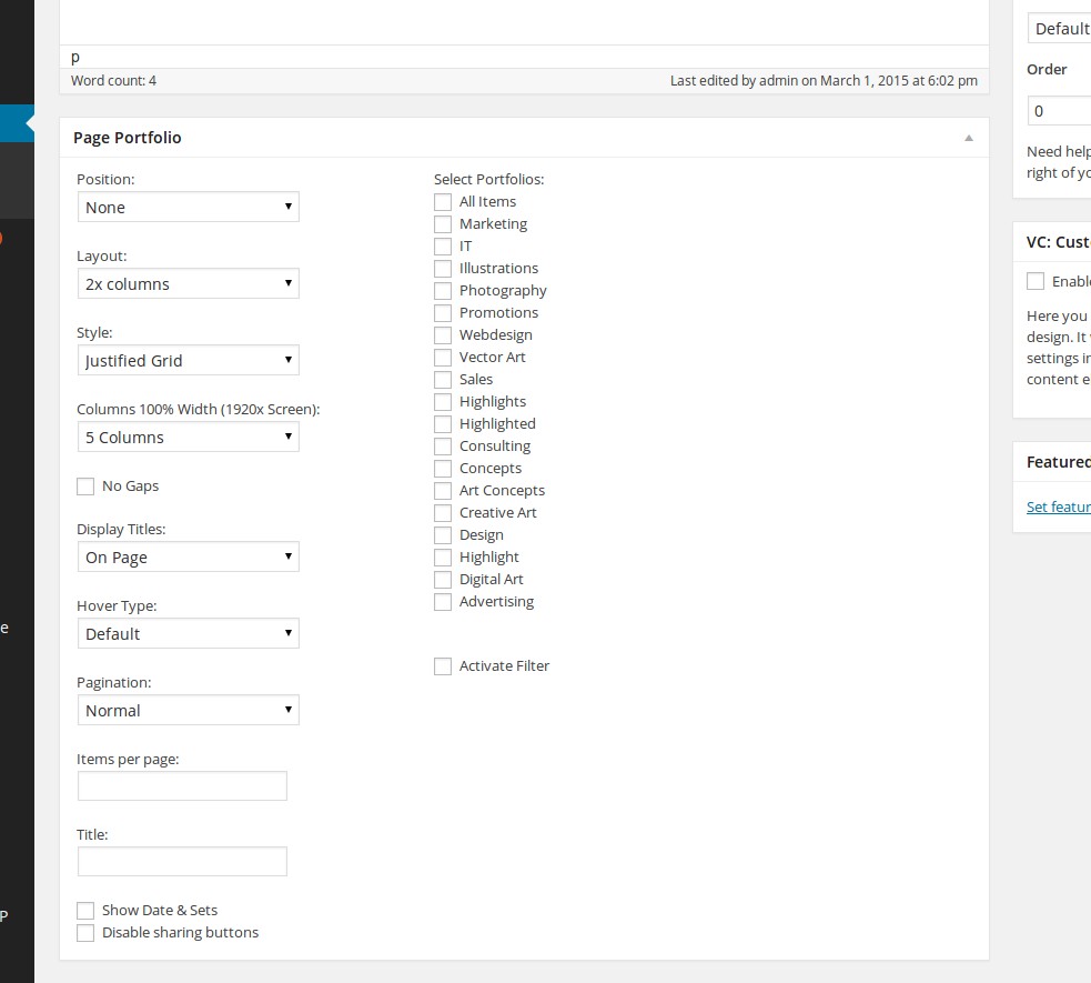
Following options can be set:
Portfolio Position
Here you define the postion of your portfolio overview on page:Layout
This option defines the layout of your portfolio overview. Depending on which value you have previously selected in "Portfolio Position", you will have different values here. If you have selected "Inside content" in "Portfolio position", you will get following:Style
Only relevant for grid overviews. Here you can choose, whether to show your grid as justified or as masonry grid.Columns 100% Width (1920x Screen)
If you have selected 100% width layout previously, here you can set a number of columns to be displayed on Full HD screen resolutionNo gaps
choose this option, if you don't wish to have a margins / gaps between yoiur portfolio items in the gridDisplay Titles
here you can select how the portfolio item's title & description should be displayed. You can choose to display it under the item's featured image or on mouse hover on featured imageHover Type
select the hover type you wish to use in your portfolio gridPagination
select the pagination style to apply. You can choose between a classic numbered pagination or to use "load more" paginationItems per page
Here you can define, how many portfolio items should be displayed at once on one pageTitle
If you would like to insert the title to your portfolio overview, use this field and enter your portfolio's title.Show date & sets
elect if you wish to show dates & portfolio categories in your grid overviewDisable sharing buttons
by activating this option you can disable a scoial sharing panel in your grid overviewsSelect Portfolios
here you see the list of all portfolio sets you have created under "Sets". NOTE: if some set do not have any portfolio items, it will not be displayed in this list. You can choose one or more sets at once to combine different items with each other. In this way you can create several portfolio overviews with different topics. You should select at least one set to display your portfolio overview on page.Activate Filter
if you would like to display several different portfolios on one page, you can activate this filter in order to provide the possibility of quick filtering your portfolio items for your website visitors. For example if you have selected "SET 1" and "SET 2" to be displayed on your page, using the filter option will enable your visitors to navigate throug your sets with one click.INSERTING PORTFOLIO SETS USING SHORTCODES
If you prefer to stay flexible and insert your portfolios on any position inside your page's content, just use the
portfolio shortcode. For detailed description see chapter Page Builder -> Portfolios
above.
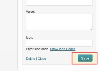
PROJECT INFO / CONTACT INFO / CUSTOM ICONED FIELDS WIDGET
In order to better inform your visitors about some specific project highlights or infos it is recommended to use
the project info widget.
To activate the project info widget go to Page Sidebar panel in page options below, choose the Project Info / Contact Info / Custom Iconed Fields widget from the list and drag it to the right panel Page Sidebar. Then open this panel "Project Info / Contact Info / Custom Iconed Fields“. Now you can fill your widget with general title - it is title of your widget, for instance "Project Highlights". Under the general title you can see a group of ten customizible fields, which you can use for your description.
There are two design styles of this widget you can choose from. This widget consists of ten fields. In each field you can define:
SEE DEMO STYLE 2»
When you are finished with filling your project information in this widget, please DON'T FORGET to click on "Save"
button at the bottom of the widget in order to save your content! . And only after saving you widget you can publish
your article.
To activate the project info widget go to Page Sidebar panel in page options below, choose the Project Info / Contact Info / Custom Iconed Fields widget from the list and drag it to the right panel Page Sidebar. Then open this panel "Project Info / Contact Info / Custom Iconed Fields“. Now you can fill your widget with general title - it is title of your widget, for instance "Project Highlights". Under the general title you can see a group of ten customizible fields, which you can use for your description.
There are two design styles of this widget you can choose from. This widget consists of ten fields. In each field you can define:
SEE DEMO STYLE 2»
CUSTOMIZING PORTFOLIO STYLES
Just like all other elements of Scalia theme you can easily customize your portfolio styles using the theme option
panel of Scalia. To open the admin panel go to Appearance ➜ Theme Options.
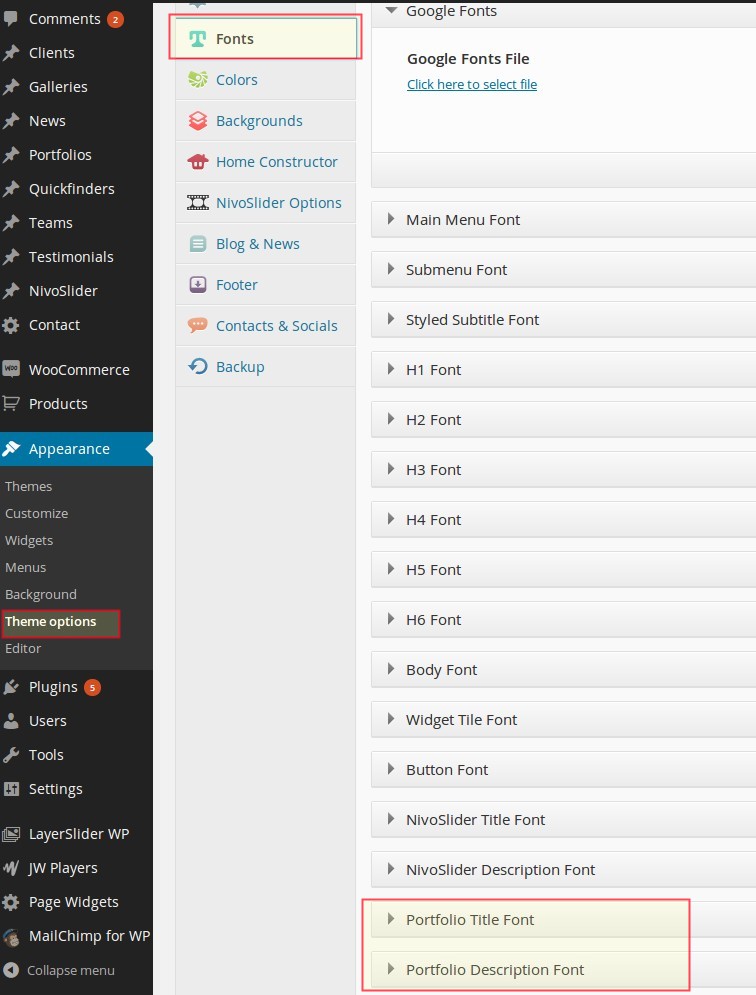
CUSTOMIZING FONTS
You can customize the fonts which are used to display the title text and description text of one portfolio item in
portfolio overviews. To do this go to "Fonts" and use following panels:
Portfolio Title Font
Portfolio Description Font
Here you can choose standard fonts as well as a plenty of google fonts and their styles
Portfolio Title Font
Portfolio Description Font
Here you can choose standard fonts as well as a plenty of google fonts and their styles
CUSTOMIZING COLORS
In order to customize all main portfolio colors navigate to "Colors" and open "Portfolio Colors"
panel.
Following color settings could be customize:
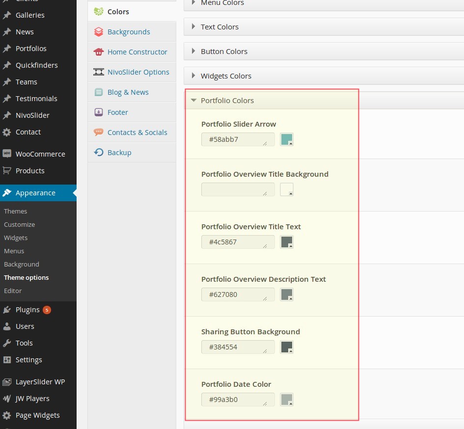
Following color settings could be customize:
Portfolio Slider Arrow
Color of an arrow for sliding the porfolio items in portfolio slider.Portfolio Overview Title Background
Color used for backgrounds of portfolio item's title and description only in portfolio overviews used inside content (on-page)Portfolio Overview Title Text
Color of portfolio item's title text in overviews (inside content).Portfolio Overview Description Text
Color of portfolio item's description text in overviews (inside content).CUSTOMIZING PAGINATION COLORS
To change the color of pager buttons used for navigation through portfolio overviews inside content, go to "Colors"
and open "Bullets, Icons, Dropcaps & Pagination" panel. Then use following options:
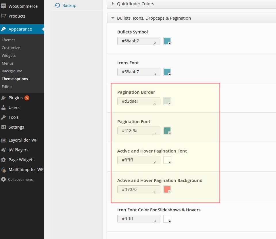
CUSTOMIZING ICON COLORS
If you use some icons in your portfolio sets or in "Project Info / Custom Iconed Fields" widget (see above) you
might wish to customize the color of these icons. To do this use following options in "Bullets, Icons, Dropcaps &
Pagination" panel:
Icons Font
Quickfinders
INTRODUCTION / UNDERSTANDING QUICKFINDERS
Quickfinders are images (icons, pictures, graphics) used to help user to navigate on the website or to highlight
some special advantages/properties of the products or services. So quickfinders could be thought in two ways:
Like Portfolios, Quickfinders consist of two major parts:
Quickfinder items
Quickfinder sets
Navigation Support
In addition or instead of classic menu navigation you can use the graphical representation of subpages in form of some icons or thumbnail images with title and short description. It helps your website visitors to find quickly the subpages / subsections /information they need.Advantages/Properties Overview
If you want to illustrate some special highlights of your products or services on the page, you can use quickfinders in form of icons to attract the visitor attention to these key issues among another page's contentLike Portfolios, Quickfinders consist of two major parts:
Quickfinder items
Quickfinder sets
QUICKFINDER ITEMS
CREATING NEW QUICKFINDER ITEM
You can create new quickfinder item using leftside wordpress menu or the button above the list of existing
quickfinder items. By creating a new quickfinder item you should fill following content fields:
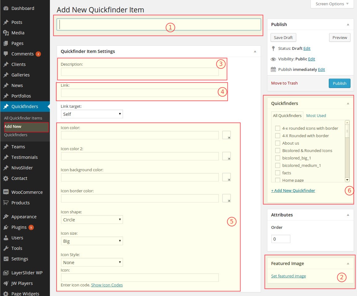
Title
This is the title of the quickfinder item, which will be shown under the quickfinder item in the overviewFeatured Image
In Scalia you can freely choose whether to use images or icons to depict your quickfinder item. If you wish to insert image for an image quickfinder use this field "Featured Image". Here you can upload/choose an image used to depict the quickfinder item in the overview on the page. Here you can use any graphics you wish.Quickfinder Item Description
Here you can enter the short description for your Quickfinder item. It will be shown under the titleLink
If you use Quickfinder item in some set as navigation support (see above), here you can enter the URL of the page, which should be associated with this quickfinder itemIcon
If you wish to display an icon as your quickfinder element, here you can choose from over 400 icons. Just click on "Show icon codes", copy the code of the icon you wish to use in the lightbox icon overview and paste this code hereIcon Color
Choose the main font color of your quickfinder icon hereIcon Color 2
If you wish to make your icon bicolored, here you can choose the second font color for your iconIcon Style
Needed for bicolored icons - here you can define the angle of color splitting on your iconIcon Background Color
Choose the background color of your iconIcon Border Color
Choose the border color of your iconIcon Shape
You can choose between squared and rounded icon shape here. NOTE: this shape will be also applied on your image if you have chosen to use featured image as your quickfinder elementIcon Size
In which size your icon should appear. NOTE: this size will be also applied on your image if you have chosen to use featured image as your quickfinder elementQuickfinder
Here you can assign the given quickfinder item to some existing or new quickfinder set (see below)ASSIGNING QUICKFINDER SETS FOR QUICKFINDER ITEM
In order to define, to which quickfinder set this quickfinder item belongs, you should select the corresponding
quickfinder sets in the panel "Quickfinders" to the right.
You can make a multiple choice if your quickfinder item suits to multiple different quickfinder sets.
Of course you can create a new quickfinder set from here by clicking on "Add new set".
You can make a multiple choice if your quickfinder item suits to multiple different quickfinder sets.
Of course you can create a new quickfinder set from here by clicking on "Add new set".
DEFINING THE SORT ORDER
It is possible to define the sort order of the quickfinder item in one set by entering the order number in the field
"Sort Order" in the right panel.
Notice: if your quickfinder item belongs to multiple quickfinder sets, in all of them it will be on
the same order position as entered in this field.
QUICKFINDER SETS
Quickfinder Sets are the categories or groups of quickfinder items and are useful to group/structure your
quickfinder items. Actually to say in other way, quickfinder set is your quickfinder you wish to insert in your
page. So you can organize different subpages or different services/product highlights as quickfinder items in one
quickfinder navigation and publish it on a page.
CREATING NEW QUICKFINDER SET
You can create new quickfinder set by going in Quickfinders ➜ Sets on the leftside wordpress menu.
After that you are already on the page of creating the new quickfinder set. On the right side in the table you see the list of all existing quickfinder sets - you can edit their properties by clicking on the title of the corresponding set.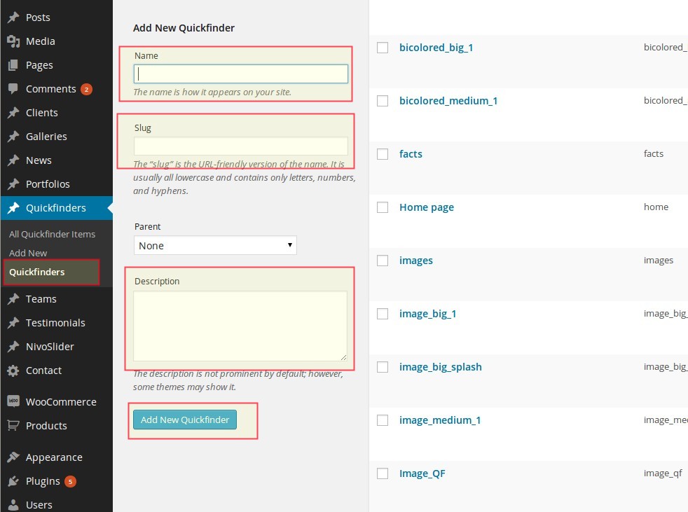
After that you are already on the page of creating the new quickfinder set. On the right side in the table you see the list of all existing quickfinder sets - you can edit their properties by clicking on the title of the corresponding set.
By editing the quickfinder set you have following fields:
Name
enter here the name of your quickfinder set. This name will be used in the list of available quickfinder sets in quickfinder item (see above)Slug
slug is a userfriendly version of the name. Slug is important, because it is used in the shortcode "Quickfinder". So don't forget to fill it if you are creating new quickfinder set.Description
just a brief description of your set, usually it is not neededPUBLISHING / INSERTING QUICKFINDER ON A PAGE
There are several ways you can insert and publish your quickfinders on the pages of your website.
INSERTING QUICKFINDER SETS USING PAGE OPTIONS
You can insert a quickfinder bar or in-content quickfinder on the page using the page options. Each page has several
quickfinder settings under Page Quickfinder panel.
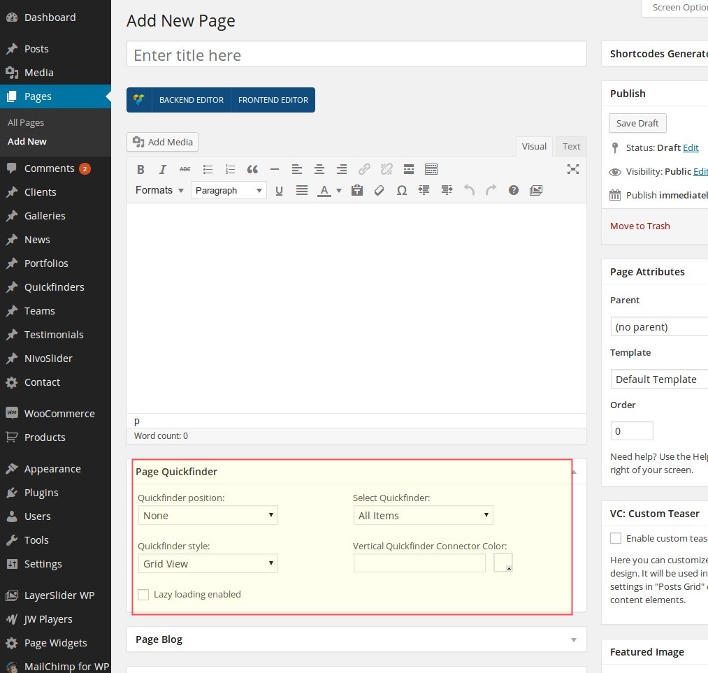 Following options can be set:
Quickfinder Position
Here you define the postion of your quickfinder on page:Select Quickfinder
here you see the select box with the list of all quickfinder sets you have created under "Quickfinders". NOTE: if some set do not have any quickfinder items, it will not be displayed in this list.Quickfinder style
In Scalia you have three different styles of presenting your quickfinders on the page you can choose from.Vertical Quickfinder Connector Color
This option is relevant for "Vertical Style 1" or "Vertical Style 2" of presenting your quickfinders. Here you can choose a color of the vertical connectorINSERTING QUICKFINDER SETS USING SHORTCODES
If you prefer to stay flexible and insert your quickfinders on any position inside your page's content, just use the
quickfinder shortcode with Visual Composer or with Shortcode Generator. See the description of
quickfinder
shortcode in this chapter
CUSTOMIZING QUICKFINDER STYLES
You can easily customize your quickfinder styles using the theme option panel of Scalia (Admin Panel). To open the
admin panel go to Appearance ➜ Theme Options.
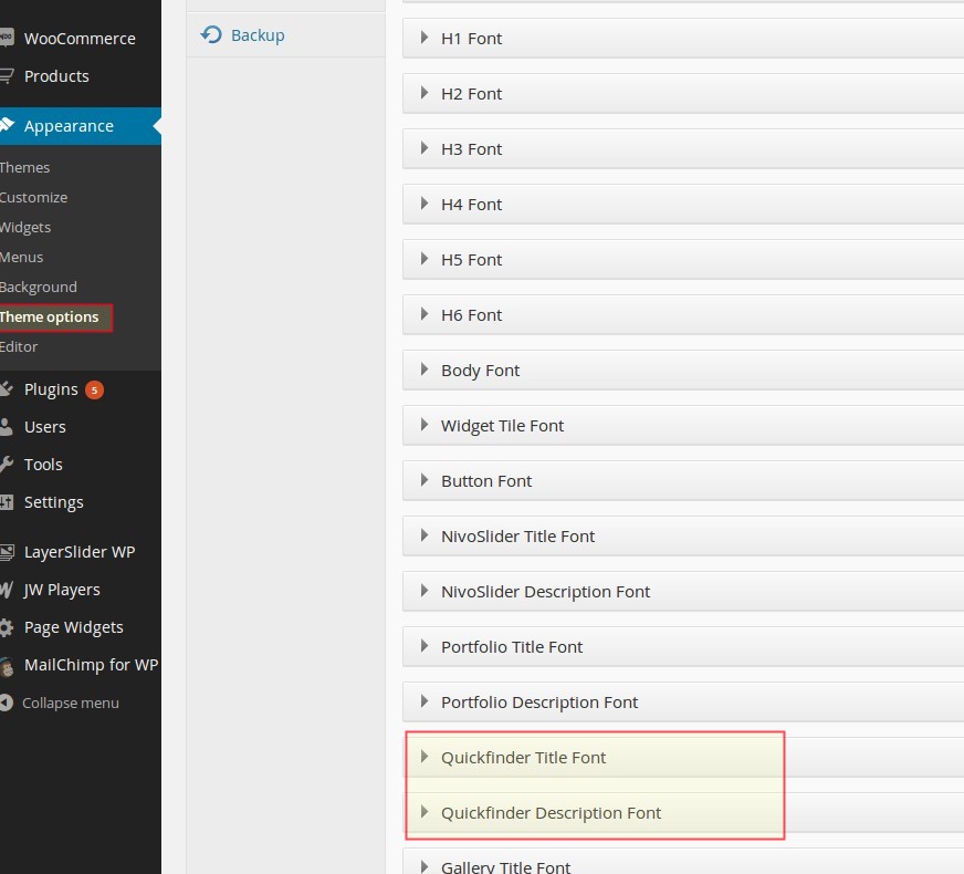
CUSTOMIZING QUICKFINDER FONTS
You can customize the fonts which are used to display the title text and description text of one quickfinder item in
quickfinders. To do this go to "Fonts" and use following panels:
Quickfinder Title Font
Quickfinder Description Font
Here you can choose standard fonts as well as a plenty of google fonts and their styles
Quickfinder Title Font
Quickfinder Description Font
Here you can choose standard fonts as well as a plenty of google fonts and their styles
CUSTOMIZING COLORS
In order to customize all main quickfinder colors navigate to "Colors" and open "Quickfinder Colors"
panel. Following color settings could be customize:
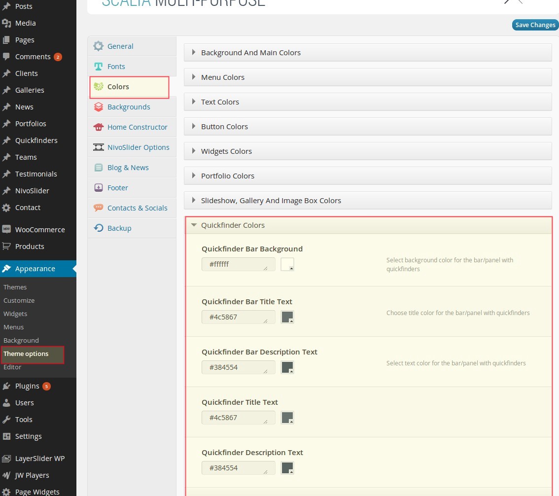
Quickfinder Bar Background
The color of the background used beneath the quickfinder-bars.Quickfinder Bar Title Text
Color of quickfinder item's title text in quickfinder barQuickfinder Bar Description Text
Color of quickfinder item's description text in quickfinder barQuickfinder Title Text
Color of quickfinder item's title text in overviews inside contentQuickfinder Description Text
Color of quickfinder item's description text in overviews inside contentGalleries
Galleries are essential part of any business website. They give the possibility to illustrate some topics or
information with a set of images, grouped together in a nice overviews of thumbnails with fullsize on-click
lightboxes. In Scalia there are different kinds of galleries you can use on your pages in a flexible way.
CREATING NEW GALLERY
ADDING NEW GALLERY
To add new gallery go to "Galleries" in the leftside WP navigation and choose "Add New Gallery"
(1).
Now you should enter the title of your gallery (2) and then click on "Add images" (3) in order to add images to your gallery.
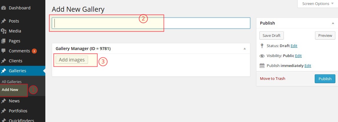
Now you should enter the title of your gallery (2) and then click on "Add images" (3) in order to add images to your gallery.
ADDING IMAGES TO A GALLERY / SORTING / EDITING
Click on "Add Images" button and new layer with media library will appear. Now you can choose images from
your media library or upload them from your computer. Note: you can choose multiple images by holding "Shift" or
"Control" button on your keyboard and clicking on appropriate images. Also in the same way you can choose images for
multiple upload from your computer.
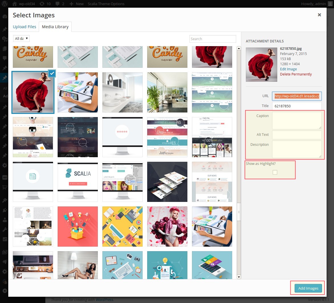
In the right sidebar in media layer you can edit different image properties. Here you can enter the meta information
(title, alt).
After making your selection and editing image properties click on "Add images". After that the selected
images will be added to your gallery.
Now you have the possibility to define the sort order of your images in the gallery just per drag-and-drop:
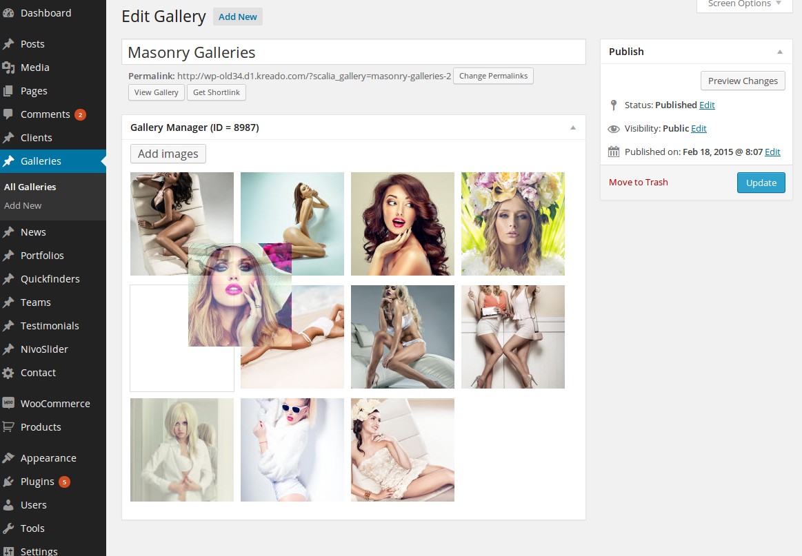
If you want to remove some specific images from your gallery, click on "X" icon in the top right corner of the
image.
If you want to edit properties of specific image from your gallery, just click on it. New tab will be opened, where
you can edit image properties. After editing just save your changes and close this tab.
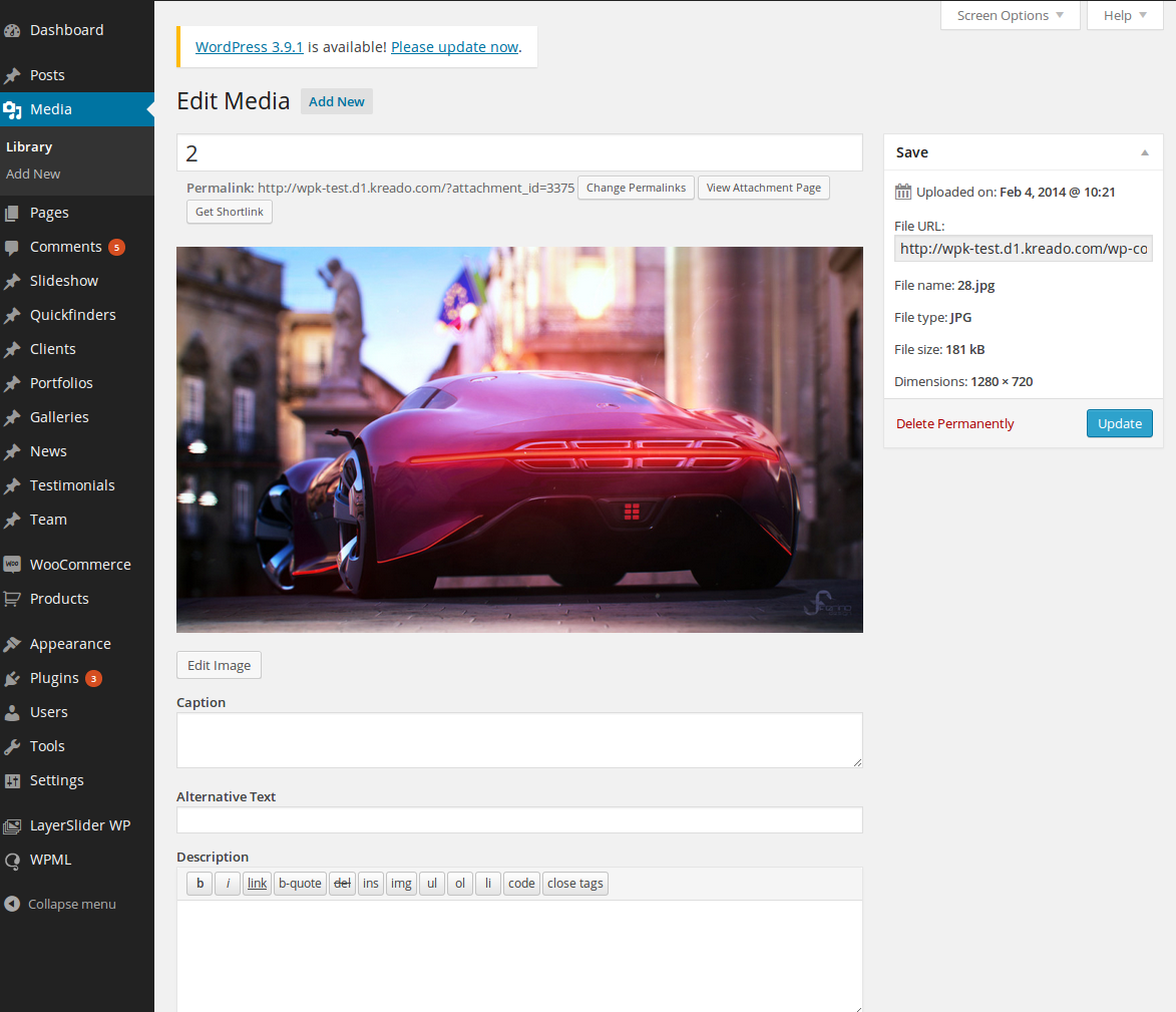
SAVING YOUR GALLERY
When you are done creating and editing your new gallery, click on "Publish" button in the right sidebar. Your
gallery will be saved and image thumbnails will be created and shown instead of original scaled images.
Note: after saving your gallery you will get an ID - you will need this ID for using your gallery in gallery
shortcode.

PUBLISHING / INSERTING GALLERIES ON A PAGE
There are several ways how you can insert and publish your galleries on the pages of your
website.
INSERTING GALLERIES USING PAGE OPTIONS
You can insert a gallery on the page using the page options. Each page (including portfolio page) has several
gallery settings under "Page Gallery" panel.
Following options can be set:
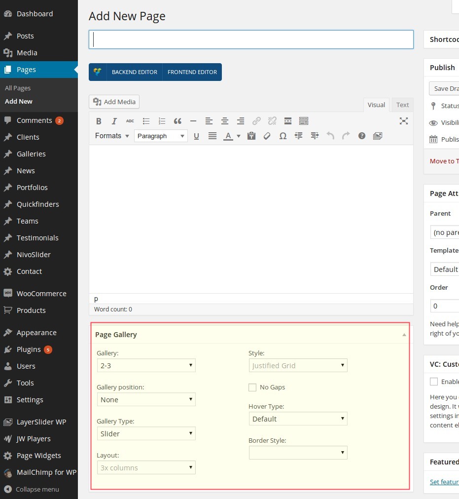
Following options can be set:
Gallery
Choose gallery you wish to show on your pageGallery position
Here you define the postion of your gallery on page:Gallery type
Here you can select the layout of your gallery:Layout
In case you have selected "Grid" in "Gallery type", you can choose between following grid options:Style
In case you have selected "Grid" in "Gallery type", you can choose between following styles:No Gaps
For grid galleries: select this option if you wish to have no gaps / margins between images in your gridHover Type
Select the on hover style for your gallery.Border Style
Select border style for your gallery.INSERTING GALLERIES USING SHORTCODES
If you prefer to stay flexible and insert your galleries on any position inside your page's content, just use the
"Styled Galleries" shortcode with Visual Composer or with Shortcode Generator. See the description of
galleries shortcode in this chapter
CUSTOMIZING GALLERIES STYLES
You can easily customize your galleries styles using the theme option panel of Scalia (Admin Panel). To open the
admin panel go to Appearance ➜ Theme Options.
CUSTOMIZING GALLERIES FONTS
You can customize the fonts which are used to display the title text and description text on the images inside your
gallery. To do this go to "Fonts" and use following panels:
Gallery Title Font
Gallery Description Font
Gallery Title Font
Gallery Description Font
CUSTOMIZING COLORS
In order to customize all main gallery colors navigate to "Colors" and open "Slideshow, Gallery And Image
Box Colors" panel.
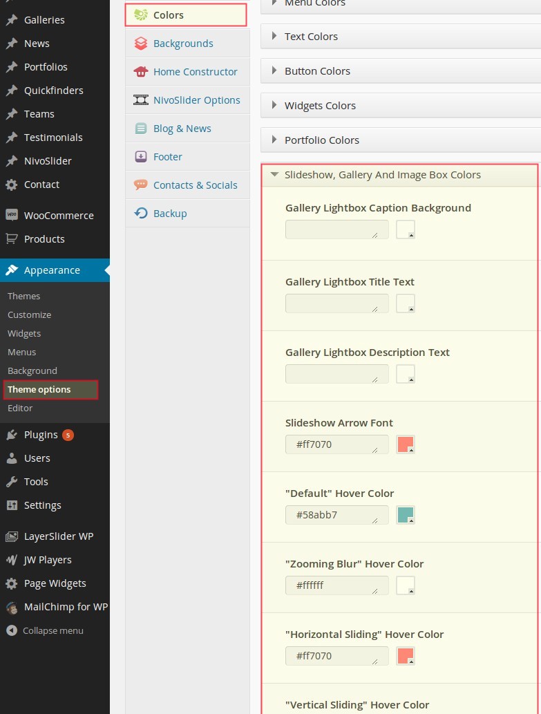
Slideshows
Slideshows are useful for teasing some special informations, highlights, promotions and activities using nice and
attractive key visuals just in the header part of your page. For example you can use the slideshow on your homepage
to
immediately catch your visitors attention and to guide them directly to the needed information / pages. In
slideshows
you can combine the visual message (using some attractive images) with text message (using some significant slogans)
and
link it with the pages you like.
Scalia is delivered with two different types of sliders
Scalia is delivered with two different types of sliders
LAYERSLIDER
LayerSlider is a premium wordpress slider plugin, created by Kreatura Media. You can find the
documentation on how to set up and use this slider in the LayerSlider WP admin area. Note, that this documentation
is context-based, so help topics change depending on the layeslider admin page you have selected. You can access
diffenrent help topics with the "Help" menu item on the top right corner of the page.
The advantage of using the LayerSlider is a power of visual effects it brings in your slideshow. However it is a bit more complicated in understanding, setting up and managing as more "minimalistic" Nivoslider (see below).
If you are an experienced user and would like to gain the most from the power of LayerSlider, so it is your choice number one! However if you prefer more minimalistic slider, also equiped with beautiful transitions and much more easier in setting up, so we would recommend to use Nivoslider
NIVOSLIDER
Nivoslider is a built-in slider plugin of Scalia. It consists of two major elements:
Slides
Slideshows
Slides
Slideshows
Slide is a single element of the slideshow which includes an image and an optional text
(slogan)
ADDING NEW SLIDE
You can create new slide using leftside wordpress menu or the button above the list of existing slides.
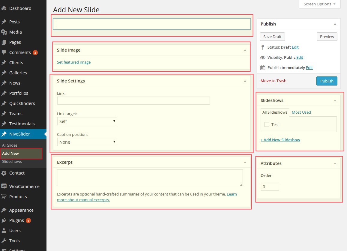
By creating a new slide you should fill following content fields:
By creating a new slide you should fill following content fields:
Title
This is the title of the slide, which could be shown on the slide in slideshowExcerpt
This is a description text, which could be shown on the slide under the title in slideshowSlide Settings: Slide Link
Here you can link your slide with some internal or external page / urlSlide Settings: Slide text position
Here you define, whether the text (title and excerpt) should be shown on your slide and if yes - in which position:Featured Image
Here you select the image for your slide via Media LibraryASSIGNING SLIDESHOWS FOR A SLIDE
Here you select the slideshow, which should be assigned to this slide. You can assign multiple slideshows to the
slide, so it will be shown in different slideshows. Of course you can create a new slideshow just from here by
simply clicking on "Add new slideshow"
DEFINING THE SORT ORDER
It is possible to define the sort order of the slide in a slideshow by entering the order number in the field "Sort
Order" in the right panel
Notice: if your slide belongs to multiple slideshows, in all of them it will be on the same order
position as entered in this field.
CREATING NEW SLIDESHOW
You can create new slideshow by going in Slideshows ➜ Slideshow on the leftside wordpress menu. After that
you are already on the page of creating the new slideshow. On the right side in the table you see the list of all
existing slideshows - you can edit their properties by clicking on the title of the corresponding slideshow.
By editing the slideshow you have following fields:
After clicking on "Add New Slideshow" your new slideshow will be saved.
Name
enter here the name of your slideshow. This name will be used in the list of available slideshows in slides and in page options (see above)Slug
slug is a userfriendly version of the name.Description
just a brief description of your set, usually it is not neededAfter clicking on "Add New Slideshow" your new slideshow will be saved.
PUBLISHING / INSERTING SLIDESHOW ON A PAGE
You can insert a slideshow on the page using the page options under "Page Slideshow" panel.
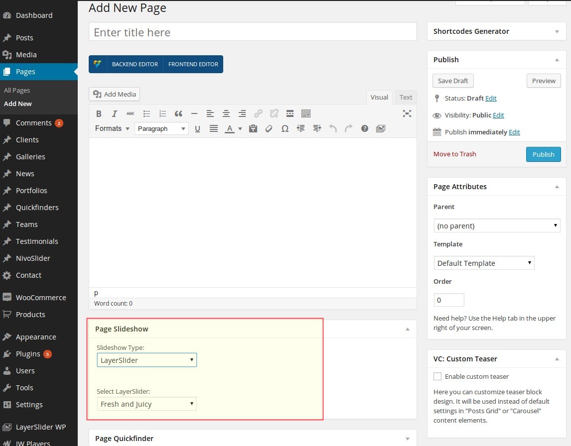
DEFINING NIVOSLIDER SETTINGS
You can define different parameters like change effect, visibility time etc. for you slideshow using the theme
option panel of Scalia (Admin Panel). To open the admin panel go to Appearance ➜ Theme Options. Here you
should select "NivoSlider Options" to get the slideshow settings. You can define following parameters:
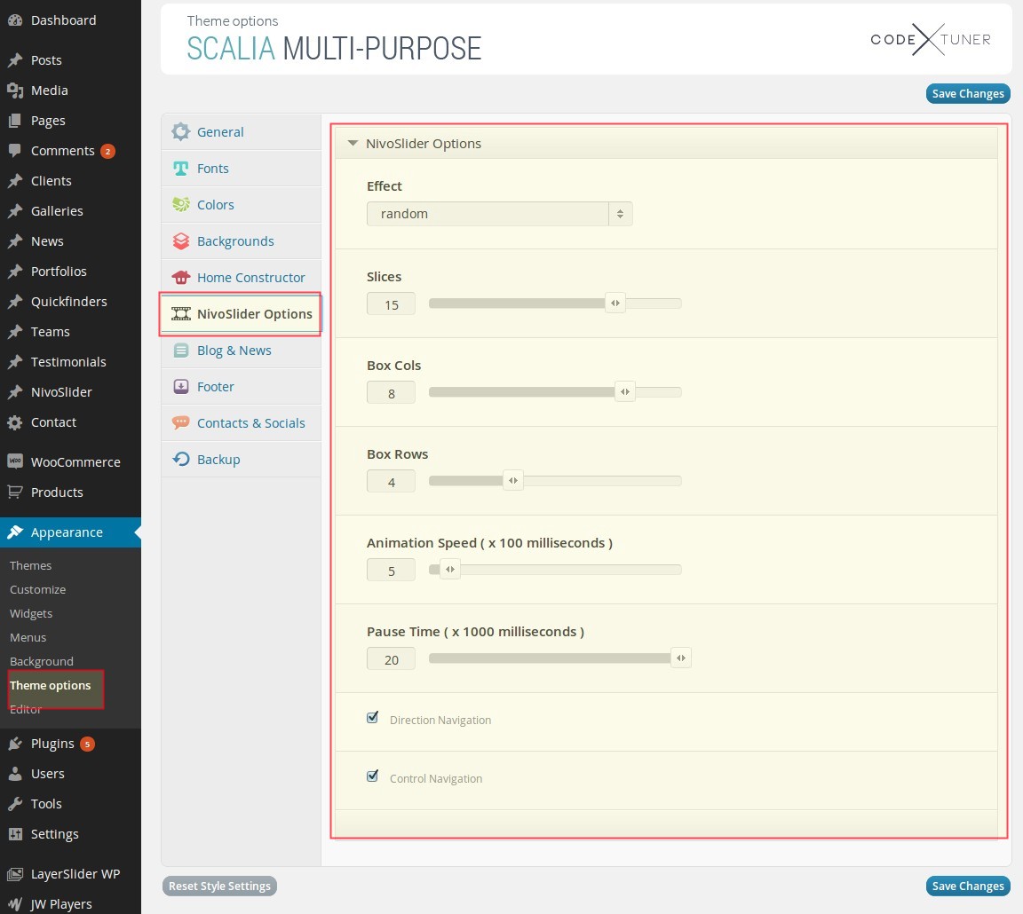
Effect
choose an effect you would like to use for sliding / image changesSlices
choose number of slices for slices effectsBox Cols & Box Rows
choose number of columns and rows for box effectsAnimation Speed ( x 100 milliseconds )
animation speed for slide effectsPause Time ( x 1000 milliseconds )
for how long one slide will be shown before chaning to anotherDirection Navigation
arrows will be used as navigation symbolsControl Navigation
small radio buttons in slide footer will be shown as navigation symbolsCUSTOMIZING NIVOSLIDER STYLES
You can easily customize your slideshow styles using the theme option panel of Scalia (Admin Panel). To open the
admin panel go to Appearance ➜ Theme Options.
CUSTOMIZING SLIDESHOW FONTS
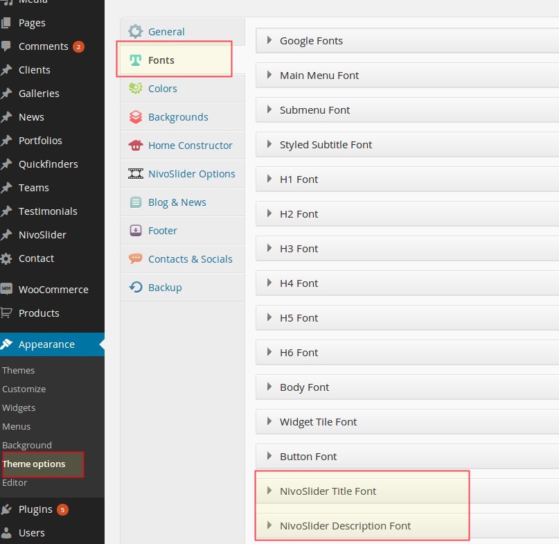
Slideshow Title Font
Slideshow Description Font
CUSTOMIZING COLORS
In order to customize slideshow text colors use settings in style.css of Scalia (to find here: wp-content\themes\Scalia\style.css)
Beginning from row 529 you can define the colors for title and description on a slide:
.slideshow .nivocaption .title
backgroundcolor: #000;
backgroundcolor: rgba(0, 18, 28, 0.77);
color: #f1f5f8;
.slideshow .nivocaption .description
backgroundcolor: #fff;
backgroundcolor: rgba(241, 245, 248, 0.77);
color: #0b1217;
Clients
"Clients" are useful to show your "Hall Of Fame": Clients/customers, for whom you have made projects, provided
services etc. The usual way to do this is to show an overview of your customers logos/identities.
However you can alos use any images to depict your customers - logos, icons, photos etc.
Like Quickfinders, Clients consist of two major parts:
Clients
Sets
However you can alos use any images to depict your customers - logos, icons, photos etc.
Like Quickfinders, Clients consist of two major parts:
Clients
Sets
Client
CREATING NEW CLIENT
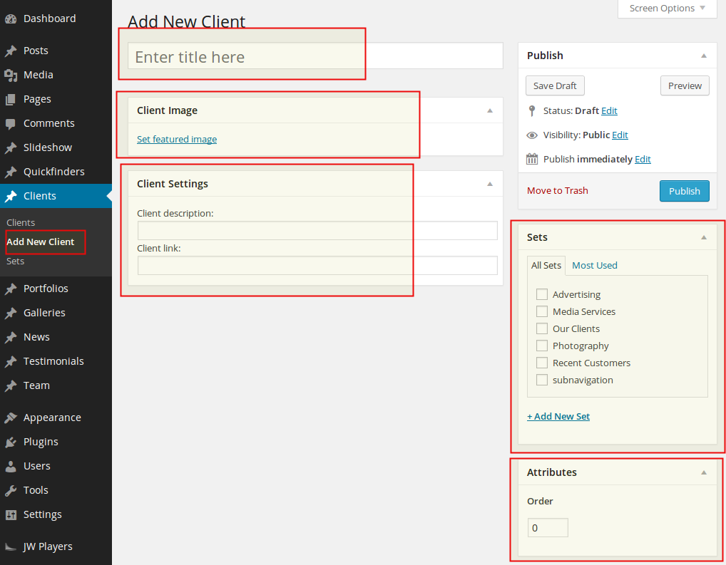
You can create new client using leftside wordpress menu or the button above the list of existing clients. By
creating a new client item you should fill following content fields:
Title
This is the name of your customerClient Image
Here you can upload an image, depicting your customer (logo or photo)Client Description
Here you can enter the short description for your Client item.Client link
Here you can enter the URL of the page, which should be associated with this ClientSets
Here you can assign the given client to some existing or new client set (see below)ASSIGNING SETS FOR CLIENTS
In order to define, to which set this client item belongs, you should select the corresponding sets in the panel
"Sets" to the right.
You can make a multiple choice if your client item suits to multiple different sets.
Of course you can create a new client set from here by clicking on "Add new set".
You can make a multiple choice if your client item suits to multiple different sets.
Of course you can create a new client set from here by clicking on "Add new set".
DEFINING THE SORT ORDER
It is possible to define the sort order of the client item in one set by entering the order number in the field "Sort
Order" in the right panel.
Notice: if your client item belongs to multiple quickfinder sets, in all of them it will be on the
same order position as entered in this field.
PUBLISHING / INSERTING CLIENTS ON A PAGE
You can easily insert your client overviews as carousel or as grid in any position of your content by using
"Clients" shortcode with Visual Composer or Shortcode Generator. The detailed description of "Clients"
shortcode you will find in chapter "Page Builder -> Clients".
Blog
ADDING NEW BLOG POST
Just like in any wordpress installation you can create new blog post by choosing "Posts" and then "Add
New" in leftside wordpress menu. A page for adding new blog post will open. Here you have:
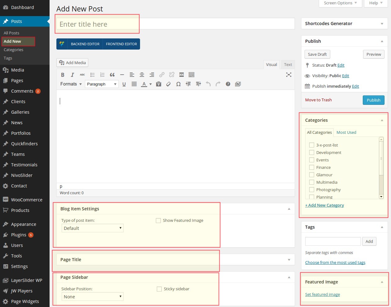
After you are finished click on "Publish" to publish your blog post
NOTE: As on any page you can make additional page settings by using the panels like "Page Slideshow", "Page Portfolio" etc. For detailed description of using the page's settings see chapter "Pages".
Title
Title of your blog postText Editor
Content of your blog post. Here you can use all of the Scalia shortcodes by using Visual Composer or Shortcode GeneratorBlog Item Settings
Page Title
Here you can set multiple options for your blog post title including excerpt. It works in the same way, as in pages (see chapter "Pages -> Adding New Page")Categories
Here you can define, to which post categories belongs your post. You can add new blog categories in Posts ➜ Categories or directly here in Categories panel by clicking on "Add New Category"Tags
In this panel you can tag your post. This feature is useful for "Tag Cloud" widget and for blog searchFeatured Image
If you want to equip your blog post with some title image, which will appear in the list of blog posts and on the top of your blog post, use "Set featured image" to select an image from media library or to upload it from your hdd
Highlighting blog post
In addition you can set if your blog post should be highlighted / emphasized in blog list by checking the option "Show as Highlight".After you are finished click on "Publish" to publish your blog post
NOTE: As on any page you can make additional page settings by using the panels like "Page Slideshow", "Page Portfolio" etc. For detailed description of using the page's settings see chapter "Pages".
DEFINING THE BLOG POST SIDEBAR
Enabling sidebar
As on any page, you can use default or customized sidebar inside your blog post. To enable sidebar in your blog post, set its position in Page Sidebar panel -> Sidebar Position. Here you can also enable sticky sidebar.Customizing sidebar
You can easily define the widgets to be displayed on your blog post by using using the settings in Page Widgets panel. Here you should select Customize (is selected by default if you create new post) and then simply drag-and-drop any widgets of your choice from Available Widgets panel to the Sidebar panel. After setting up / filling your widgets don't forget to click on [save] at the bottom of each widget to save your widget settings for this customized sidebar! For detailed description of all available widgets see chapter Widgets.CREATING A LIST PAGE FOR BLOG POSTS
In order to display your blog posts in a list form consisting of post teasers (title, excerpt, read more) do
following:
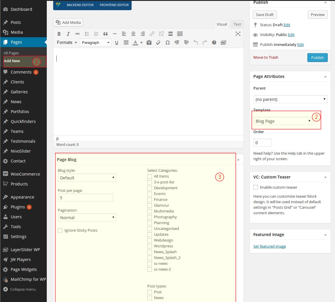
INSERTING BLOG LIST IN PAGE CONTENT
You can insert blog lists in different styles in any position of your content by using "News & Blog" shortcode with
Visual Composer or Shortcode Generator. The detailed description of "News & Blog" shortcode you will
find in chapter "Page Builder -> News & Blog Posts".
CUSTOMIZING BLOG SETTINGS
In order to customize some of blog settings use Theme Options of Scalia. Go to Appearance ➜ Theme Options and you
will get our Admin Panel. Here select "Blog & News" to get the blog options:
Show author
Here you define whether to show the author's info in your blog posts or notExcerpt length
Number of symbols to be shown in blog excerpt on the list pageTeam
Team feature is a perfect tool to present your team inside your page content or in sidebar. For example if you have
a product or service page and would like to present direct contact persons responsible for the customer
communication concerning this product or service, use this tool as a shortcode or as a widget.
ADDING NEW PERSON
To add new person to your teams, go to Team ➜ Add New Person in the leftside wordpress menu. You will get a
page for adding the new person. Here you can define:
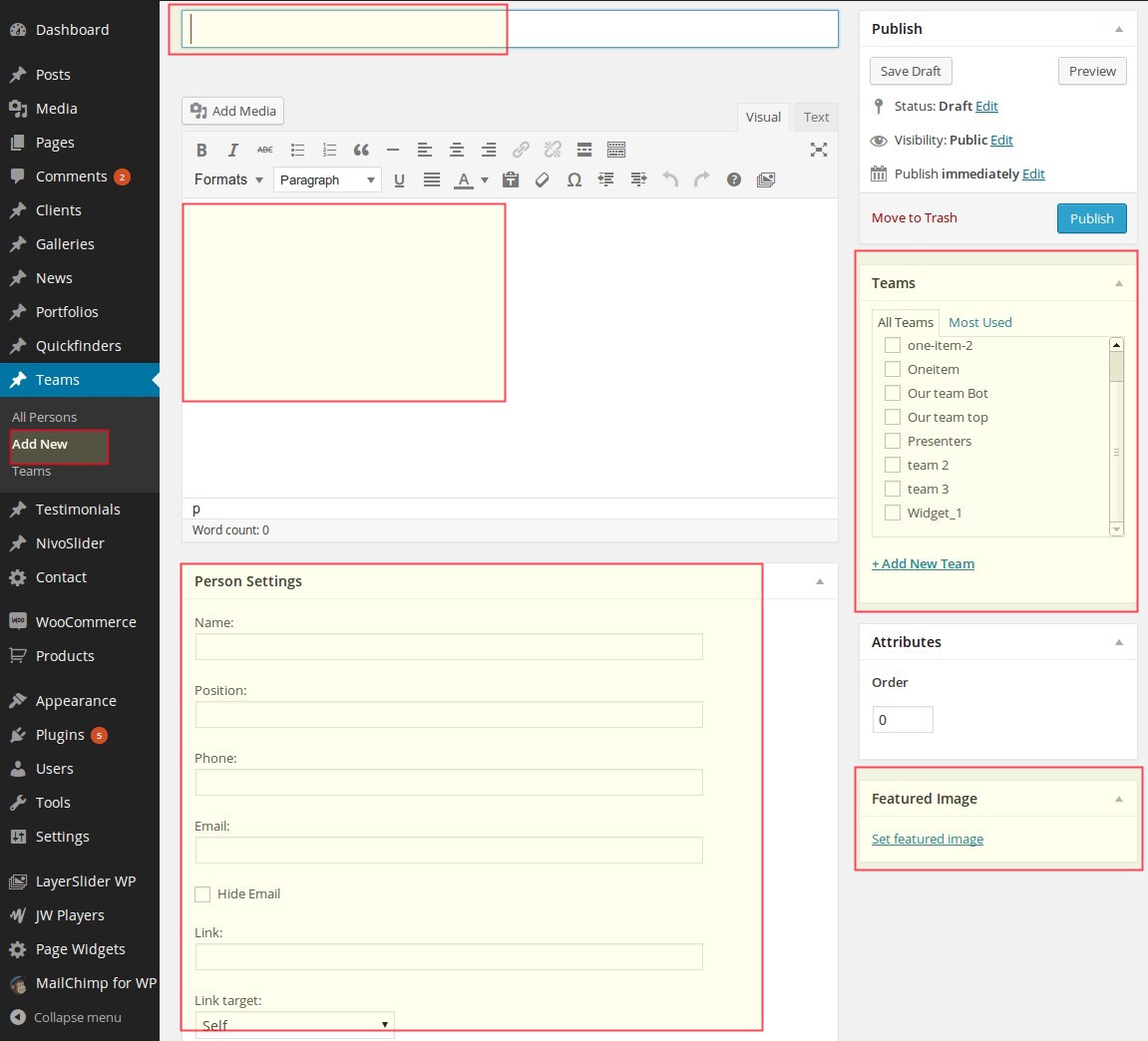
In Person Settings you define the visible public settings, which will be displayed in person's information on the website:
Featured Image is a picture of your contact person, which will be shown on the website while displaying teams. Click on “Set featured image” to select your person's image from the media library or from your local hdd.
Title
it is a person's title, which is used intern only for wordpress admin, for example in persons listText Editor
here you can enter some brief description or some quoted text concerning your person. This text will be displayed in one of team stylesIn Person Settings you define the visible public settings, which will be displayed in person's information on the website:
Name:
Person's namePosition:
Position of person in your team / companyPhone:
telephone number for direct contactEmail:
email address for direct contact. If you don't want to display the email directly on your webpage, you can hide it by choosing "Hide Email option - in this case instead of email address the link to contact will be displayedLink:
here you can link your team personTeams
In panel Teams to the right you can select, to which teams in your company this person belongs. You can create new teams by going to "Team ➜ Sets" or directly here by clicking on "Add New Set". You can make multiple selection if this person works in multiple teams.Featured Image is a picture of your contact person, which will be shown on the website while displaying teams. Click on “Set featured image” to select your person's image from the media library or from your local hdd.
ADDING NEW TEAM
To add new team use Team ➜ Teams in the leftside wordpress menu. Sets are teams. Here you can define
following data:
After you are finished with filling the team's data click on "Add New Set" and you are done - your new team will appear in the list of available teams in the right table.
Name
team's name. Is used for team's widget, where you can select teams to be displayedSlug
slug is used in team shortcode, so be sure to fill this field properly with URL-friendly version of the team's nameDescription
brief description of the team, is used only internAfter you are finished with filling the team's data click on "Add New Set" and you are done - your new team will appear in the list of available teams in the right table.
PUBLISHING TEAM ON A PAGE
You can easily insert your team overviews in different styles in any position of your content by using "Team"
shortcode with Visual Composer or Shortcode Generator. The detailed description of "Team" shortcode
you will find in chapter "Page Builder -> Team".
USING TEAM WIDGET
You can also publish / display your team in a page sidebar or blog post sidebar on your website.
To activate the team widget go to "Page Sidebar" panel in page options below, choose the Team widget from the list of "Available Widgets" and rag it to the right panel "Page Sidebar". Then open this widget "Team" by clicking on its title. Now you can fill your widget with general title -it is title of your widget, for instance "Key Accounts". Under the general title you can select the team sets which you would like to show in your team widget. You can select multiple teams to be displayed.
When you are finished with setting up your widget, please DON'T FORGET to click on "Save" button at the widget's bottom in order to save your content. Only after saving you widget you can publish your article.
Testimonials
Testimonials are the perfect way to show your website visitors the opinion of your customers about the work you can
provide. It is a good mean of convincing your potential customers about how good you are. Scalia allows to use
testimonial widgets to show testimonials.
ADDING NEW TESTIMONIAL
To add new testimonial, go to Testimonials ➜ Add New Testimonial in the leftside wordpress menu. You will get
a page for adding the new testimonial. Here you can define:
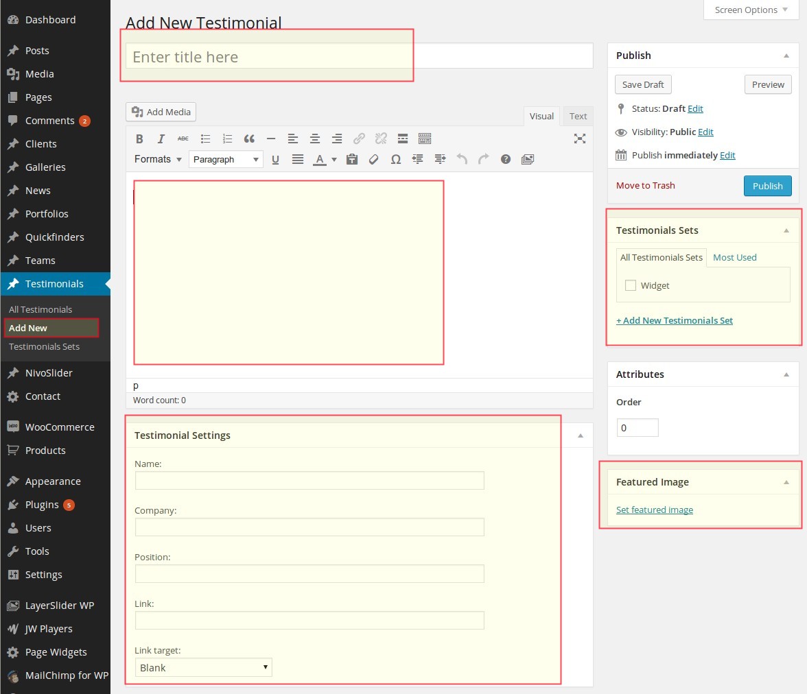
In Testimonial Settings you define the visible public settings, which will be displayed in testimonial's information on the website:
Name: Name of the person, who has written this testimonial
Position: Position of this person in your customer's company
Company: Company's name of your customer
Link to Company: URL of your customer's website
Testimonial Sets
In panel "Testimonial Sets" to the right you can select, to which testimonial sets this testimonial belongs. You can create new sets by going to Testimonials ➜ Sets or directly here by clicking on "Add New Set". You can make multiple selection if this testimonial should be assigned to multiple sets.
"Featured Image" is a picture of your testimonial's contact person, which will be shown on the website while displaying teams.
Title
it is a testimonial's title, which is used intern only for wordpress admin, for example in testimonial listsText Editor
here you can enter the quoted text or brief description concerning your testimonial. It will be displayed in your testimonial on pageIn Testimonial Settings you define the visible public settings, which will be displayed in testimonial's information on the website:
Name: Name of the person, who has written this testimonial
Position: Position of this person in your customer's company
Company: Company's name of your customer
Link to Company: URL of your customer's website
Testimonial Sets
In panel "Testimonial Sets" to the right you can select, to which testimonial sets this testimonial belongs. You can create new sets by going to Testimonials ➜ Sets or directly here by clicking on "Add New Set". You can make multiple selection if this testimonial should be assigned to multiple sets.
"Featured Image" is a picture of your testimonial's contact person, which will be shown on the website while displaying teams.
ADDING NEW TESTIMONIAL SET
Testimonial sets are are useful to group a number of topical related testimonials in one set in order to show it on
the certain website page. For example if you are editing a page with some industry specific product / service
description, it would be beneficial to show a set of testimonials from this industry.
To add new testimonial set use Testimonials ➜ Sets in the leftside wordpress menu. Here you can define following data:
After you are finished with filling the set's data click on "Add New Set" and you are done - your new testimonial set will apper in the list of available sets in the right table.
To add new testimonial set use Testimonials ➜ Sets in the leftside wordpress menu. Here you can define following data:
Name
set's name. Is used for testimonial widget, where you can select testimonial sets to be displayedSlug
slug is a URL-friendly version of the sets's nameDescription
brief description of the set, is used only internAfter you are finished with filling the set's data click on "Add New Set" and you are done - your new testimonial set will apper in the list of available sets in the right table.
PUBLISHING TESTIMONIAL ON A PAGE
You can easily insert your testimonials in different styles in any position of your content by using "Testimonials"
shortcode with Visual Composer or Shortcode Generator. The detailed description of "Team" shortcode
you will find in chapter "Page Builder -> Testimonials".
USING TESTIMONIAL WIDGET
Just like your team members, you can show testimonials of your customers in the page sidebar. Just select one or
multiple testimonial sets by clicking on checkboxes. If you have several testimonials in the set, they will be shown
on the page with a fading in / fading out effects. In Scalia there are two different styles of displaying
testimonials in sidebar; you can choose between them in selectbox "Style". When you are finished with setting up
your widget, please DON'T FORGET to click on "Save" button at the widget's
bottom in order to save your content. Only after saving you widget you can publish your article.
SEE DEMO »
SEE DEMO »
News
ADDING NEWS
You can create new "News" post by choosing "News" and then "Add New News" in leftside wordpress menu. A page for
adding new "news" post will open. Here you can define:
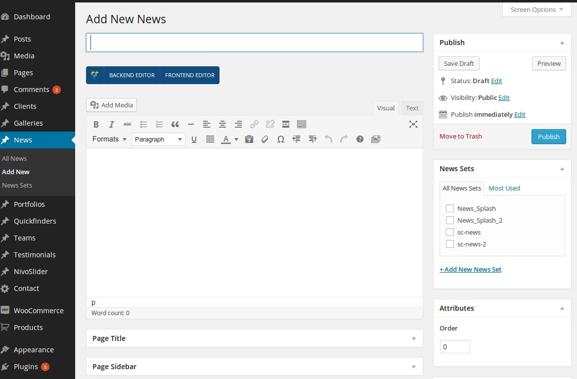
After you are finished click on "Publish" to publish your news post
NOTE: As on any page you can make additional page settings by using the panels like "Page Slideshow", "Page Portfolio" etc. For detailed description of using the page's settings see chapter "Pages".
Title
Title of your news postText Editor
Content of your news post. Here you can use all of the Scalia shortcodes by using Visual Composer or Shortcode GeneratorPage Title
Here you can set multiple options for your news post title including excerpt. It works in the same way, as in pages (see chapter "Pages -> Adding New Page")News Sets
Here you can define, to which news sets belongs your news post. You can add new sets in News ➜ News Sets or directly here in News Sets panel by clicking on "Add New News Set"Featured Image
If you want to equip your news post with some title image, which will appear in the news list, use "Set featured image" to select an image from media library or to upload it from your hddAfter you are finished click on "Publish" to publish your news post
NOTE: As on any page you can make additional page settings by using the panels like "Page Slideshow", "Page Portfolio" etc. For detailed description of using the page's settings see chapter "Pages".
INSERTING NEWS LIST IN PAGE CONTENT
You can insert news lists in different styles in any position of your content by using "News & Blog" shortcode with
Visual Composer or Shortcode Generator. The detailed description of "News & Blog" shortcode you will
find in chapter "Page Builder -> News & Blog Posts".
WPML
If you need to make your website multilingual, WPML could be the best solution to do it. WPML is the set of plugins,
allowing you to easily translate your website in other languages. Scalia was carefully tested and is fully
compatible with WPML. In order to use WPML you need to purchase the license for this plugin here http://wpml.org/purchase/
On the WPML.org website you can find very detailed documentation about using this plugin, check this link http://wpml.org/documentation/getting-started-guide/.
After purchasing WPML you will get free support from WPML team, you can use their support forum here http://wpml.org/forums/forum/english-support/.
Below you will find some specific aspects of using WPML with Scalia.
FIRST STEPS / SETTING UP WMPL
# BEGIN WP
<IfModule mod_rewrite.c>
RewriteEngine On
RewriteBase /
RewriteCond %{REQUEST_FILENAME} !-f
RewriteCond %{REQUEST_FILENAME} !-d
RewriteRule . /index.php [L]
</IfModule>
# END WP
LANGUAGE SWITCHER
In Scalia you have a pre-defined location for language selector:
In order to enable language selector in the top menu, go to "WPML -> Languages", section "Language switcher
options" and make following selection:
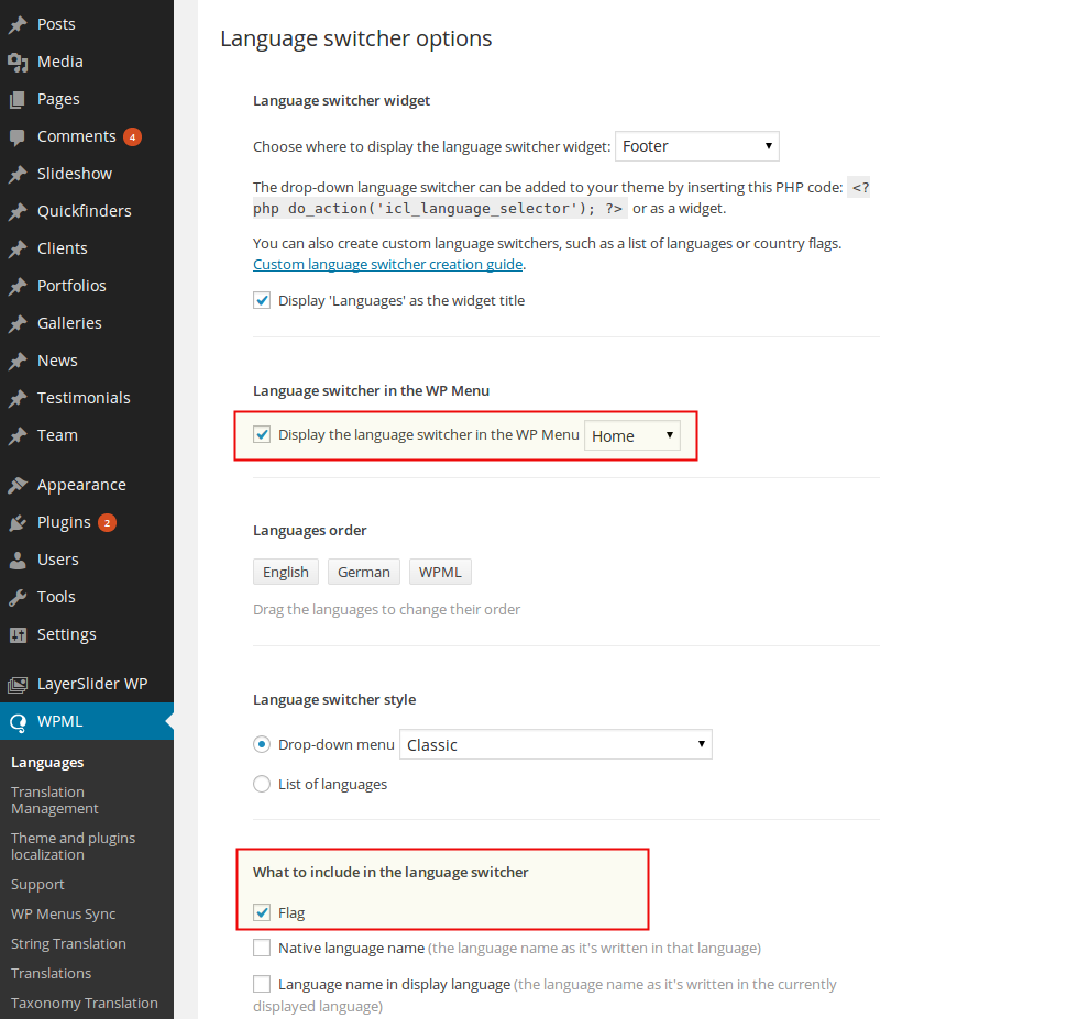
To display language selector at the bottom of the website choose following:
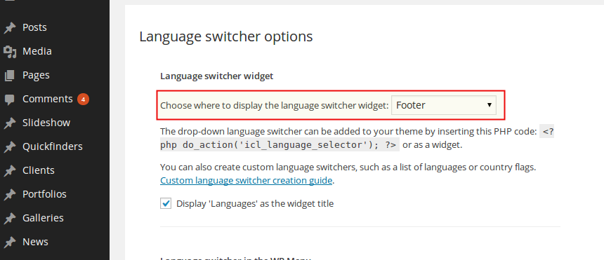
USING Scalia-STYLED COUNTRY FLAGS
Scalia is provided with the set of country flags, styled in flat style suitable for Scalia design. You can find all
flags in folder PSD, "Flags". You can use these flags to display them in languge selector. To do this:
TRANSLATING PAGES & POSTS
Go to "Pages" -> "All Pages". You see columns for each active language, with a pencil icon (for ‘edit
translation’) or a ‘+’ icon (for ‘add translation’) next to each page. Using these icons you can add a new language
version of this page or edit the exiting one. The easiest way to start is to edit the original language page and
here to check "duplicate" checkbox in "translate" box and then to click on "Duplicate". In this way you create a
copy of your page in other language version with all the content from original language, so you can easily translate
it.
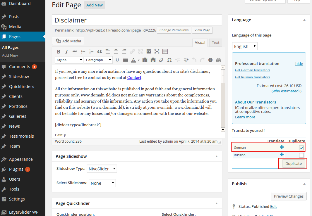
You’ll probably be interested in the process of batch duplication of pages and posts. To use this feature, go to WPML->Translation
Management, and from the Translation Dashboard, select the filter you want (Pages/Posts), and click ‘Display’.
Select the pages or posts you want to translate or duplicate (you can select them all by clicking the checkbox
besides the ‘Title’ header or footer):
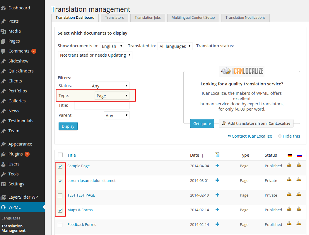
Then, at the bottom of the page, choose languages for which you want to translate or duplicate, and ‘Submit
Documents’:
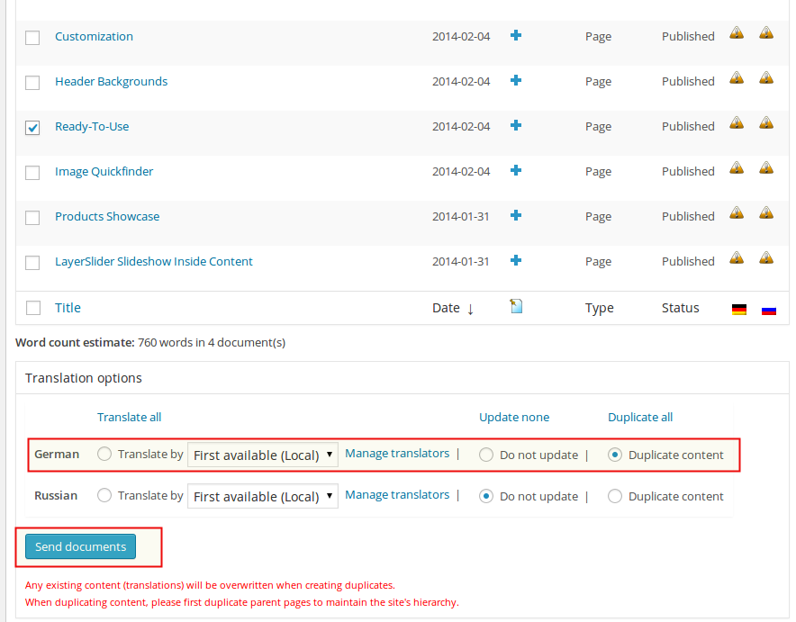
In general, with WPML you can always choose between ‘translating’ or ‘duplicating’ content. If you do the former but
want to import content from the original you can always use the buttons to ‘copy content from the original’ in their
edit page; if you do the latter, you can always choose later ‘Translate independently’ so that you can save your
edits. Try both procedures to see which one you find better for your workflow.
TRANSLATING QUICKFINDERS, PORTFOLIOS, TESTIMONIALS, TEAMS ETC.
Scalia comes with a rich set of custom post types such as portfolios, quickfinders, testimonials etc. and custom
taxonomies. In order to get a similar interface & workflow for translation/duplication as for posts and pages (see
description above), you need to go to WPML->Translation Management, and select the tab ‘Multilingual Content
Setup’. At the bottom of the page you’ll see:
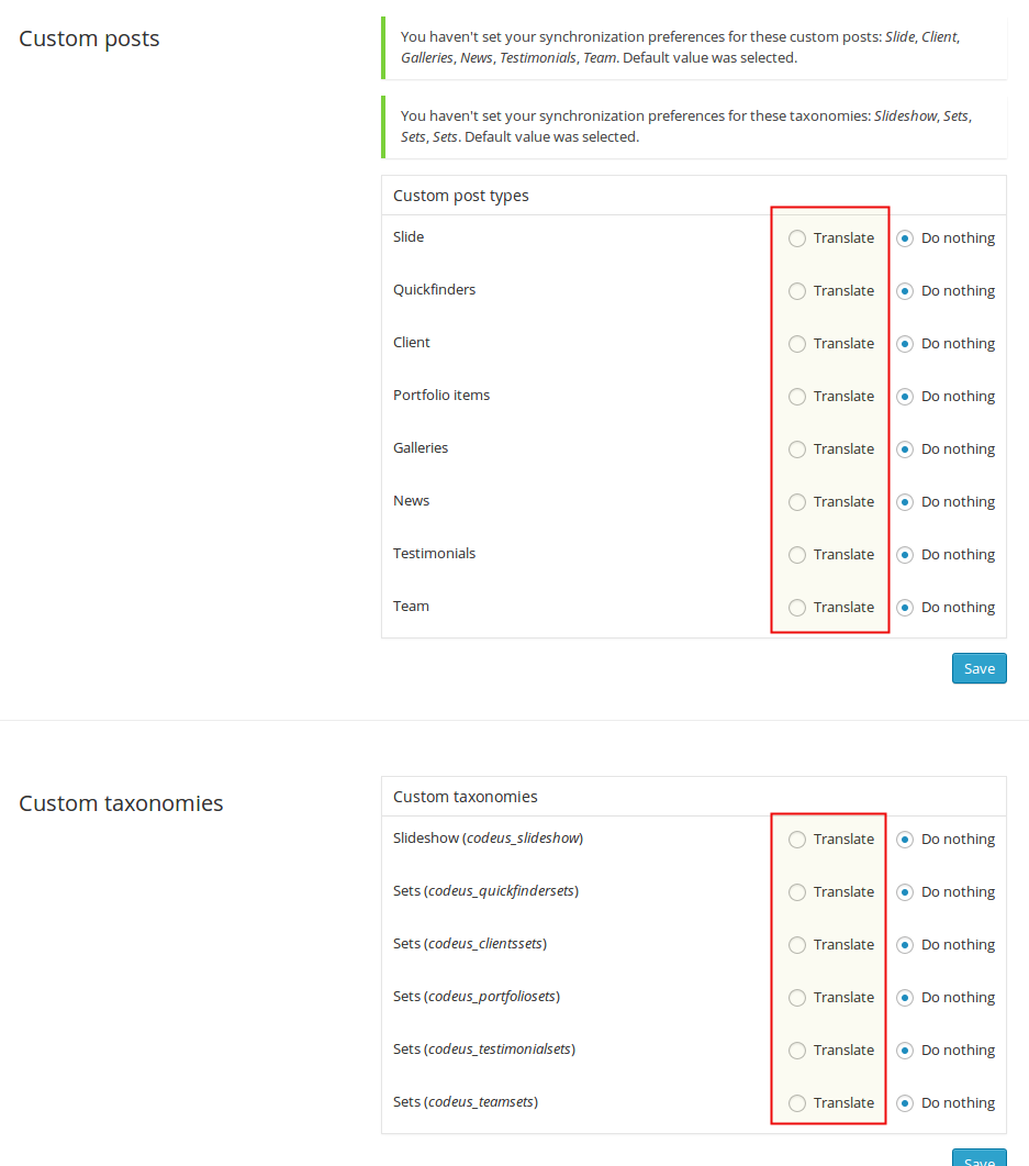
You need to select ‘translate’ for the custom post types you want to make translatable.
TRANSLATING HOMEPAGE
If you choose to use some specific static page or blog list to be shown on your homepage, you just need do translate
this page /posts as it was described above.
If you prefer to use Home Constructor to build your homepage, be sure, that all of your
content elements you would like to use on your translated homepage, are already translated. So, please, before using
Home Constructor in another language version, translate your quickfinders, portfolios etc. which you use on your
homepage. For process of translating pages, quickfinders etc. see description above.
NOTE: Home Constructor is language-independent. That means, that you can build different
homepages in different content languages. Form example in English version you can use quickfinders, and in German
language you can skip them.
To build your homepage in another language do the following:
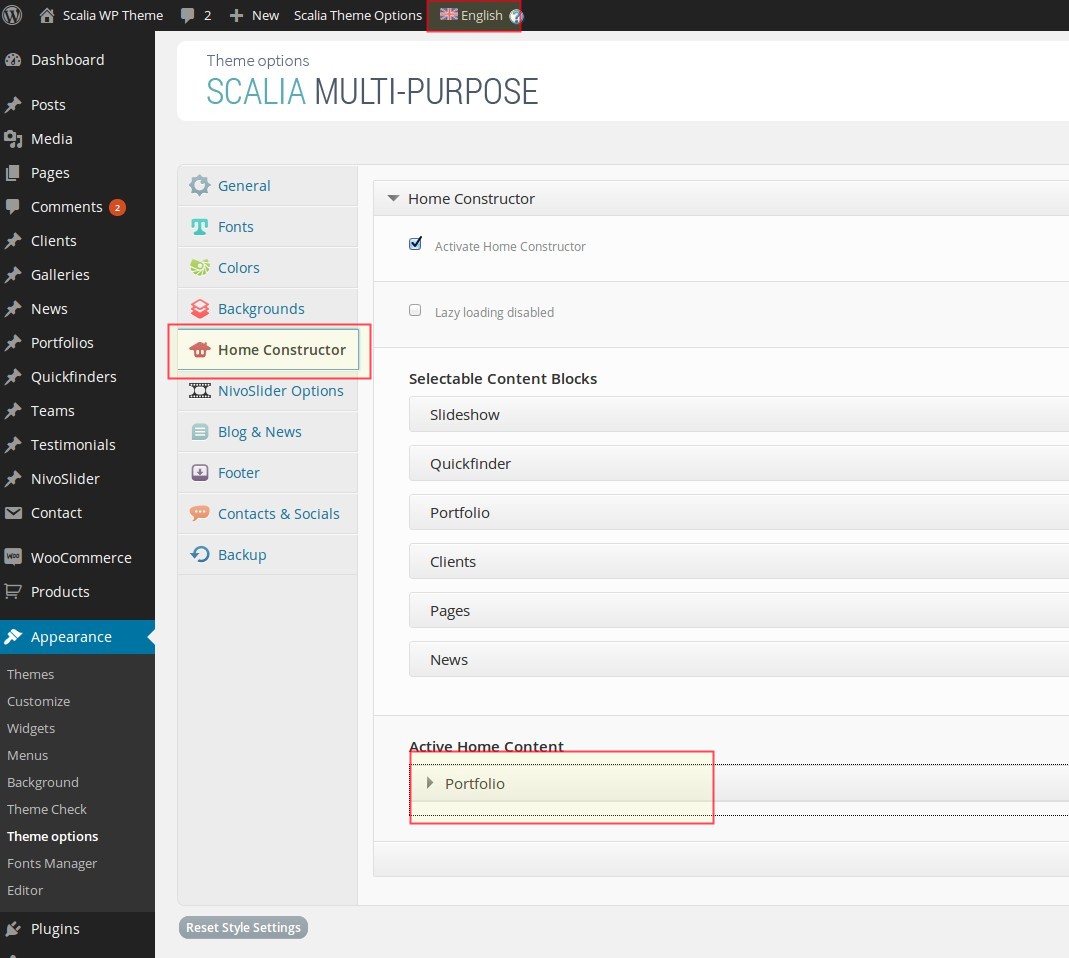
Here you will see, that your homepage content is empty and you can start configuring it for
the chosen language version. Proceed in the same way, as you have done it before for your initial language version
(see detailed description in Chapter "SETTING UP HOMEPAGE"). Choose content
elements, drag-n-drop them into homepage area and arrange it in the way you'll like it. (as noted above, you can
build your homepage for another language version in other way, as for your initial language, because Home
Constructor works separately with different language versions.)
For each content element choose content from selectboxes, which you would like to see on
your homepage. Note, that in selectboxes you see only translated versions of your content for this language
specifically. That means, that for example in German version of Home Constructor you see only German pages,
portfolio sets, quickfinders etc., and no English pages, portfolios, quickfidners etc. Home Construtor filters
automatically the needed language versions and shows it in selectboxes. That's why it is important, that you
translate your content before building the localized language version with Home Constructor.
TRANSLATING MENUS
WPML can synchronize menus. This means that if some entries, for example some pages, posts or categories, are in the
English menu, WPML can generate and keep in synch menus for other languages pointing to the translated versions of
these pages, posts or categories.
NOTE: before synchronising menus be sure you have translated all of the pages you would like to appear in the new
language version. Only translated pages will be synchronised!
Go to Appearance->Menus and look at "Synchronize menu" link on the top.
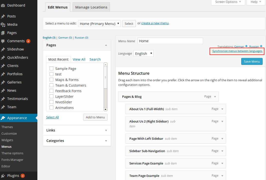
By clicking on it you will get following screen:
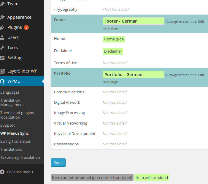
By clicking on the Sync button at the bottom of the page (with its informative legends by
its side) you’ll be presented with a set of menu items that can be translated; select them all, and go ahead to
apply the changes. After the synching operation you can individually edit the menus in each language from WordPress
"Appearance->Menus".
TRANSLATING THEME SPECIFIC STRINGS
After translating your website content you would be probably interested in translating some theme specific phrases
or words like "Next" button in testimonial or "Follow Us" title in "Follow & Contact Us" area. To do this, proceed
as follows:
WOOCOMMERCE
Scalia is fully compatible with WooCommerce and includes templates integration. To get started with creating your
online
shop, you need to install the free WooCommerce Plugin here http://www.woothemes.com/woocommerce/.
This documenation on using WooCommerce covers only the theme specific points you need to get started. To get full
documentation on using WooCommerce use following links:
FIRST STEPS / SETTING UP WOOCOMMERCE
CREATING YOUR PRODUCTS
Follow the steps described in WooCommerce Documentation
Creating One-Page Site
In Scalia you have an option to create simple one-page site. It is a sort of sites like this one: http://codex-themes.com/scalia/one-page/. If
you click on main menu items above, you will be slightly scrolled down to the needed section.
The process of making one-page site is very simple and consist of two steps:
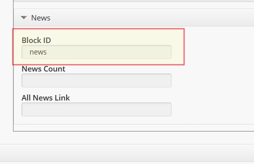 Create your homepage using Theme Options -> Home Constructor (see description of Home
Constructor here). By adding your content blocks to the homepage pls notice, that you have a field "Block
ID". In this field you can enter any unique block identifier you wish.
Create your homepage using Theme Options -> Home Constructor (see description of Home
Constructor here). By adding your content blocks to the homepage pls notice, that you have a field "Block
ID". In this field you can enter any unique block identifier you wish.
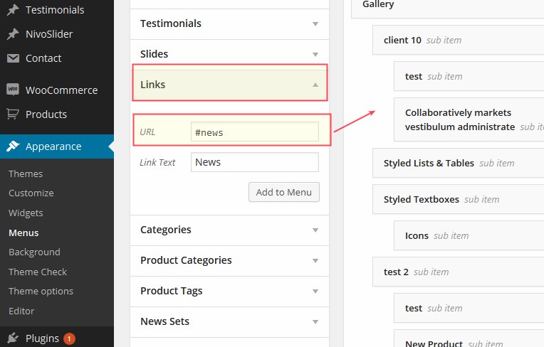 After you are done with building your homepage in Home Constructor, save your changes and go to Appearance ->
Menus. Here make your main menu using "Links" type of menu items. Pls note, that as "URL" you should type in the
appropriate "Block ID" you have used in Home Constructor in Step 1 previously.
After you are done with building your homepage in Home Constructor, save your changes and go to Appearance ->
Menus. Here make your main menu using "Links" type of menu items. Pls note, that as "URL" you should type in the
appropriate "Block ID" you have used in Home Constructor in Step 1 previously.
The process of making one-page site is very simple and consist of two steps:
STEP 1
STEP 2
Creating Mega Menus
Scalia comes with built-in mega menu options. With this feature you can create stunning & impressive flyout menus
with
grouped structures for better usability.
STEP 1
Go to Appearance -> Menus. Create your menus as described in this section,
subsection "Menus".
NOTE: In order to make mega menus, your menu structure must contain min. 3 levels, where your: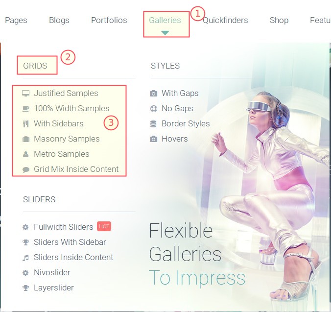
NOTE: In order to make mega menus, your menu structure must contain min. 3 levels, where your:
STEP 2
Now open your first level menu item. Here you can make general settings for your mega meni. You will see following
options:
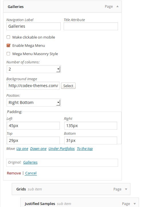
Enable Mega Menu
With this option you enable the mega menu view.Mega Menu Masonry Style
By default mega menus in Scalia have justified grid. With this option you can enable masonry gridNumber of columns
Here you can define the number of columns to be displayed in your mega menuBackground image
If you wish to use a background image in your mega menu, here you can define this image. In our example it is something like this http://codex-themes.com/scalia/wp-content/uploads/2015/01/galleries_megamenu_image2.jpgPosition
Here you set the position of the background image you have chosen previouslyPadding
In these field you can set paddings for your mega menuSTEP 3
Now open your second level menu item.
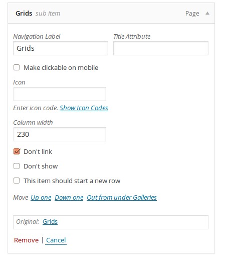
Icon
If you wish to set an icon for your submenu title, you can make it here by selecting the icon code and pasting it in this field.Column width
Define the width of your first column in mega menu layoutDon't link
If you don't want to make your submenu title clickable, here you can deactivate itDon't show
In case you don't want to display the submenu title, here you can hide itThis item should start a new row
If enabled, this option moves this submenu title to the new row in your mega menu layoutSTEP 4
The last step - go to the third level menu item.
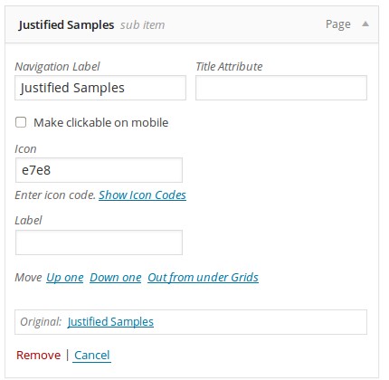
That's all. Now make the same with the rest of your menu items and save your mega menu.
Icon
If you wish to set an icon for your menu item, you can make it here by selecting the icon code and pasting it in this field.Label
This option enables you to add some highlighted markers/labels like "NEW", "HOT" etc. to your menu item.That's all. Now make the same with the rest of your menu items and save your mega menu.
Mobile Menus
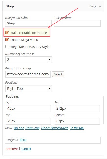
Scalia transforms your menus to responsive style automatically, so you don't need to make some special settings at
this point. The only thing you might know is, that in responsive menu all menu items, which have submenu items, are
not clickable by default. So if you click on such menu item, it will open the submenu without loading the actual
page.
If you don't need this behaviour for some of your menu items (i.e. you wish to make them clickable), use this option in your menu item (in "Appearance -> Menus"):
If you don't need this behaviour for some of your menu items (i.e. you wish to make them clickable), use this option in your menu item (in "Appearance -> Menus"):
Make clickable on mobile
If enabled, after you click on this menu item on mobile device, you will see an additional option "Show this page" in mobile menu. In this way your website visitor can decide, whether he would like to see this page or to go further to submenu items.Font Icons
Scalia is delivered with a huge set of ready-to-use font icons. Still you have always an option to add your own font icons or to modify the existing icons. First, if you run main scalia parent theme, we recommend to install and use main child theme for making these changes (check scalia-default-child.zip). It is needed for further Scalia updates in future. Otherwise, if you will make these changes directly in Scalia parent theme, they will be lost after next update.
Adding new social icons
If you wish to add or to replace social icons, which are positioned in top area and footer of the theme, proceed with these steps:
PART 1: Adding new icons
PART 1: Adding new icons
PART 2: Updating font file
PART 3: Adding icons in Top Area
PART 4: Adding icons in footer
That's all. Adding new font icons for content elements
PART 1: Creating icon font
PART 2: Adding icon font in theme
We would recommend to use scalia main child theme for these modifictaions (if you use main Scalia theme)
That's all.
If you don't use the child theme, so just replace the files in folder /fonts/ with the files you have downloaded from Icomoon. We would recommend to use scalia main child theme for these modifictaions (if you use main Scalia theme)
Legal Notes
DISCLAIMER
Scalia was tested to work in different browsers and wordpress versions (see Theme's Page on themeforest.net).
However we cannot guarantee, that Scalia will function with all third party plugins and server environments. We
cannot provide support solving any conflicts with third party plugins.
CREDITS
Please be advised that all preview data (text and media) is for preview purposes only and is not included in the product or covered by the product's license. The responsibility for any content used on a website lies solely with the website owner. If any media (including images, videos, audio, or text) requiring its own license has been used, it is the responsibility of the website owner to purchase the appropriate license for that media.
Icons:
Free icon packs from http://icomoon.io/ and Font Awesome
Images on theme demo website:
Graphicriver.net (regular license), IDs: 6691601, 6993268, 7345815, 3484320, 6468313, 5705964
Photodune.net (regular license), IDs: 4555418, 3256414, 1689745, 914953, 6734927, 5848717, 5578933, 1373187, 1837889, 3307270, 5248341, 3979249, 1861062, 4555418, 369318, 358198, 353390, 5757567, 5652496, 2360811, 4807316, 1714557, 4016845, 5345409, 3419961, 514671, 5692739, 4807316
Images With Creative Commons Attribution License 3.0
Unsplash.com
Thestocks.im
Pixabay.com
Mazwai.com
Pixeden.com
Shutterstock.com (regular license), IDs: 179473799, 161730896, 166441373, 212589148, 153626741, 225388861, 183006680, 228152602, 183009029, 133300961, 182603093, 183009773, 128238317, 113168935, 114041509, 148724891, 159326039, 132366848, 230047054, 189842585, 230780998, 126492314, 173727986, 154766285, 197558105, 182603069, 214814665, 196294955, 206695300, 212621287, 159672671, 147893546, 141236470, 238047637, 88315597, 51719998, 133786706, 233683780, 184342181, 215470309, 99256976, 152291621, 96103796, 218526937, 155808509, 231299968, 207559387, 170924099
Fonts:
http://www.google.com/fonts/
Coding:
Jquery http://jquery.com/
JS:
html5.js
/**
* @preserve HTML5 Shiv v3.6.2 | @afarkas @jdalton @jon_neal @rem | MIT/GPL2 Licensed
*/
jquery.carouFredSel.js
/*
* jQuery carouFredSel 6.2.1
* Demo's and documentation:
* caroufredsel.dev7studios.com
*
* Copyright (c) 2013 Fred Heusschen
* www.frebsite.nl
*
* Dual licensed under the MIT and GPL licenses.
* http://en.wikipedia.org/wiki/MIT_License
* http://en.wikipedia.org/wiki/GNU_General_Public_License
*/
jquery.galleriffic.js
/**
* jQuery Galleriffic plugin
*
* Copyright (c) 2008 Trent Foley (http://trentacular.com)
* Licensed under the MIT License:
* http://www.opensource.org/licenses/mit-license.php
*
* Much thanks to primary contributer Ponticlaro http://www.ponticlaro.com)
*/
colorpicker
/**
*
* Color picker
* Author: Stefan Petre www.eyecon.ro
*
* Dual licensed under the MIT and GPL licenses
*
*/
fancyBox
/*!
* fancyBox - jQuery Plugin
* version: 2.1.4 (Thu, 10 Jan 2013)
* @requires jQuery v1.6 or later
*
* Examples at http://fancyapps.com/fancybox/
* License: www.fancyapps.com/fancybox/#license
*
* Copyright 2012 Janis Skarnelis - janis@fancyapps.com
*
*/
jquery-ui
/*! jQuery UI - v1.10.2 - 2013-03-14
* http://jqueryui.com
* Includes: jquery.ui.core.js, jquery.ui.widget.js, jquery.ui.mouse.js, jquery.ui.draggable.js, jquery.ui.droppable.js, jquery.ui.resizable.js, jquery.ui.selectable.js, jquery.ui.sortable.js, jquery.ui.effect.js, jquery.ui.accordion.js, jquery.ui.autocomplete.js, jquery.ui.button.js, jquery.ui.datepicker.js, jquery.ui.dialog.js, jquery.ui.effect-blind.js, jquery.ui.effect-bounce.js, jquery.ui.effect-clip.js, jquery.ui.effect-drop.js, jquery.ui.effect-explode.js, jquery.ui.effect-fade.js, jquery.ui.effect-fold.js, jquery.ui.effect-highlight.js, jquery.ui.effect-pulsate.js, jquery.ui.effect-scale.js, jquery.ui.effect-shake.js, jquery.ui.effect-slide.js, jquery.ui.effect-transfer.js, jquery.ui.menu.js, jquery.ui.position.js, jquery.ui.progressbar.js, jquery.ui.slider.js, jquery.ui.spinner.js, jquery.ui.tabs.js, jquery.ui.tooltip.js
* Copyright 2013 jQuery Foundation and other contributors; Licensed MIT */
tinymce-widget
/*
Version: 1.1.1
Author: Black Studio
Author URI: http://www.blackstudio.it
License: GPL2
*/
nivo-slider
/*
* jQuery Nivo Slider v3.2
* http://nivo.dev7studios.com
*
* Copyright 2012, Dev7studios
* Free to use and abuse under the MIT license.
* http://www.opensource.org/licenses/mit-license.php
*/
LayerSlider WP
/*
* Plugin Name: LayerSlider WP
* License: Extended License * Plugin URI: http://codecanyon.net/user/kreatura/
* Description: LayerSlider is the most advanced responsive WordPress slider plugin with the famous Parallax * Effect and over 200 2D & 3D transitions.
* Version: 5
* Author: Kreatura Media
* Author URI: http://kreaturamedia.com/
Visual Composer
/* Plugin Name: WPBakery Visual Composer * Plugin URI: http://vc.wpbakery.com
* License: Extended License
* Description: Drag and drop page builder for WordPress. Take full control over your WordPress site, build any layout you can imagine – no programming knowledge required.
* Version: 4.4.2
* Author: Michael M - WPBakery.com
* Author URI: http://wpbakery.com